COVID-19 India-Timeline an understanding across States and Union Territories
Karnataka Deceased Data
Karnataka State Government's Ministry of Health and Family Welfare has a dedicated COVID-19 Dashboard on its website and also has been providing detailed Media Bulletins on a daily basis since March 9th, 2020. In this page, we track the Deceased data provided in bulletins to give a more comprehensive view of the COVID-19 fatalities in the state of Karnataka.
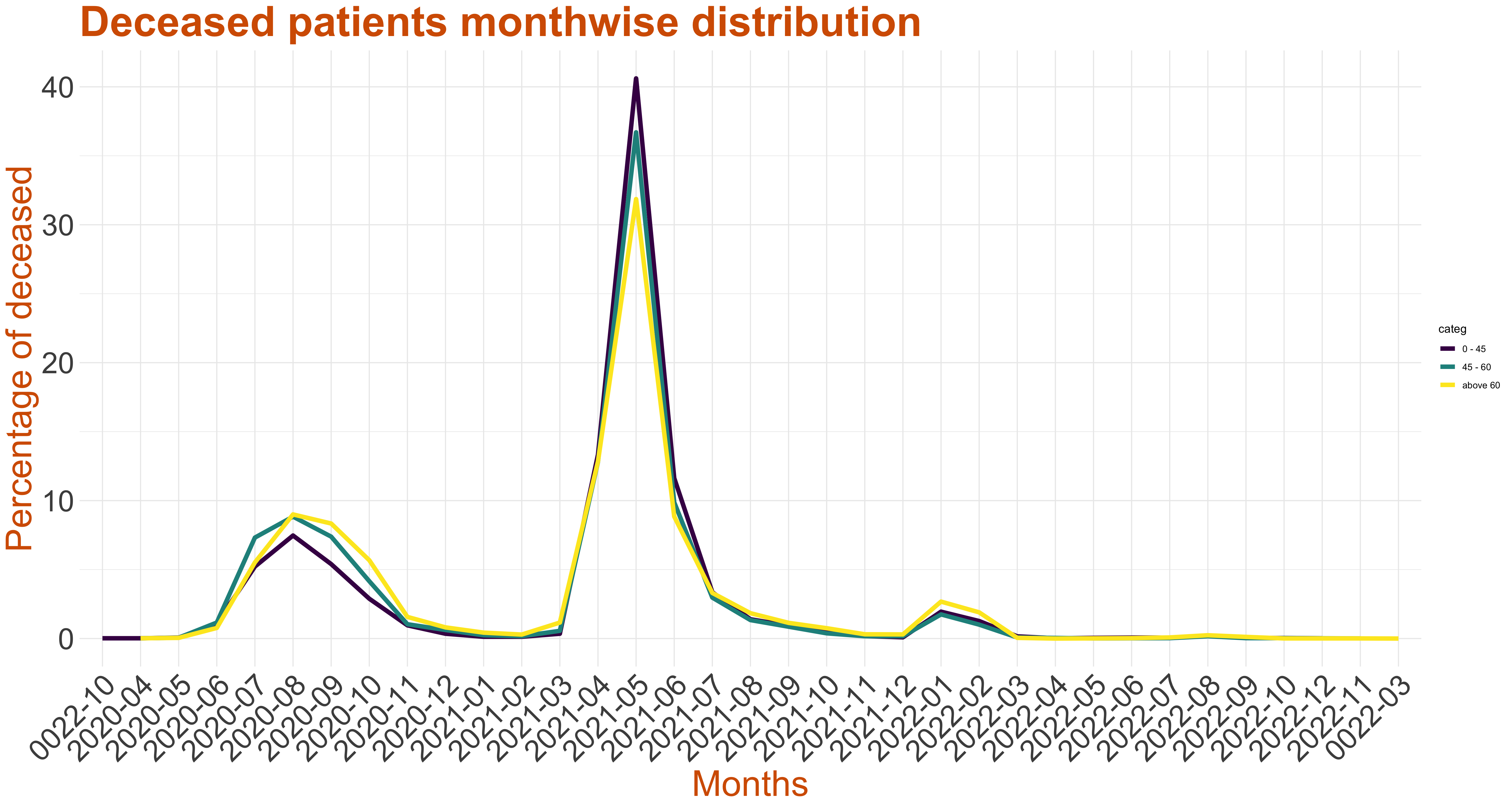
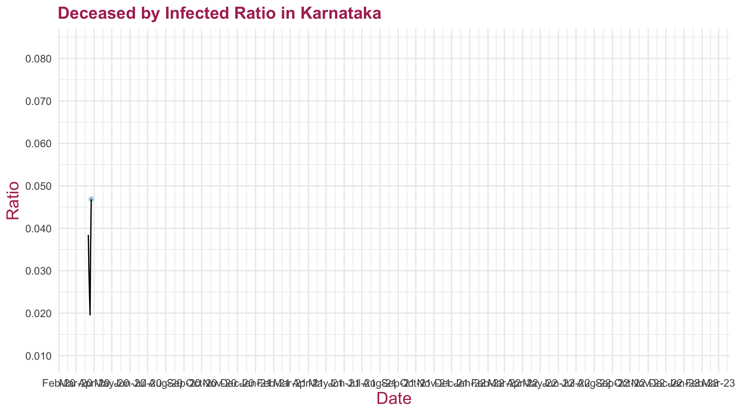
The left graph represents monthwise percentage death count. The percentage count is with regard to total deaths till current date. Although there has been slight increase in deaths in August 2020, there is a visible spike of death cases in May 2021. The graph on the right hand side plots the case fatality rate for the duration of the pandemic.
In particular we track:
- Age-Gender Distribution of the Deceased
The graph on the left (below) provides the stacked age distribution of the deceased COVID-19 patients in Karnataka along with the census of the population of Karnataka for reference. The graph on the right is the stacked age gender distribution of the deceased in Karnataka.
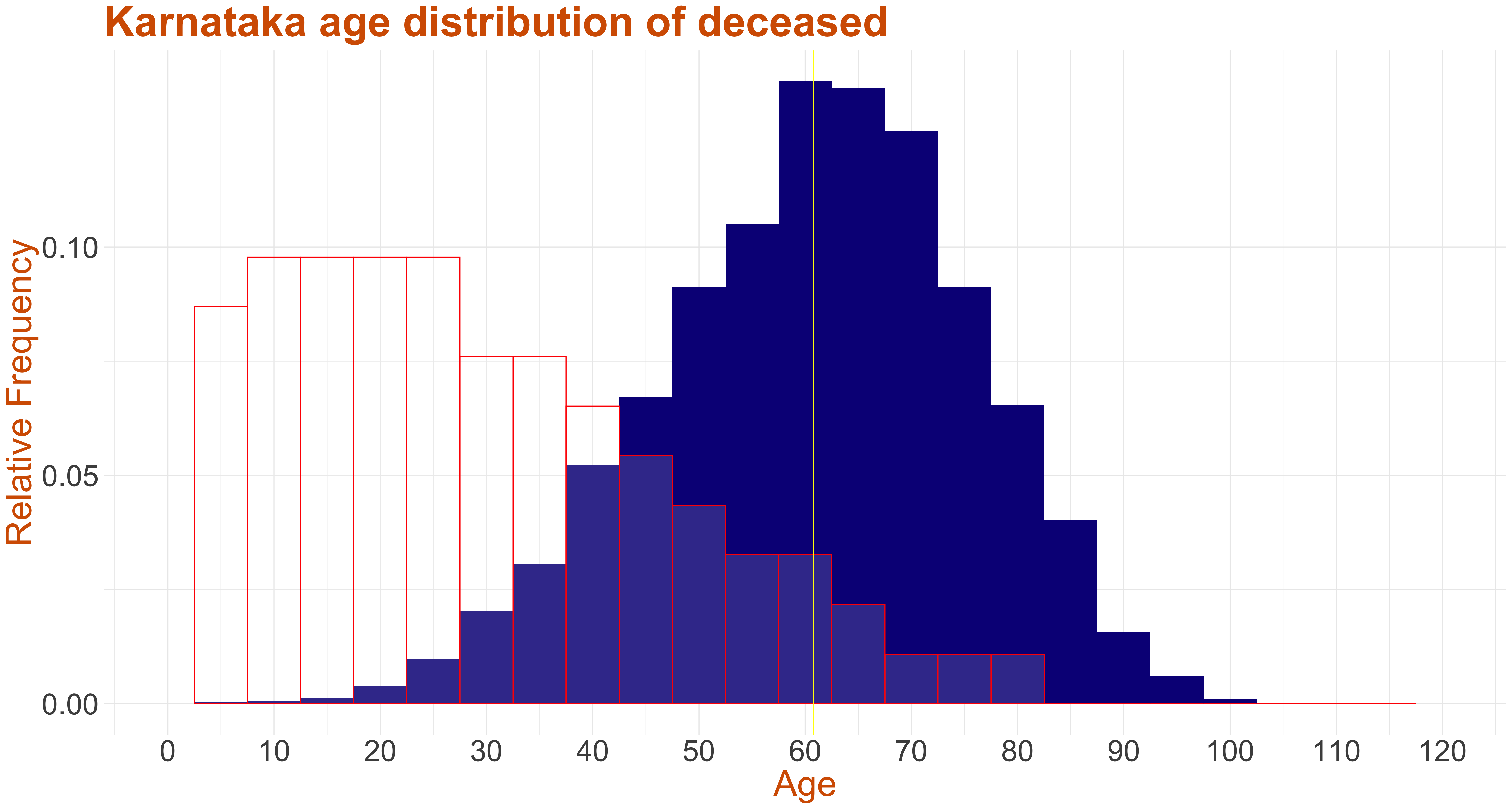
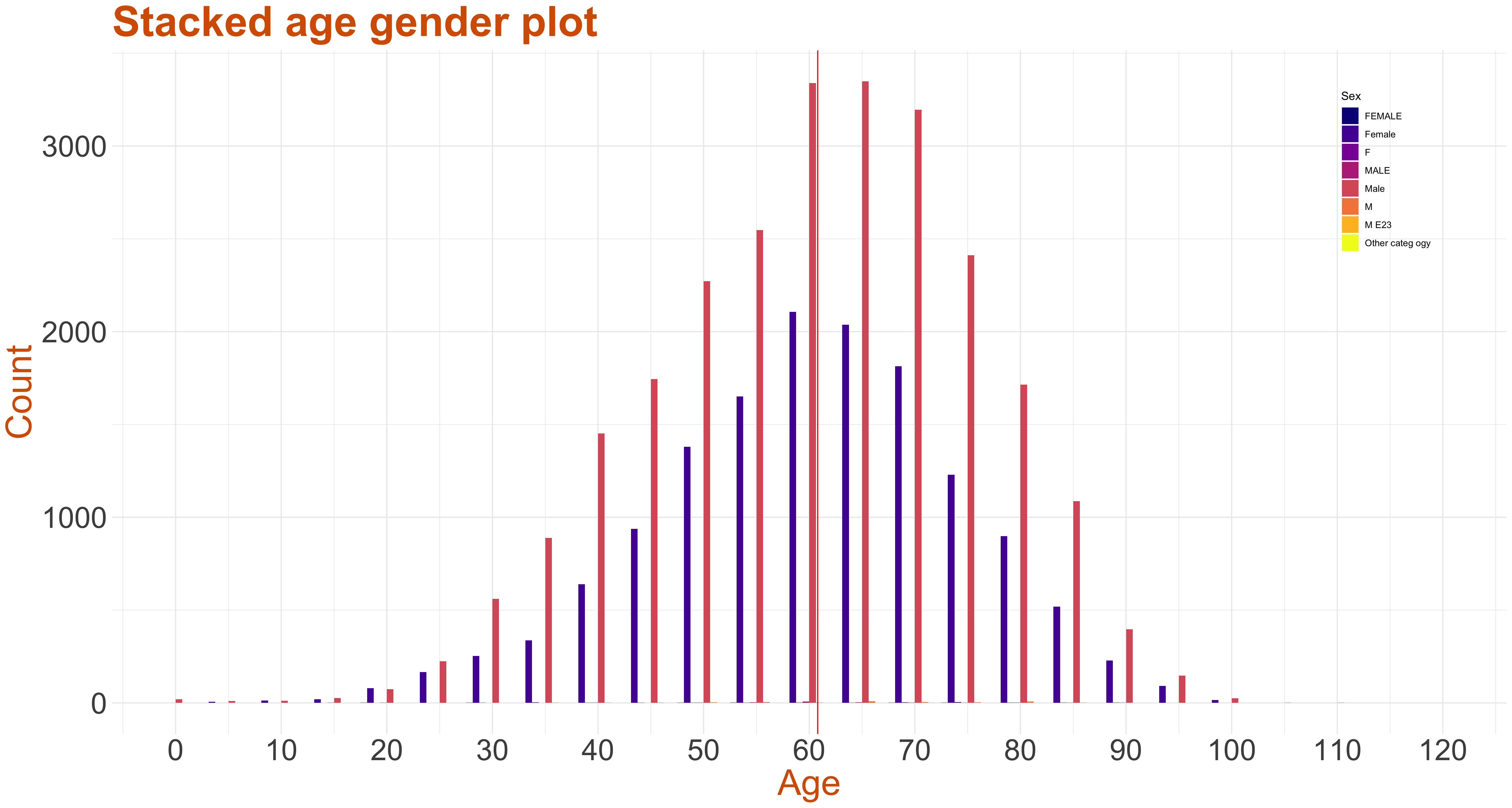
The filled in blue color indicates the distribution of the deceased coronavirus patients in Karnataka and the red outline represents the census of population. From the graphs we see that mean age of the deceased is around 60 yrs, the age group 60-70 have the highest number of deceased patients, while the age group 0-30 have very less death count. The number of Male deaths in each group is uniformly higher across all age groups over corresponding female deaths. In the media bulletins, some entries did not mention, age, sex, and districts and also some entries were attributed to "others". Such entries have not been plotted in the above.
- The district name.
- The State P Code for that patient.
- The age of the patient, given in years.
- The sex of the patient.
- The description of the patient including why they were tested and which cluster they fall in.
- The symptoms of the patients.
- Any co-morbidities that the patients might have had.
- The date at which they were admitted to the hospital. For the patients who were brought dead or passed away at their residence, that has been mentioned.
- The date on which they passed away.
- The date of the media bulletin they appeared in.
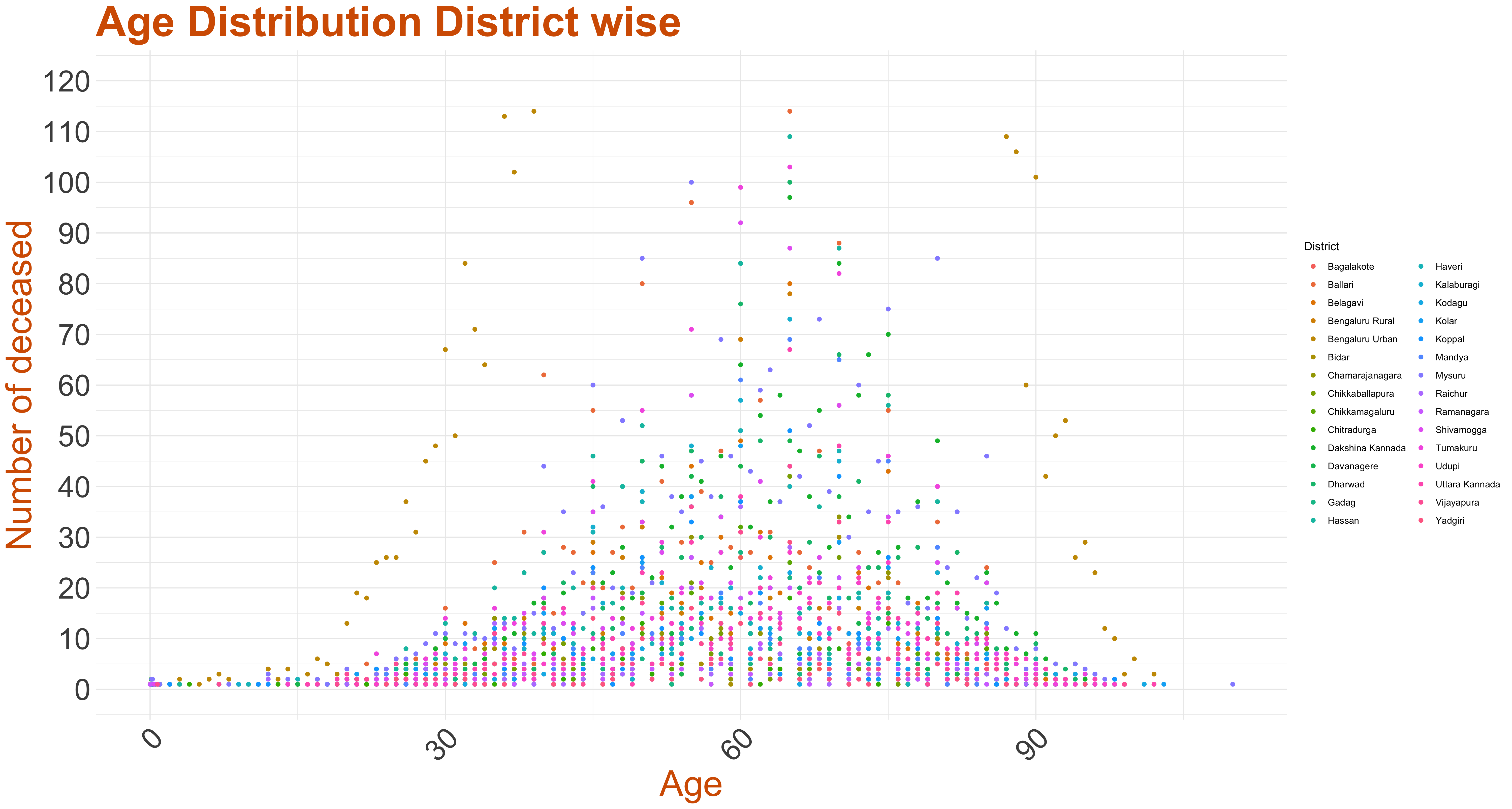
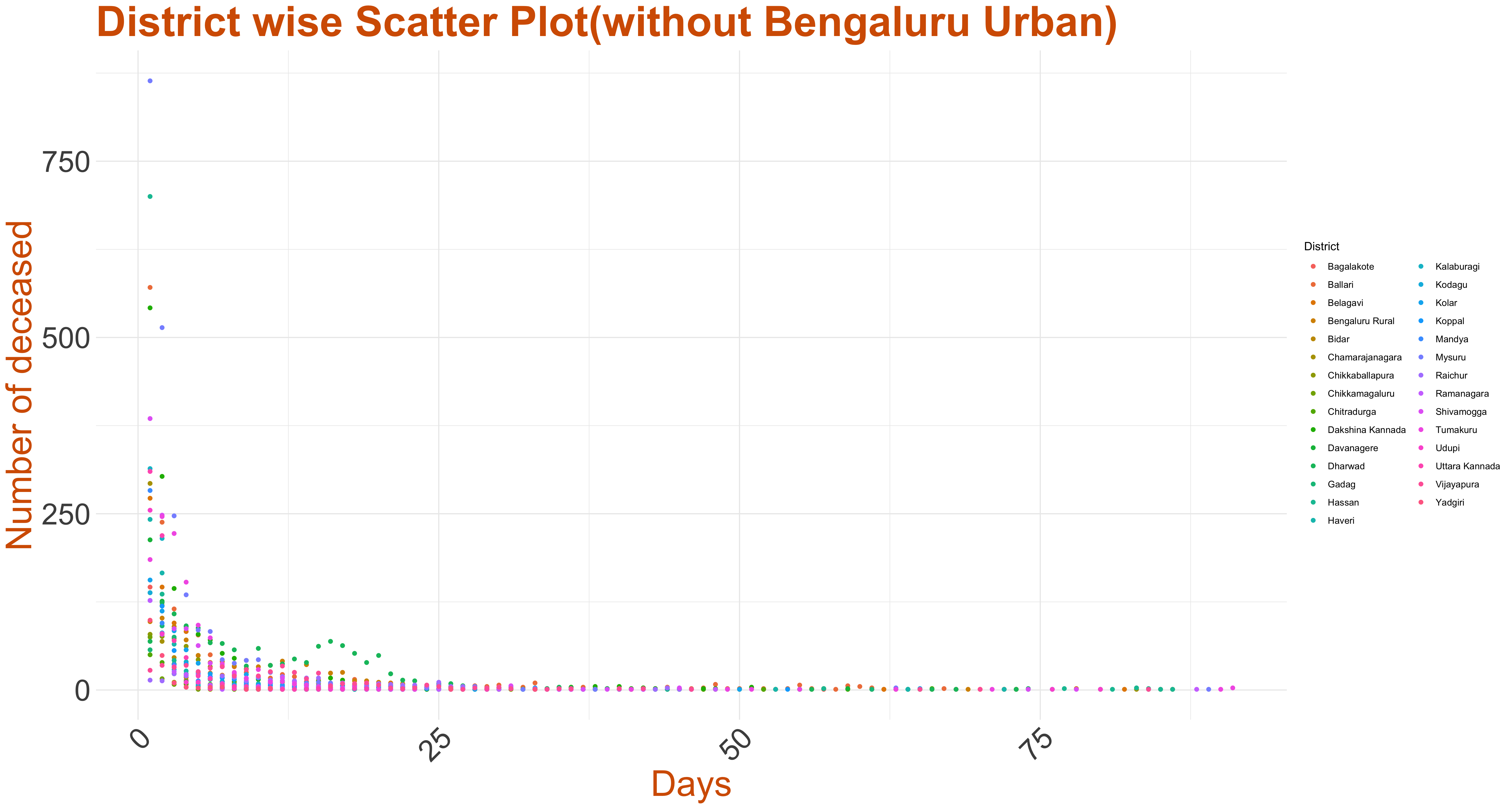
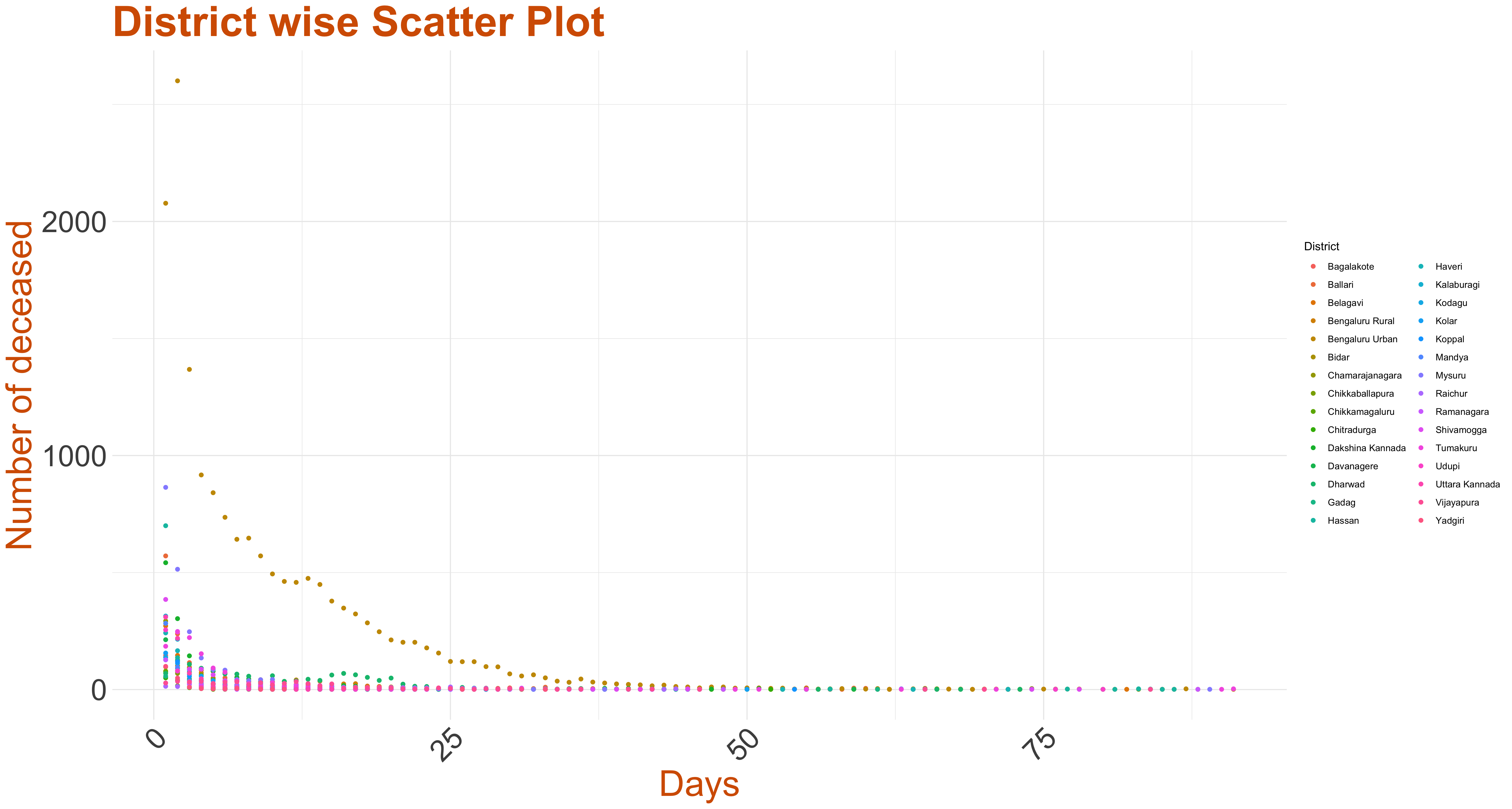
This zipped file is a collection of files that contain data for each district in Karnataka, where each file contains all the information of all the people who died in that particular district. The columns have data on:This graph is the scatter plot of the total age distribution across all districts.
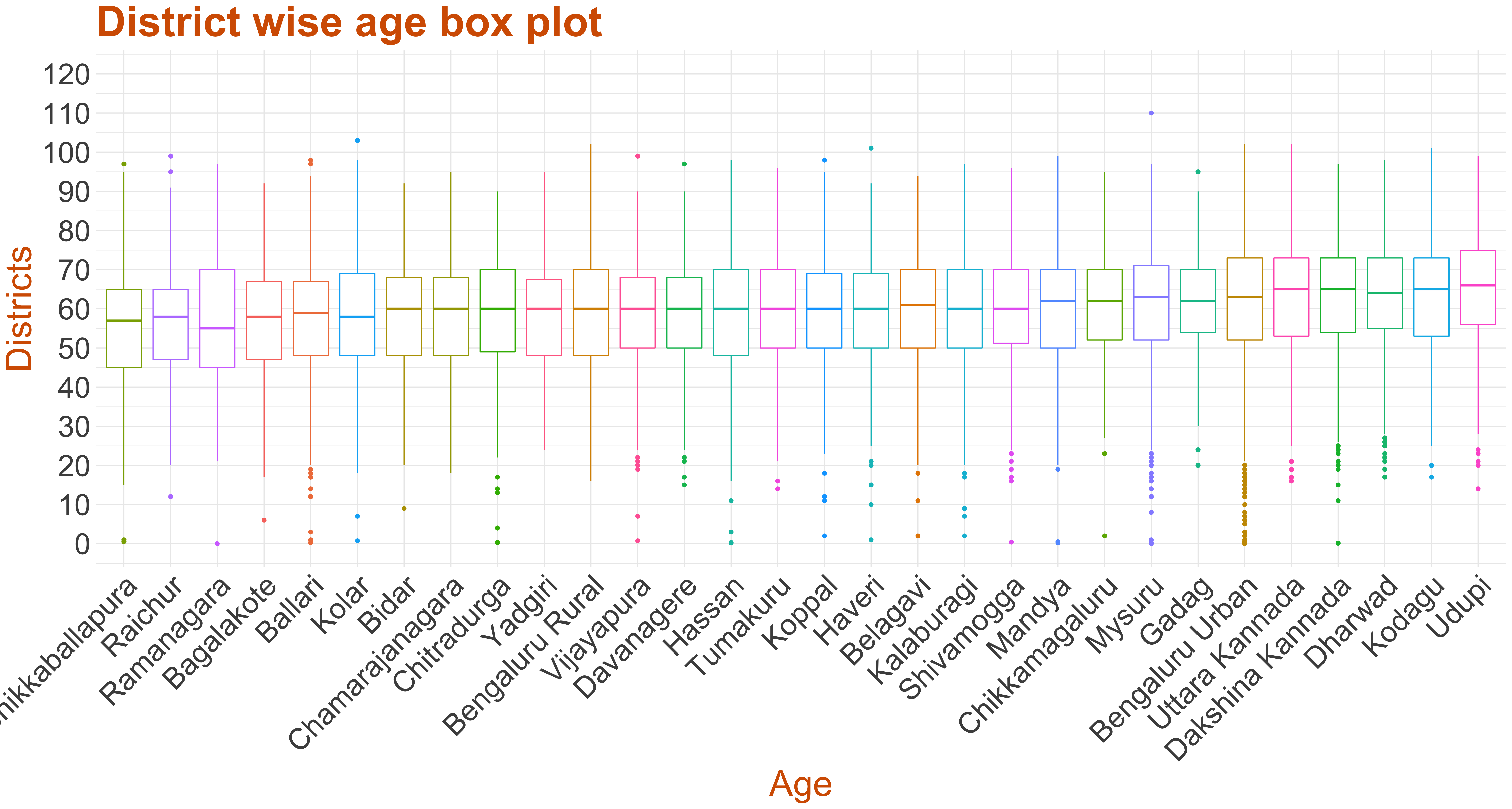
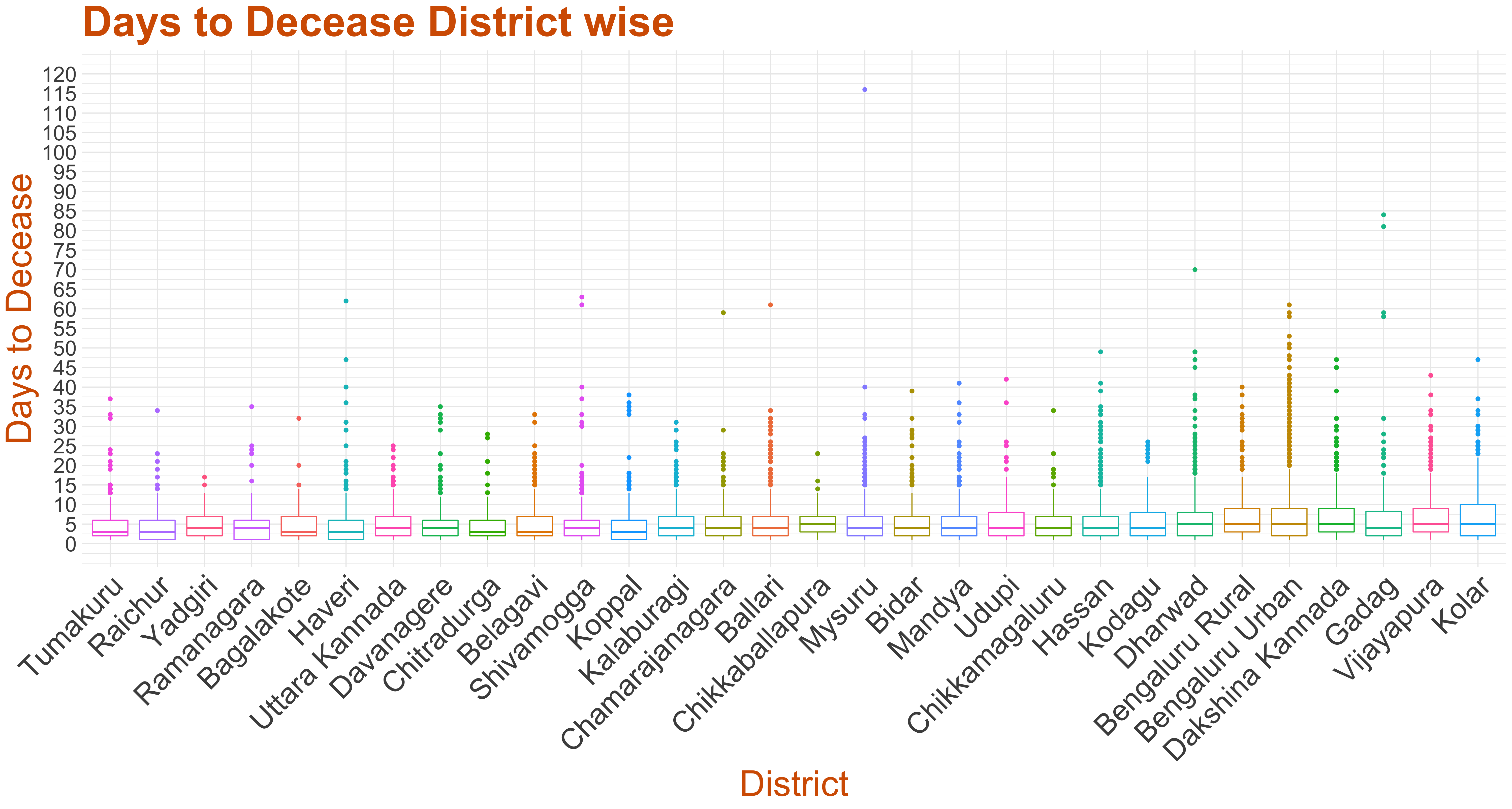
The below box-plot, across districts, suggest that the median age of the deceased from every district is around 60 mostly, consistent with the general overall trends and across waves. We can see that the maximum number of outliers can be observed with Bengaluru Urban while Bidar has no outliers.
- Days to Decease
The graph below represents a scatter plot of days to decease for each patnly considered the patients who were admitted to a hospital and then computed the difference between admission date and decease date to arrive at days to decease.
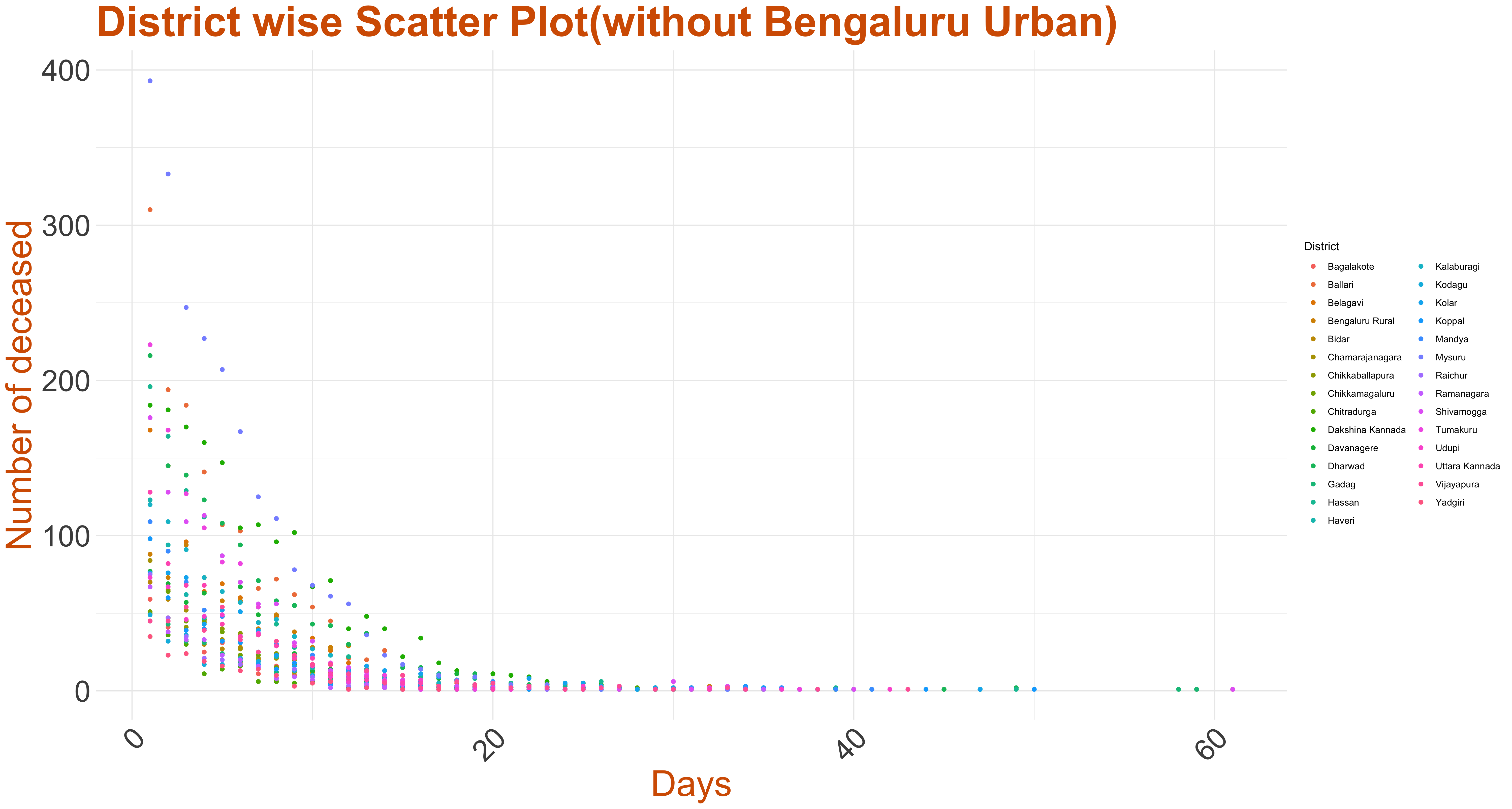
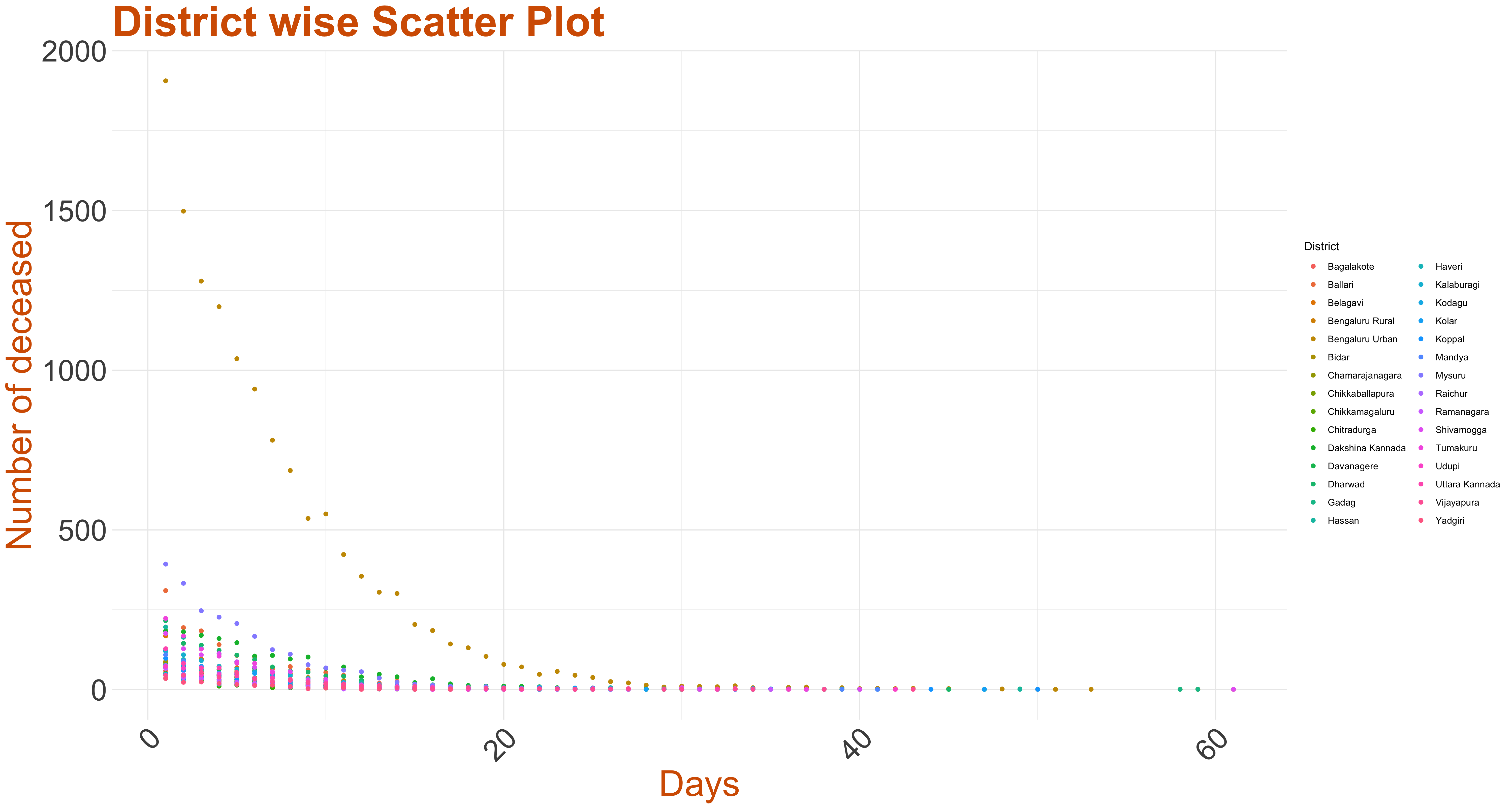
More than 4000 people die just after first day of hospitalisation. Days to decease for a majority of patients is within 2 weeks and and the mean is nearly 6 days.
- The patient id,
- Name of District,
- Date of Admission,
- Date of Decease,
- The days to decease being the difference between the dates mentioned in third and second column.
- Age-Gender Category,
- Total deceased patients,
- t-value of Total deceased patients,
- Mean Days to decease,
- Variance of Days to decease,
- Standard deviation of Days to decease,
- Gender.
Csv File. From the media bulletin, we took the difference between the date of decease and admission date and call the difference as days to decease.The csv file conatains:The graph below represents the Box-plot for days to decease in Karnataka(District-wise) based on the data reported.All District shows similar trend.
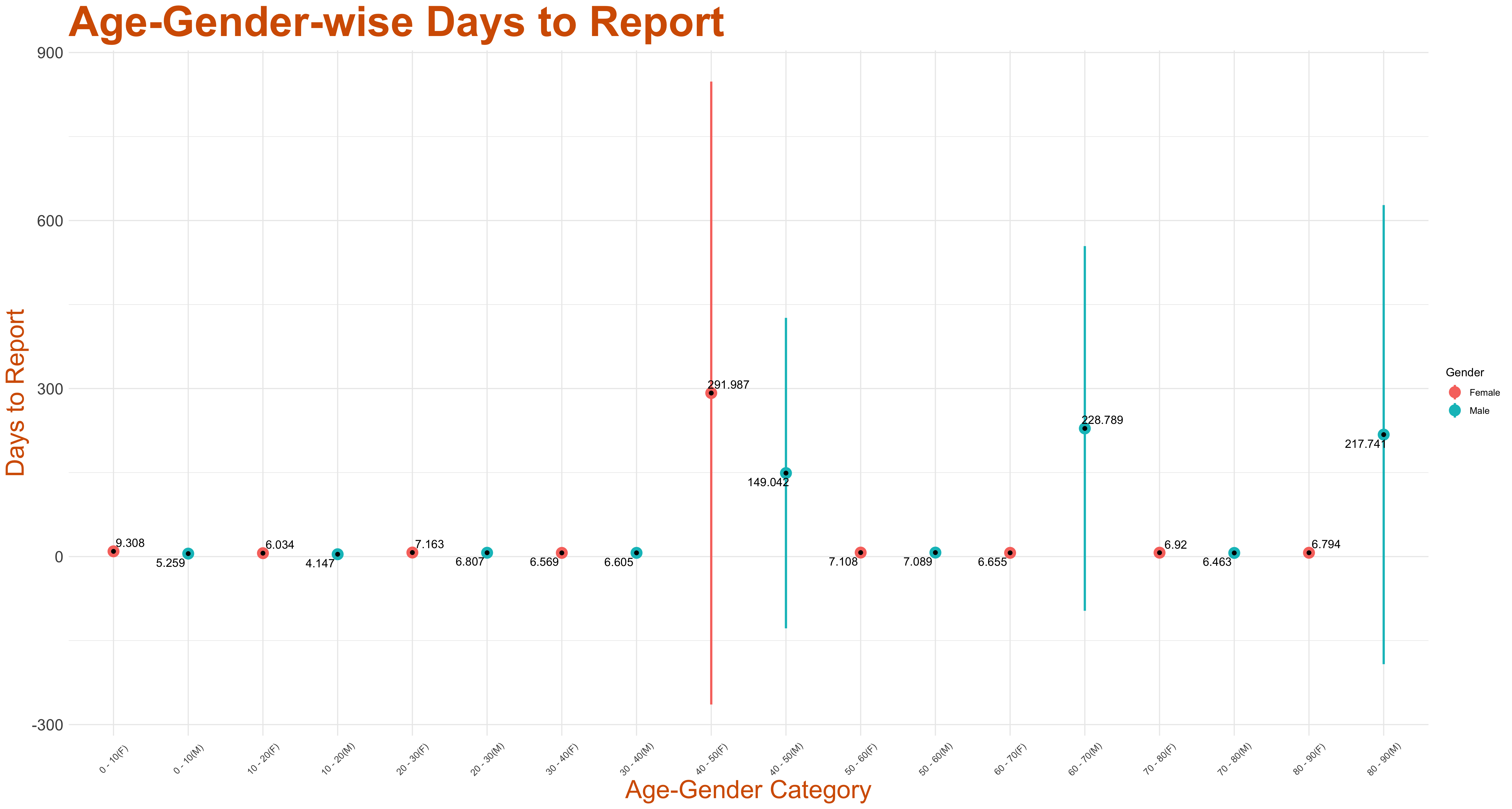
Below we plot the 95% t-confidence interval around the mean for days to decease across gender in various age bins.
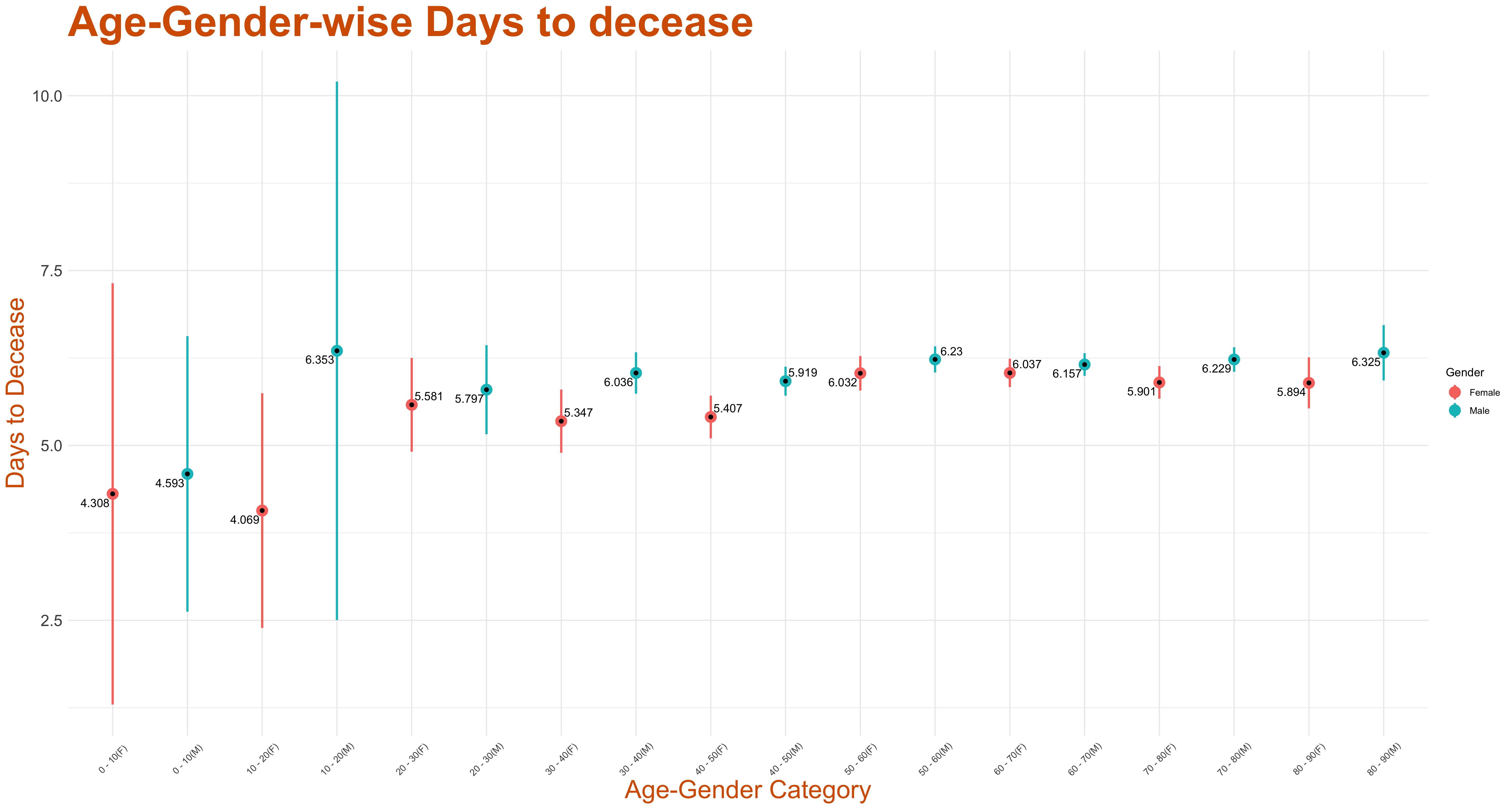
Csv File. From the media bulletin, we took the difference between the date of decease and admission date and call the difference as days to decease.We then separated the deceased on the basis of age and gender and calculated the mean, variance, and standard deviation for days to decease.
The column has data on:
- Days to Report
The graph below represents the histogram of days to report in Karnataka. Here we considered all deceased patients and computed the difference between the date they were reported in the Media Bulletin and the decease date. Thus we arrive at days to report for each deceased patient.
The above histogram is right-skewed indicating early reporting of deaths by the district administration. The mean time is nearly 7 days.
- The patient id,
- Name of District,
- Date of Decease,
- Date of Report,
- The days to report being the difference between the dates mentioned in third and second column.
Csv File. From the media bulletin published by the state government, we took the difference between the date of decease and the media bulletin date and call the difference as the days to report.
The column has data on:The graph below represents the Box-plot for days to report in Karnataka(District-wise) based on the data reported.Most districts have similar trend but some have high interquartile range along with high number of outliers.

Below we plot the 95% t-confidence interval around the mean for days to report across gender in various age bins.
- Hospitalisation Ratio
In the media bulletin each deceased patient is reported as either admitted to hospital or has been brought dead or has died at her/his residence. We take the ratio of hospitalised patients to total deceased patients to arrive at the hospitalisation ratio. Below we present the data of Hospitalisation Ratio of the deceased patients as scatter plots across months. The size of the blob in the scatter plot indicates the number of monthly deaths.
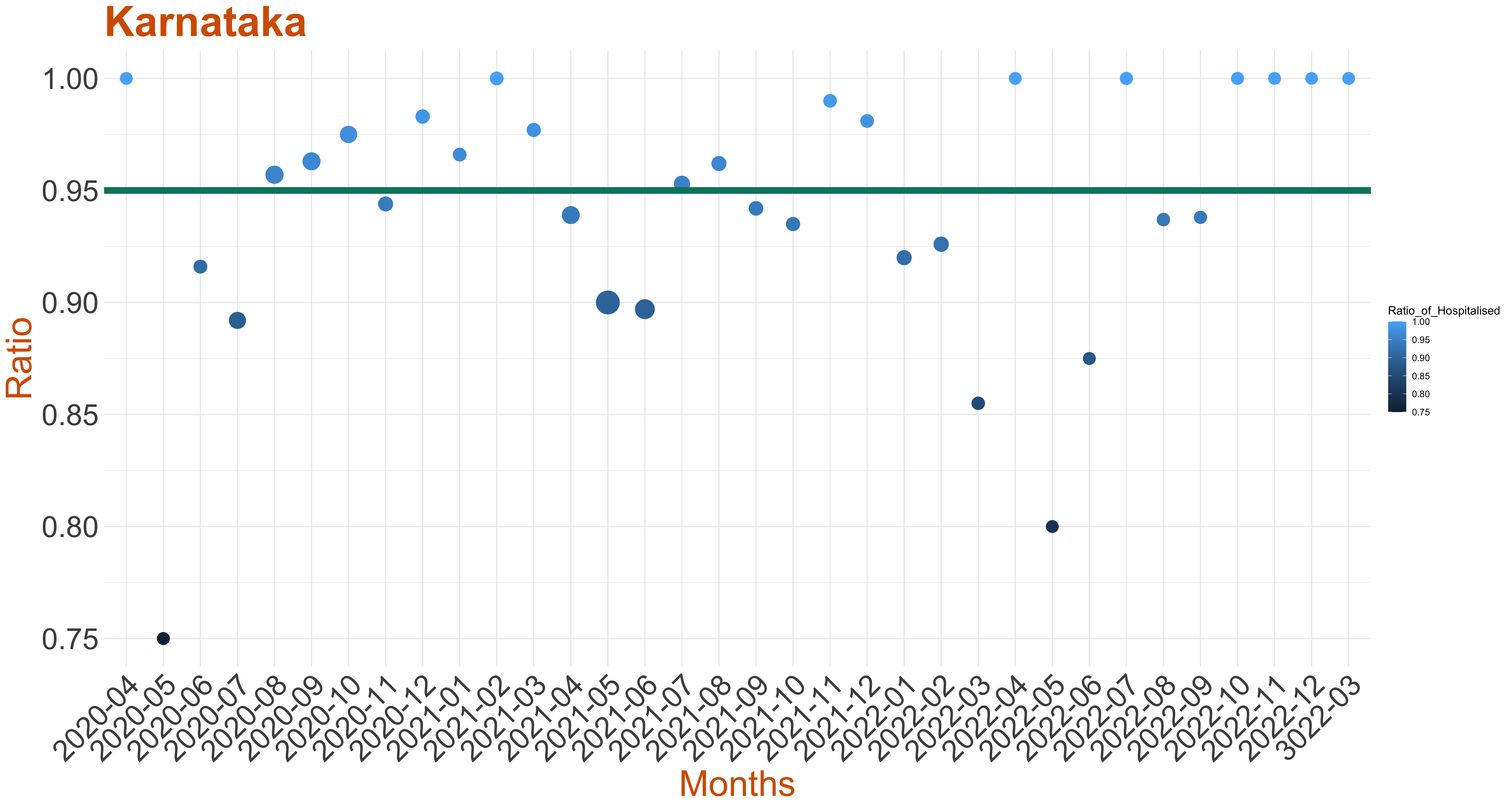
We have marked a line at 95% hospitalisation ratio in the scatter plots or at the minimum monthly hospilisation ratio if it is higher. This line may be viewed as an ideal hospitalisation ratio. In comparison with days to decease one may arrive at a standard for clinical treatment.
As per the media bulletin published by the state government, each individual death is reported either as hospitalised, brought dead,or died at residence.In the data file, for each individual district, we provide the count of total death, total deceased patients who were hospitalised, and deceased patients who were not hospitalised, that is, we added the deceased who were either brought dead or died at residence.Then we also calculate the ratio of hospitalisation and the ratio of unhospitalised patients and the values are listed in individual column of the csv file attached.
The column has data on:-
Each row represents a district in Karnataka.
Each row in this column represents total deaths in that district.
Each row represents total deceased patients who were hospitalised in that district.
Each row represents total deceased patients who were not-hospitalised in that district.
Each row represents ratio of hospitalisation in that district.
Each row represents ratio of un-hospitalised deceased patients in that district.
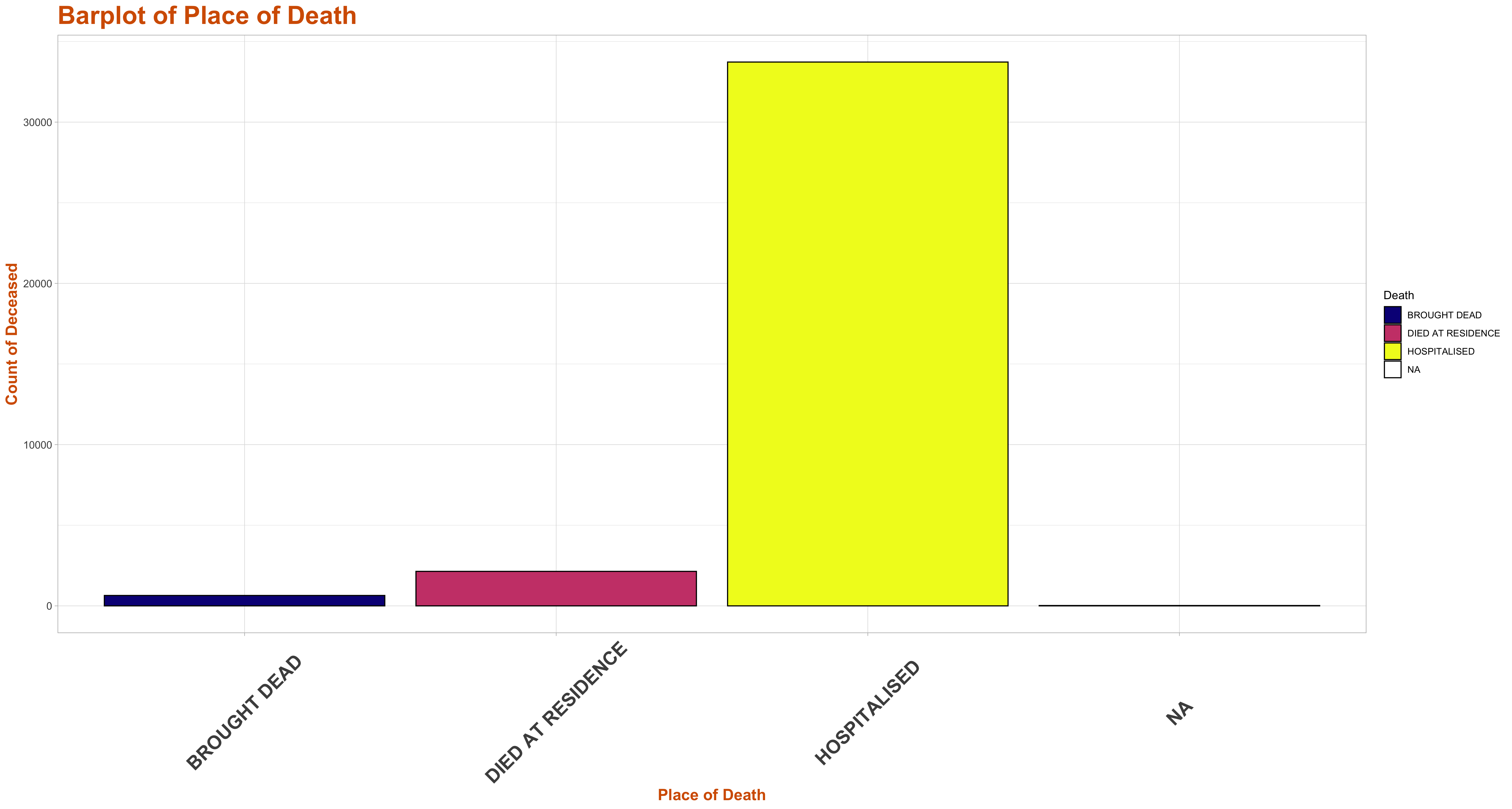
From the above we can see that the majority of deceased patients sought treatment at a hospital. A siginficant proportion still succumb without treatment at a medical having been brought dead or passing away at their residence.
The graph below represents the Barplot of Place of Death for the state of Karnataka based on the data reported.
The graph below represents the Barplot of Place of Death(District wise) in Karnataka based on the data reported.
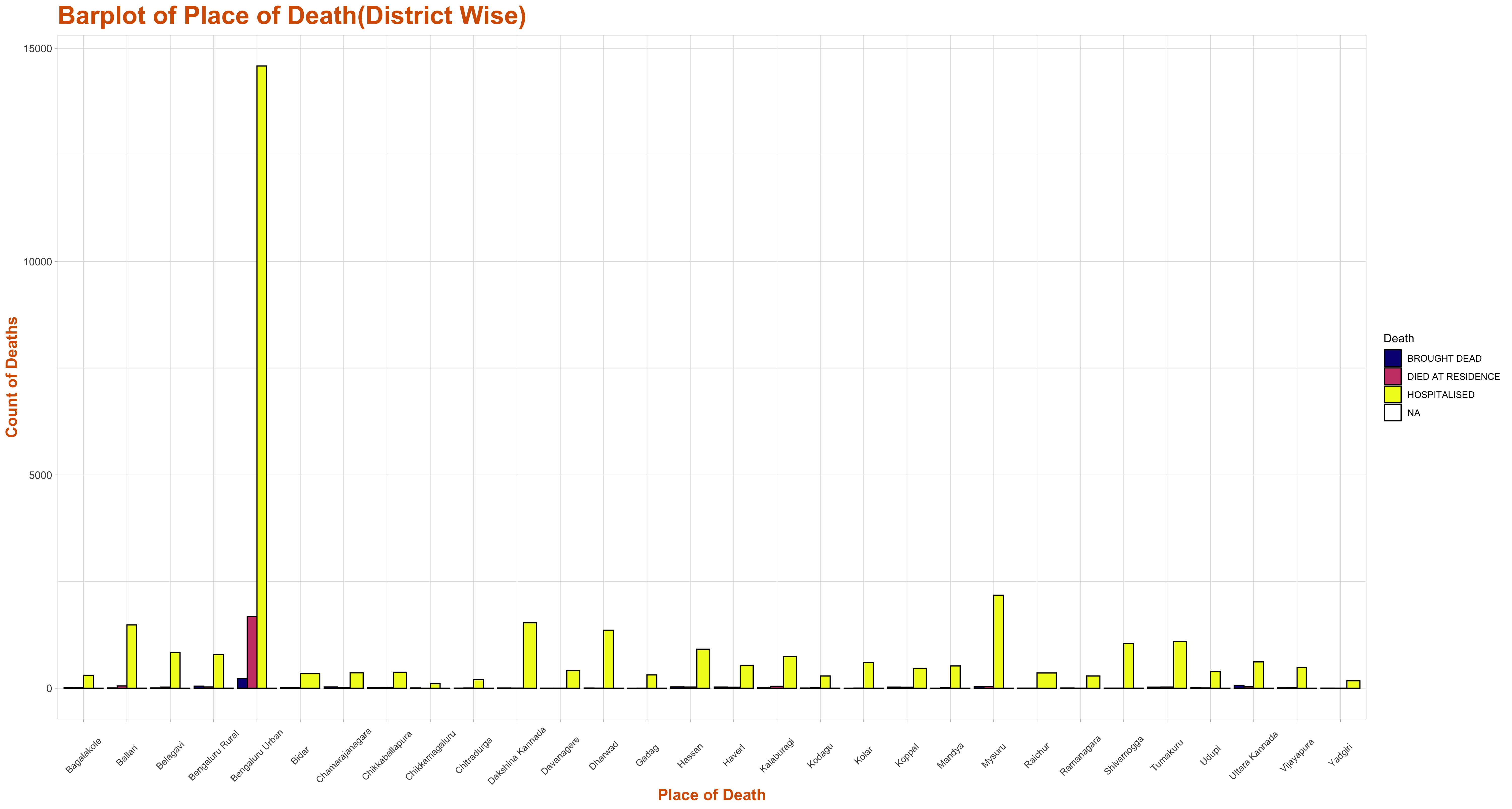
Most of the patients were actually diagnosed in hospitals before death.But Bengaluru urban shows a peak in death count in hospitals.
- Description of Source of Illness
In the media bulletin for each deceased patient the source of illness is identified in the Description column. We have grouped the sources into 4 travel related clusters, SARI, ILI and Unkown. To see the variation in description of source of illness we have plotted a heat map of the percentage (within each district) number of deceased patients across description clusters for all districts. Every tick on the x-axis represents the different source of illness. The y-axis represents the different districts. Each cell represents the percentage number of deceased patients in that description cluster for that particular district. The darker the colour of a cell, the smaller the percentage of deaths in that description for the given district while the brighter the colour, the larger is the corresponding percentage.
- Influenza Like Illness
- Severe Acute Respiratory Illness
- Contact of Patient or Containment Zone
- Inter District Travel in Karnataka
- Domestic Travel outside of Karnataka
- International Travel
- Unknown (Contact under tracing or ongoing investigation)
This csv file contains information about the 7 different clusters of description of sources of illness of deceased patients and the percentage of the number of deceased patients in each cluster of description of source of illness for each district in Karnataka. The 7 columns represent the following 7 clusters of description and the headings in each column are the name of the clusters of description.
All the rows below the headings (except the last row) contain the percentage of the number of deceased patients in each of the 7 clusters of description of source of illness for each district. The last row represents the percentage of deceased patients in each of the 7 clusters of description in all of Karnataka.
In the media bulletin for each deceased patient the source of illness is identified in the Description column. We have grouped the sources into 4 travel related clusters, SARI, ILI and Unknown. The specific clustering is provided in the following csv file.
Clusters of Description of Source of Illness
This CSV file contains information about the clusters of sources of illness based on the description associated with each patient in the Description column of the Media Bulletin. In the CSV file, the 7 columns represent the 7 clusters of description and the heading of each column is the name of that cluster of description of the source of illness. The rows below the headings are the description of the sources of illness classified under the corresponding cluster of description of the sources of illness.
The above bar graph represents the 7 clusters of the description of the sources of illness vs. the percentage of deceased patients in each of the clusters of description for all of Karnataka in total. As we can see, the percentage of deceased patients in the clusters of ILI (Influenza Like Illness), SARI (Severe Acute Respiratory Illness) and Unknown (Contact Under Tracing and Under Investigation), far exceed those in each of the other clusters. After clicking on the graph, hovering on the bars in the graph reveals the percentage of deceased patients in the given cluster. For clusters of description other than those related to ILI, SARI and Unknown, the bars are very short and hence hovering on them might not reveal the percentage of deceased patients. In such a case, please zoom on the graph to make visible the percentage of deceased patients in clusters with shorter bars while hovering on them.
- Symptoms of the Patient
The above bar graph represents the ten symptom clusters vs. the percentage of deceased patients in each of the symptom clusters for all of Karnataka in total. As we can see, the percentage of deceased patients in the symptom clusters of breathlessness, cold, cough and fever, far exceed those in each of the other symptom clusters. After clicking on the graph, hovering on the bars in the graph reveals the percentage of deceased patients in the given symptom cluster. For symptom clusters other than those related to fever, cough, cold and breathlessness, the bars are very short and hence hovering on them might not reveal the percentage of deceased patients. In such a case, please zoom on the graph to make visible the percentage of deceased patients in clusters with shorter bars while hovering on them.
- Asymptomatic
- Abdominal Pain and Released Symptoms
- Chest pain and Pneumonia
- Body Pain and Fatigue
- Breathlessness and Respiratory Failure
- Fever, Cold or Cough without Breathlessness
- Fever, Cold or Cough with Breathlessness
- Anorexia and Decreased Appetite
- Acute Myocardial Infarction
- Altered Sensorium
In the media bulletin in the Symptoms column the symptoms observed in each deceased patient is listed. To see the variation in symptoms of deceased patients across different districts, we first grouped symptoms into 10 clusters. The specific clustering is provided in the following csv file.
This CSV file contains information about the different symptom clusters and the different sets of symptoms that are classified under each symptom cluster. In the CSV file, the 10 columns represent the 10 symptom clusters and the heading of each column is the name of that symptom cluster. The rows below the headings represent the different symptoms classified under the corresponding symptom clusters.
This csv file contains information about the 10 different clusters of symptoms of deceased patients and the percentage of the number of deceased patients in each symptom cluster for each district in Karnataka. The 10 columns represent the following 10 symptom clusters and the headings in each column are the name of the symptom clusters.
All the rows below the headings (except the last row) contain the percentage of the number of deceased patients in each of the 10 symptom clusters for each district. The last row represents the percentage of deceased patients in each of the 10 symptom clusters for all of Karnataka.
 The above bar graph represents the ten symptom clusters vs. the percentage of deceased patients in each of the symptom clusters for all of Karnataka in total. As we can see, the percentage of deceased patients in the symptom clusters of breathlessness, cold, cough and fever, far exceed those in each of the other symptom clusters. After clicking on the graph, hovering on the bars in the graph reveals the percentage of deceased patients in the given symptom cluster. For symptom clusters other than those related to fever, cough, cold and breathlessness, the bars are very short and hence hovering on them might not reveal the percentage of deceased patients. In such a case, please zoom on the graph to make visible the percentage of deceased patients in clusters with shorter bars while hovering on them.
- Comorbidities in the Patient

In the media bulletin in the Comorbidities column the Comoorbidities observed for each deceased patient is listed. To see the variation in Co-Morbidities of deceased patients across different districts, we first grouped the Co-Morbidities into 15 clusters. In the above graph we have plotted a heat map of the percentage(within each district) number of deceased patients across comorbidities clusters for all districts. Every tick on the x-axis represents the different comorbidities clusters. The y-axis represents the different districts. Each cell represents the percentage number of deceased patients in that comorbidity clusters for a district. The darker the colour of a cell, the smaller the percentage of deaths in that symptom for the given district while the brighter the colour, the larger is the corresponding percentage.
- Respiratory Diseases
- Kidney Related Diseases
- Liver Related Diseases
- Heart and Blood Pressure Related Diseases
- Epilepsy
- Diabetes and Obesity
- Hormone and Gland Diseases
- Anaemia and Myasthenia
- Cancer
- Sepsis
- Pulmonary and Lung Diseases
- Brain Related Diseases
- Skin Diseases
- Pregnancy Related Illness
- Infectious Disease
In the media bulletin in the Comorbidities column the Comoorbidities observed for each deceased patient is listed. To see the variation in comorbidities of deceased patients across different districts, we first grouped the comorbidities into 15 clusters. The specific clustering is provided in the following csv file.
This CSV file contains information about the different clusters of comorbidities and the different sets of comorbidities that are classified under each comorbidity cluster. In the CSV file, the 15 columns represent the 15 comorbidities clusters and the heading of each column is the name of that comorbidity cluster. The rows below the headings are the comorbidities classified under the corresponding clusters of comorbidities
This csv file contains information about the 10 different clusters of comorbidities of deceased patients and the percentage of the number of deceased patients in each comorbidities cluster for each district in Karnataka. The 15 columns represent the following 15 comorbidities clusters and the headings in each column are the name of the comorbidities clusters.
All the rows below the headings (except the last row) contain the percentage of the number of deceased patients in each of the 15 comorbidities clusters for each district. The last row represents the percentage of deceased patients in each of the 15 comorbidities clusters in all of Karnataka.
The above bar graph represents the 15 comorbidities clusters vs. the percentage of deceased patients in each of the comorbidities clusters for all of Karnataka in total. As we can see, the percentage of deceased patients in the comorbidities clusters of Diabetes and Obesity and Heart Disease, far exceed those in each of the other comorbidities clusters. After clicking on the graph, hovering on the bars in the graph reveals the percentage of deceased patients in the given comorbidities cluster. For comorbidities clusters other than those related to Heart Disease, Diabetes and Obesity and Kidney Diseases, the bars are very short and hence hovering on them might not reveal the percentage of deceased patients. In such a case, please zoom on the graph to make visible the percentage of deceased patients in clusters with shorter bars while hovering on them.