COVID-19 India-Timeline
an understanding across States and Union Territories
Next update will be on May 29th,2022
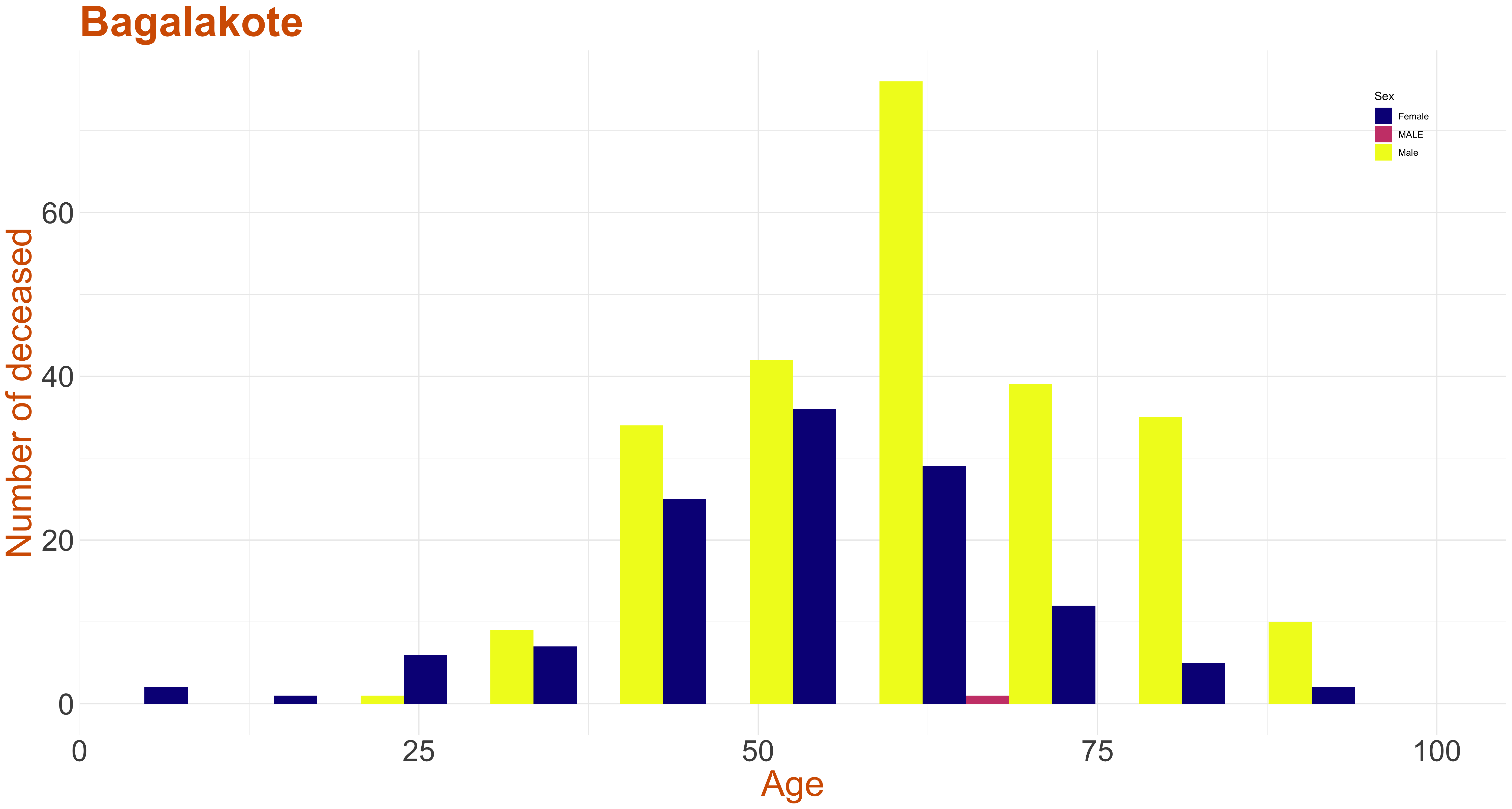
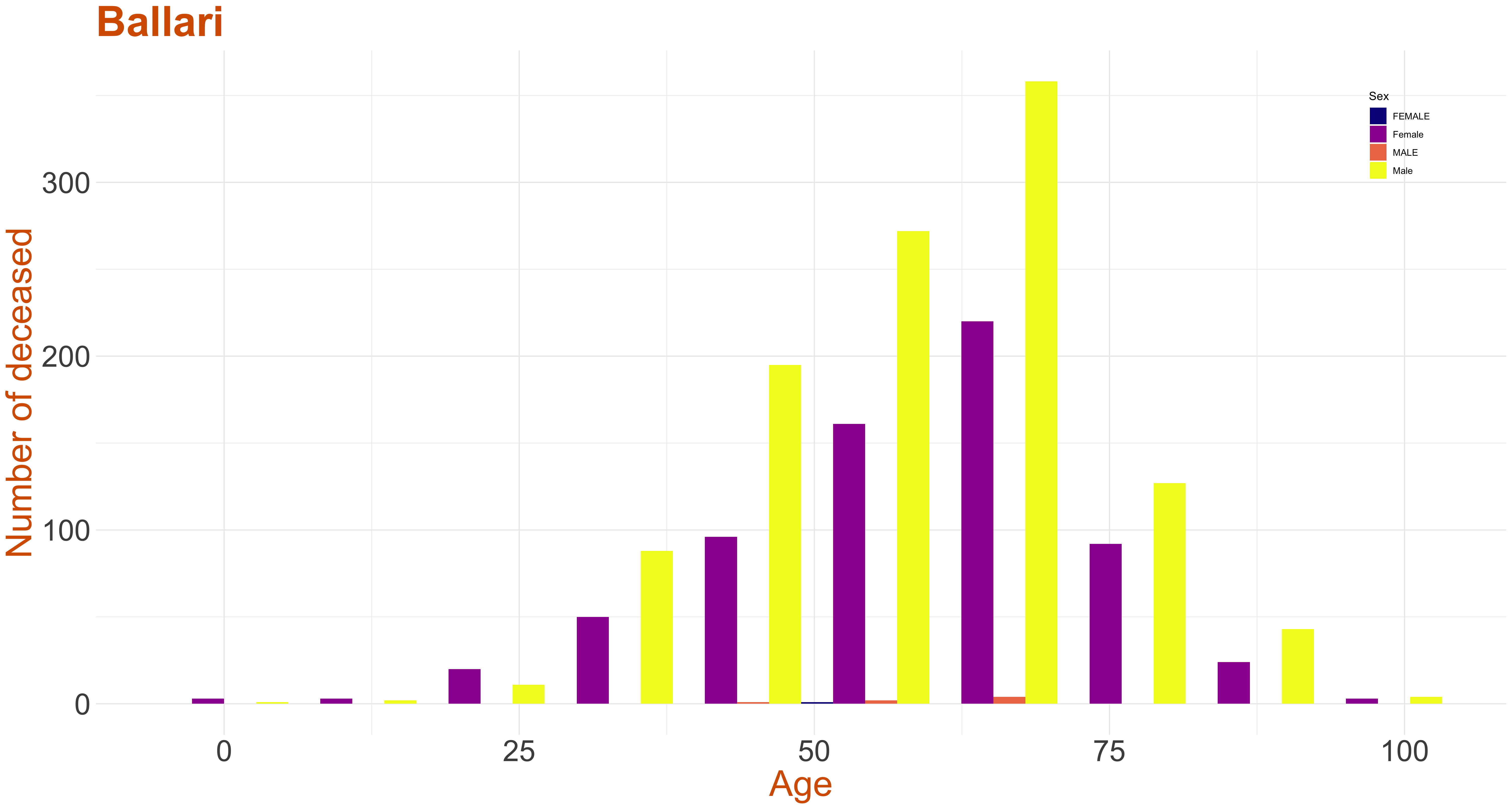
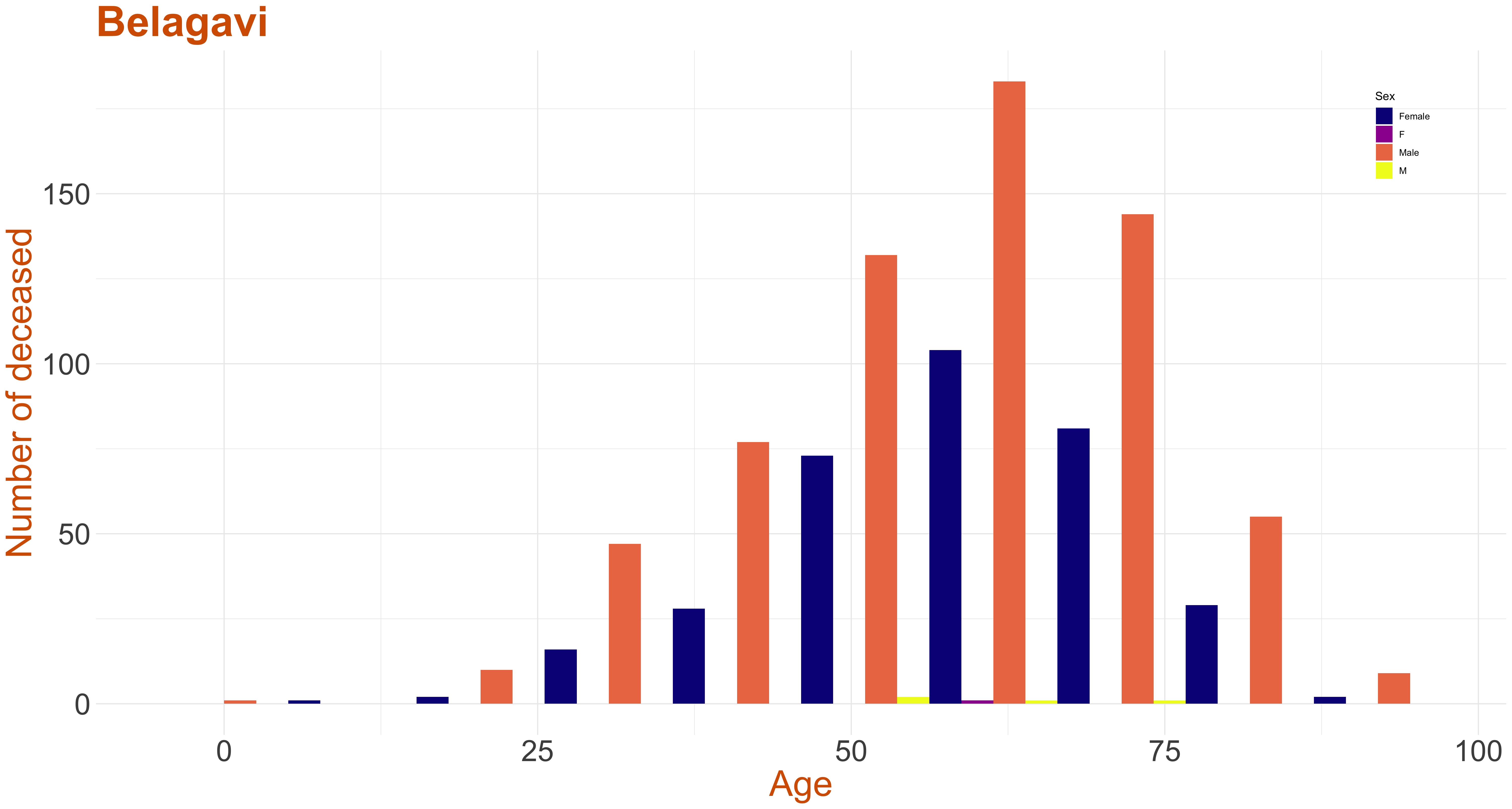
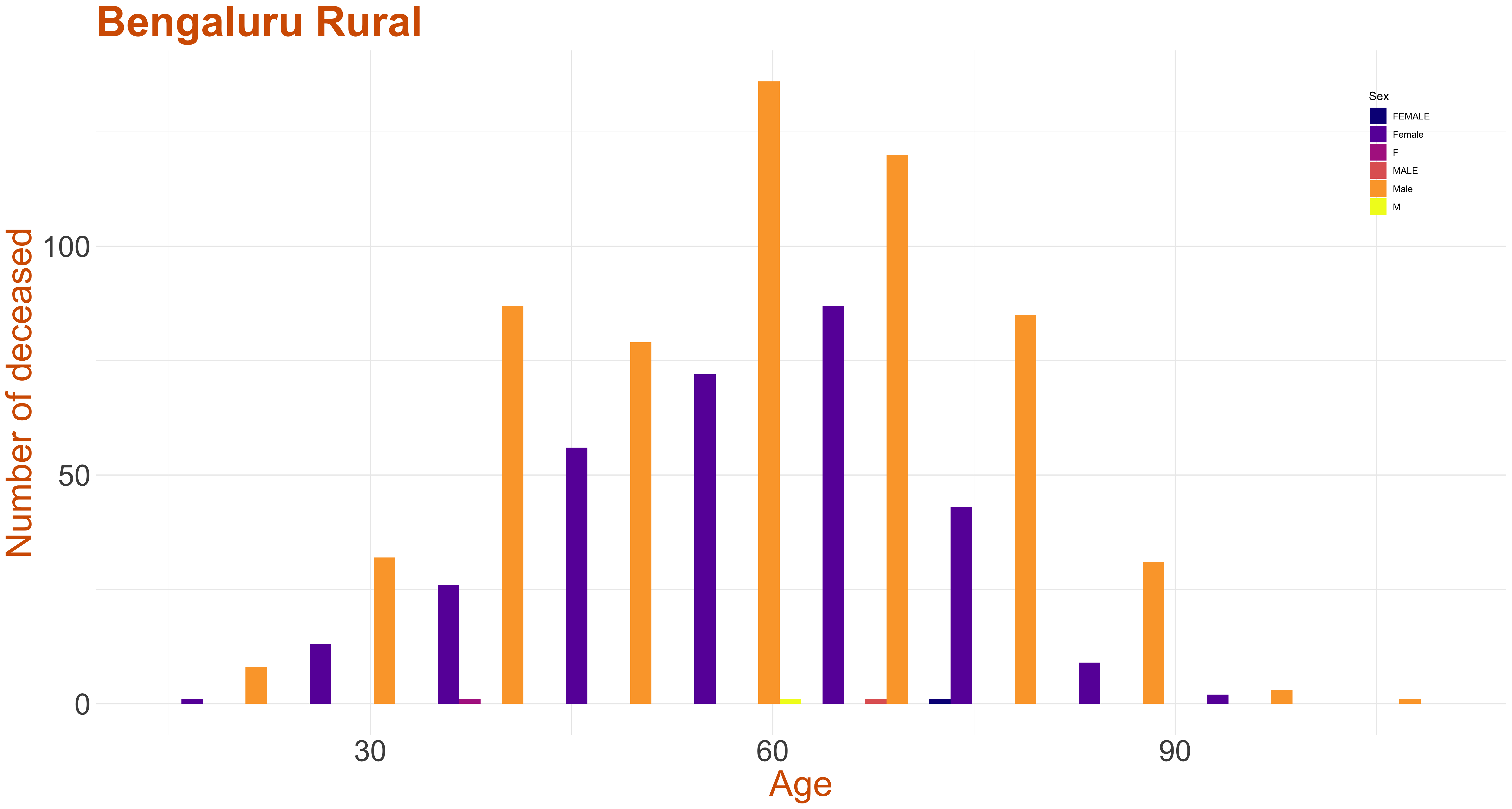
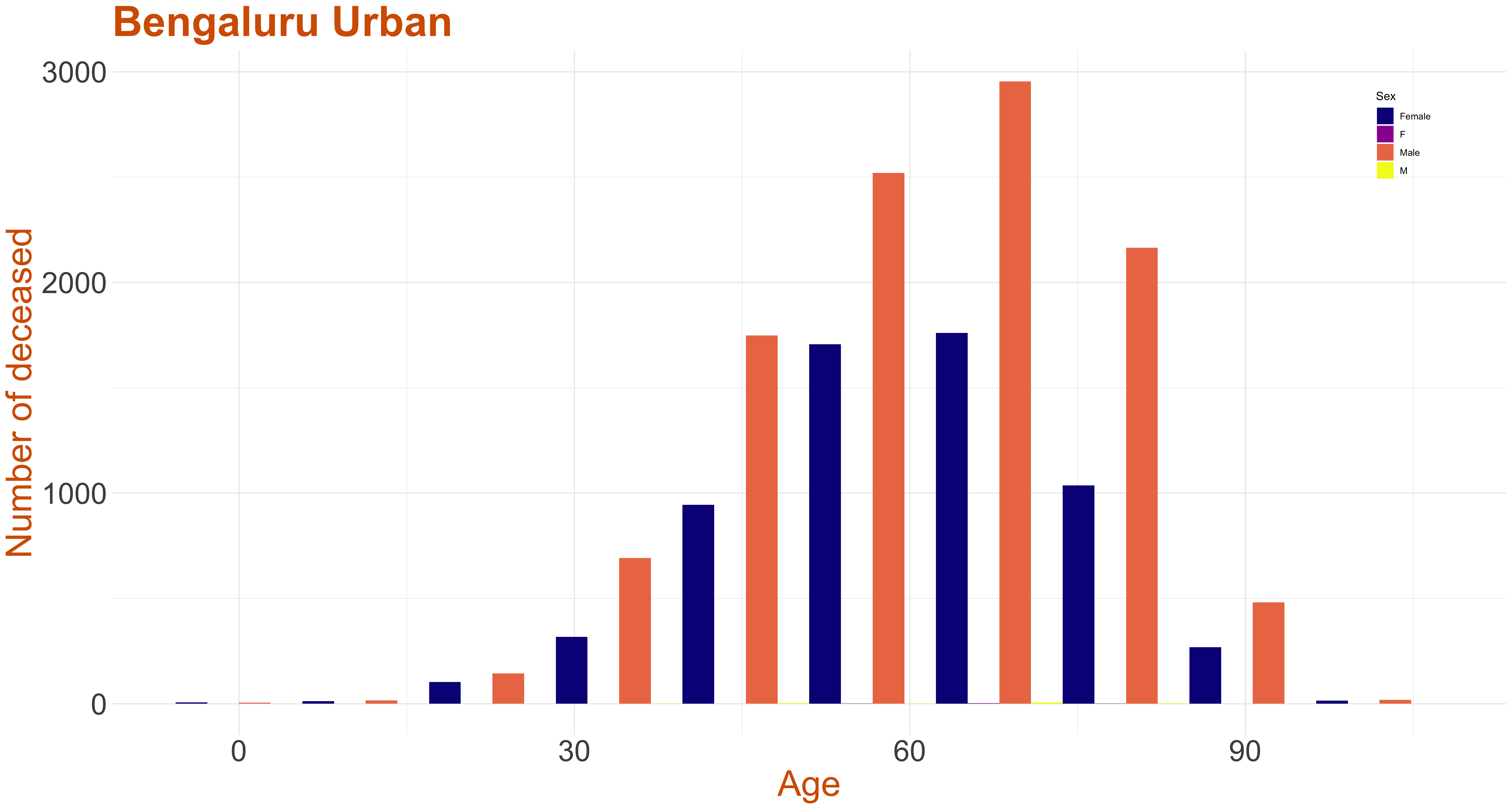
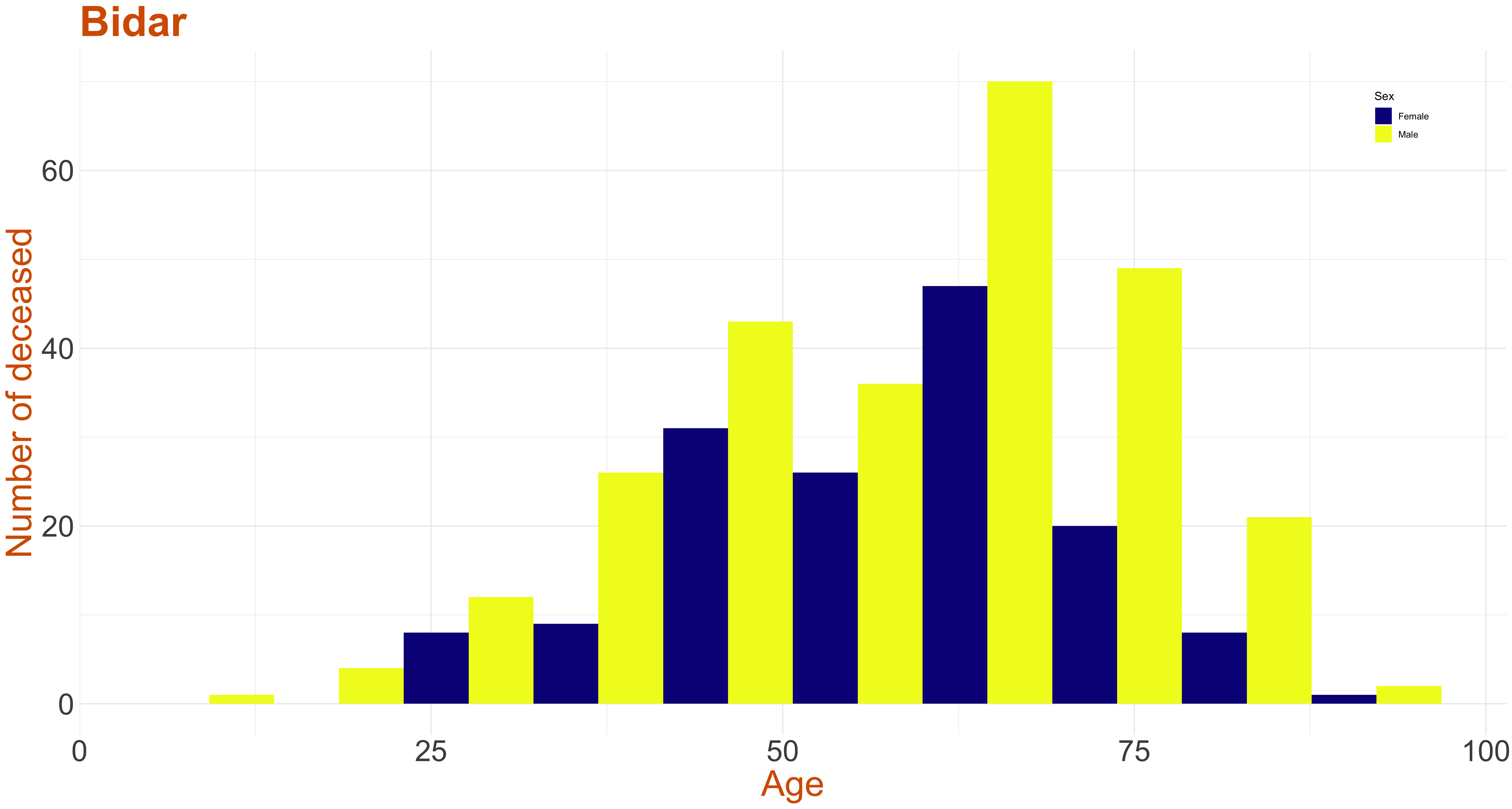
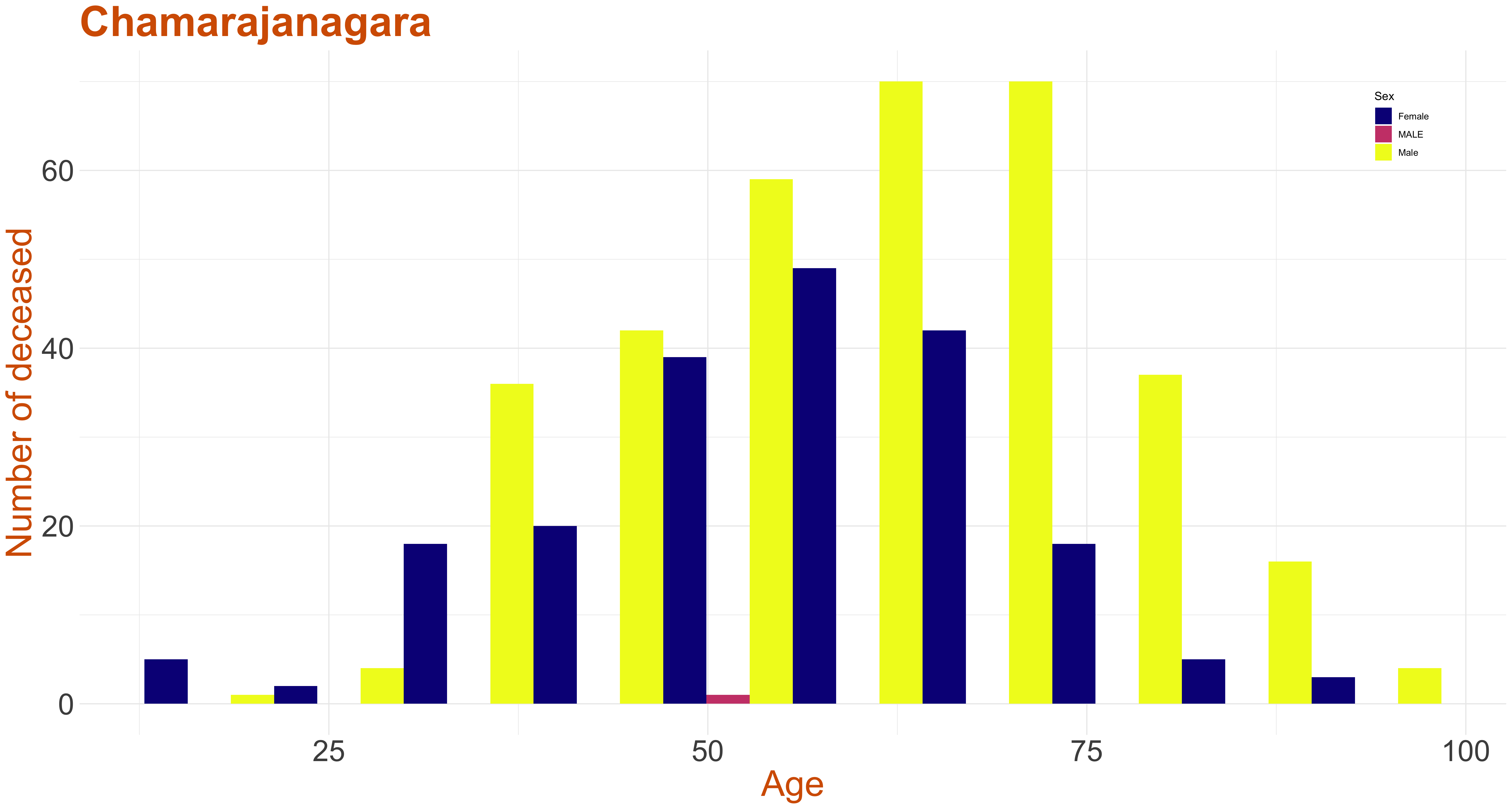
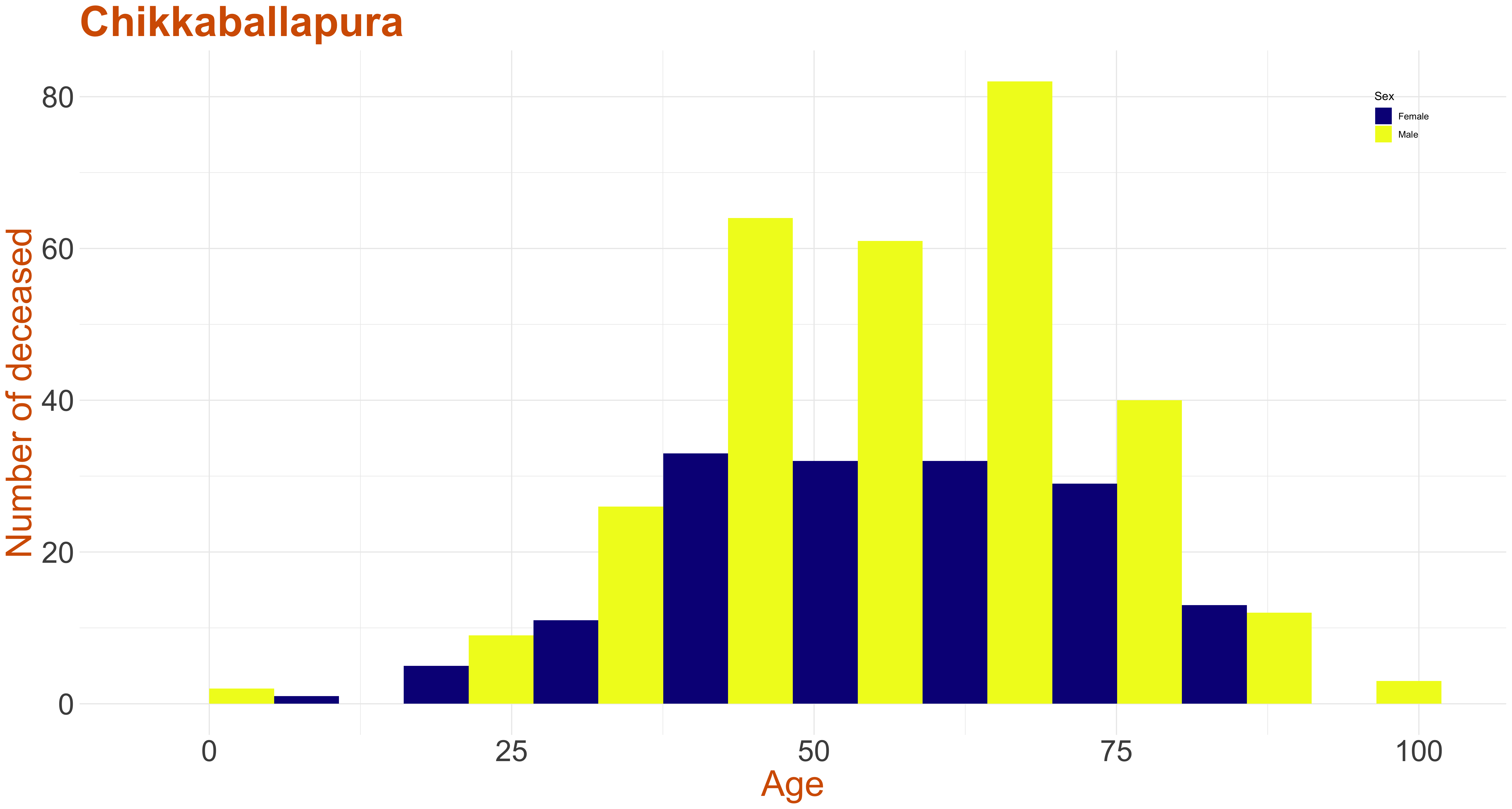
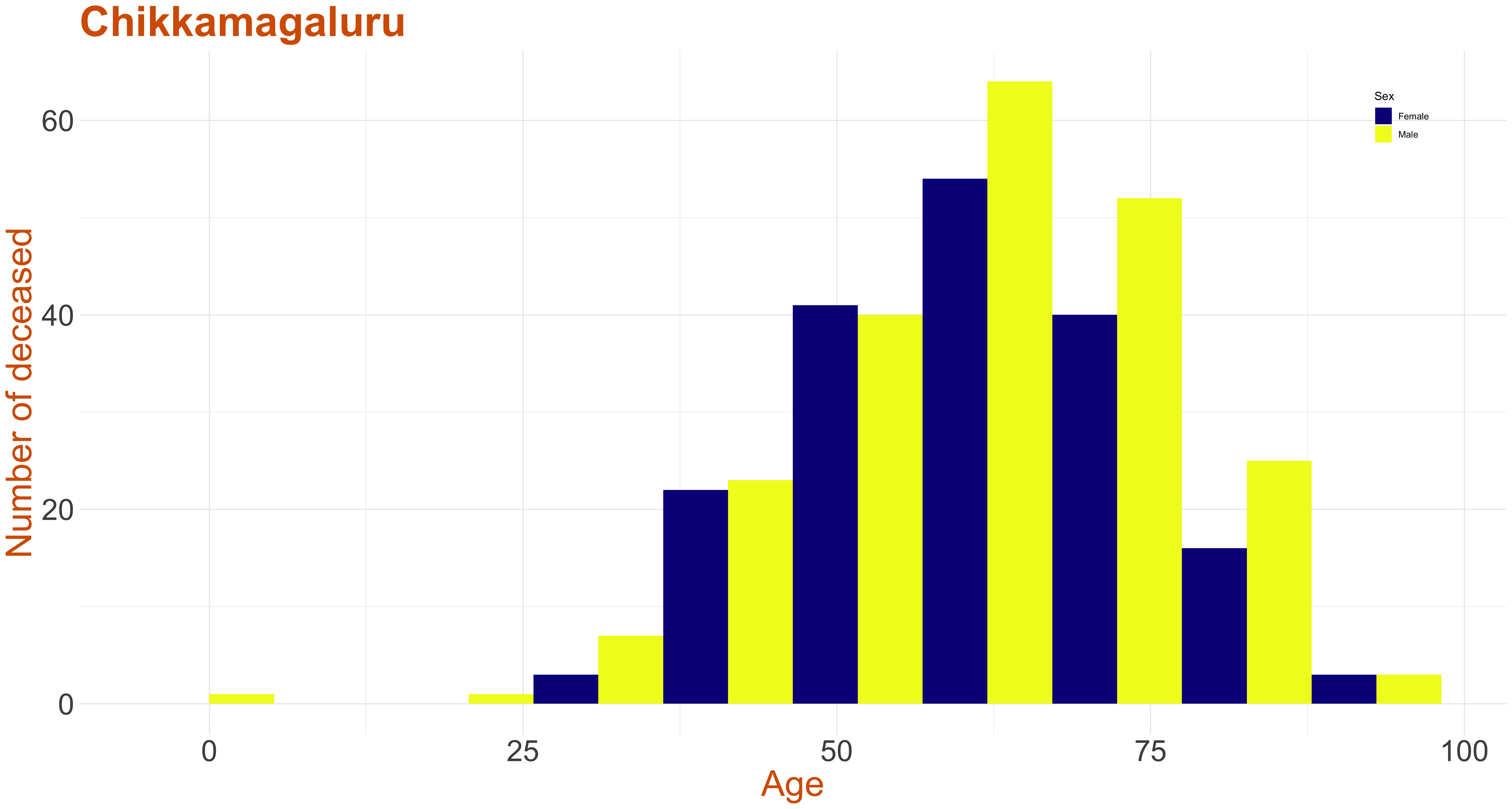
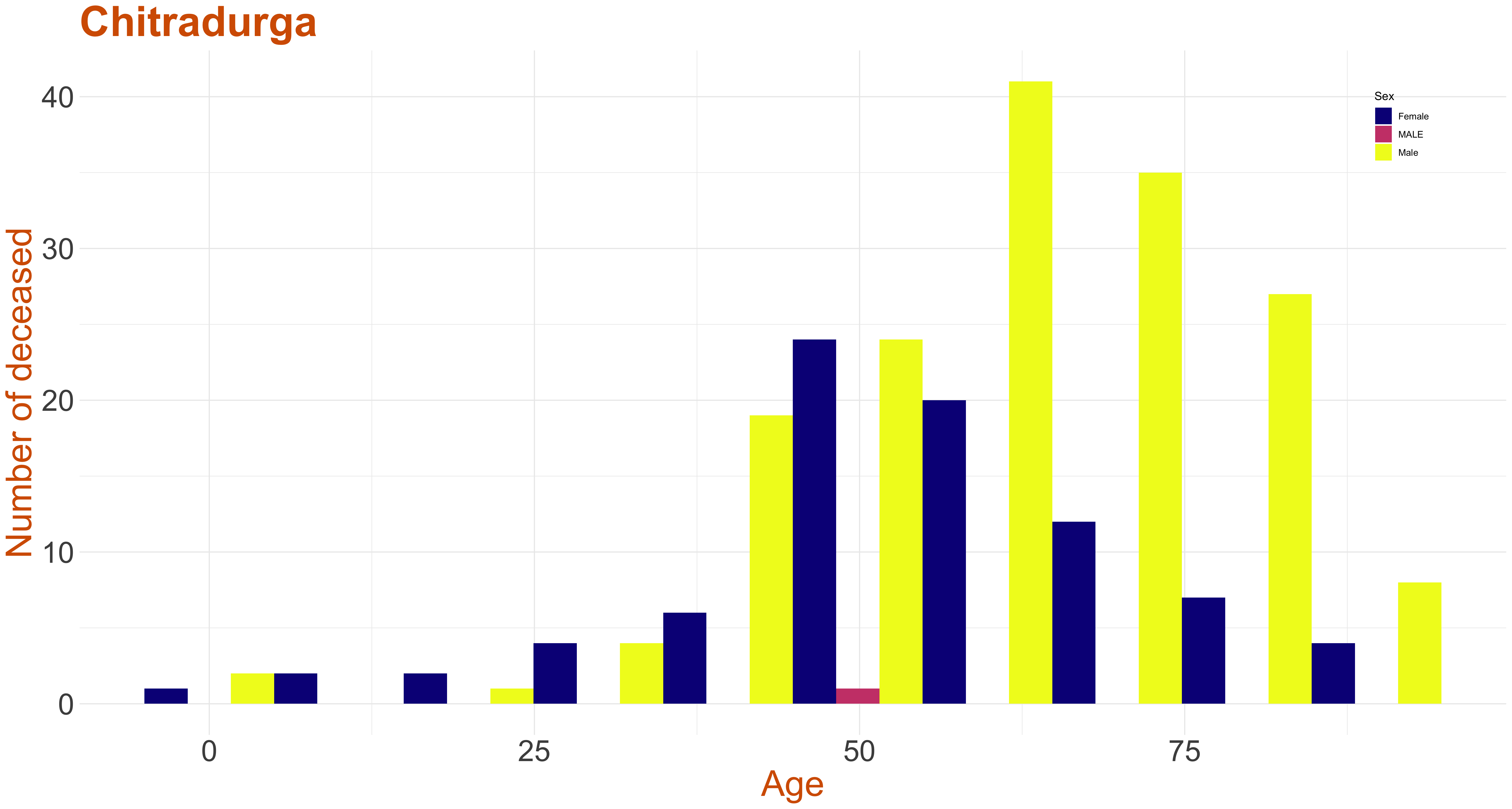
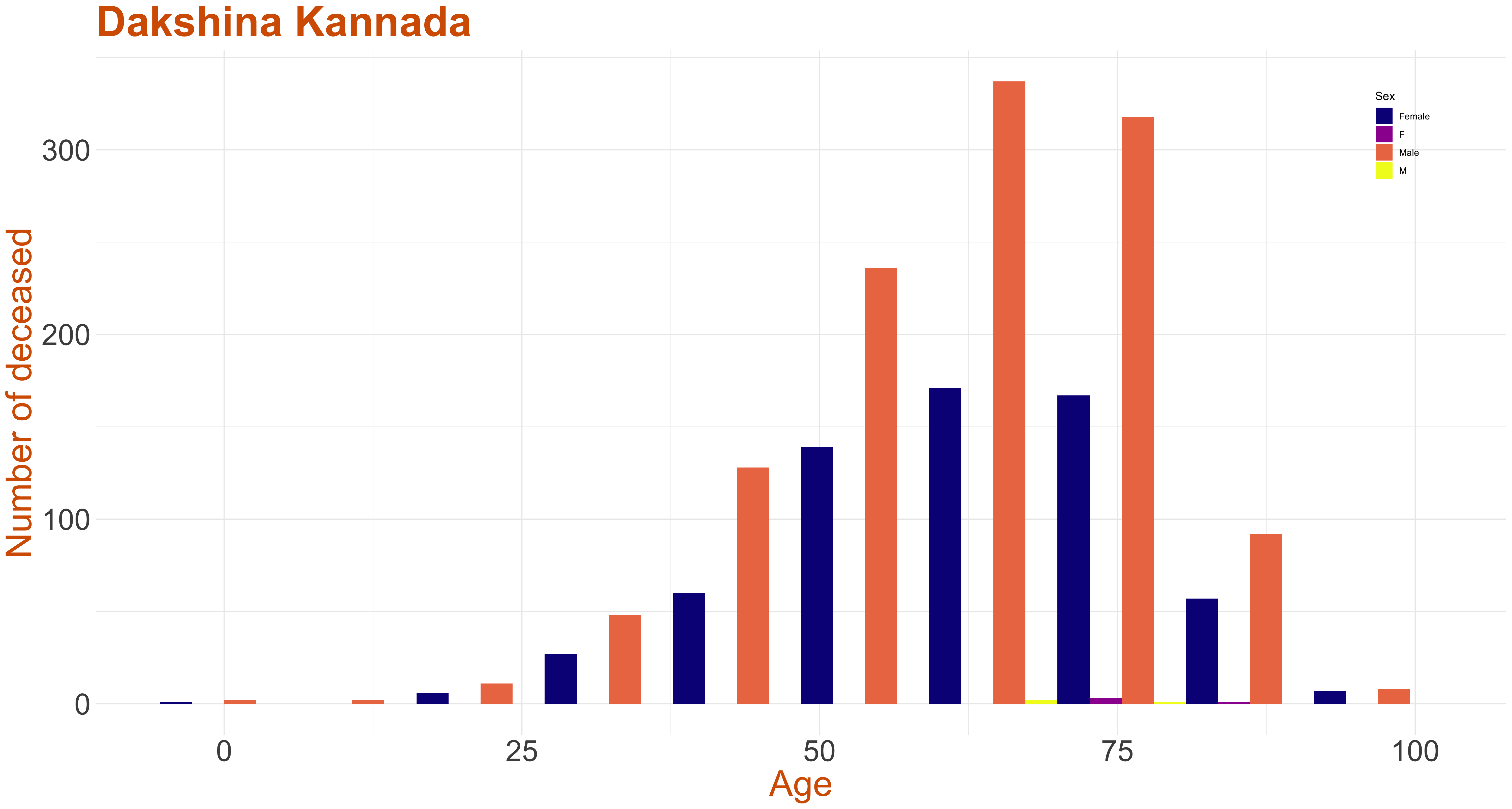
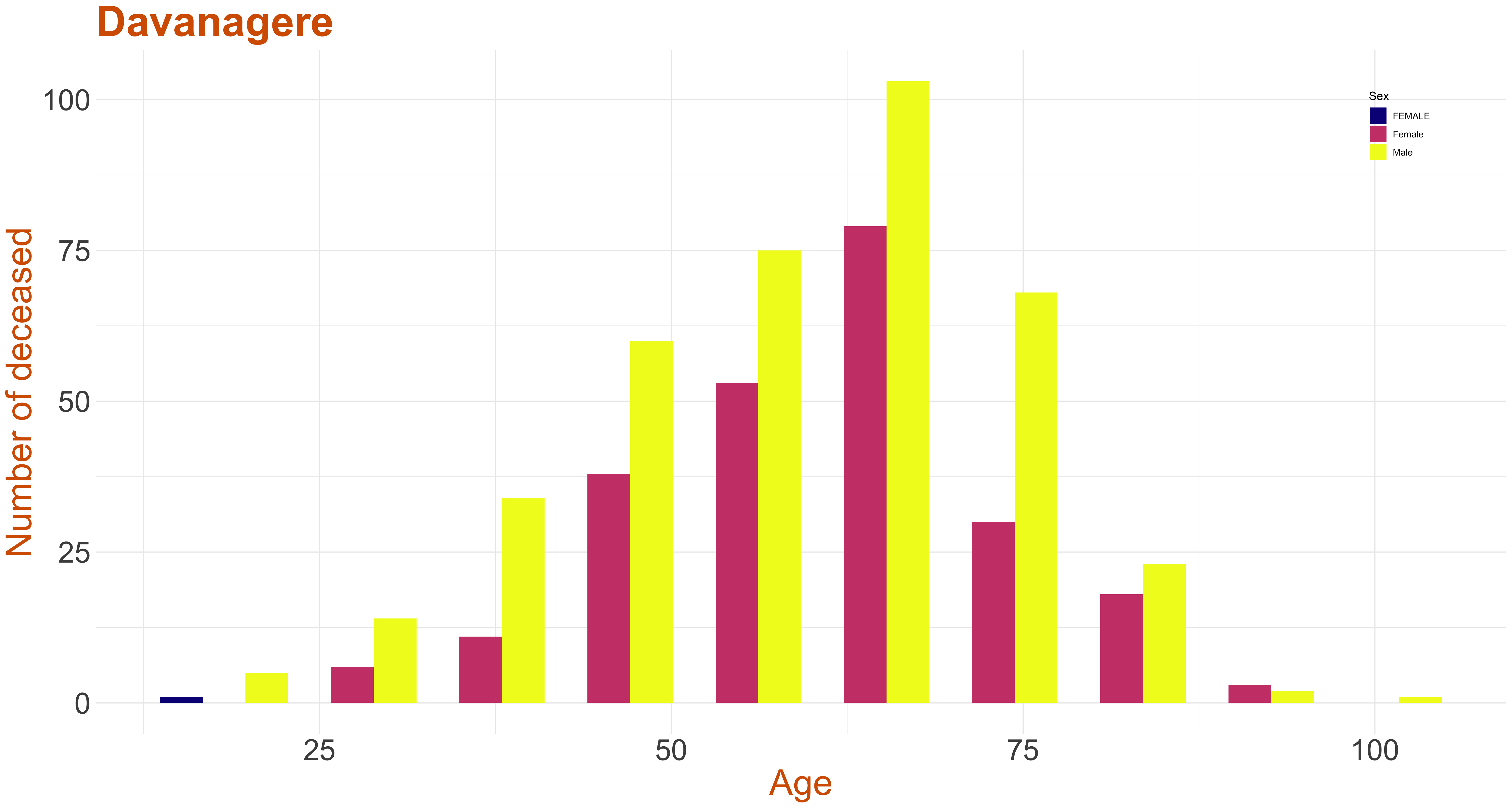
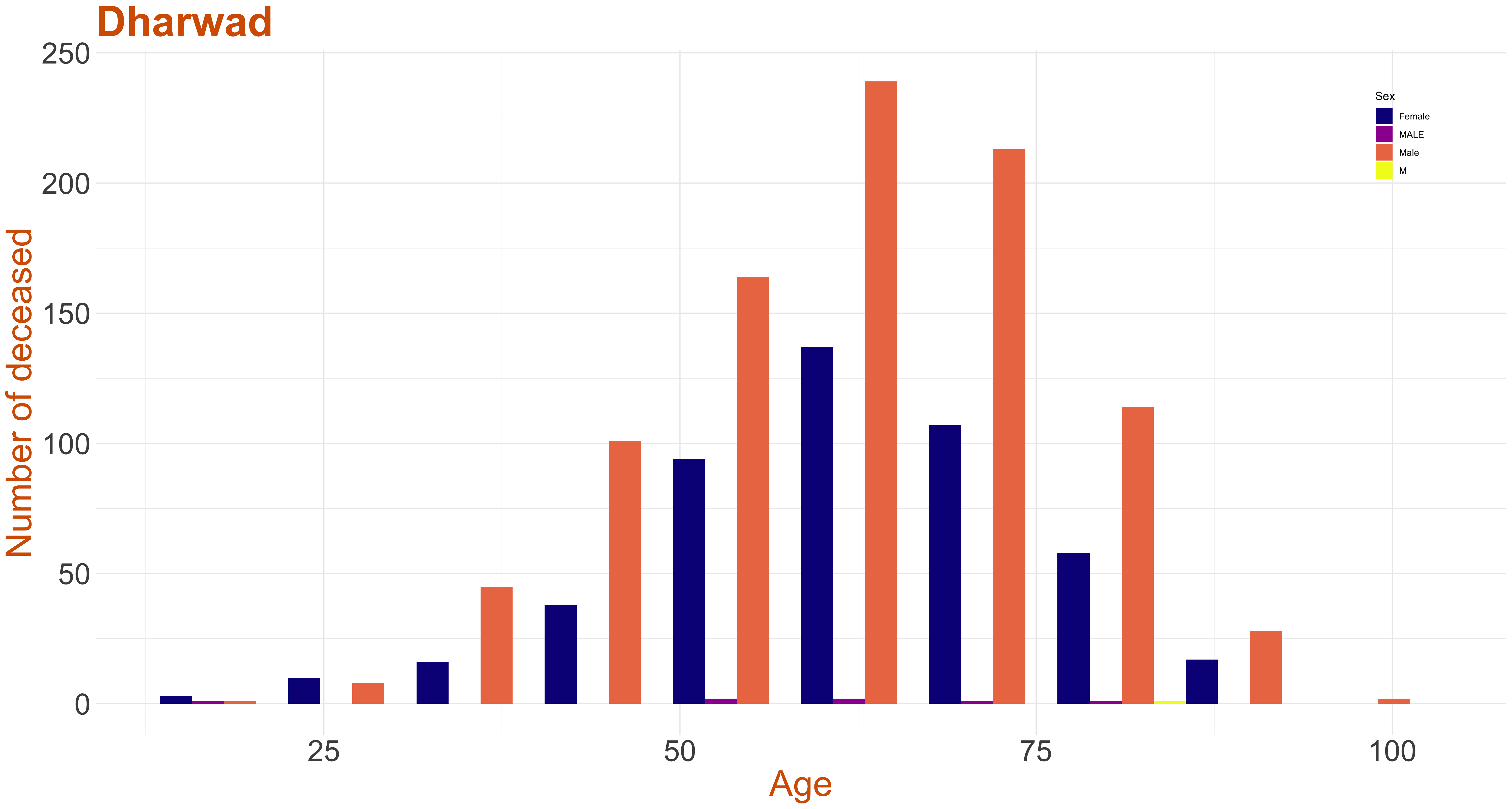
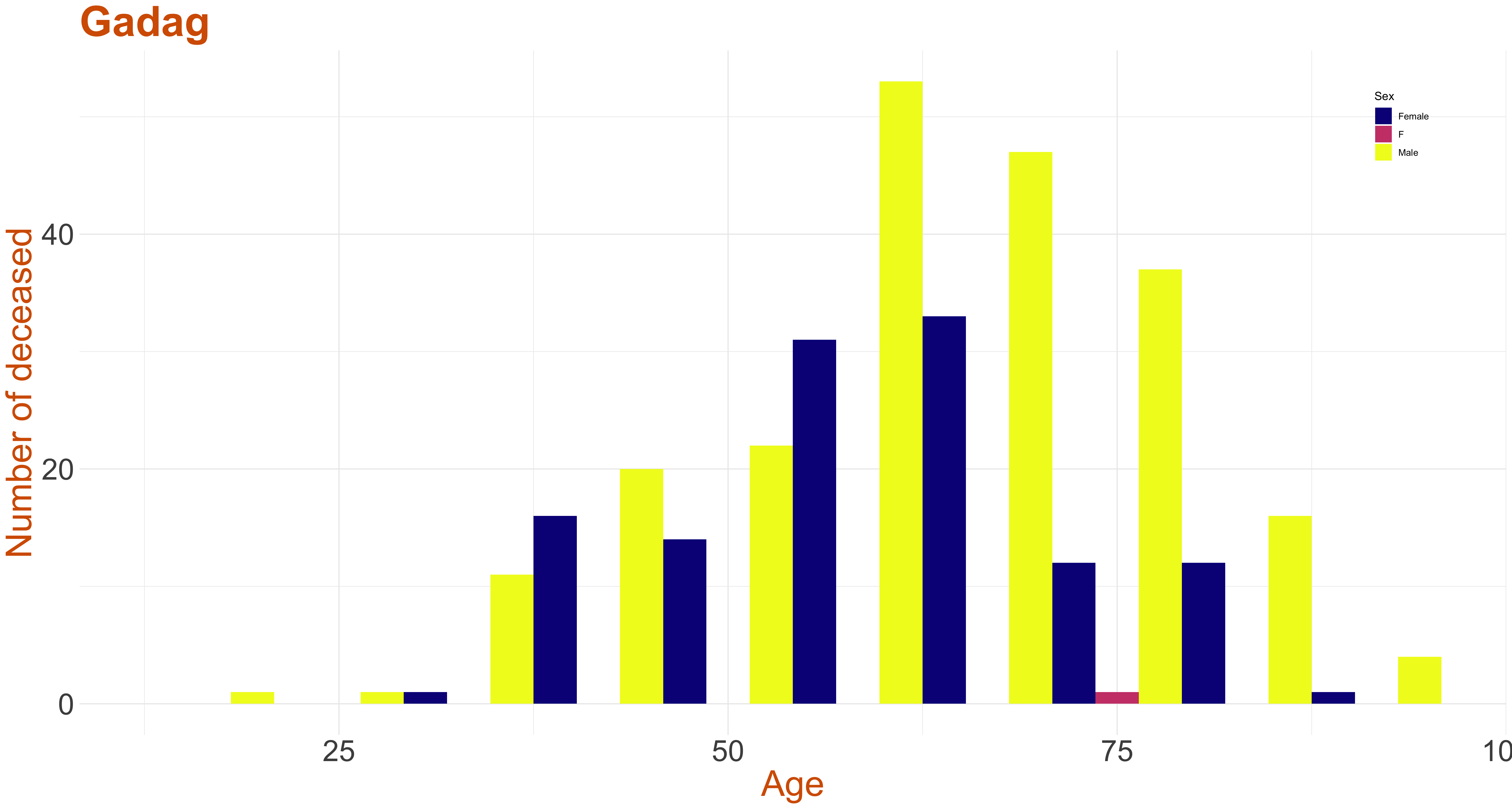
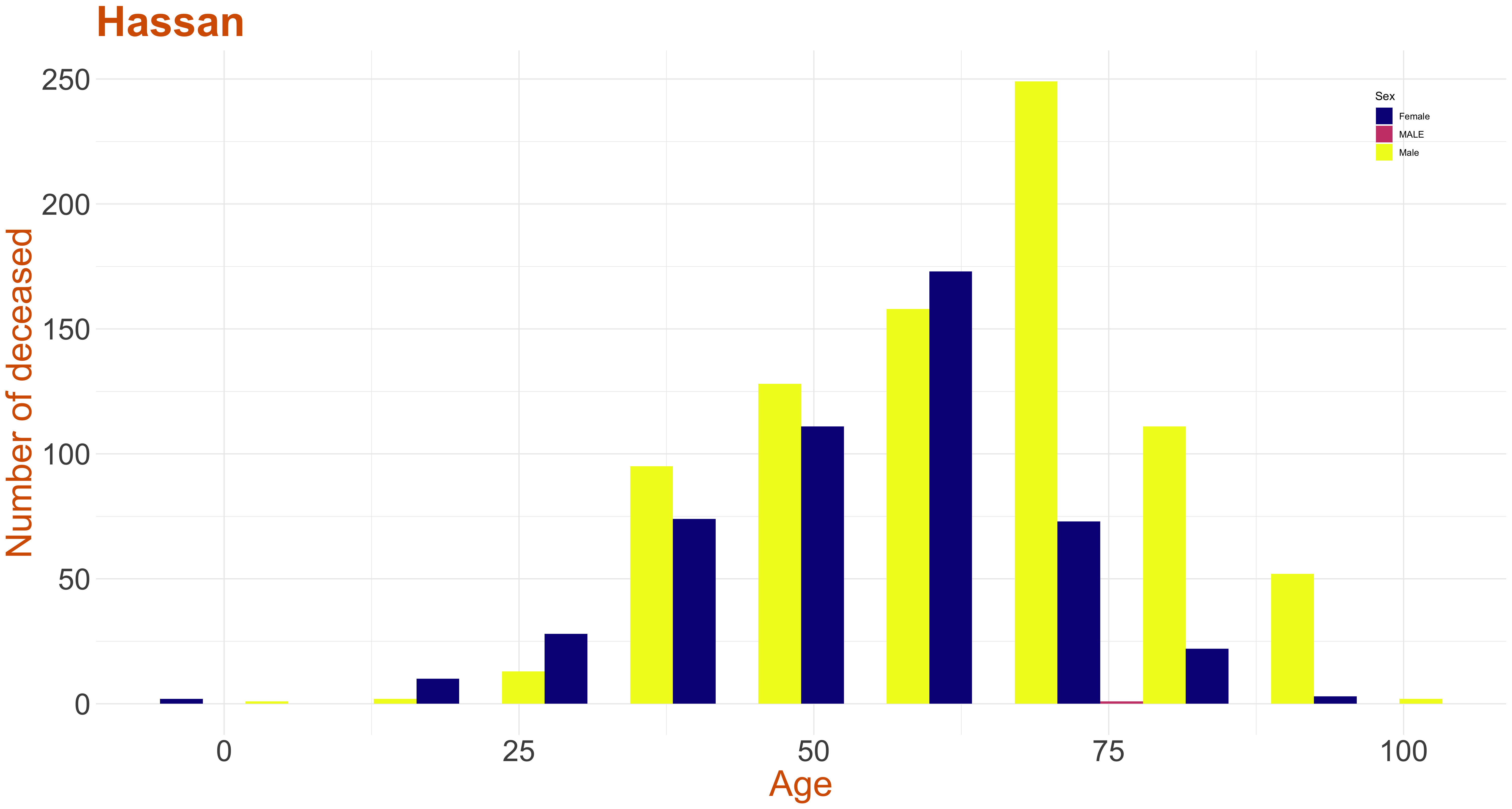
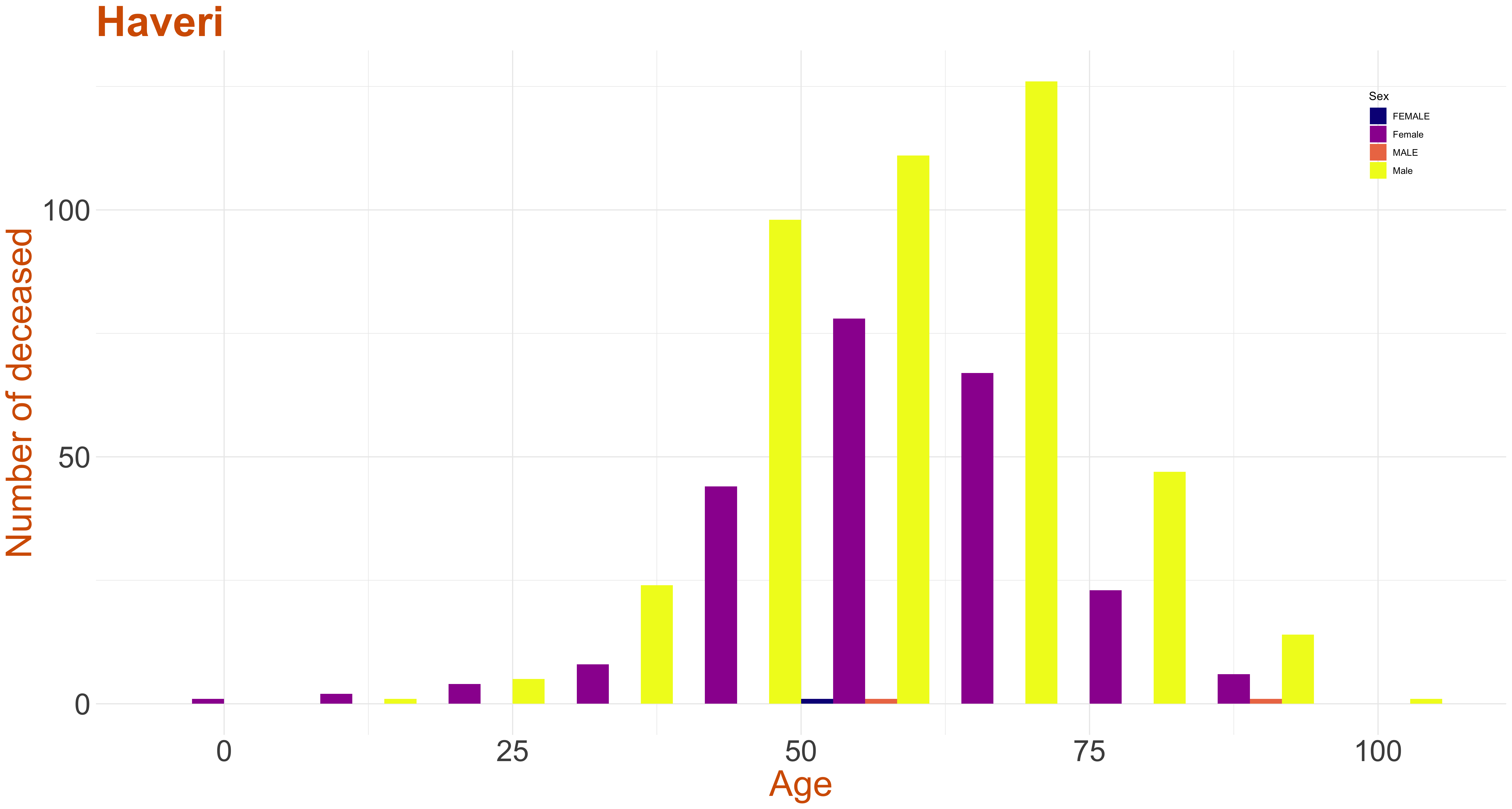
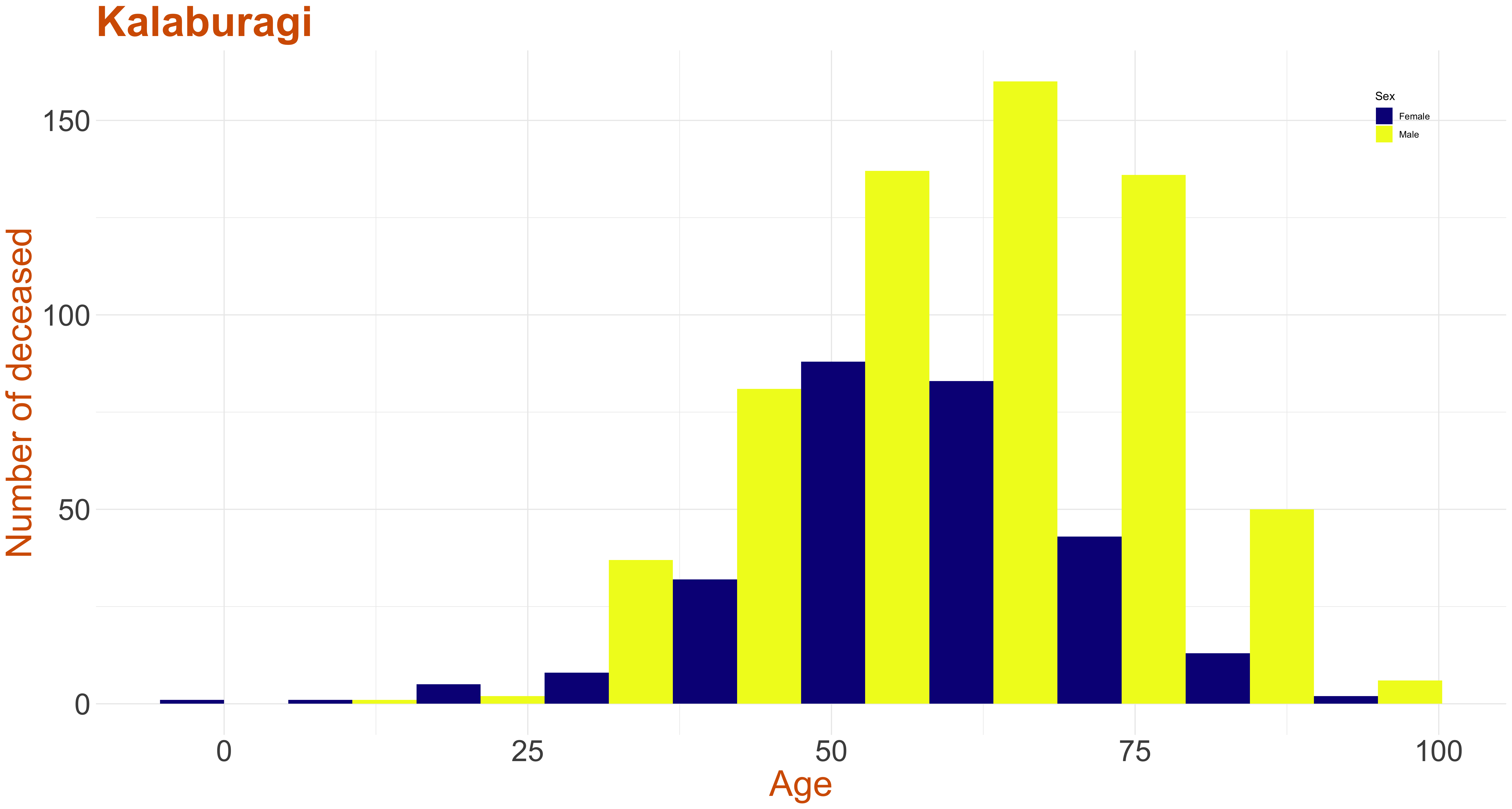
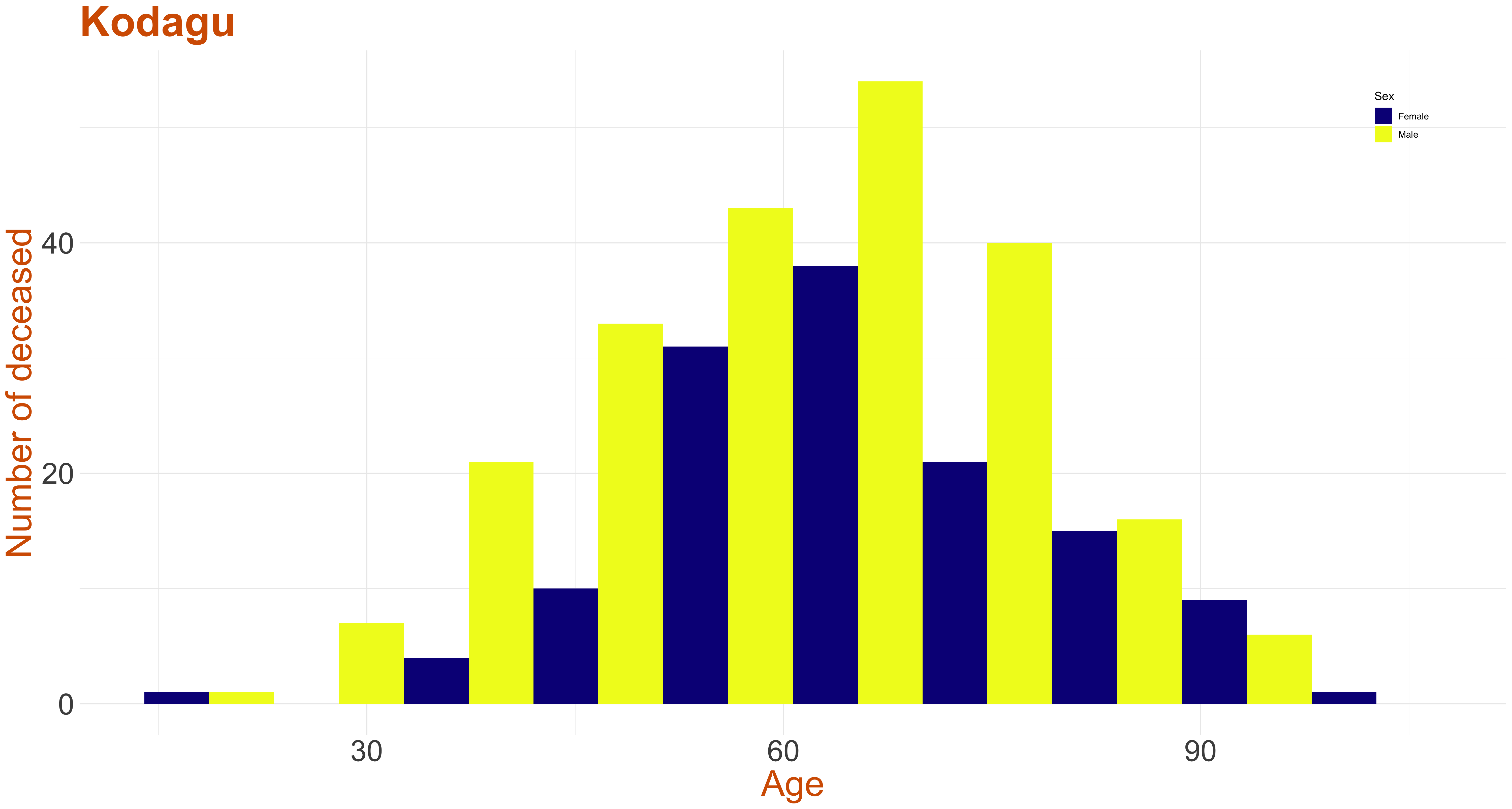
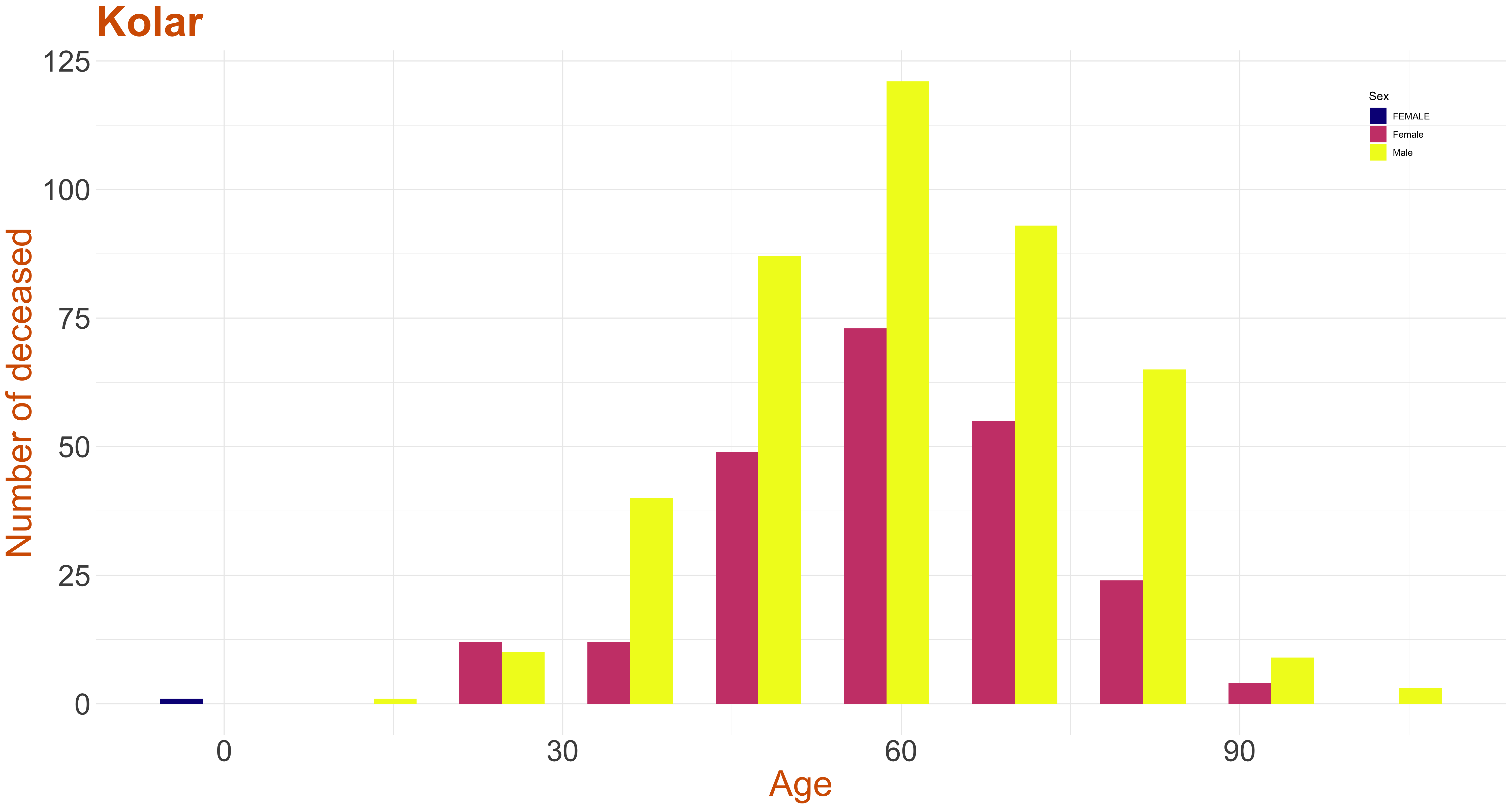
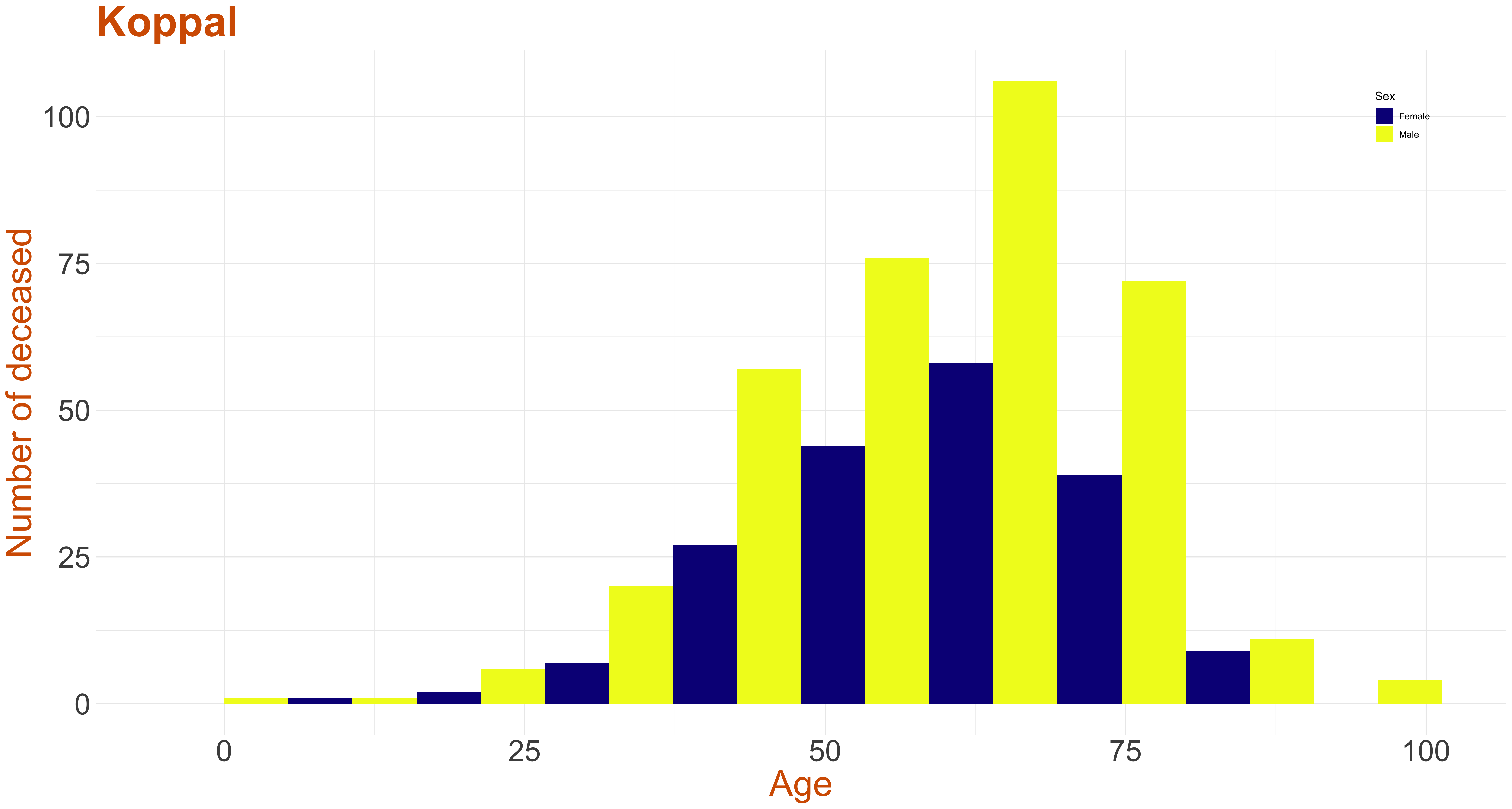
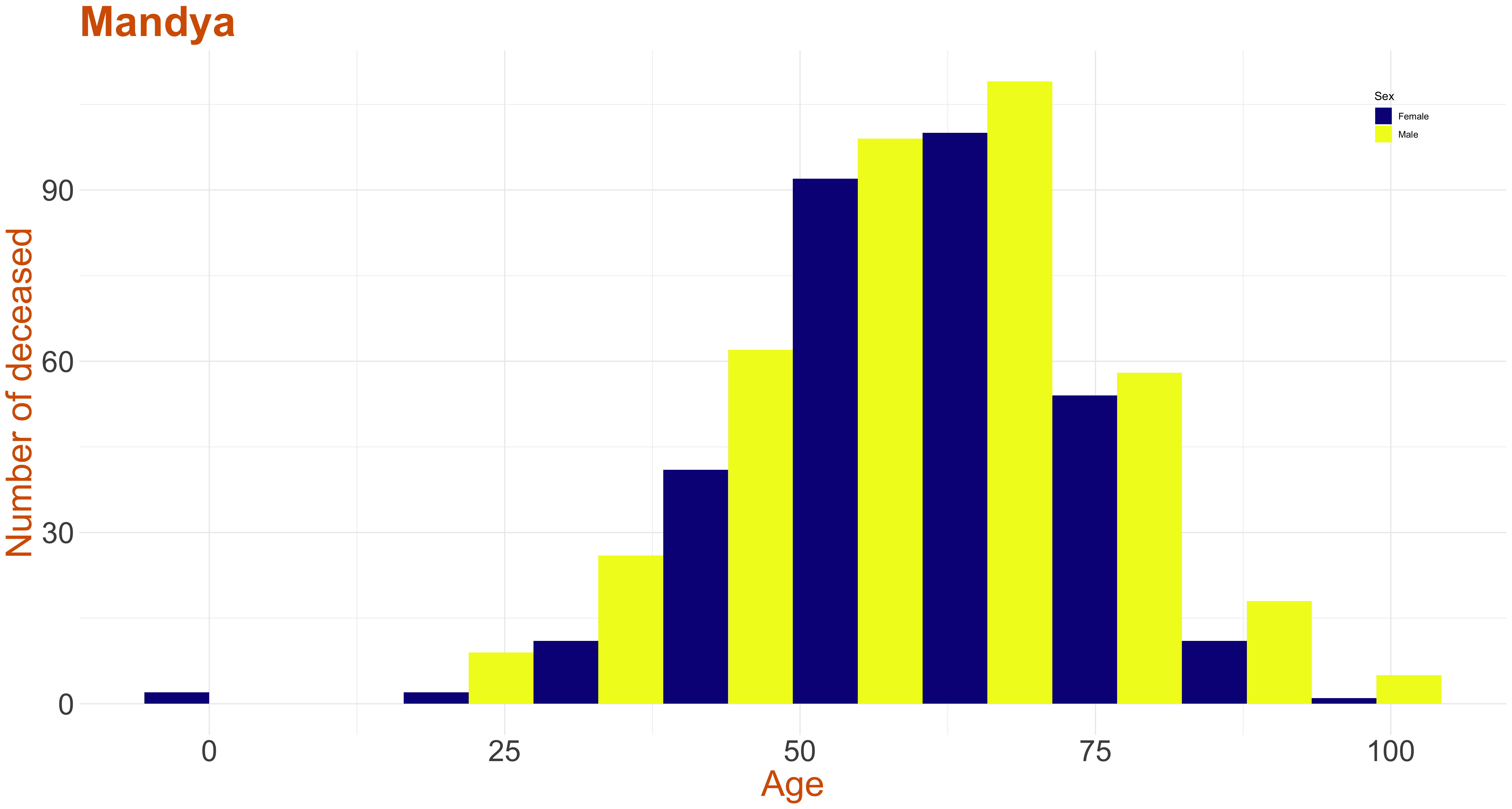
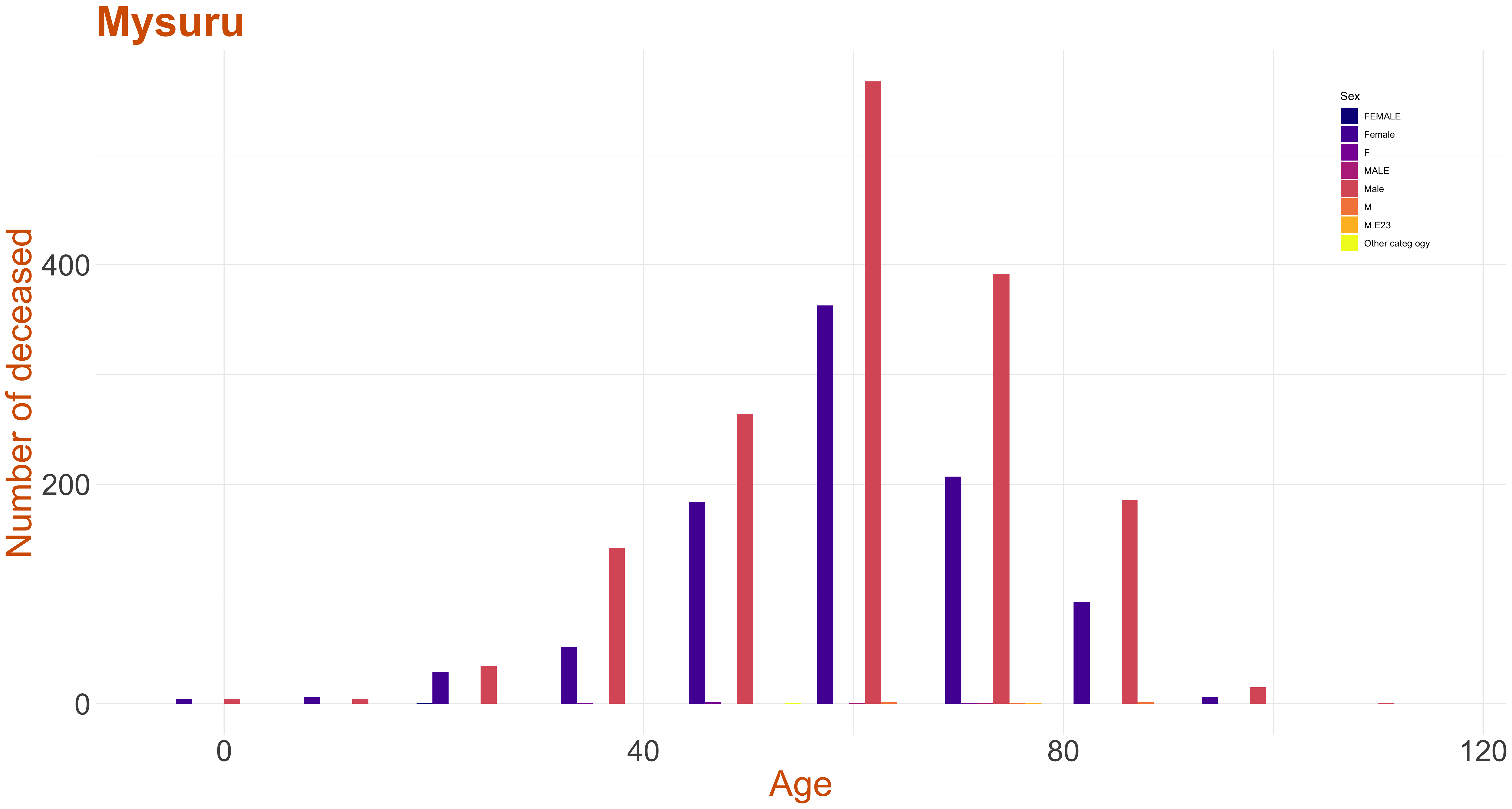
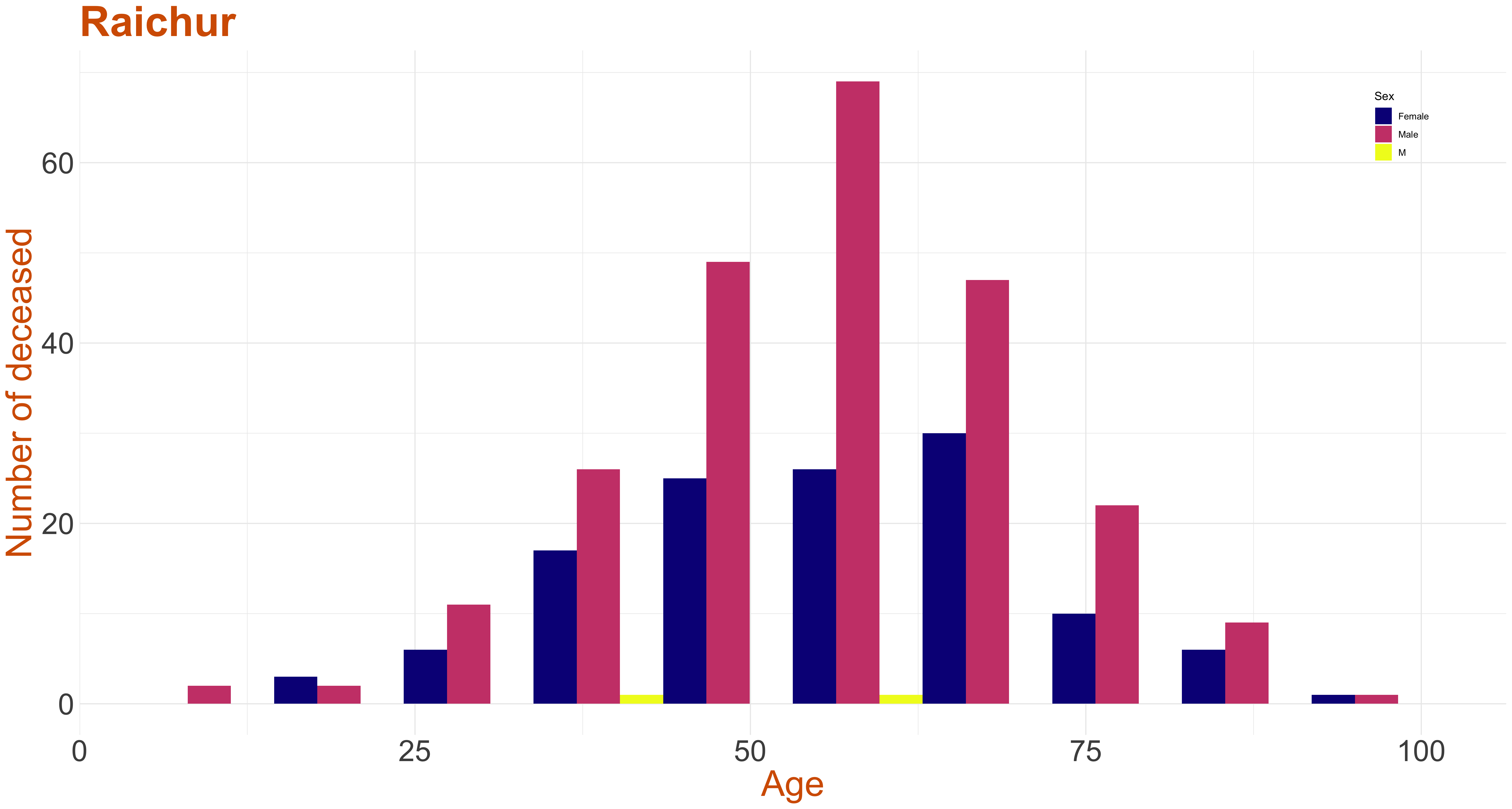
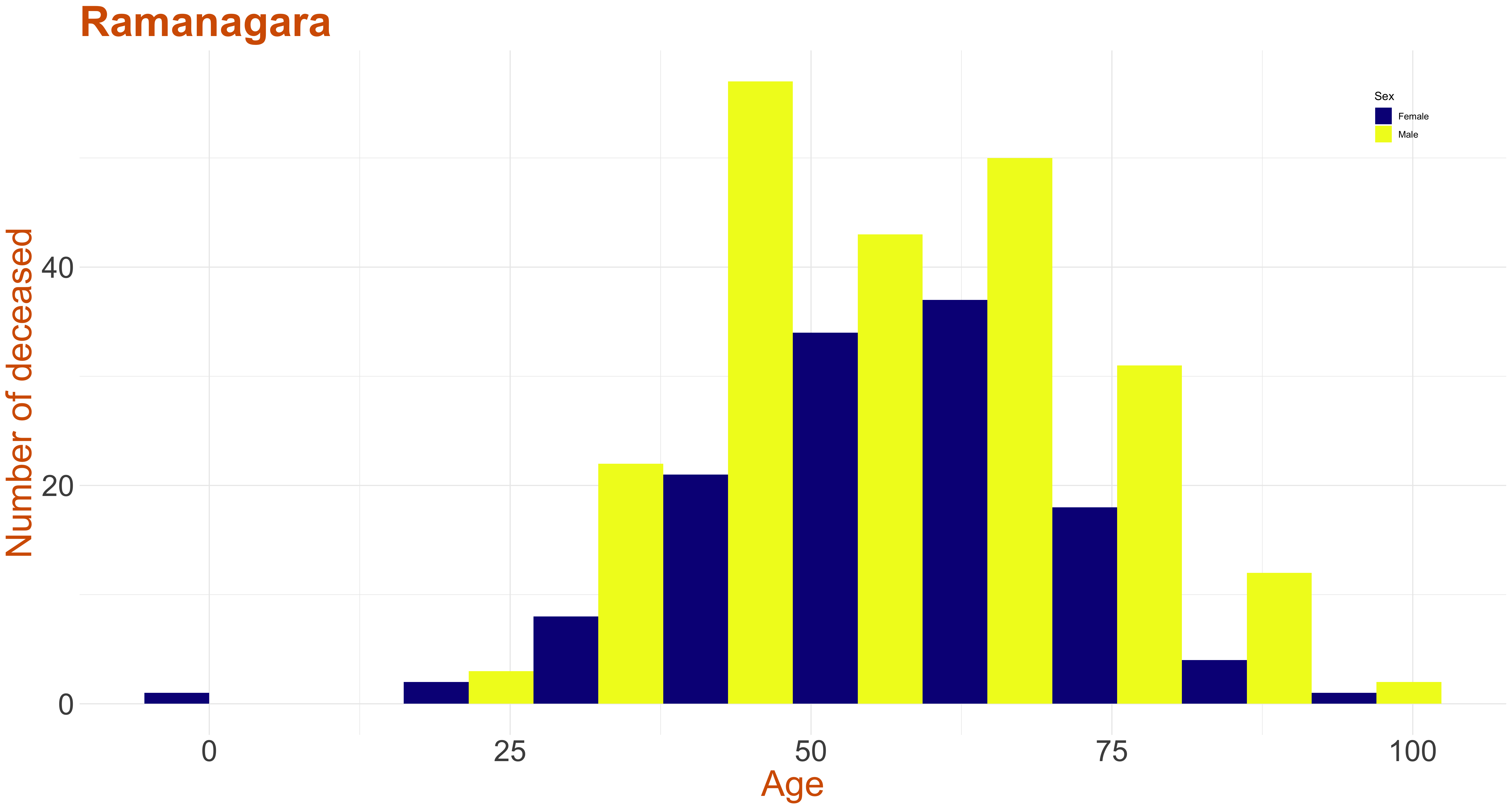
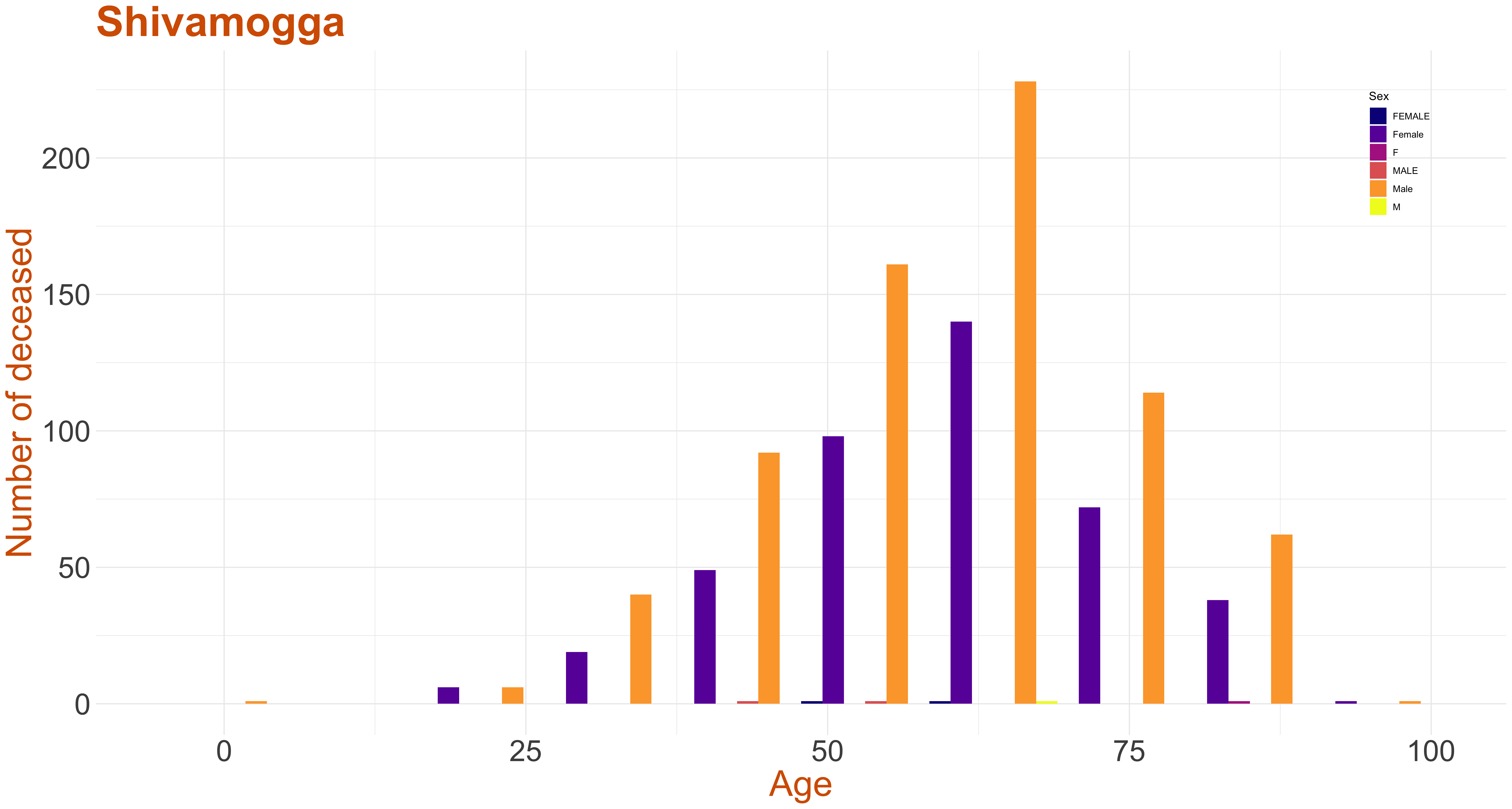
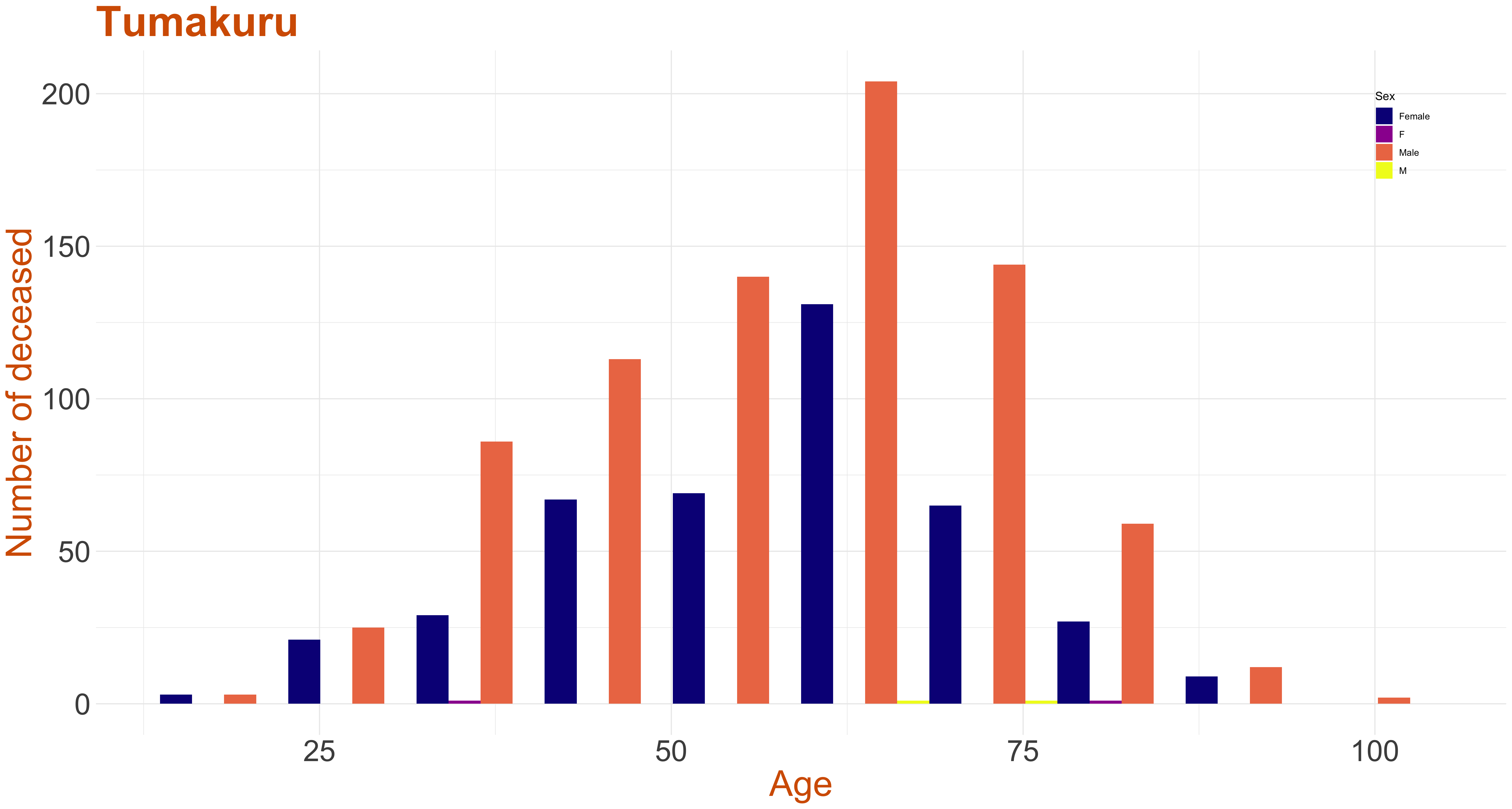
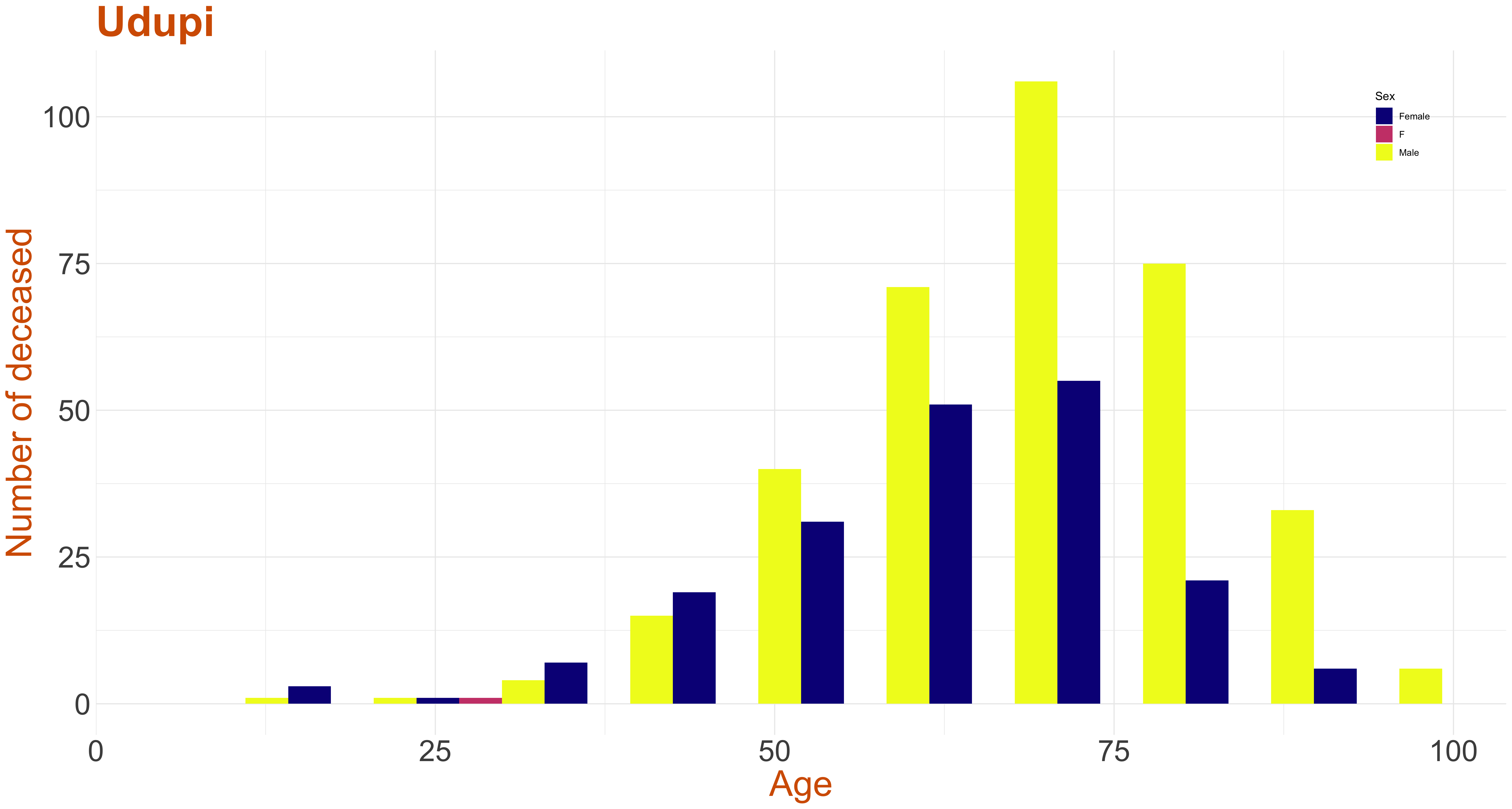
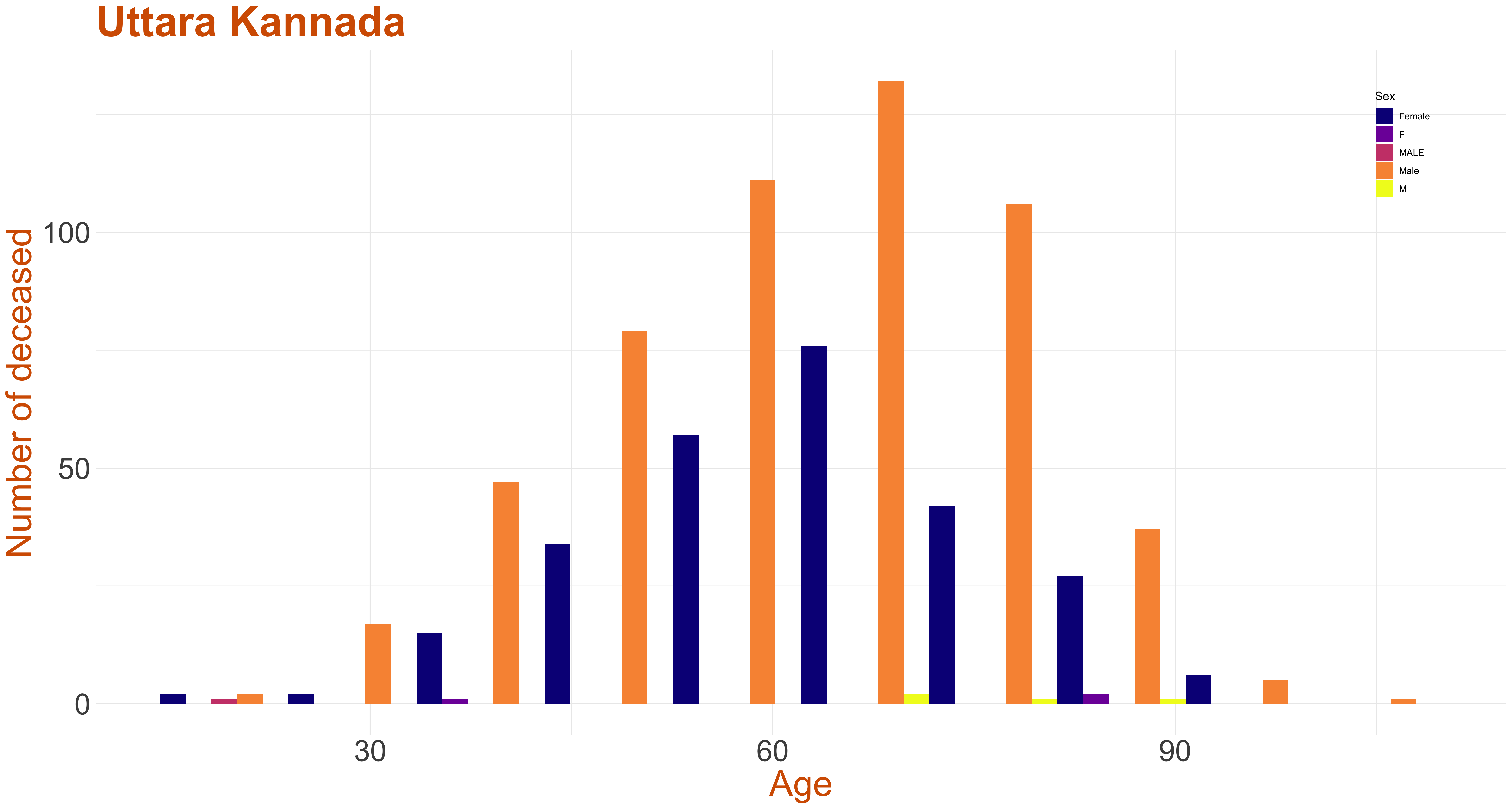
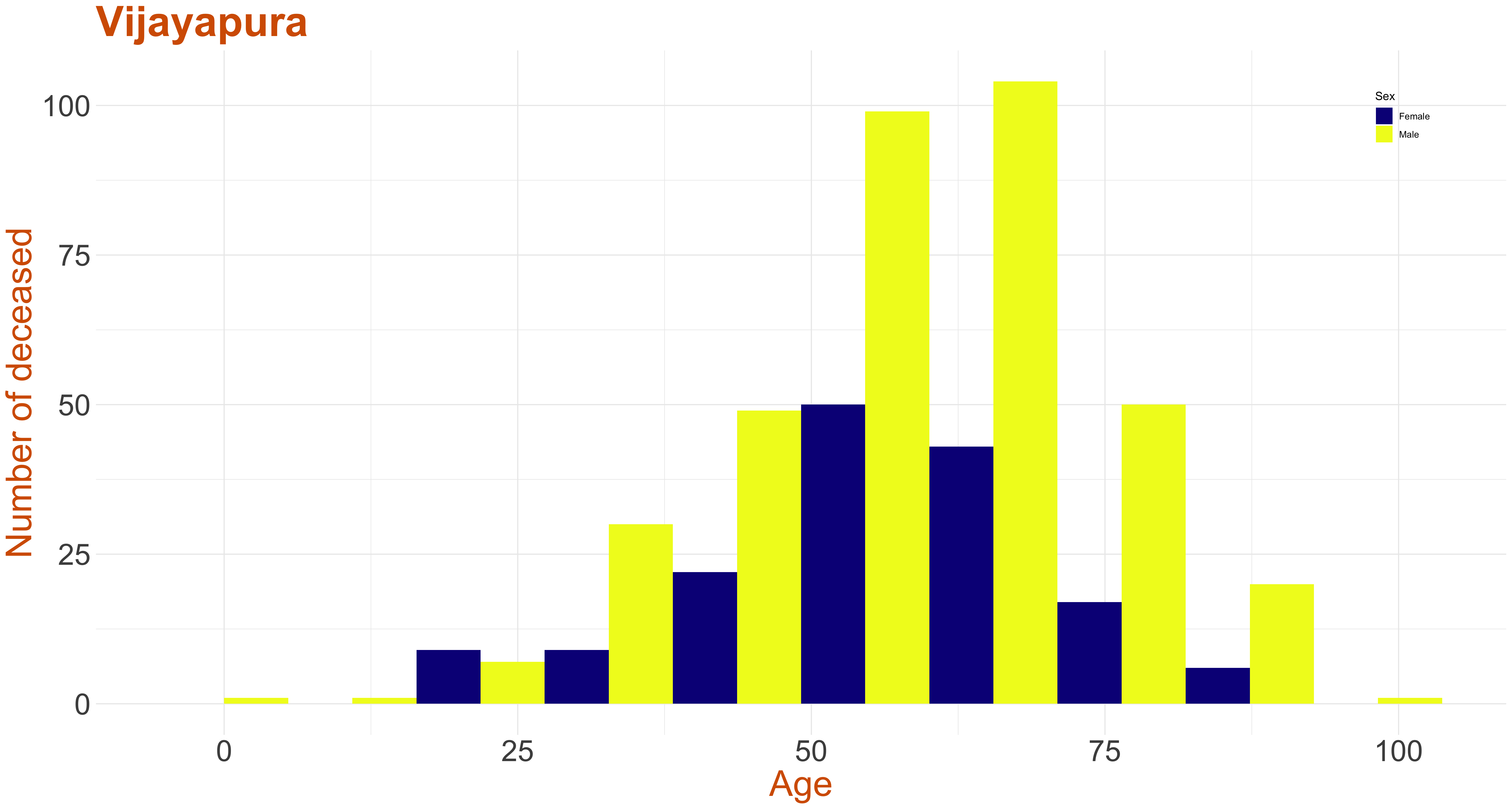
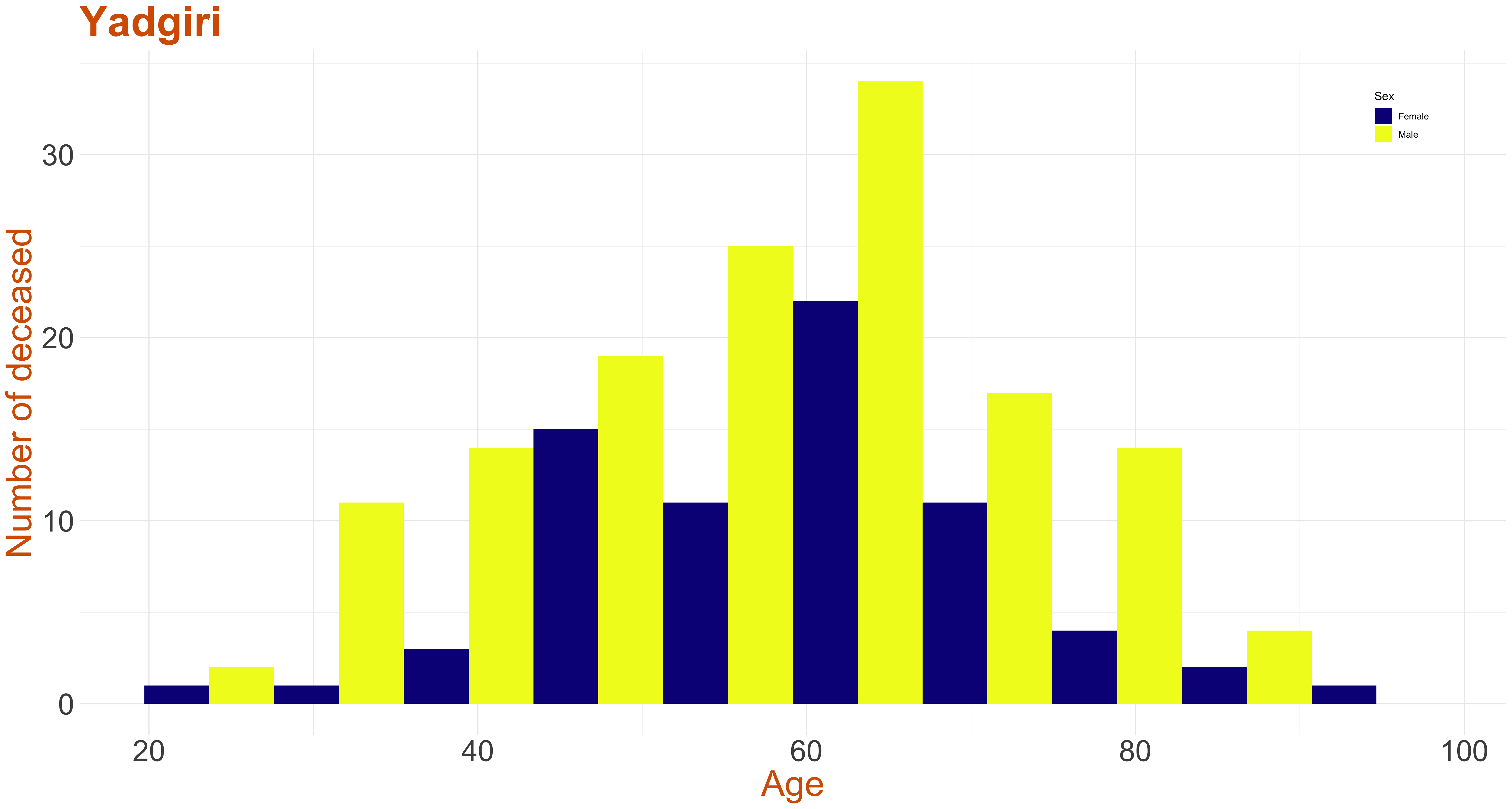
Stacked Age-Gender Distribution of Deceased across Districts
All these graphs provide the stacked age distribution of the deceased COVID-19 patients in every district. The yellow bar is for male while the blue bar is for female. Since the number of transgender, neutral gender, unknown ages, district and gender were small, they have not been plotted. The data has a district called as others, whose count was also less and hence not plotted.
For all the graphs on this page, if you click on the image then it will display an interactive graph, where as you hover your mouse pointer over the graph annotations with details will be displayed.