Karnataka State Government's Ministry of Health and Family Welfare has a dedicated COVID-19 Dashboard on its website and also has been providing detailed Media Bulletins on a daily basis since March 9th, 2020. In this page, we track the data provided in bulletins to give a more comprehensive view of the COVID-19 infection in the state of Karnataka. In particular we track:
We would like to believe the behaviour of the virus is similar in this state compared to other parts of India and the information presented here can be used to infer similar features in other states.
- Trace History
From the very detailed information in the bulletins, we created graphical representation of Karnataka Trace History via a tree diagram.
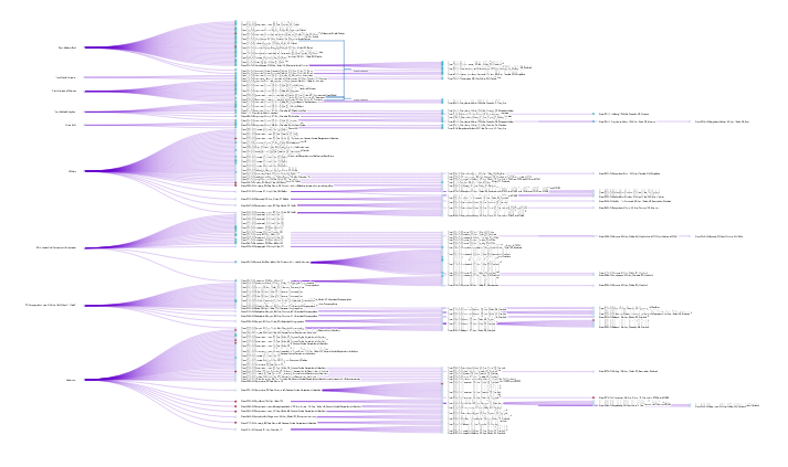
This graph was frozen on 26th June as the Media Bulletins after that did not contain contact information.
The bulletins, apart from issuing regular guidelines for the public, contain detailed information from screening of air/sea passengers, people under observation, number of positive tests on each day and details of each infected patient [including: age, sex, place and source, of infection, relationships to other patients, etc.] The briefings are so thorough that among all the cases, there is only one patient whose location is unknown.
We first divided up the cases into clusters from their place of origin, for example "From Europe" or "Pharmaceutical Company in Nanjangud, Mysore". Then in each cluster we begin with patients who got it independently from the place of origin and then recursively plot the patients whom they passed it onto. The resulting graph is tree like and a snap shot is given below. In the interactive graph one can view each cluster separately and zoom in to see the precise trace history for each patient in Karnataka. One can also observe how large each cluster is and how the virus spreads locally from an infected patient. The ages, residence, and place of treatment of the patients have been mentioned as well.
- Cluster Time-line
We begin with an animation showing the growth of the clusters in the Karnataka Trace History chart over time. Different clusters have been represented by differently colored lines.
Clicking on the play button will start the animation.
This animation was frozen on 26th June as the Media Bulletins after that did not contain contact information.
The animation starts from 17th March. Hence, on the x-axis and the slider at the bottom, 1 corresponds to 17th March, 2 to 18th March and so on. The y-axis has the cumulative count of the number of cases. For information on specific clusters, one can click the lines of the clusters not required, on the legend on the right. In order to look at the condition on a specific day, one may click the label of the slider at the bottom for that particular day.
It can be observed that some clusters have flat lines for certain periods of time, which means that there is no growth in the number of cases in this cluster and the infection from these sources has been contained for that period of time.
- Cluster Information
In the Karnataka Trace History graph, the first generation nodes [at depth one] in the graph of each cluster are the patients who got the infection directly from the place of origin of the infection. These patients we shall call as 'parents' of the cluster. The ‘children’ are the people who contracted the disease from the people labelled as ‘parents’, that is, they are at a depth of two in the trace history chart. Similarly, ‘grandchildren’ and ‘great grandchildren’ have depth three and four respectively. In the above we have plotted the histogram of parents, children, grandchildren and great grandchildren in each cluster. We begin with a description of the parent-to child relationships within each cluster from the trace history.
For the graph below, if you click on the image then it will display an interactive graph, where as you hover your mouse pointer over the graph annotations with details will be displayed.

This graph was frozen on 26th June as the Media Bulletins after that did not contain contact information.
Due to relaxations in travel restrictions after May 3rd,2020, there have been number of new infections due to migration. Migrations from each state have been designated as a separate cluster. The cluster: From Maharashtra is quite large and we have again divided it into sub-clusters according to the resident city of the infected.

This graph was frozen on 26th June as the Media Bulletins after that did not contain contact information.
The graph below shows the number of deceased, recovered and infected people within each cluster.


For the graph above, if you click on the image then it will display an interactive graph, where as you hover your mouse pointer over the graph annotations with details will be displayed.
Both these graphs were frozen on 26th June as the Media Bulletins after that did not contain contact information.
One can observe that in some clusters all the cases have recovered.
SARI in the SARI cluster stands for Severe Acute Respiratory
Infection. The parents in this cluster had already developed symptoms
of Severe respiratory infection before they were tested for COVID-19.
This may explain why the SARI cluster has large number of deaths.
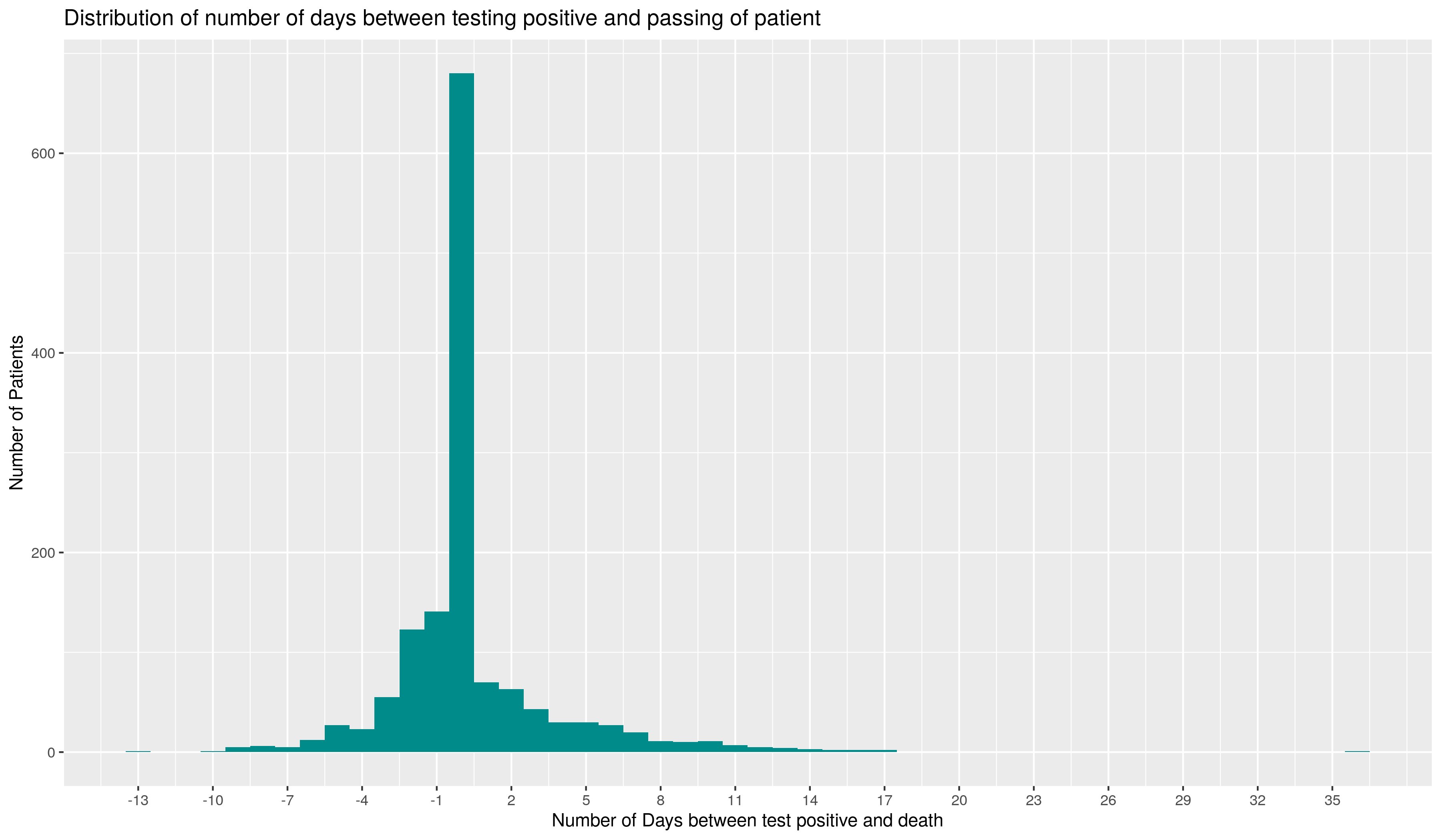
- Time to Recover
To better approximate the hospital beds requirement, and get an idea of how long an infected person remains infectious, we plot the time taken for recovery for the patients in Karnataka alongside the time taken for the patient to succumb to the disease.
For the graph below, if you click on the image then it will display an interactive graph, where as you hover your mouse pointer over the graph annotations with details will be displayed.
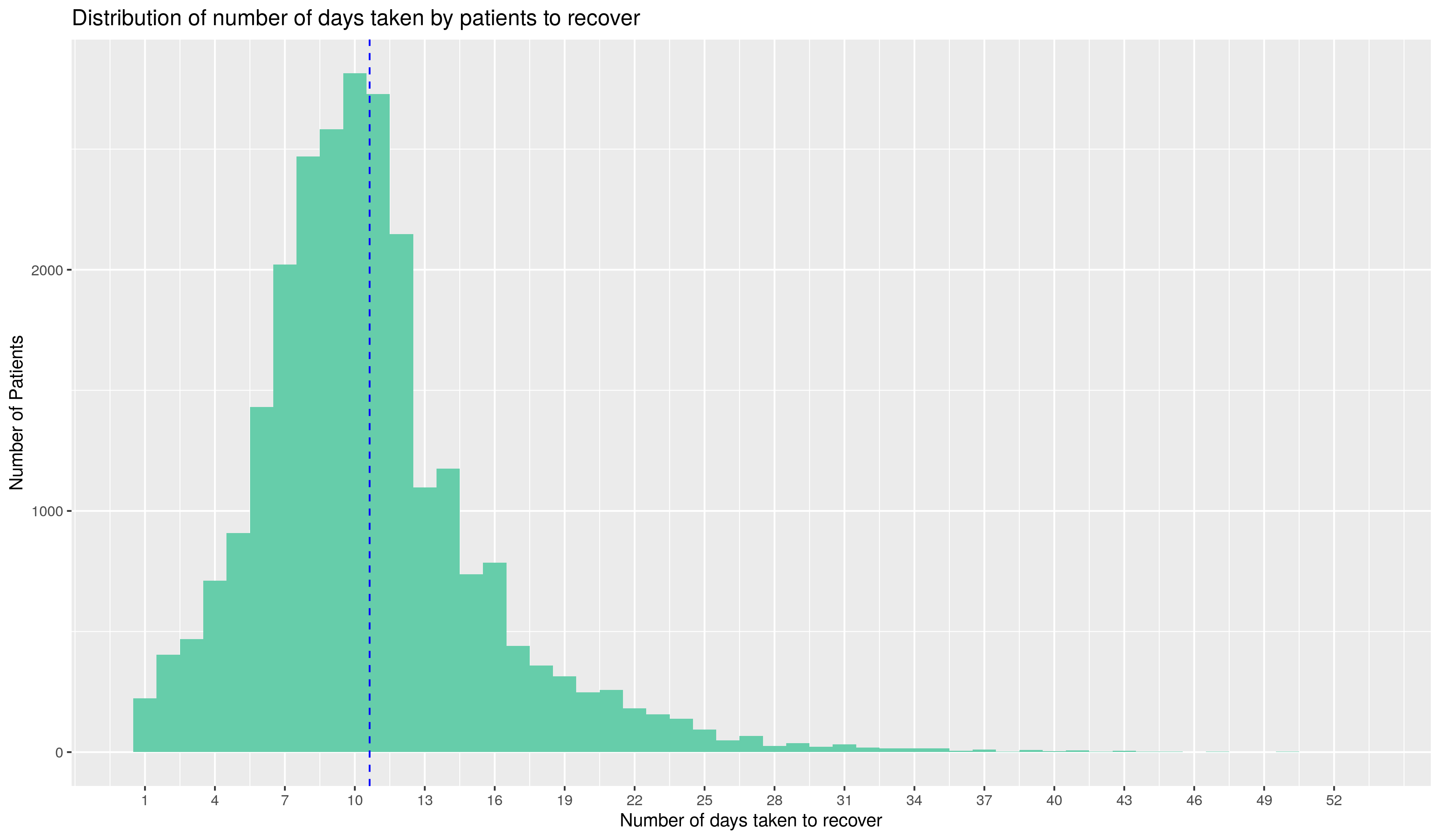
On the left, we have plotted a histogram of the number of days to recover for all discharged patients. The blue dotted line shows the mean of the recovery time of the patients. Note that the above graph contains information only on those patients whose recovery has been reported by the state. For a few days after 8th May, the recovery data was provided in a consolidated manner. This graph contains information on all the patients who have recovered, excluding the ones who have recovered on those days.
On the right, we plot the same for those who have succumbed to the disease. This distribution continues information on all those patients who have succumbed to the infection.
Further, it is seen in the graph on the right that a large fraction of patients who have succumbed to the disease have tested positive on the day they died.
This is because the first column also includes those patients who passed away and later tested positive for COVID-19.
We now do a scatter plot of Age versus days to cure and Age versus days to Succumb. (For those recoveries reported by the state.)
For the graph below, if you click on the image then it will display an interactive graph, where as you hover your mouse pointer over the graph annotations with details will be displayed.
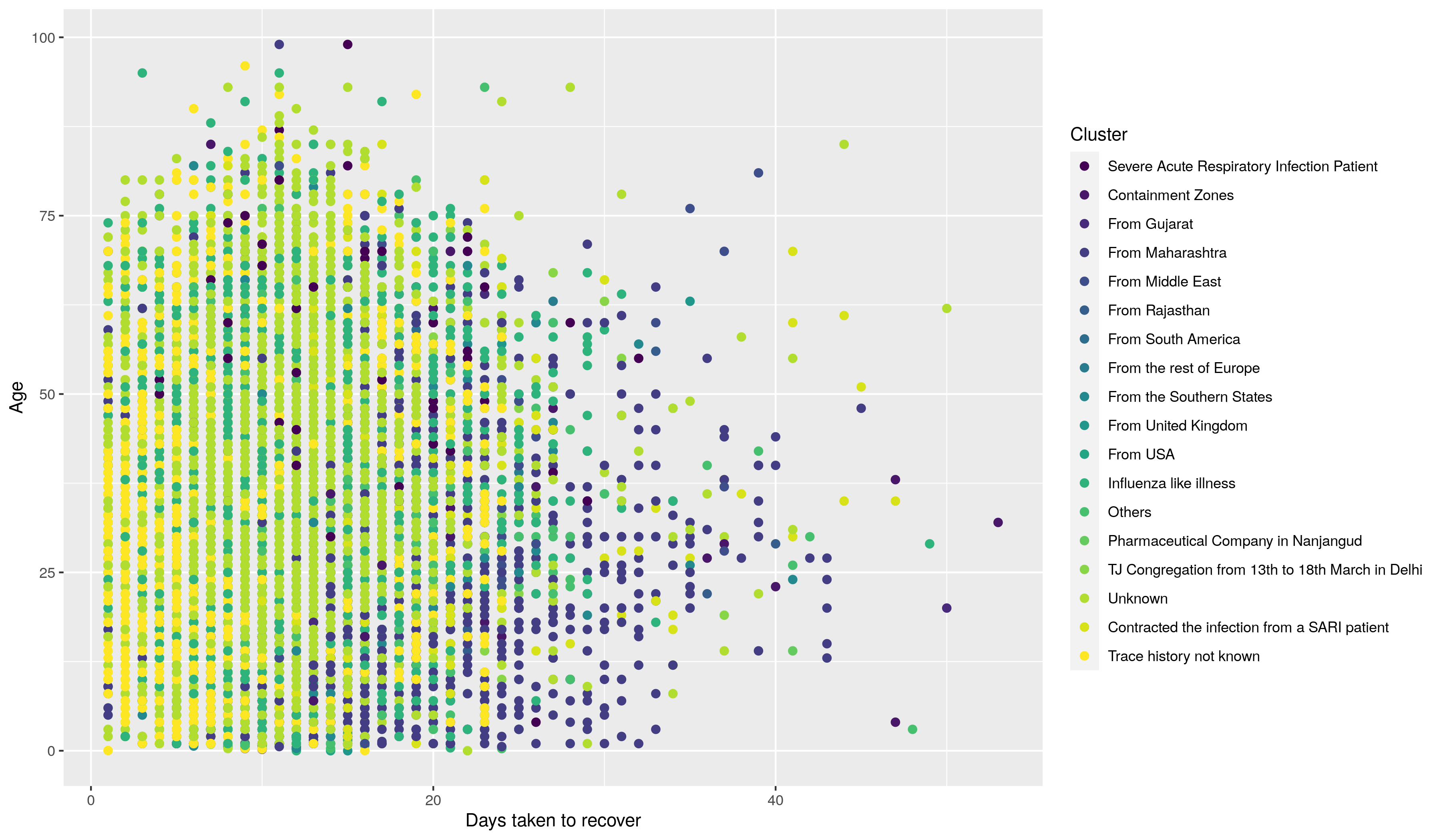
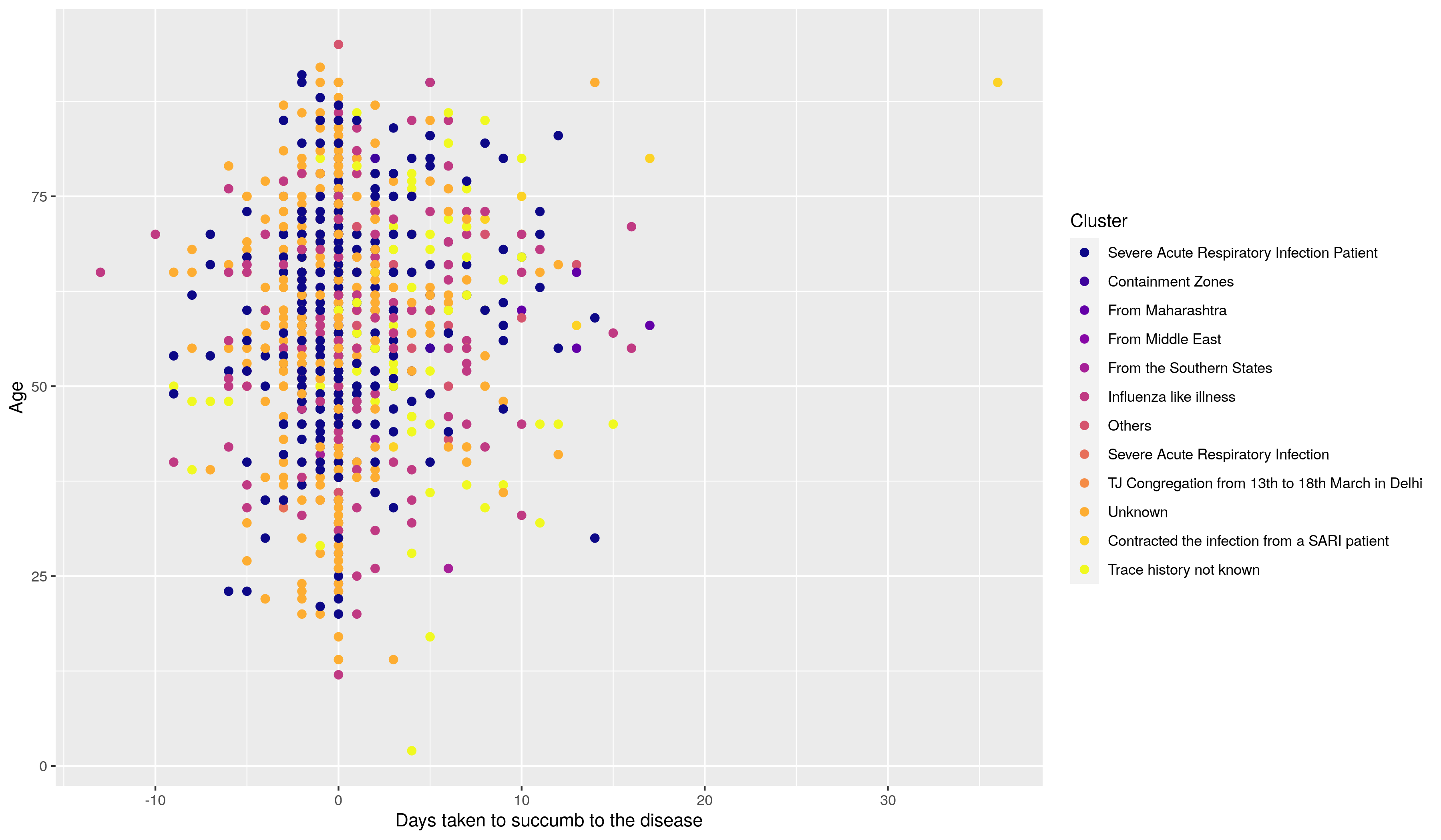
The first plot is a scatter plot for those patients who have recovered. On the x-axis, we have plotted the days between their being confirmed positive with COVID-19 and their recovery and on the y-axis, we have plotted their age. The colors represent their cluster of origin. This may be helpful to see if different strains of the virus are more severe than others.
The plot below shows the same for the deceased patients. The x-axis shows the days taken to succumb to the disease and the y-axis shows their ages. The colors represent their cluster of origin. To isolate a cluster, double click on it's name in the origin. It can be observed that most of the patients who are now deceased are Severe Acute Respiratory Infection patients. It is also seen that many patients who have passed away, do so on Day 0 and Day "negatives". This is because their samples, which result in positives, are sent for testing after their passing.
- Age Distribution
It is important to understand how the virus affects different age groups in the population. Towards this we present a graph of the
age distributions for the COVID-19 patients in Karnataka with along
with the distribution of the entire population of Karnataka [data
taken from the 2011 census]
For the graph below, if you click on the image then it will display an interactive graph, where as you hover your mouse pointer over the graph annotations with details will be displayed.
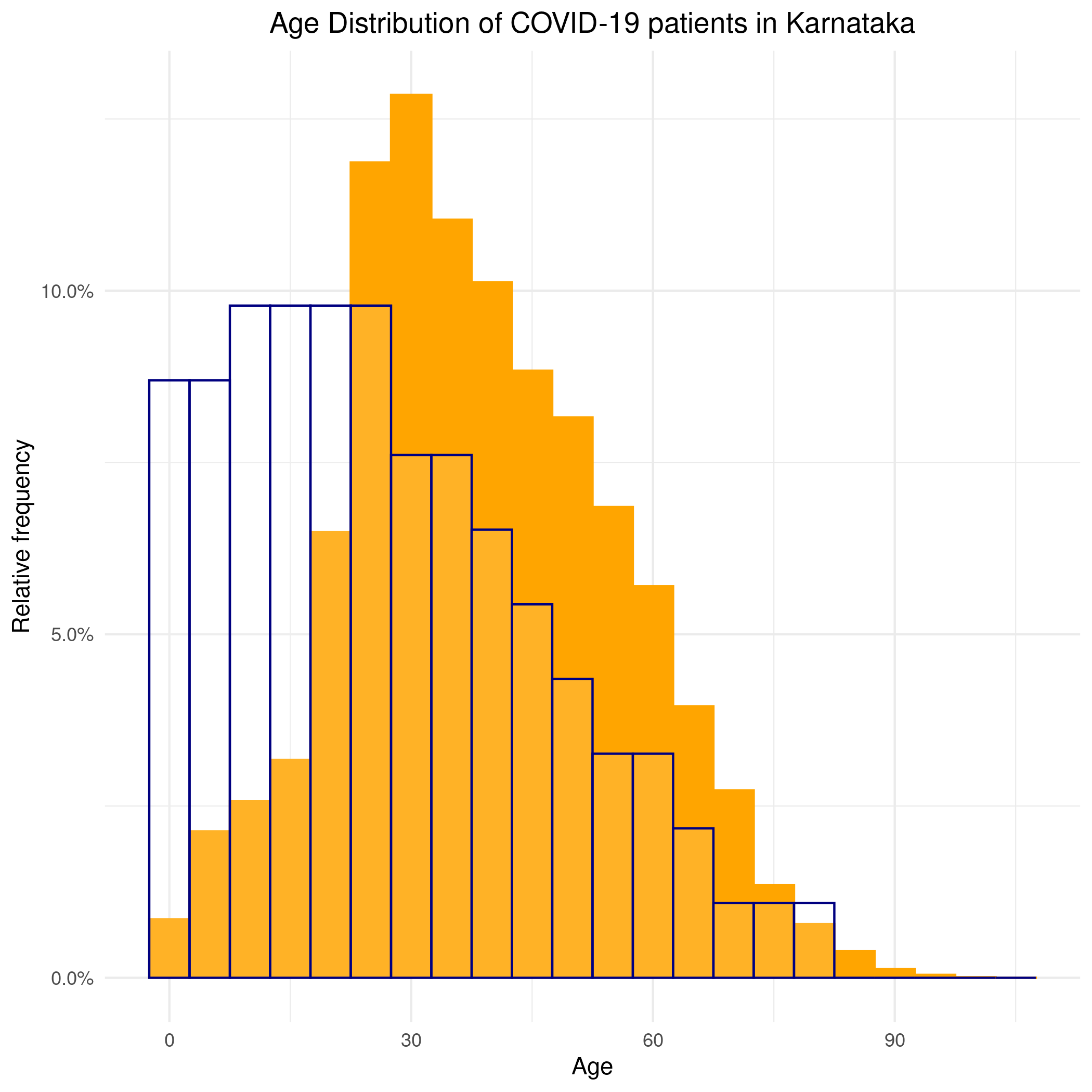
The filled in orange color indicates the distribution of the coronavirus patients in Karnataka and the navy outline represents
the Age distribution of the entire population of Karnataka for reference. Out of all the cases, three have unknown ages. Medical practitioners may be interested in knowing how the virus
is affecting the people across age groups, whether or not it is affecting different age groups differently.
It is seen that the distribution of the coronavirus patients has a
higher fraction of the patients among the range of ages in 20-35 and
not too many in the range 0-20, when compared to the demographic in
Karnataka. A possible reason for this might be that imported cases,
i.e. due to travel abroad, were due to travel of working
professionals. The state also took steps quite early on to lock down
schools and universities to prevent the younger segment of the
population to be affected. Those in the age group of 0-15 are primary or secondary contacts of those who have some sort of
travel history to COVID-19 affected locations.
- Hospitalisation Requirements :
During the spread of an infection as contagious as COVID-19, it is imperative for the state to understand the capacity of Hospital beds, ICU beds, ICU Oxygen/Ventilators required. This will reduce a patient's waiting time for treatment and also maximize health care response.
- ICU Timeline
For the graph below, if you click on the image then it will display an interactive graph, where as you hover your mouse pointer over the graph annotations with details will be displayed.
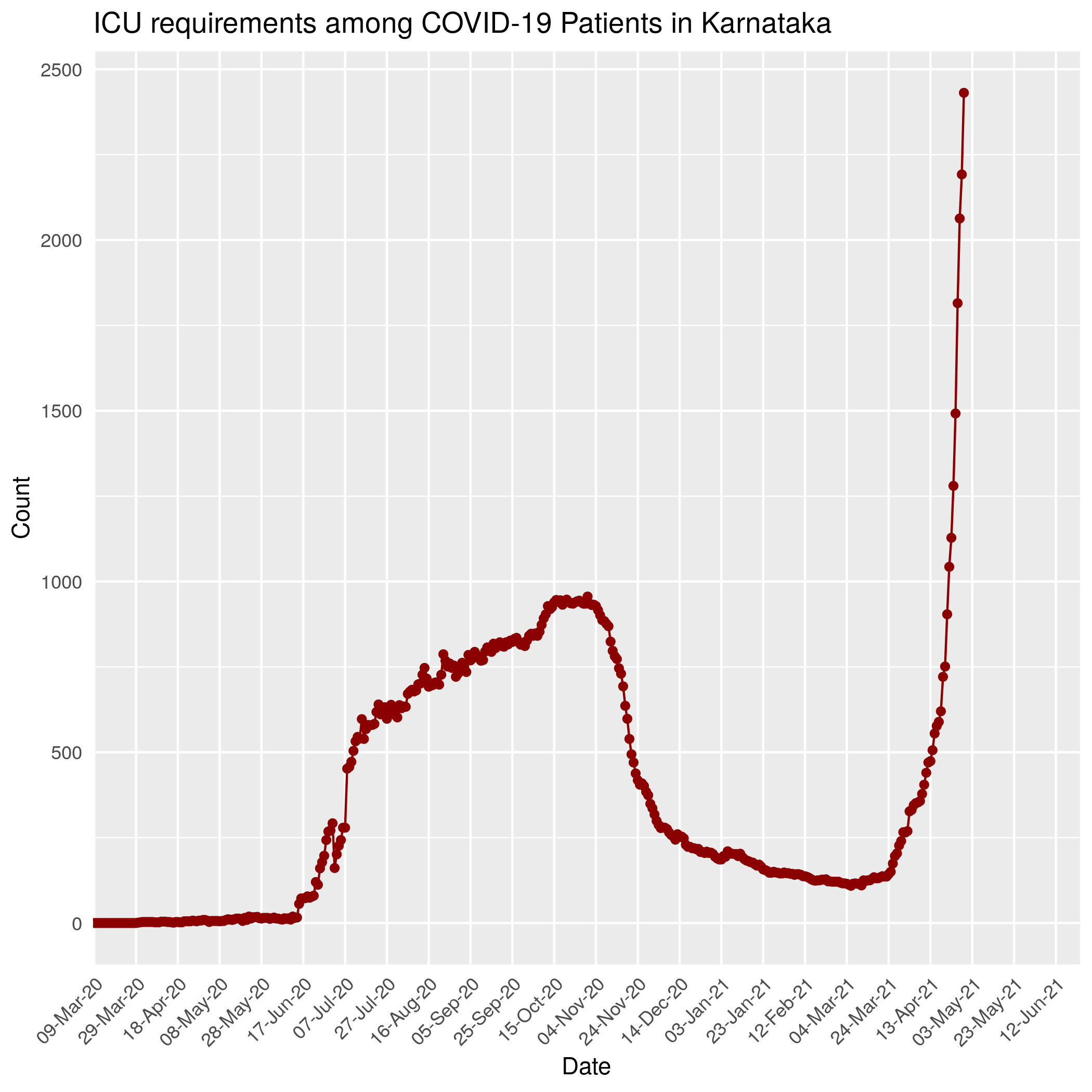
In an article published in the New England Journal of Medicine article Fair Allocation of Scarce Medical Resources in the Time of Covid-19
by Ezekiel J. Emanuel Et.all, the authors simulate possible hospitalisation requirements. In the article and otherwise it is widely accepted that the COVID-19 virus has the following
distribution among the infected people:
80% of infected will be asymptomatic or have mild symptoms, 6% will require health care but no hospitalization,
8% will require hospitalization and the final 6% will require ICU.
The patients in the ICU include those on Oxygen or on a Ventilator.
They include a very small [less than 5%] percentage of the number of currently infected people. On hovering, one can see what percentage of the currently infected people that require an ICU.
In Karnataka, everyone who is infected is being hospitalized
regardless of whether they show symptoms or not, as it would ensure
isolation. This isn't the case for countries like Netherlands where
only those who require hospitalization are hospitalized.
For the graph below, if you click on the image then it will display an interactive graph, where as you hover your mouse pointer over the graph annotations with details will be displayed.
- Days to and Days in ICU
To further approximate the ICU bed requirements, we consider those patients who have required an ICU, and plot the number of days between their testing positive and being admitted to ICU. We also plot the distribution of the days spent by the patients in ICU.
Both these plots have been frozen on 8th May as the Media Bulletins post 8th May provided consolidated numbers of patients in ICU.
For those patients who were in ICU before May 8th, below is a scatter plot of the days they were infected before requiring an ICU and the number of days they've spent in the ICU so far.
The y-axis represents the number of days between the patient's testing positive and requiring ICU. The y-axis has the days they spent in an ICU. Since this graph also contains information on those patients who are still in ICU, some of the points may move further left. The points are colored based on the patient's current condition i.e. if they're recovered, deceased, still in ICU or requiring hospitalization. Hovering on the points will give you information on the patient's age, sex, city of residence and the cluster of origin of the infection.
Note that this graphs has been frozen on 8th May. The colors represent the condition of those patients who were in ICU on 8th May.
- Basic Reproduction Number
In epidemiology, the "basic reproduction number" of an infection can be thought of as the expected number of cases directly generated by one case.
From the Karnataka Trace History we can plot the distribution of number of cases directly generated by each case, i.e. distribution of number of children across the infected patients.
For the graphs below, if you click on the image then it will display an interactive graph, where as you hover your mouse pointer over the graph annotations with details will be displayed.


These graphs were frozen on 26th June as the Media Bulletins after that did not contain contact information.
In the above plot, only immediate successors [children] in the tree have been counted for each node, and not grandchildren or great grandchildren. A vast majority of cases have no children, which is due to the isolation and hospitalization measures.
However, the distribution seems to have a few people who have a very high number of children. This behaviour is sometime seen in an epidemic spread.
- Distribution Across Cities
We present observable timeline of the distribution of total number of infections in Karnataka across the cities.
For the graph below, if you click on the image then it will display an interactive graph, where as you hover your mouse pointer over the graph annotations with details will be displayed.
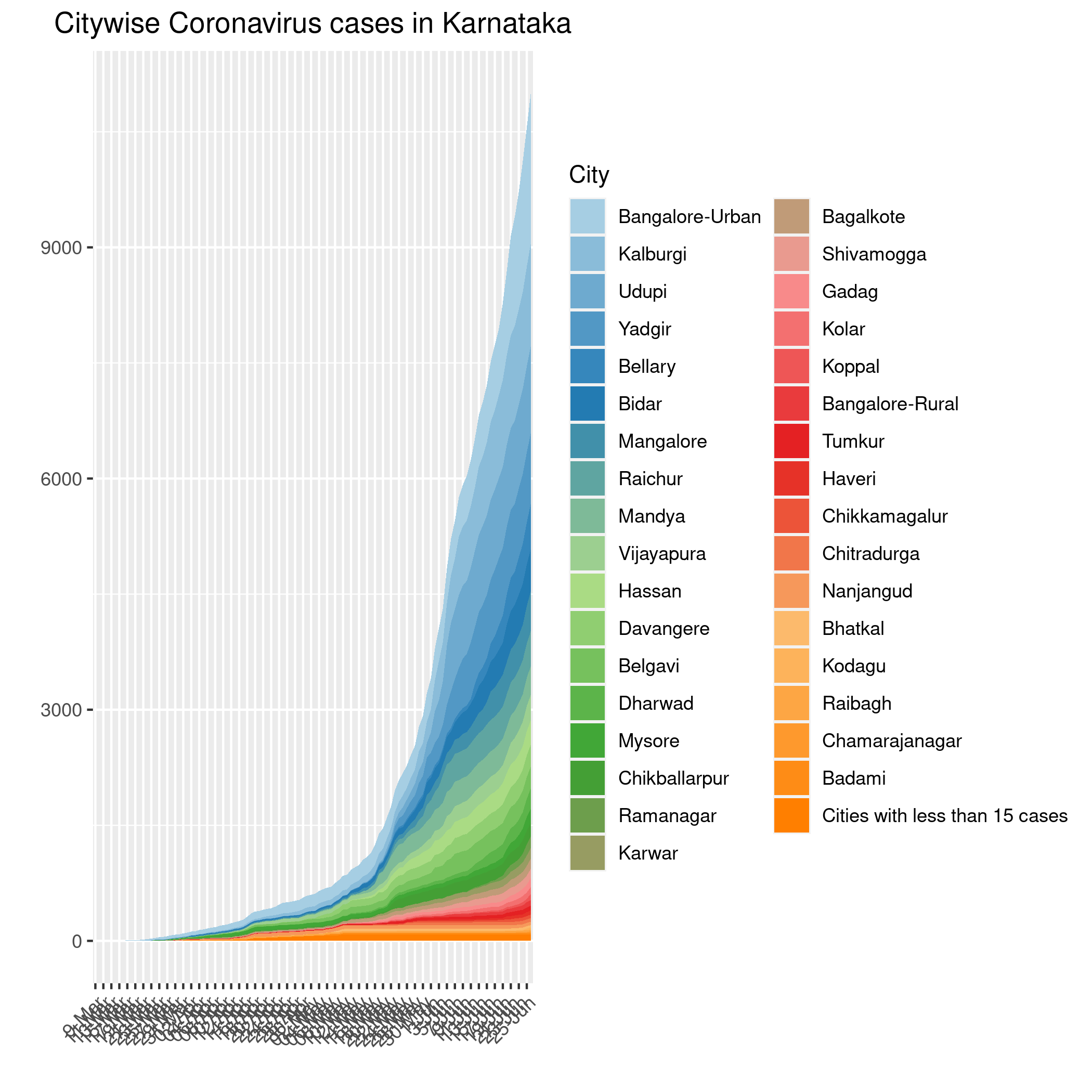
The above graph is a continuous analog of a stacked bar chart. It is used here to show how the composition of the total Coronavirus cases
in Karnataka varies across the different cities. The growth in area of each color over time represents the corresponding increase
in the number of Coronavirus cases for that city.
- Testing Data
It is widely believed a strong testing regimen is the best indicator of infection spread.
For the graph below, if you click on the image then it will display an interactive graph, where as you hover your mouse pointer over the graph annotations with details will be displayed.

The above graph is a continuous analog of a stacked bar chart. It is used here to show the composition of the testing done in Karnataka. The growth in area of red colour over time represents the total number of positive tests till that day, green colour over time represents the total number of negative tests till that day and finally the blue color represents the total number of tests whose results are awaited till that day.
From 17-July onwards, the Media Bulletins contained information on the number of Rapid Antigen tests and RTPCR & other methods. Different tests are used for different types of patients and may have different test positive fractions. We consider all the tests cumulatively done, including the Rapid Antigen Tests.
In the below graph we plot the total number of tests done on a daily basis since March 2020 in the state.
For the graph below, if you click on the image then it will display an interactive graph, where as you hover your mouse pointer over the graph annotations with details will be displayed.
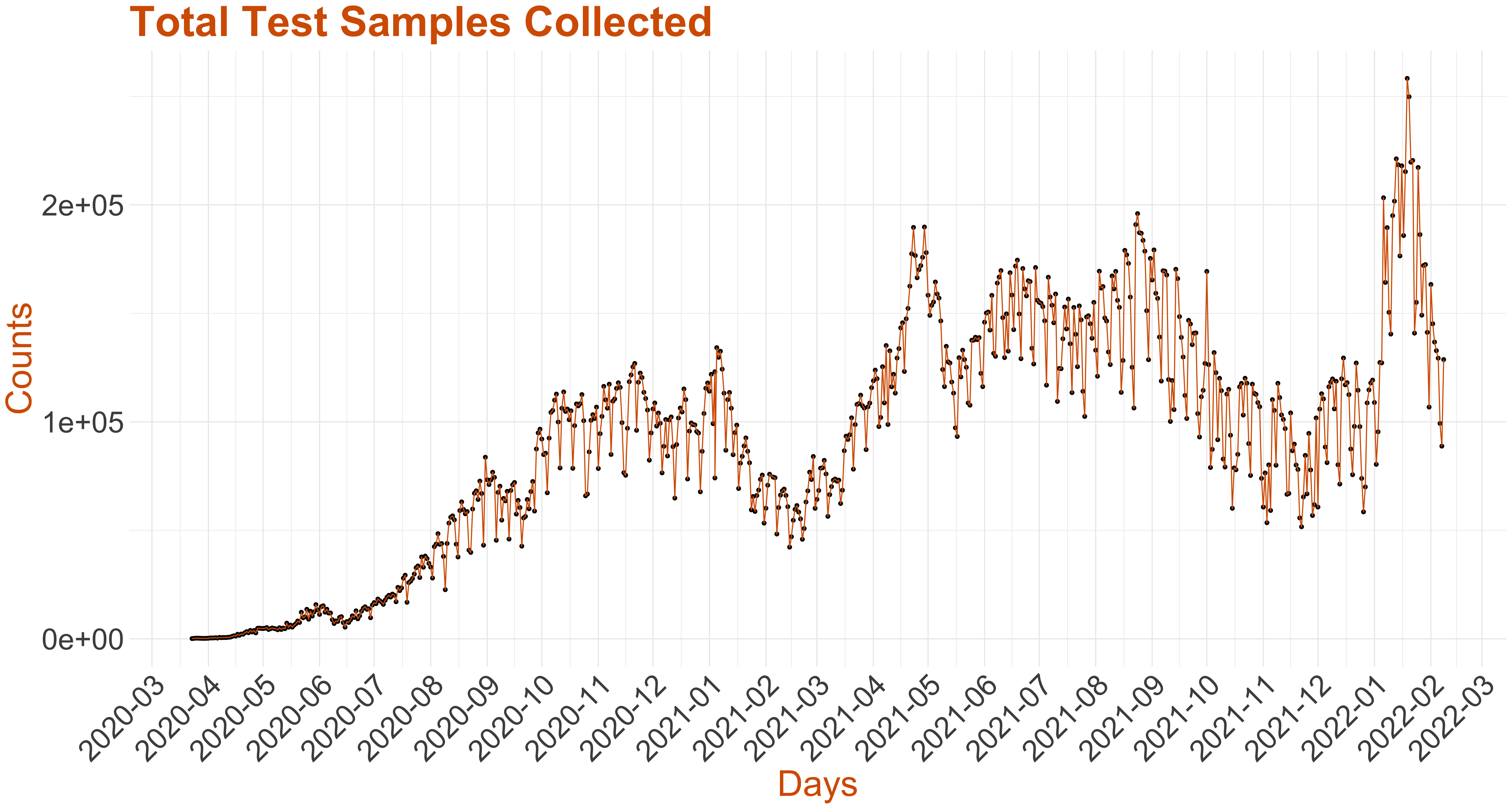
There were two typographical errors in the Media Bulletins. On 17th March, 2020 the number of positive tests was incorrectly mentioned as 1 even though the cumulative count had gone up by 4. This we have rectified in the above. On 25th March there was a discrepancy in the cumulative and daily counts for negative samples. 25th March onwards, we have considered the daily counts instead of the cumulative counts of negative samples in the Media Bulletins.
The percentage of positive tests is an indication of the prevalence of the infection in the population. Below we have plotted, the test positive rate on a daily basis.
For the graph below, if you click on the image then it will display an interactive graph, where as you hover your mouse pointer over the graph annotations with details will be displayed.
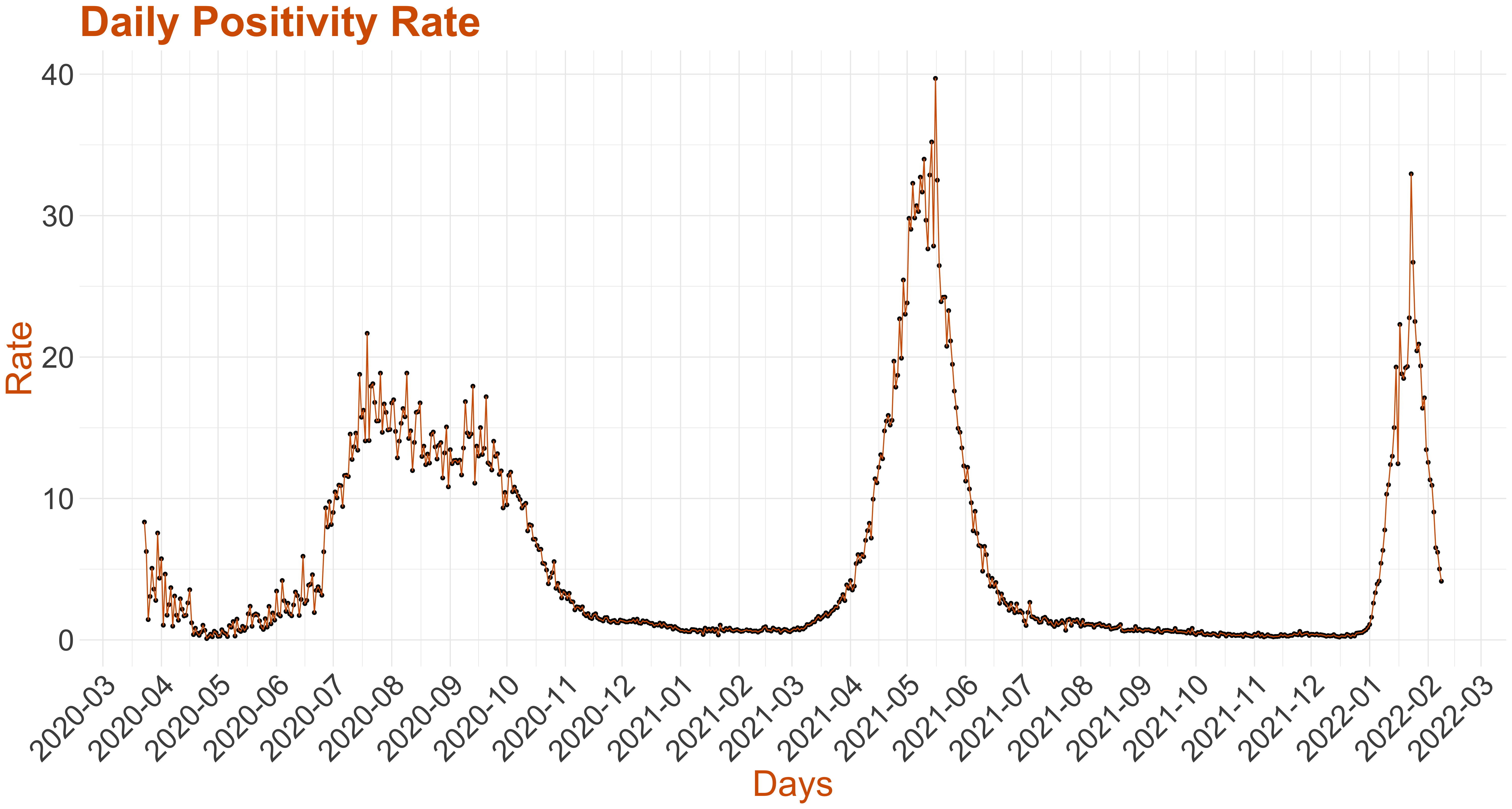
Hovering over the points will give you information on the total tests conducted upto that day and the total positive cases.