COVID-19 India-Timeline an understanding across States and Union Territories
Early Warning System for Indian States
Goal: From the daily reported cases, create a stable early warning system based on each state's health care infrastructure capacity that provides:
- prediction of number of active cases in the next two weeks,
- days to critical (i.e. the number of days in which active cases will test health care infrastructure at current rate of growth), and
- warnings when the cases are low.
Click here for Summary of Method
Suppose $\active{t}$ is the total number of active cases at time $t$ and $\ractive{t}$ is the number of new infections per active infection per unit time at time $t$. Assuming constant recovery : $\rinactive{t} \equiv 1/10$ we can estimate $$ \ractivehat{t} = 0.1 + \frac{ \active{t + 7} - \active{t} }{ 7 \cdot \active{t} } $$ Note that at time $t$, $\ractivehat{t} > 0.1$ implies active cases will increase over time and $\ractivehat{t} < 0.1$ implies active cases will decrease over time. For prediction, we use average of last 4 calculated values of $\ractivehat{t}$ on date of last data point as the growth rate for the future.
For details and limitations of the method we refer to Early Prediction of COVID Surge-Slides.
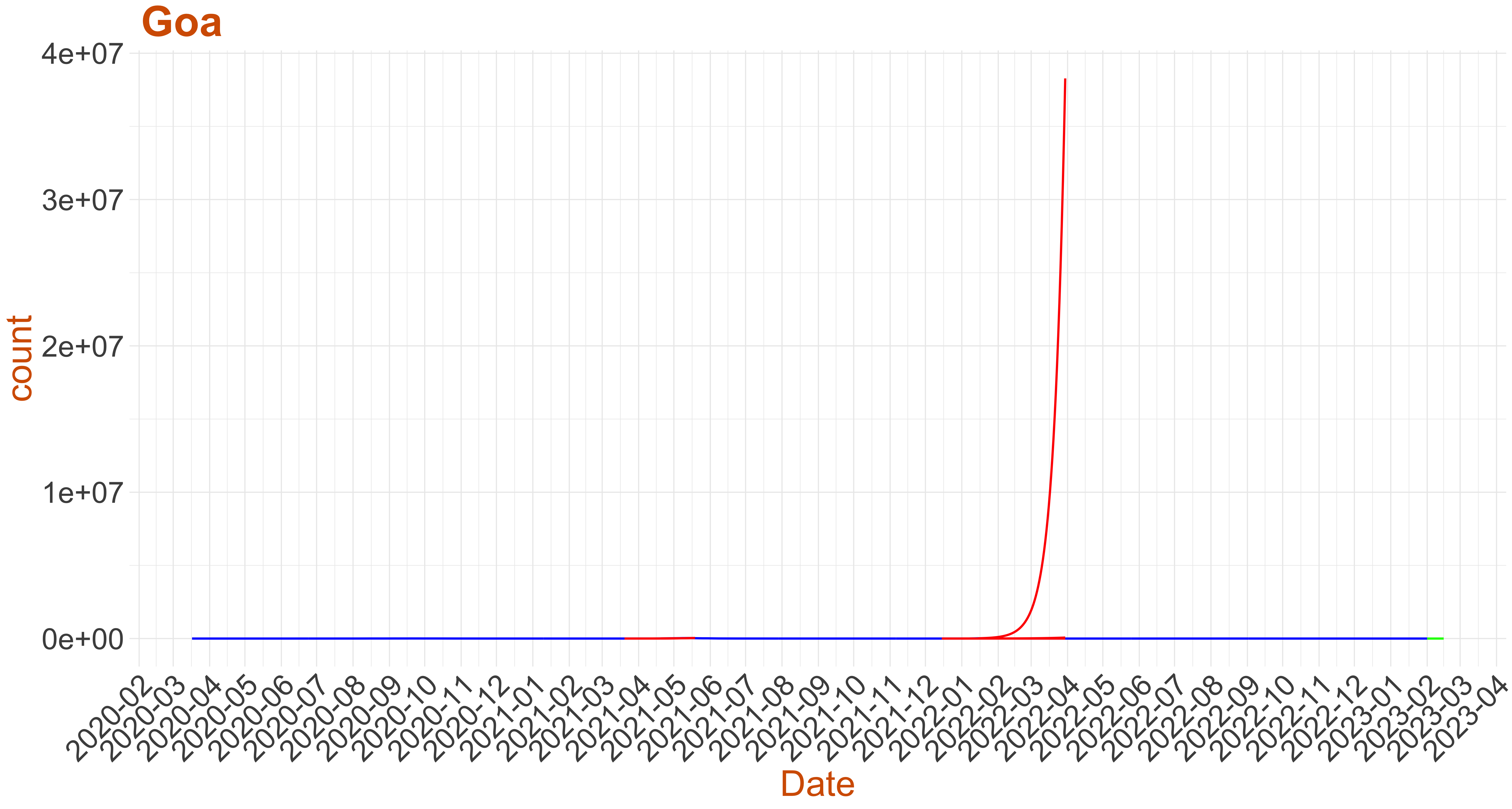
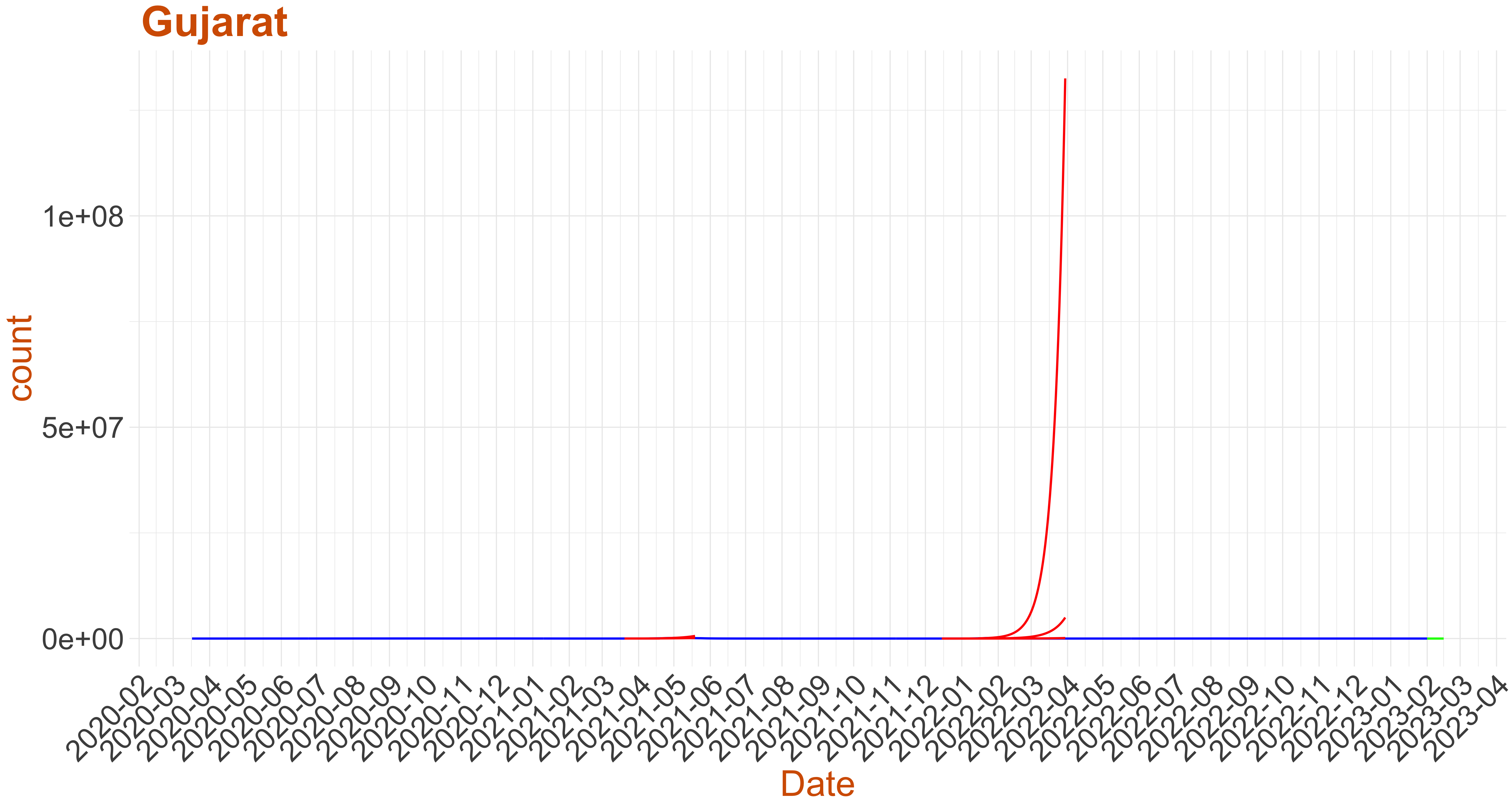
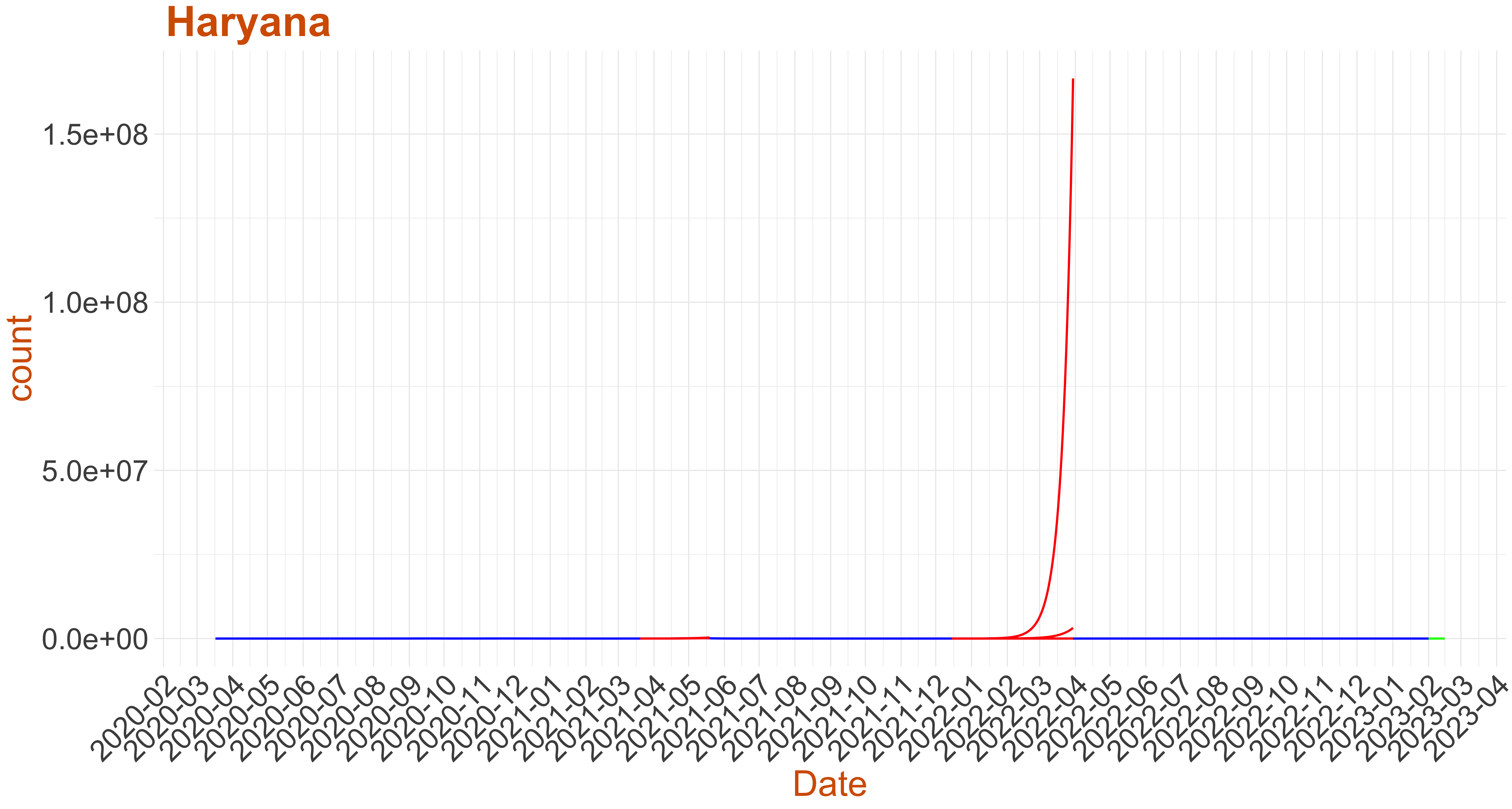
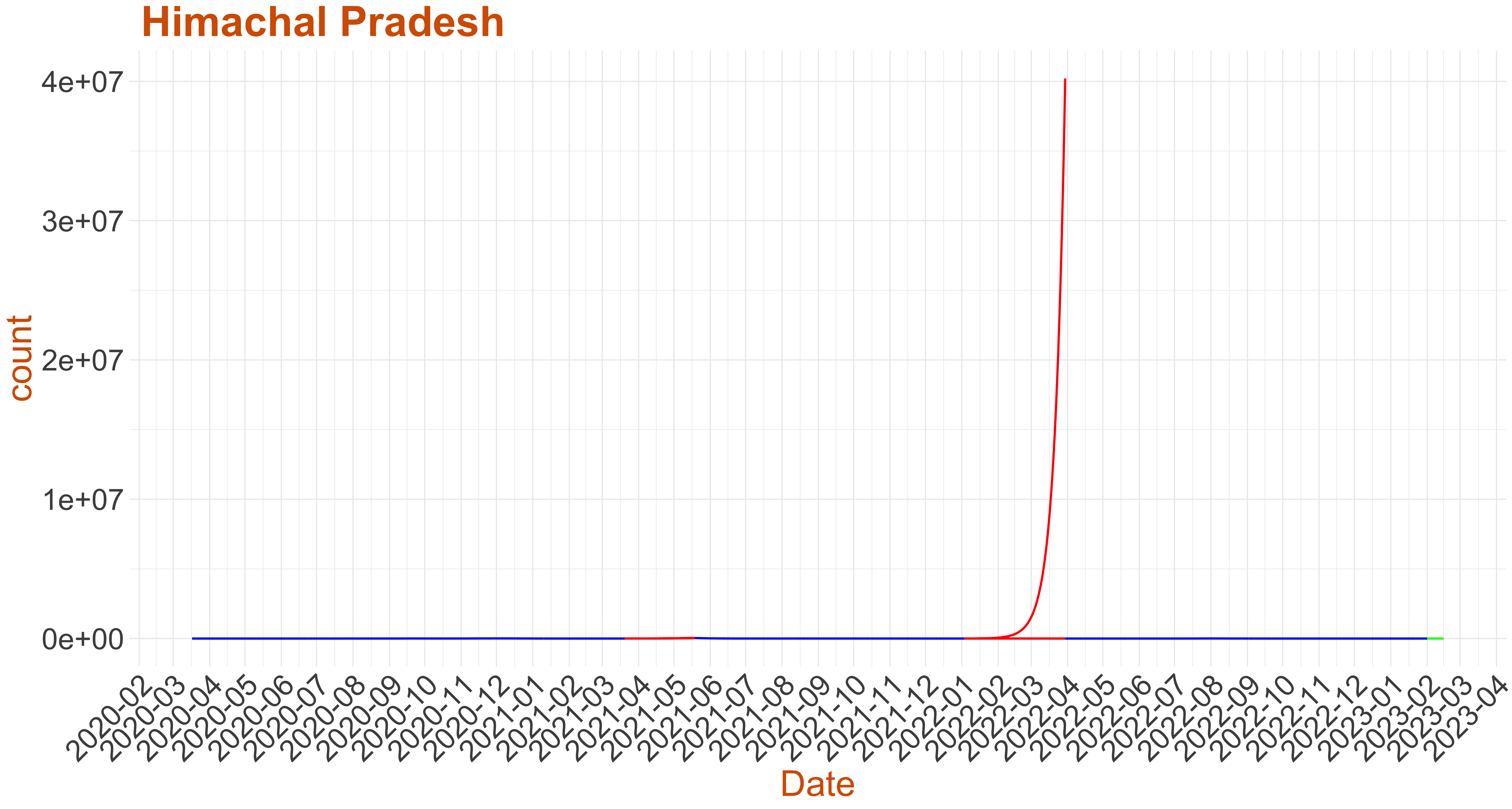
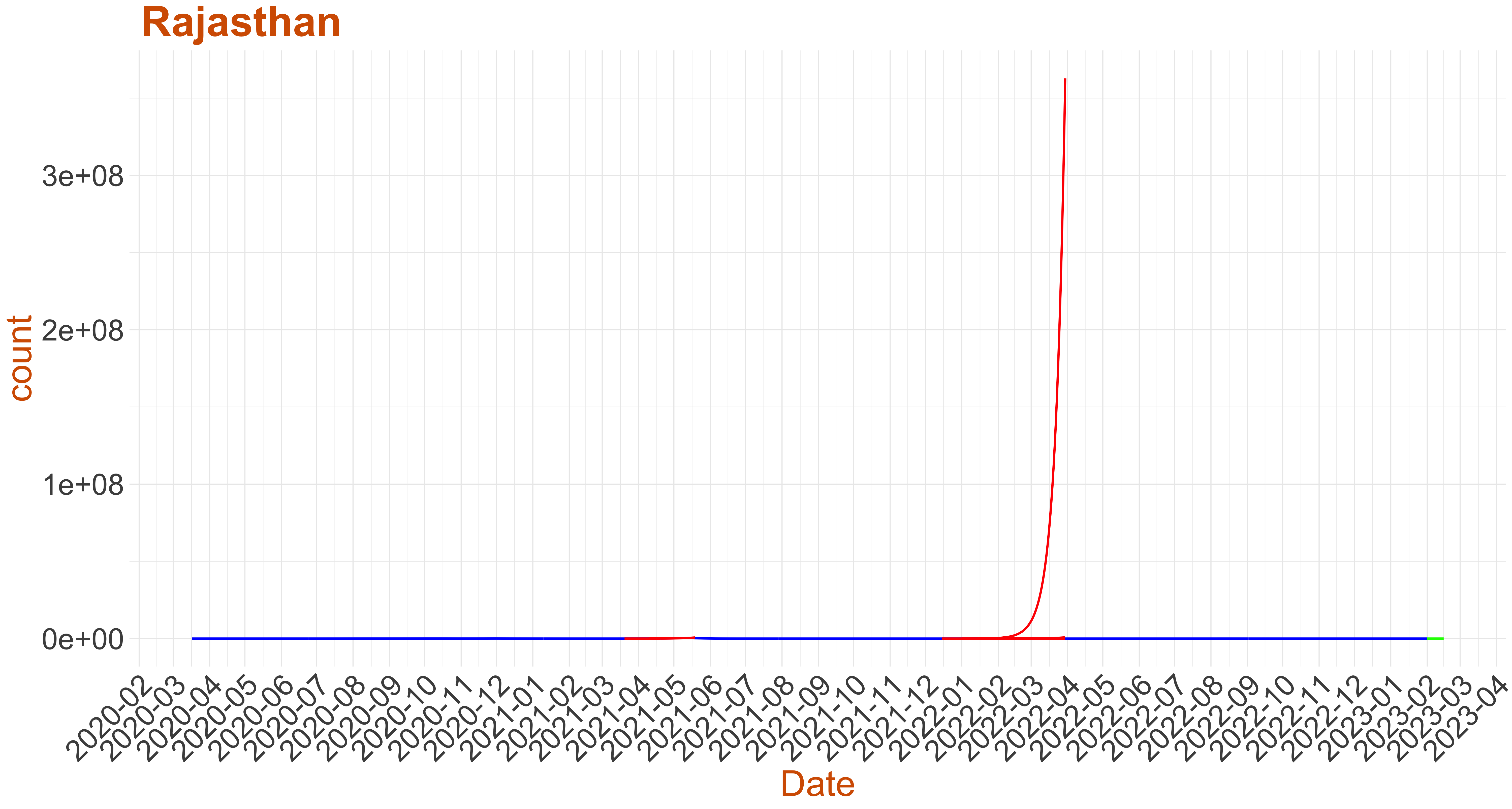
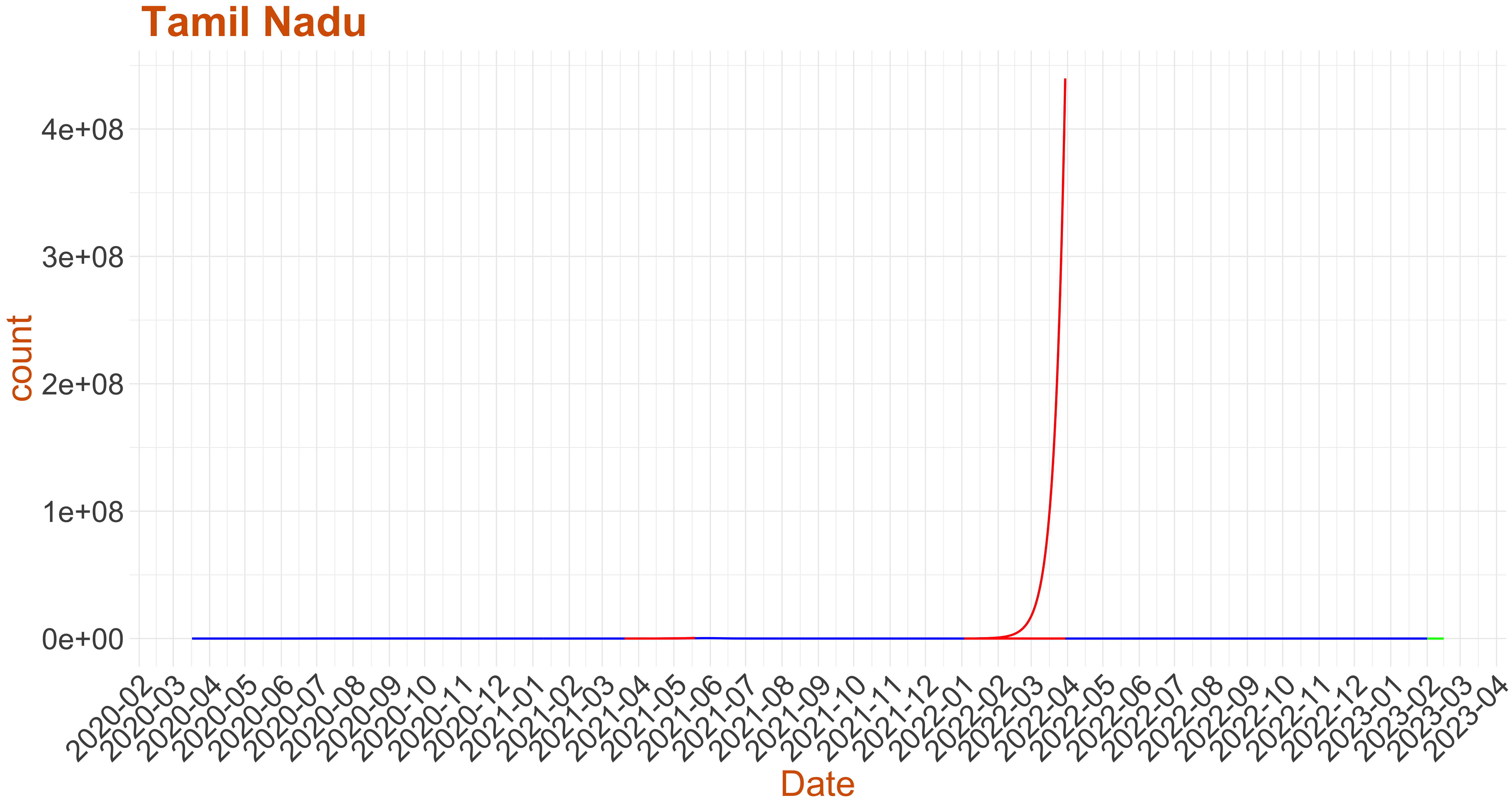
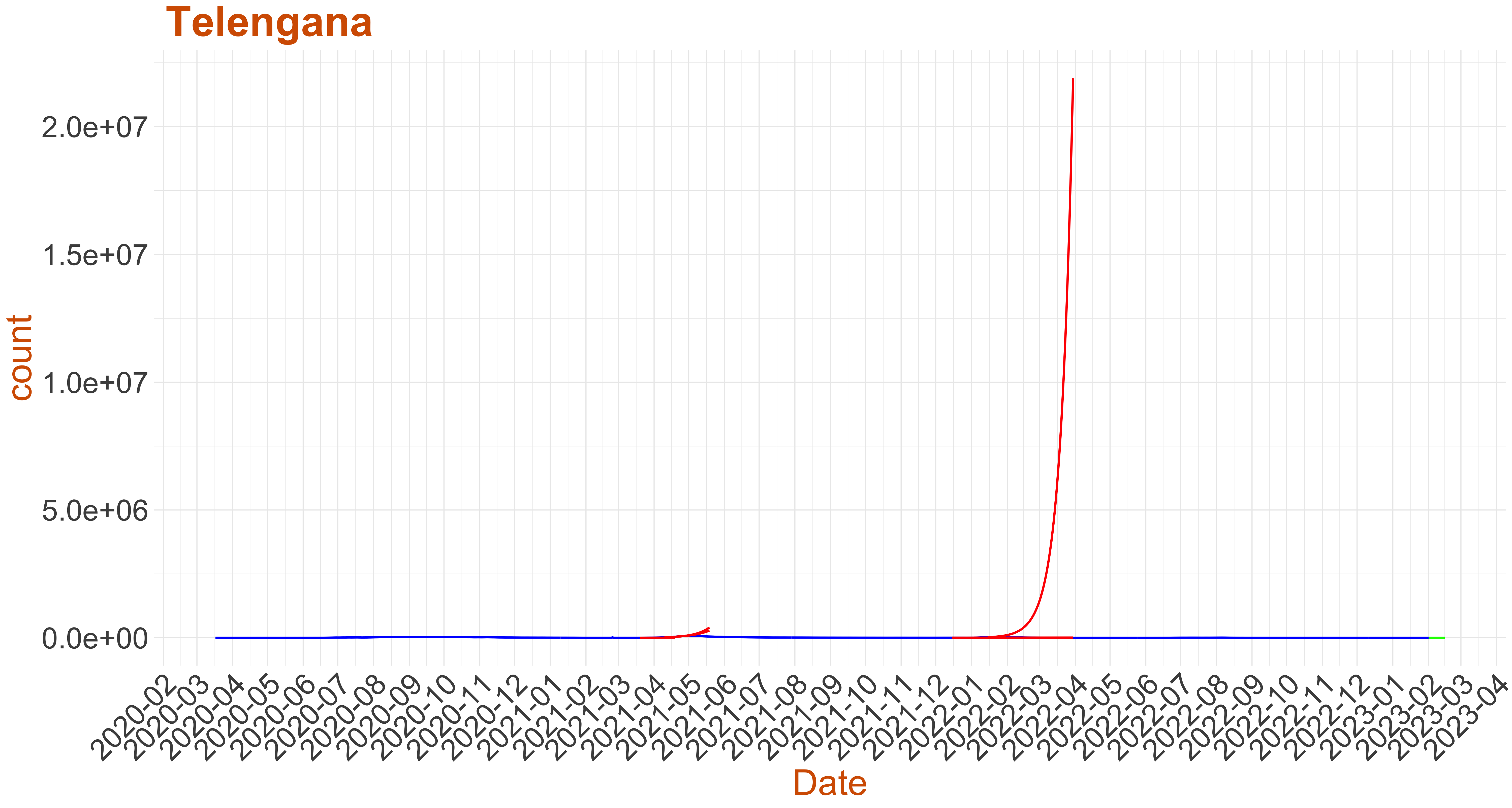
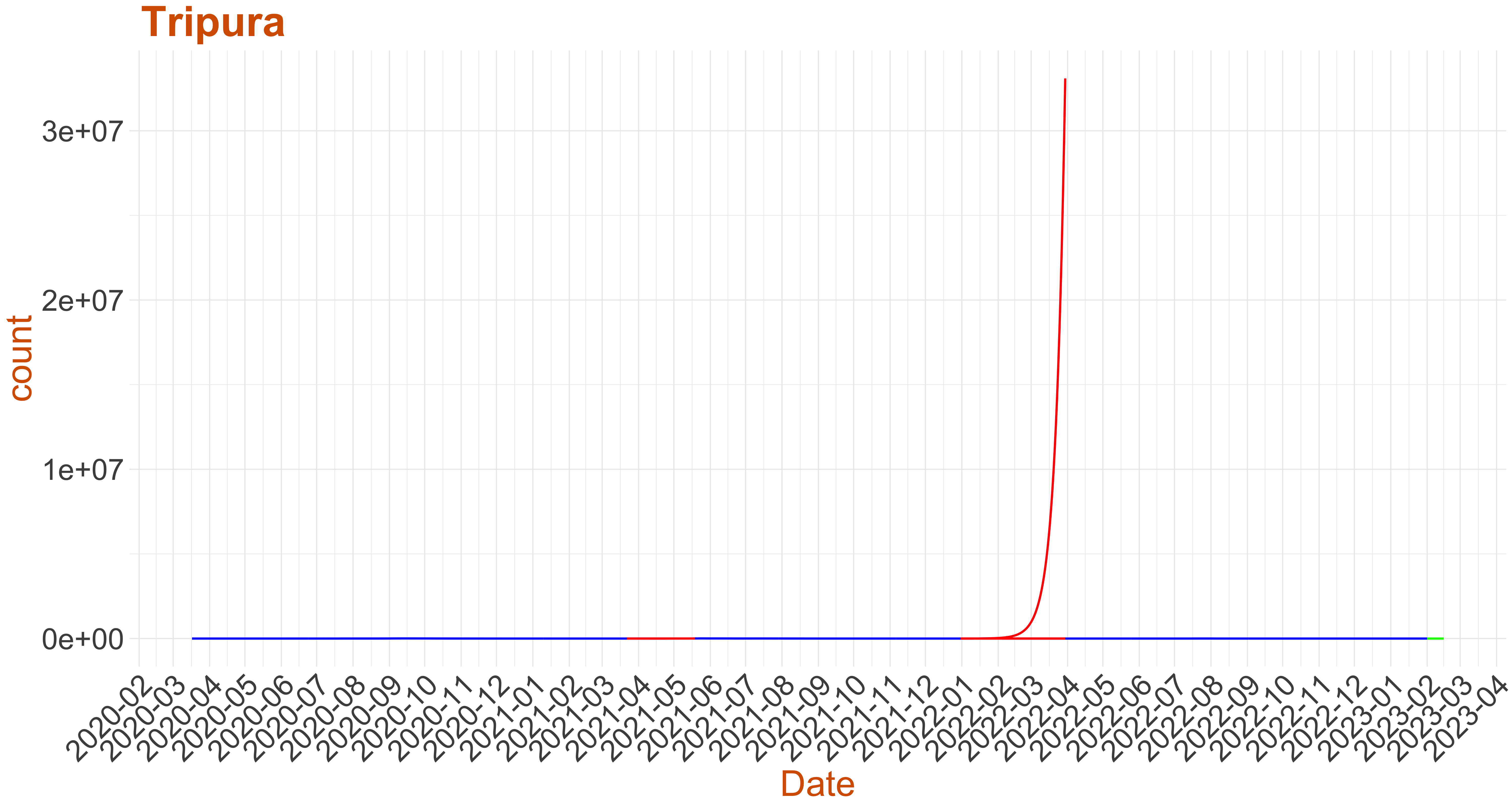
Early warning Signals:
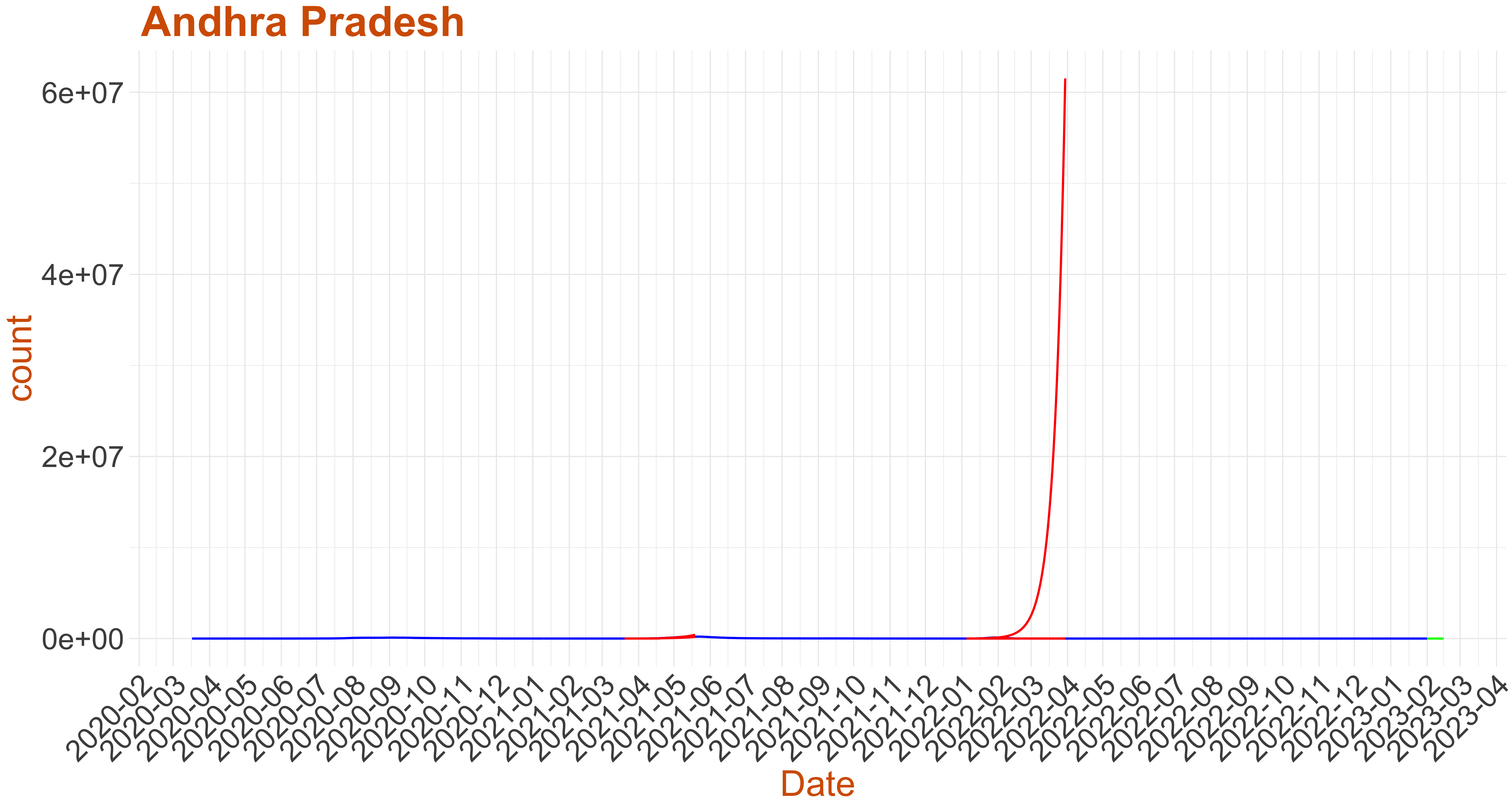
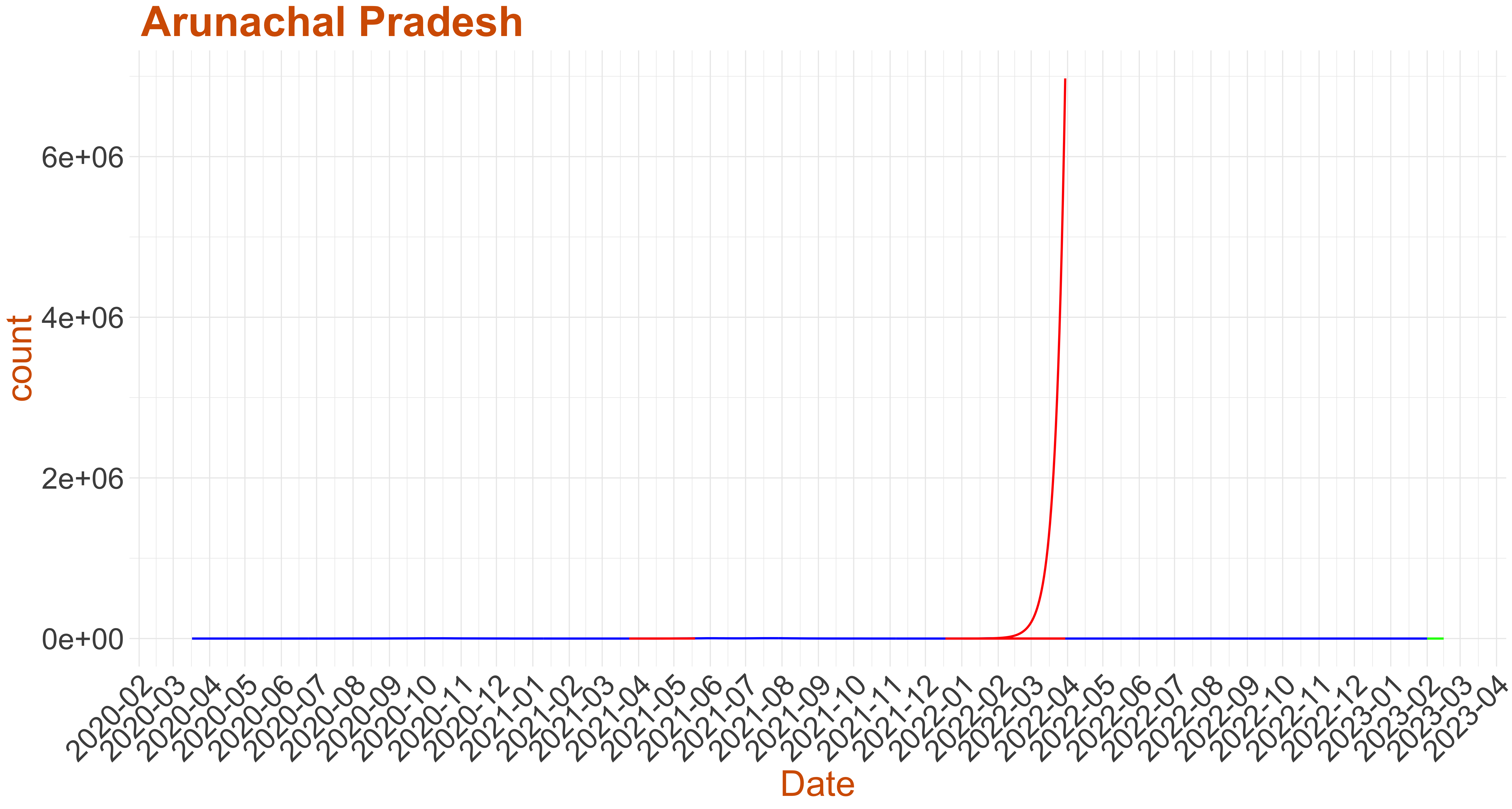
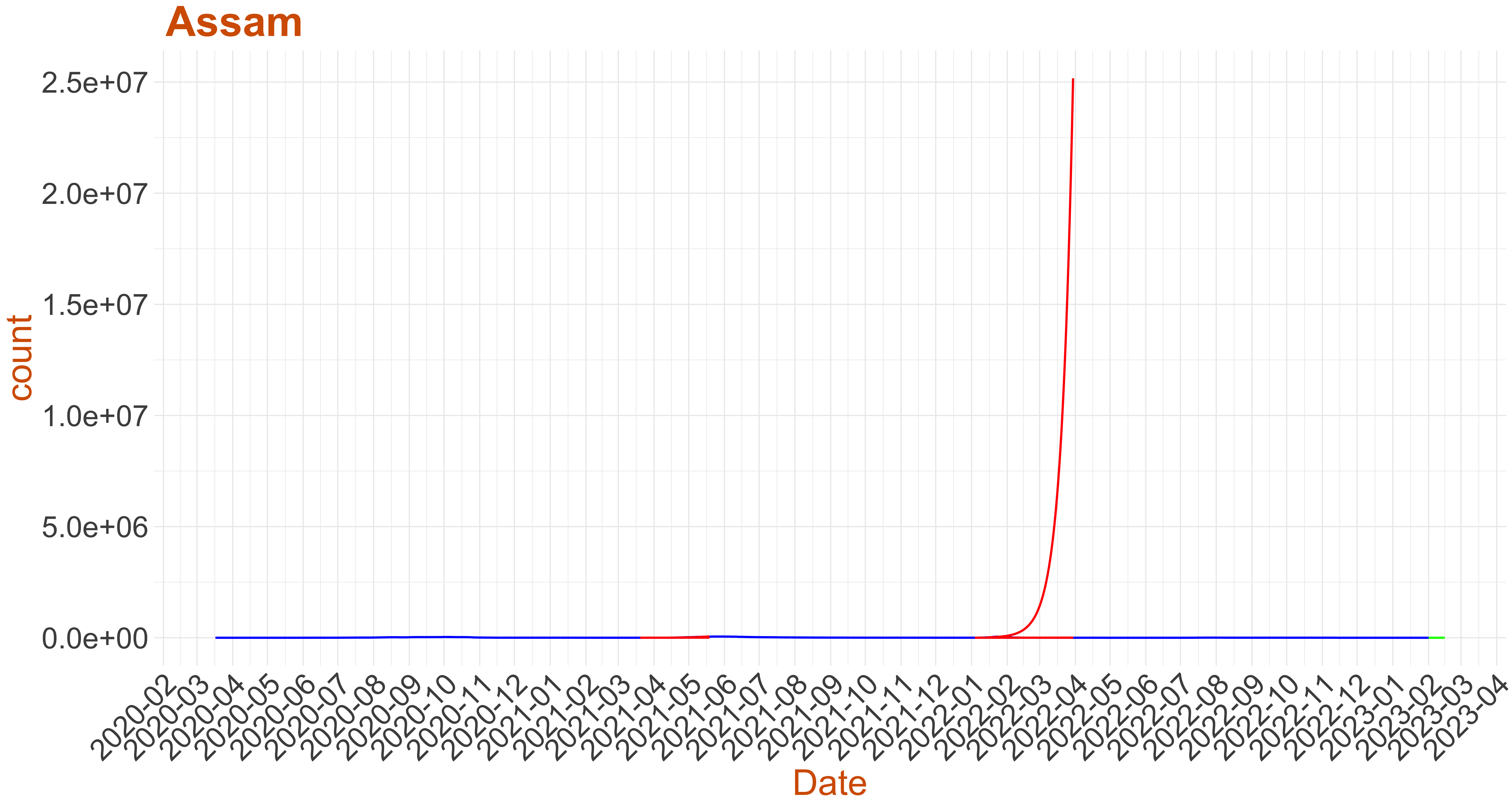
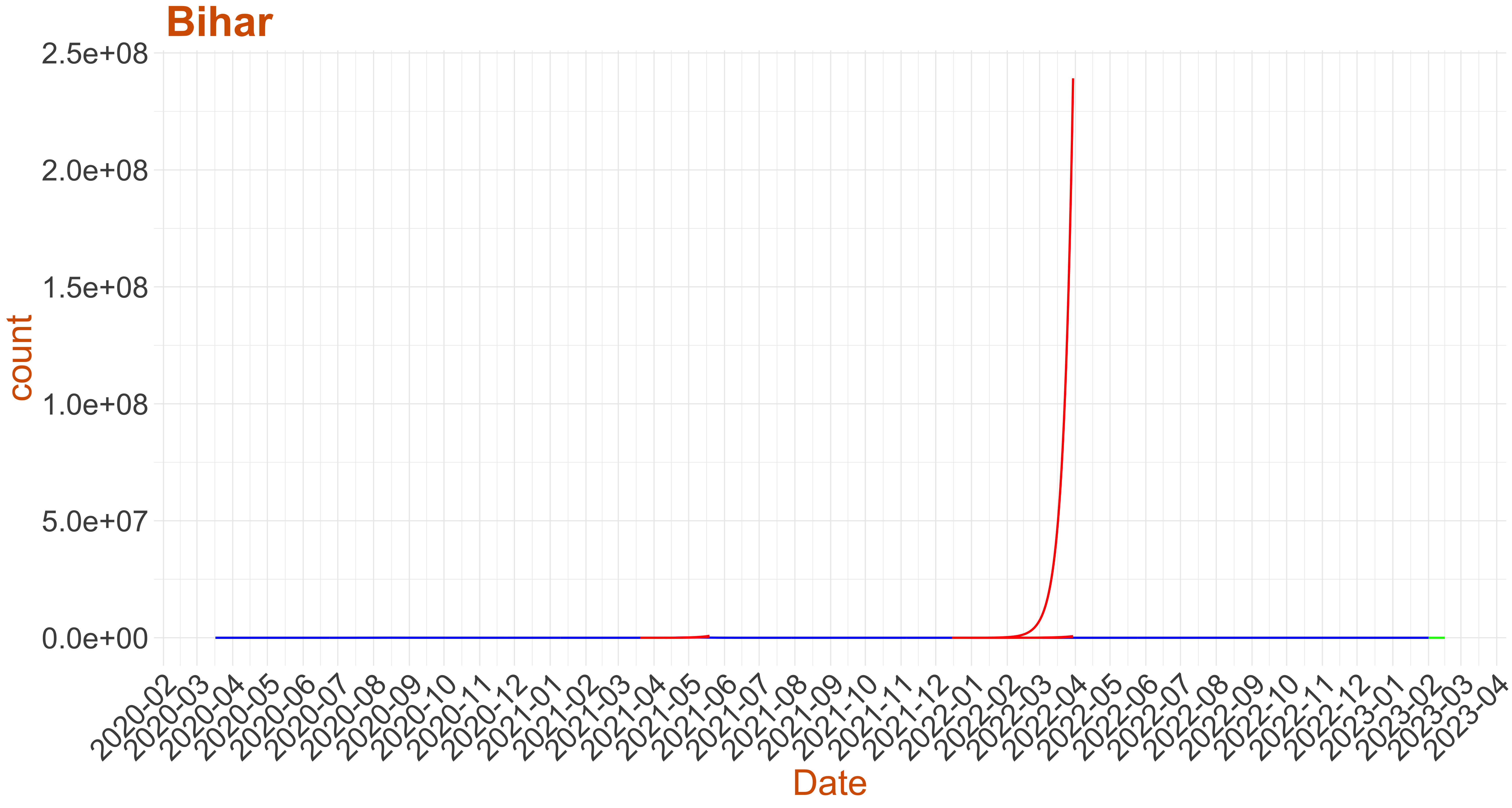
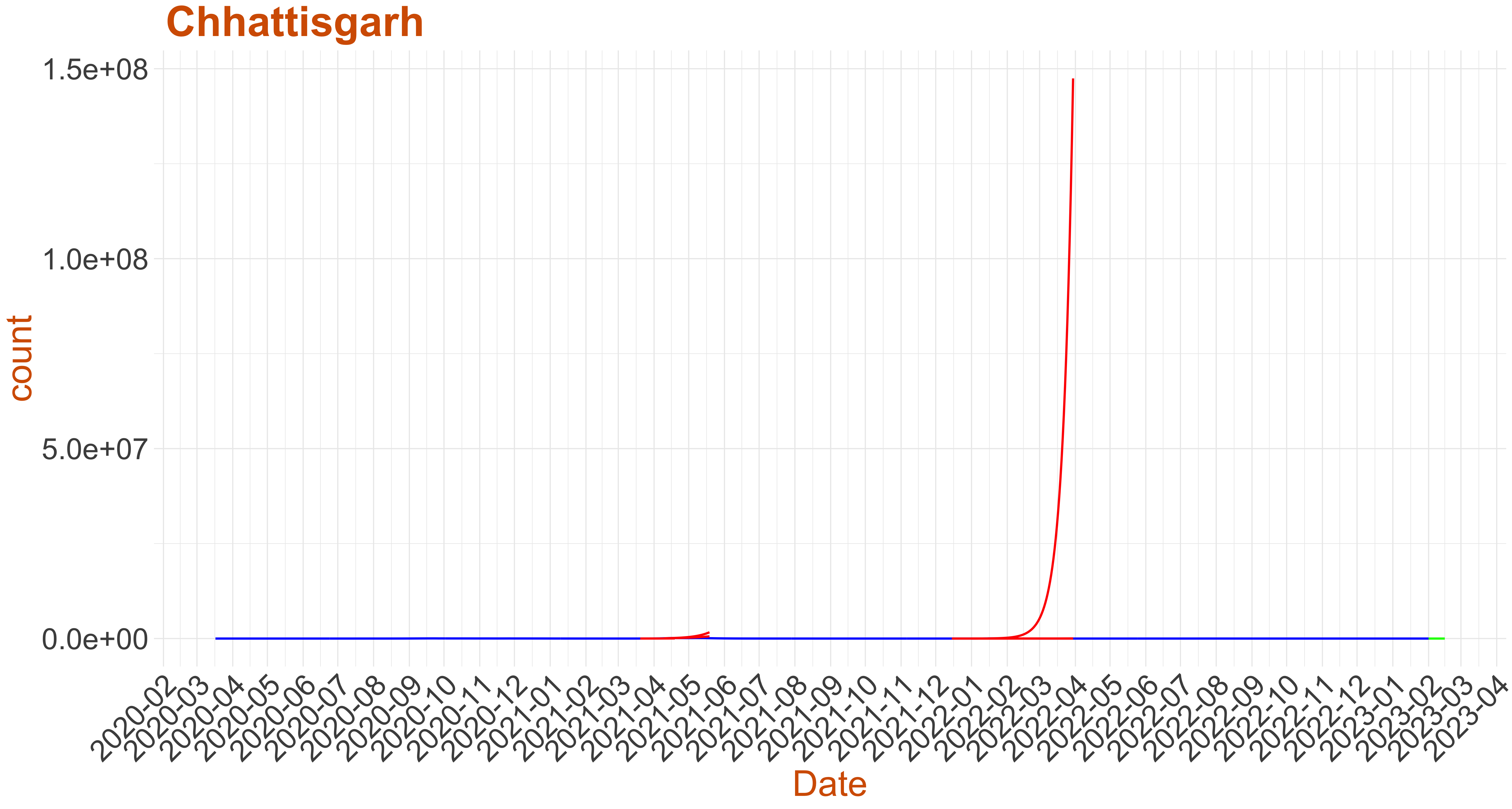
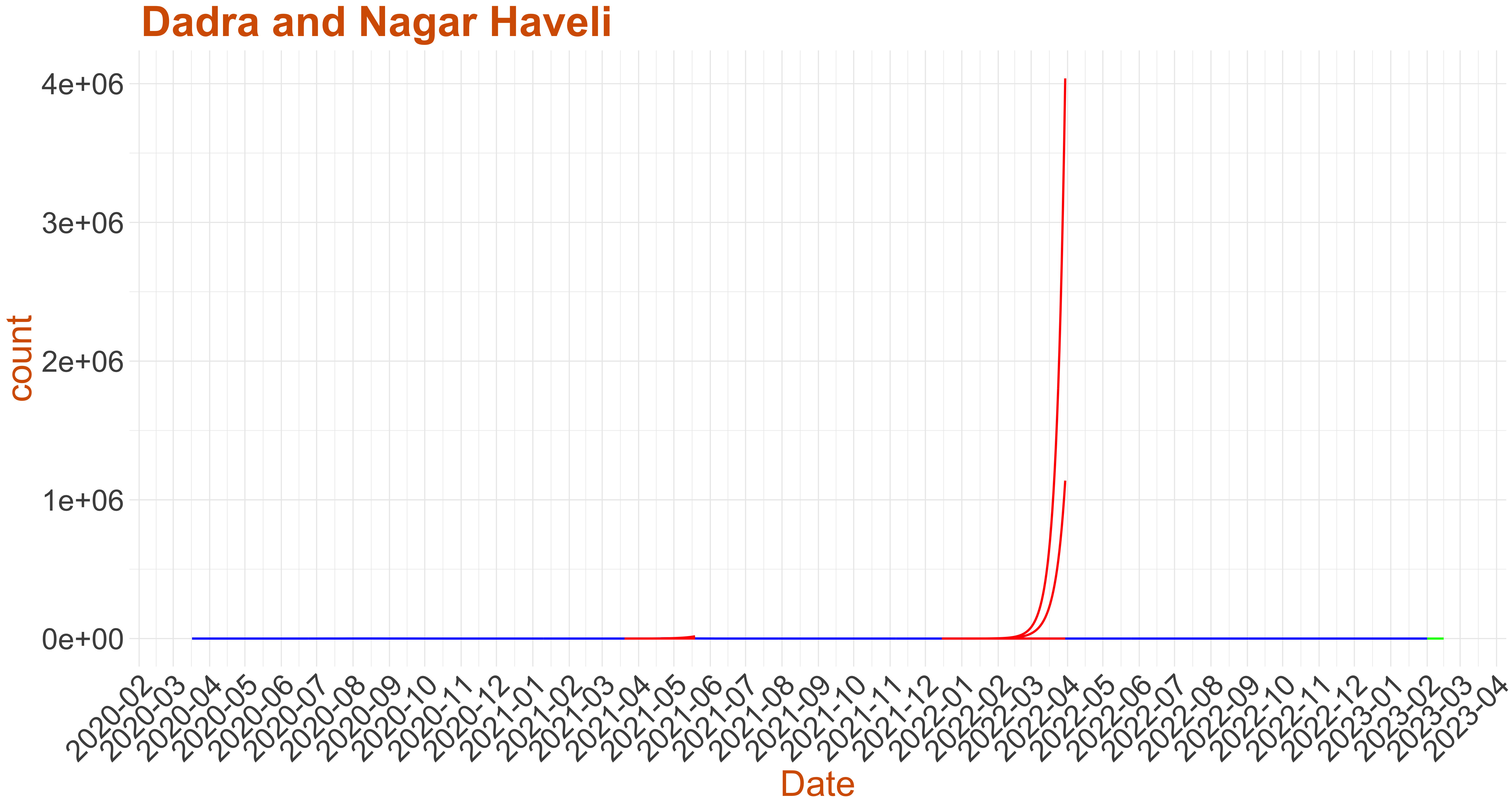
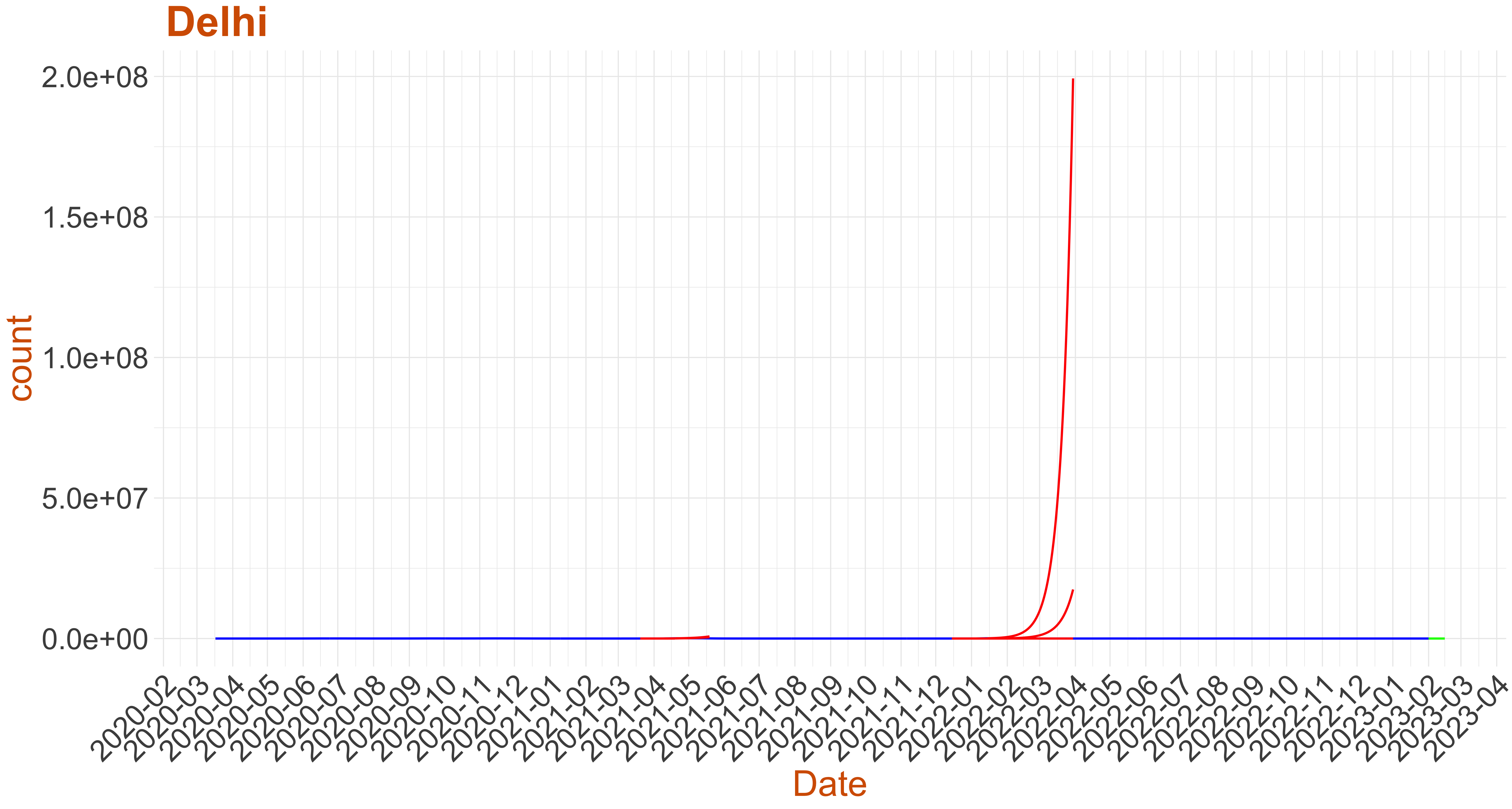
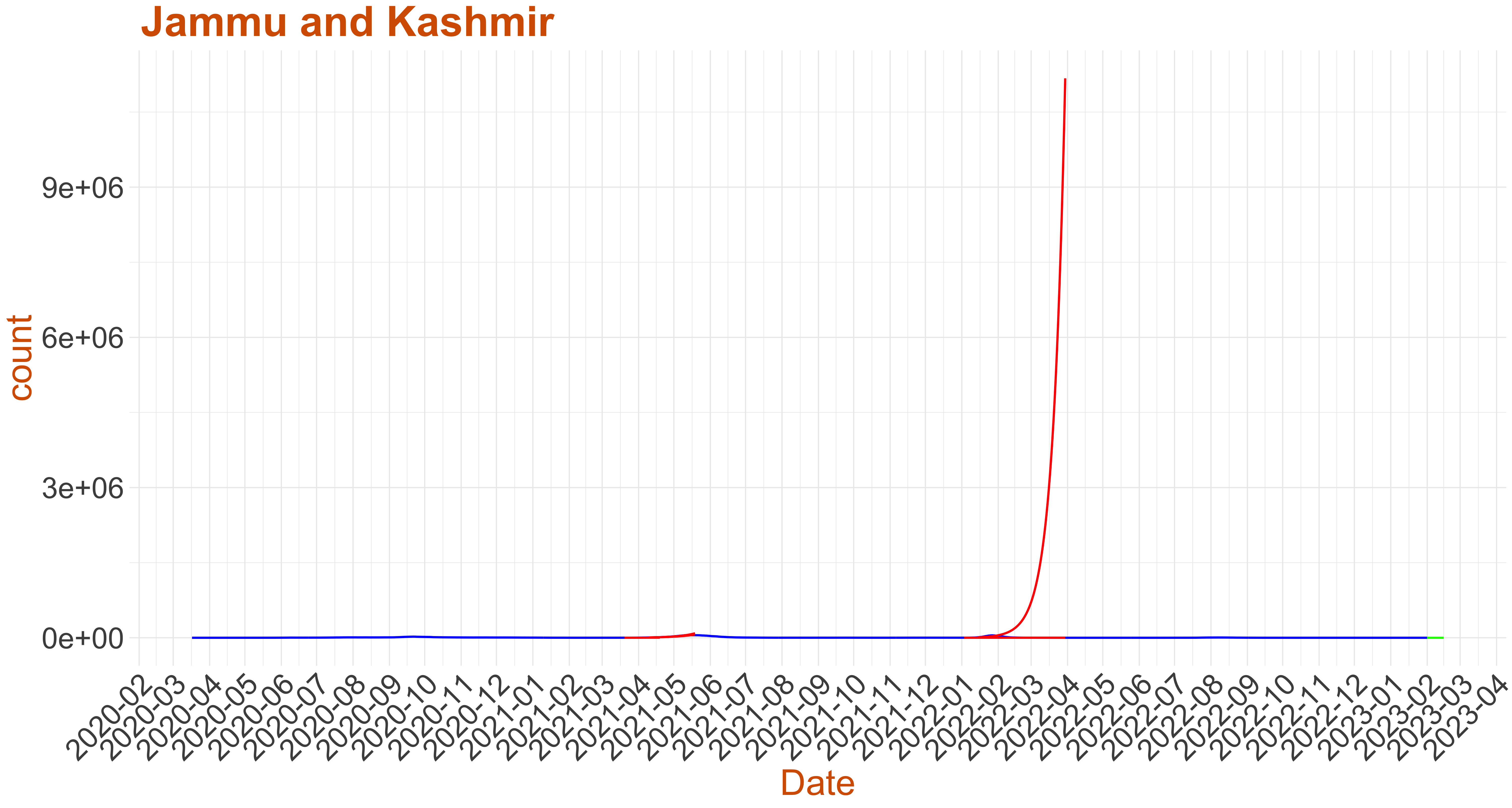
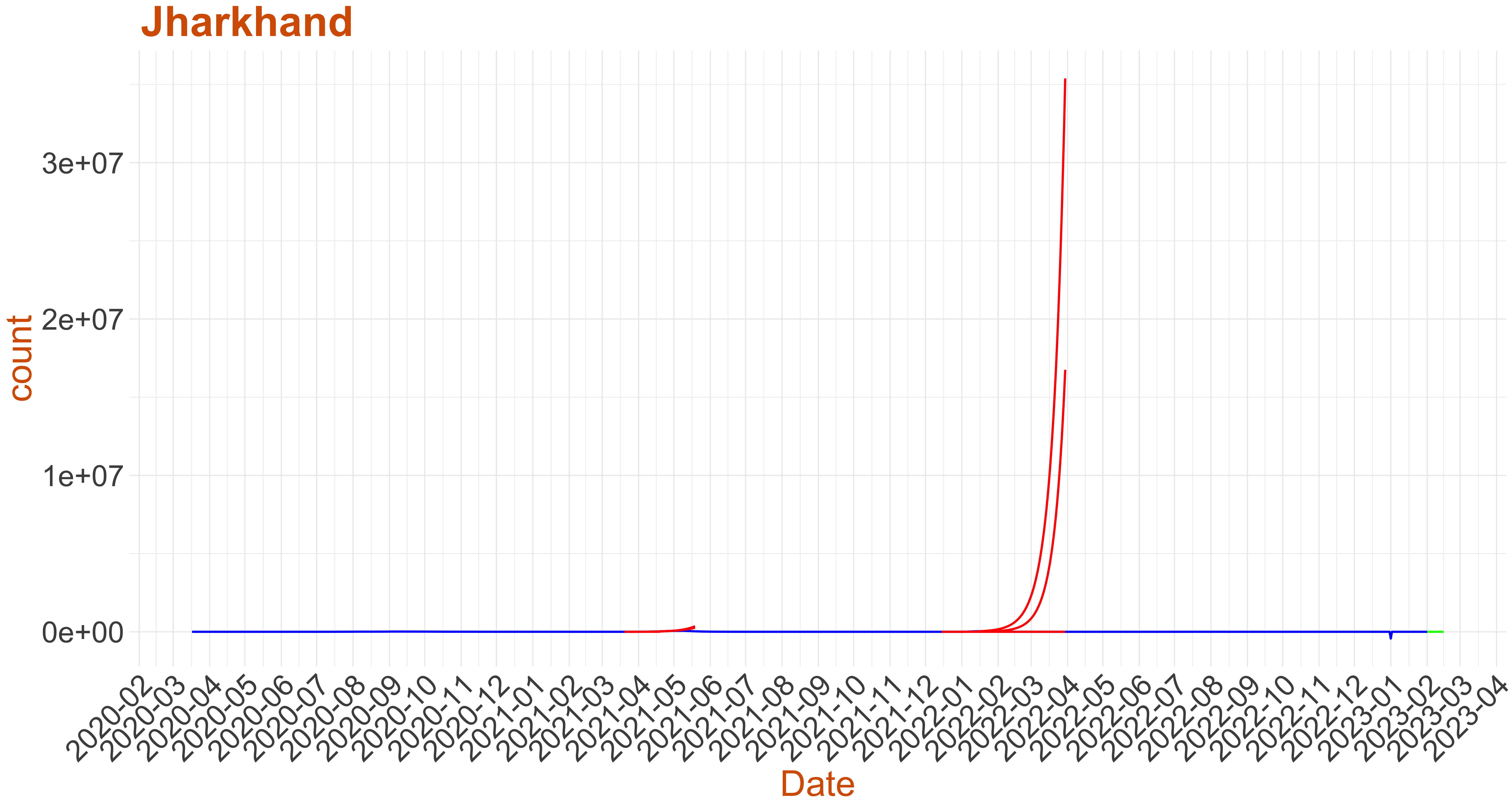
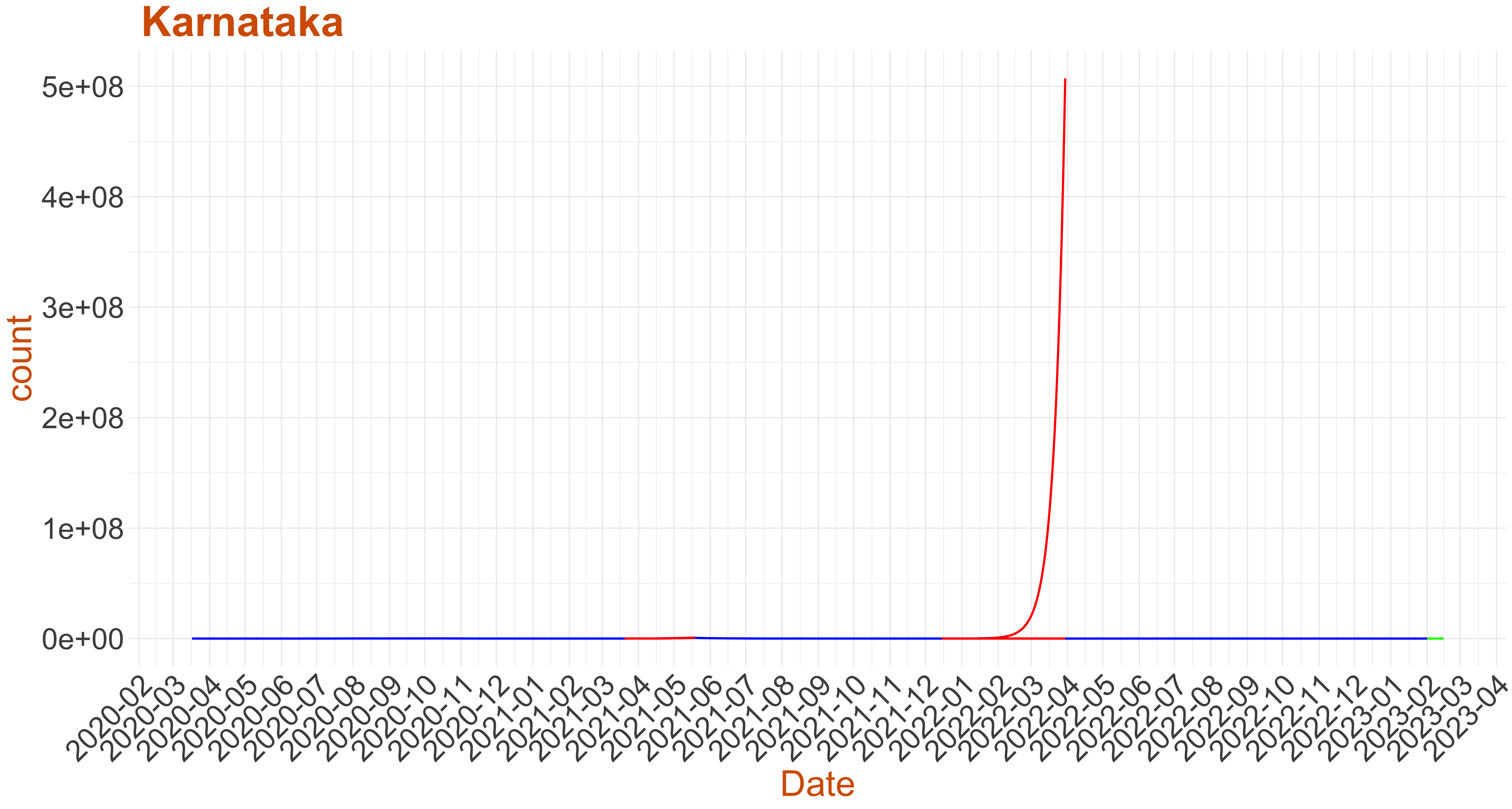
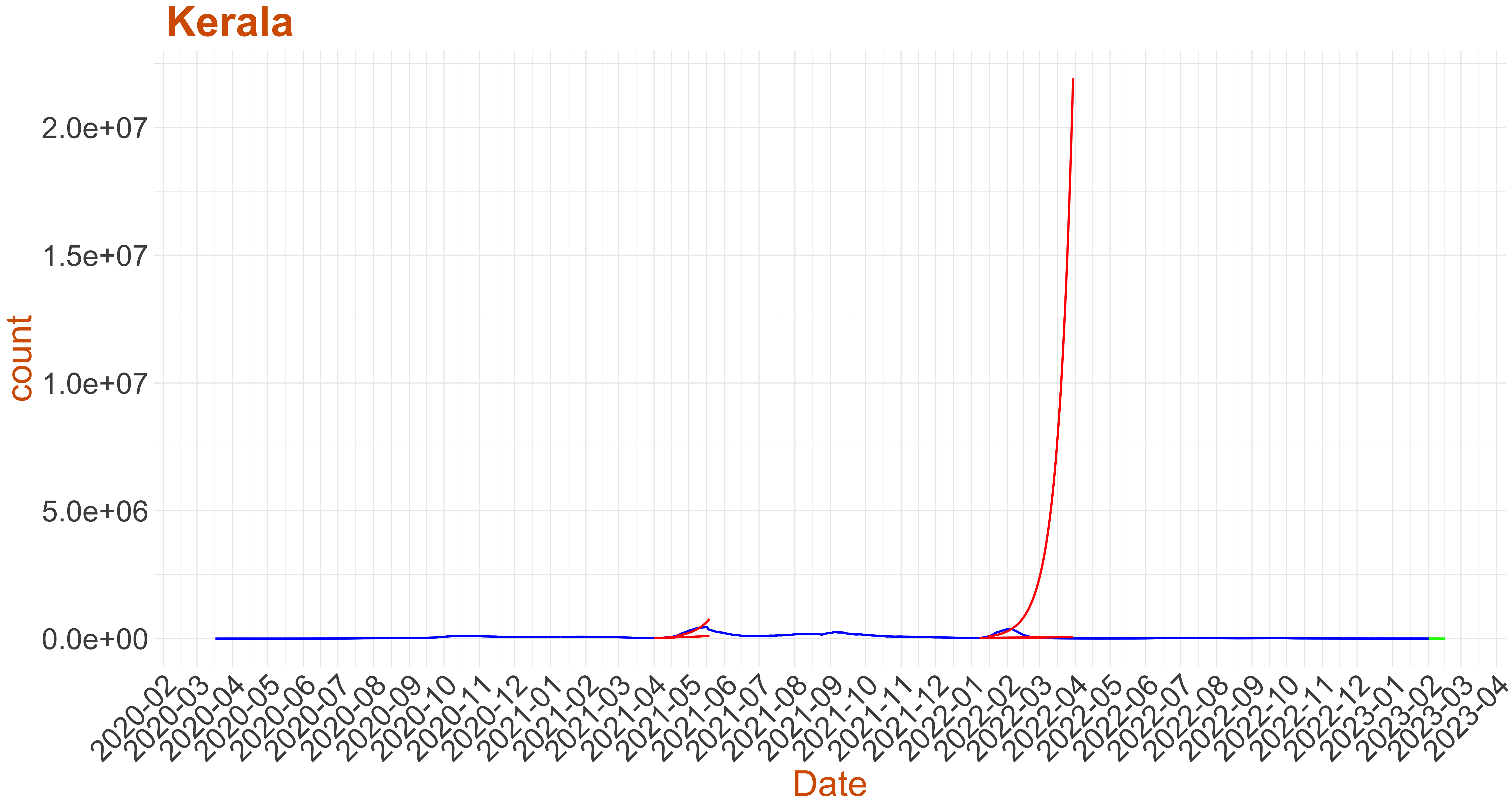
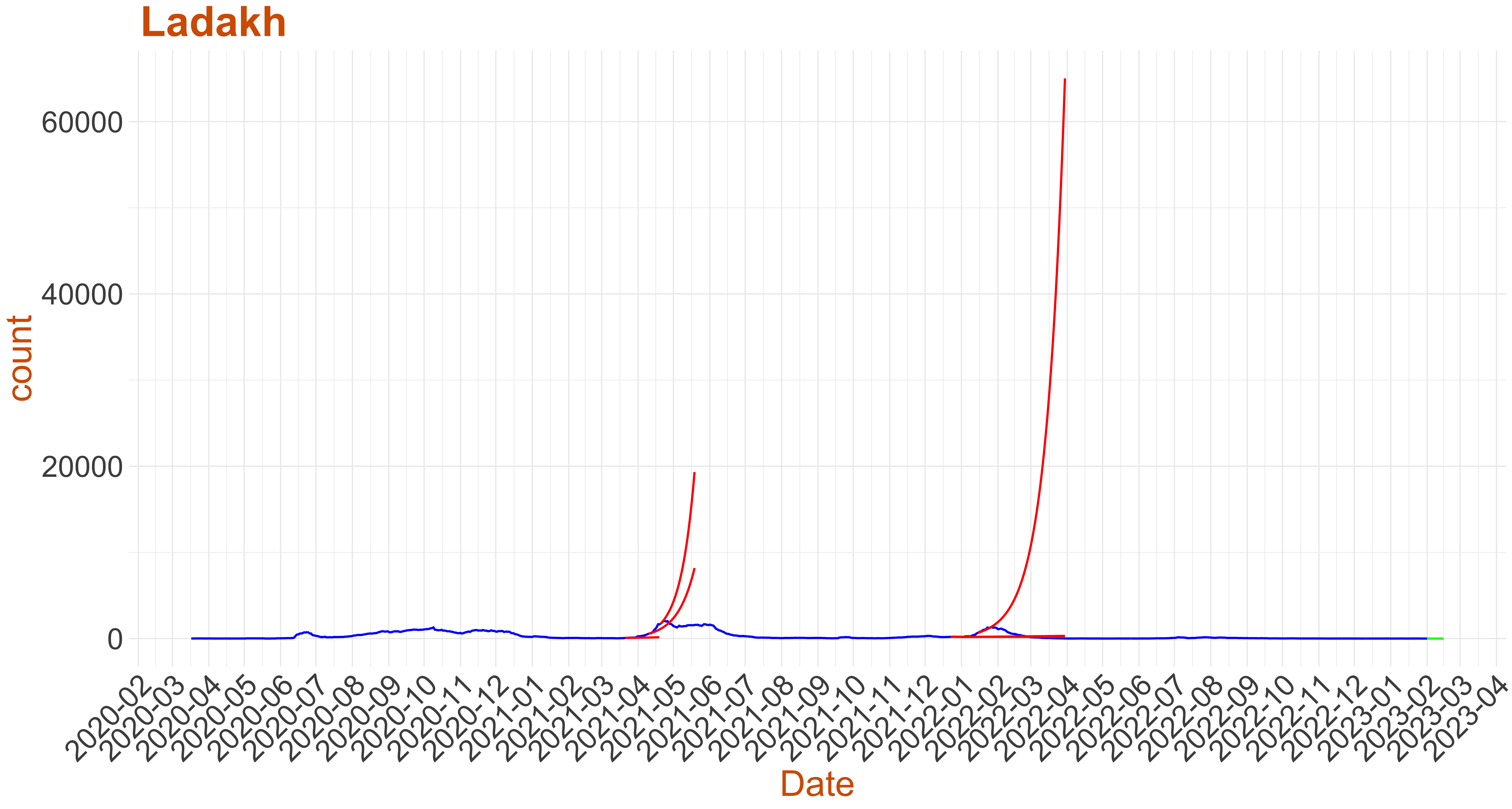
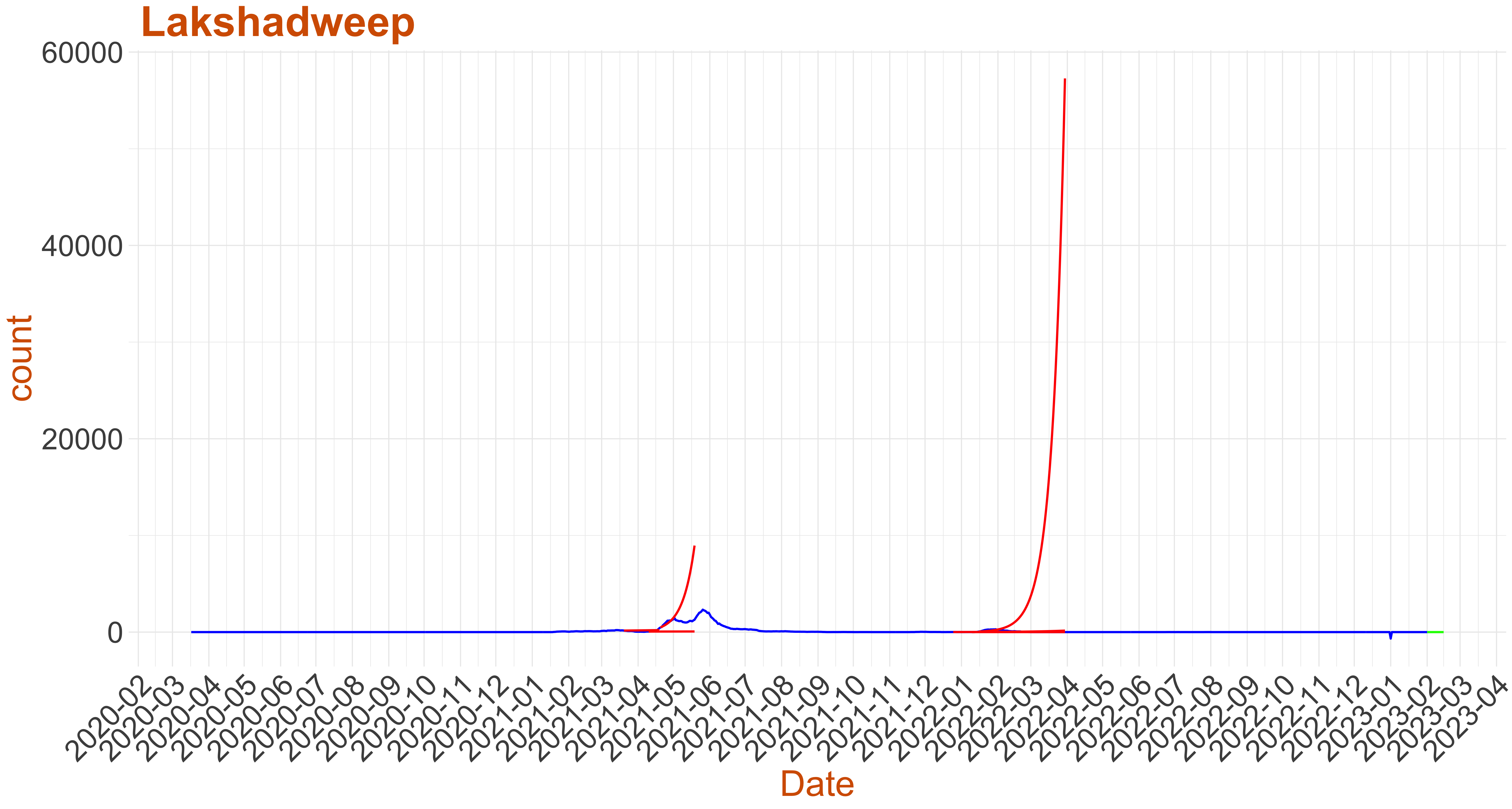
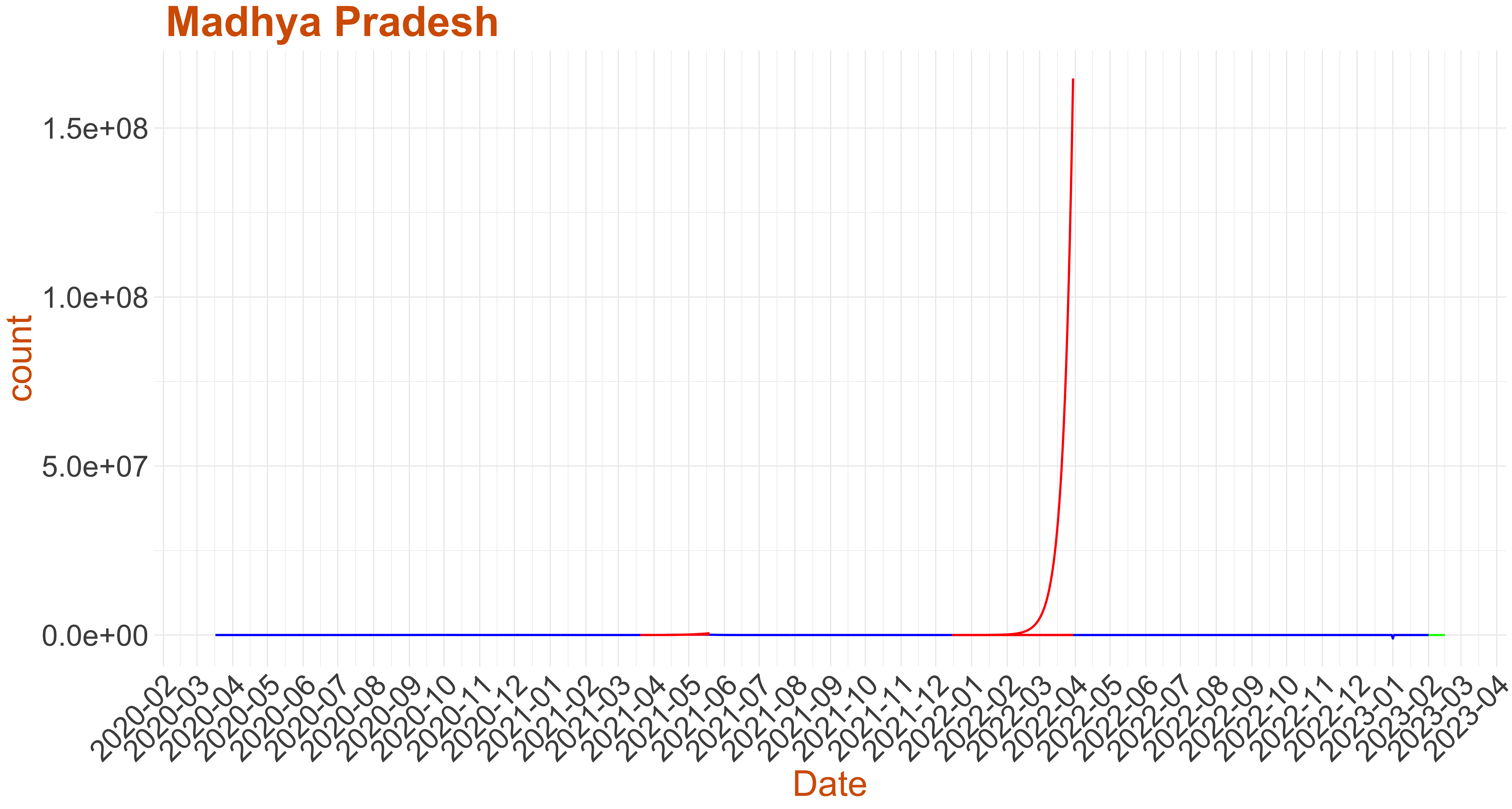
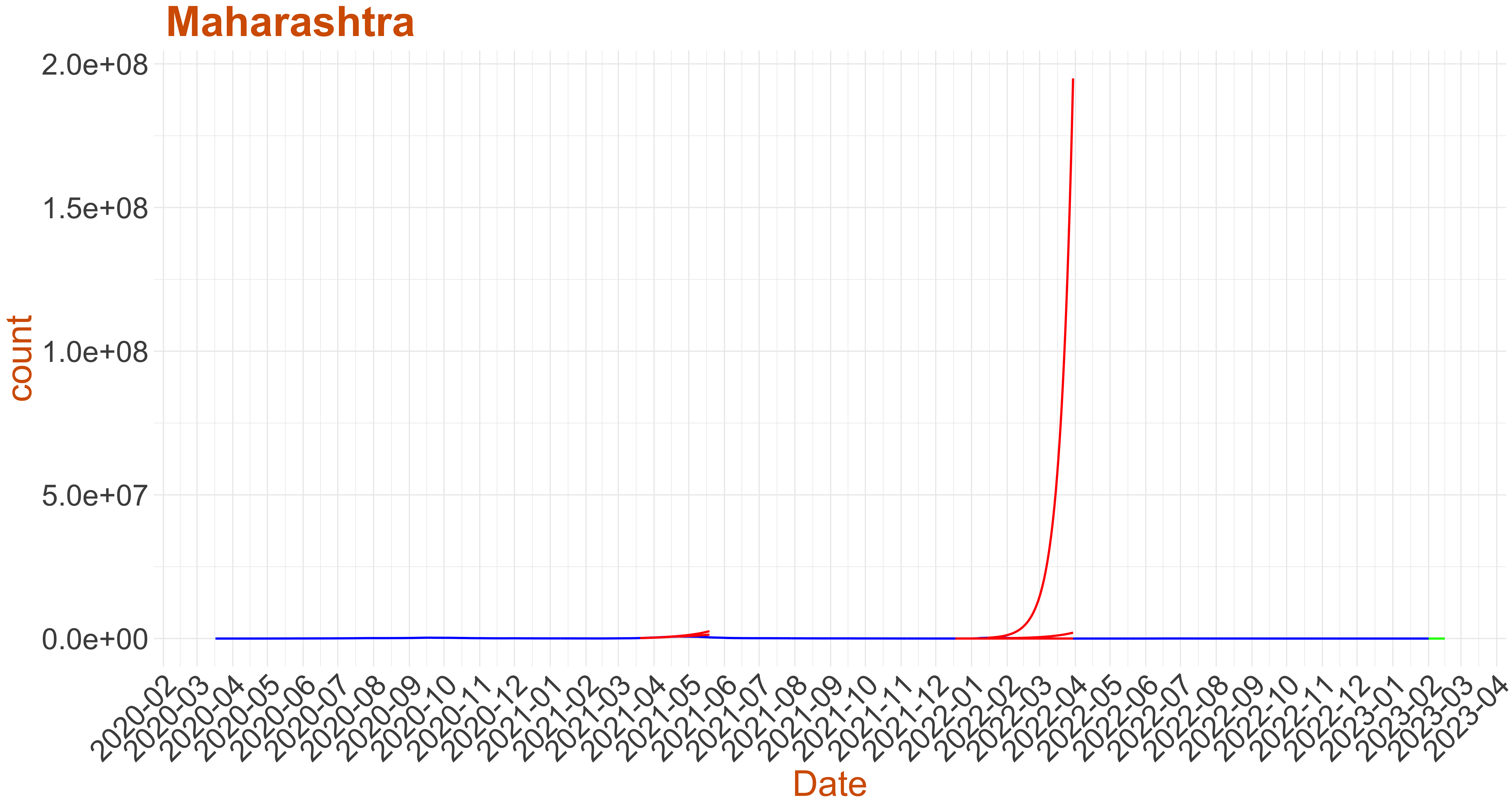
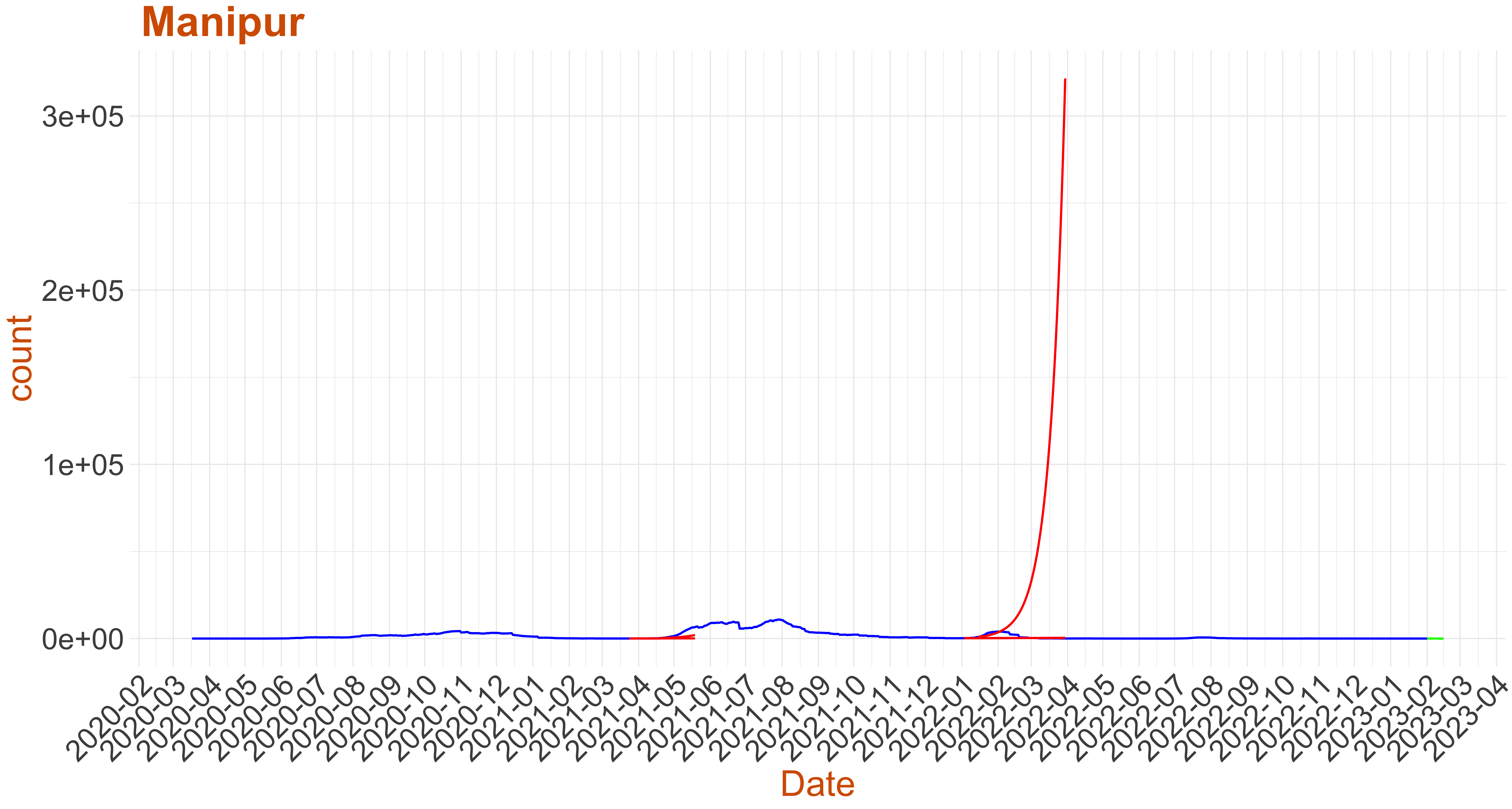
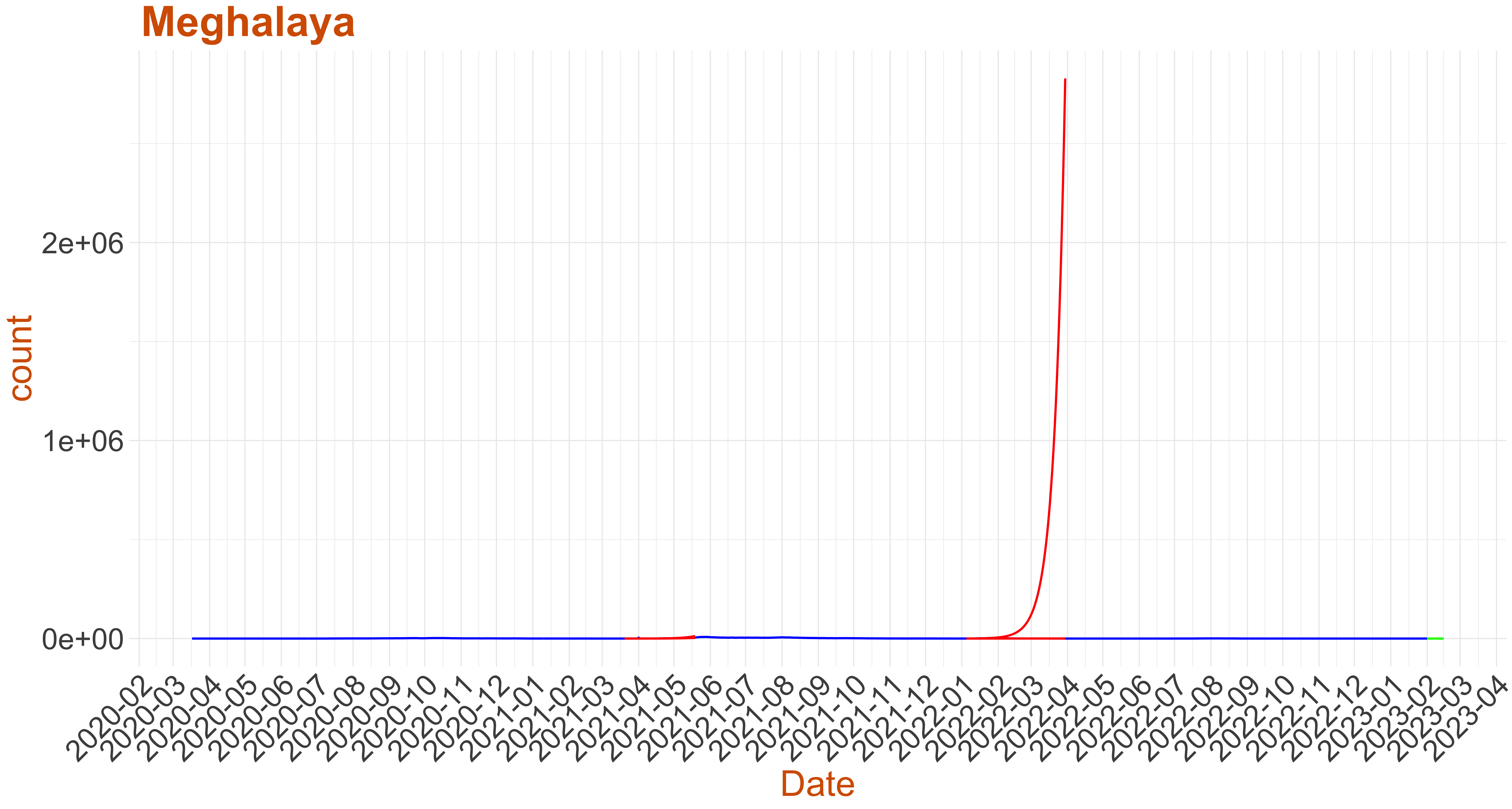
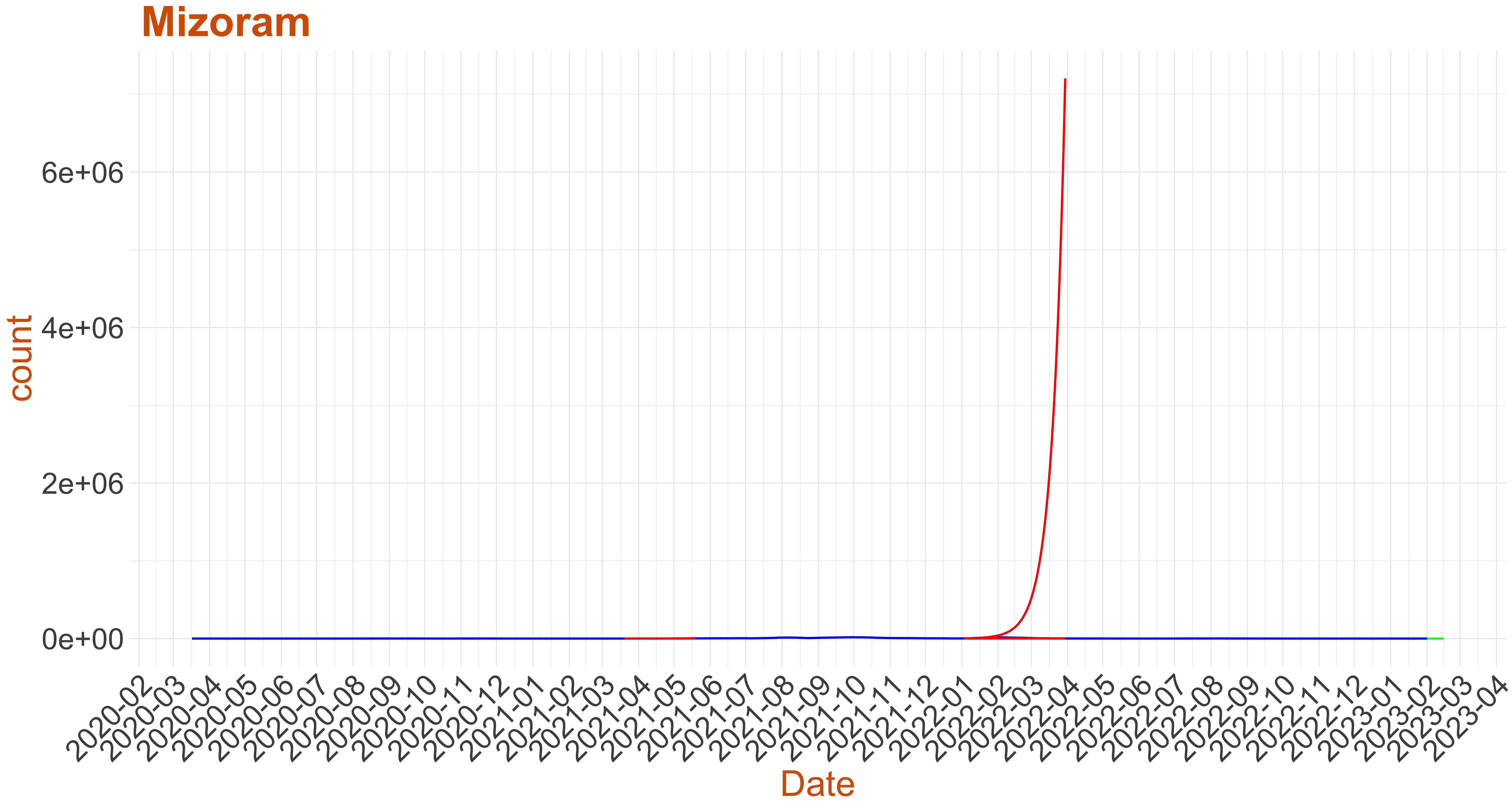
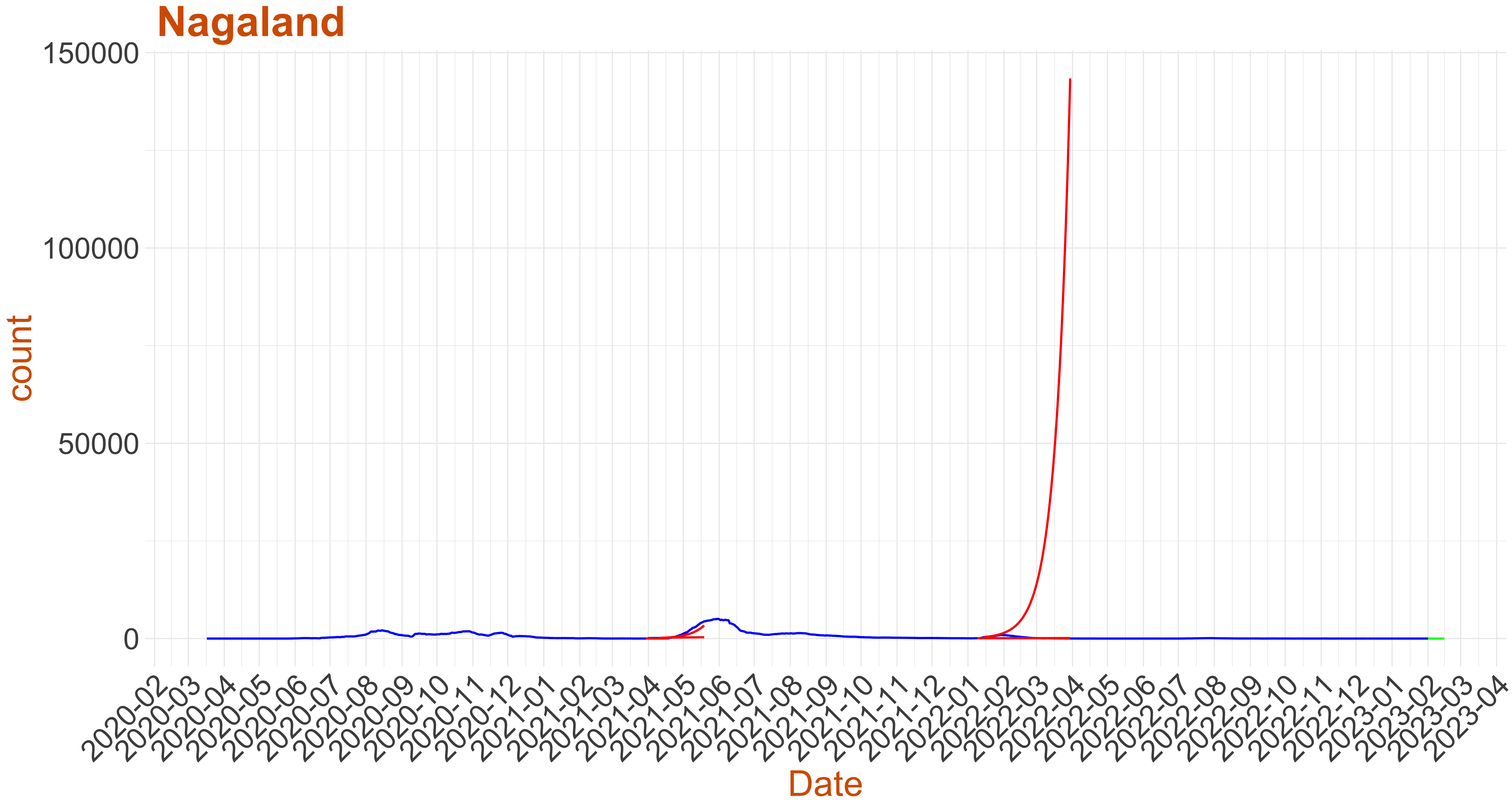
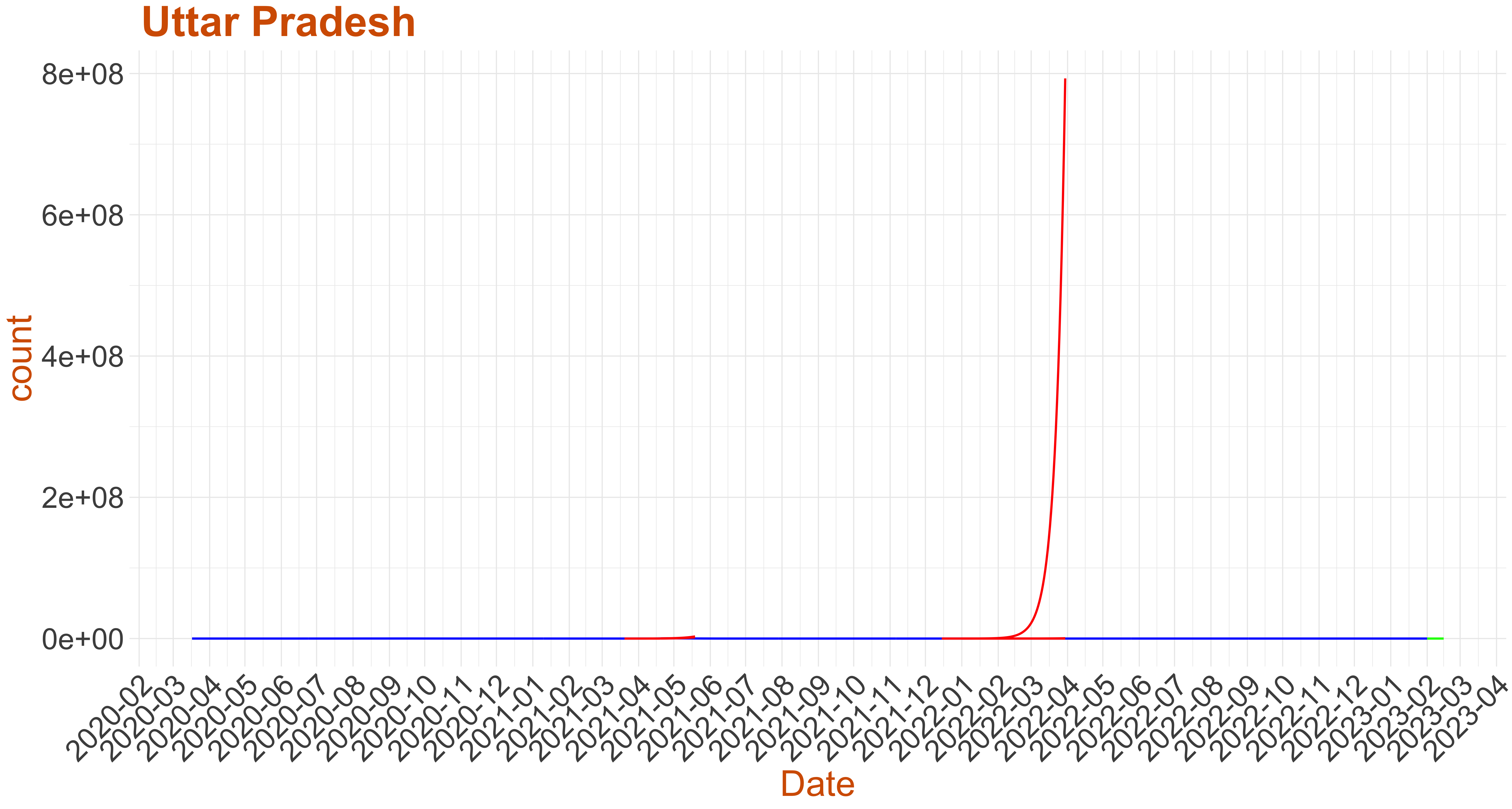
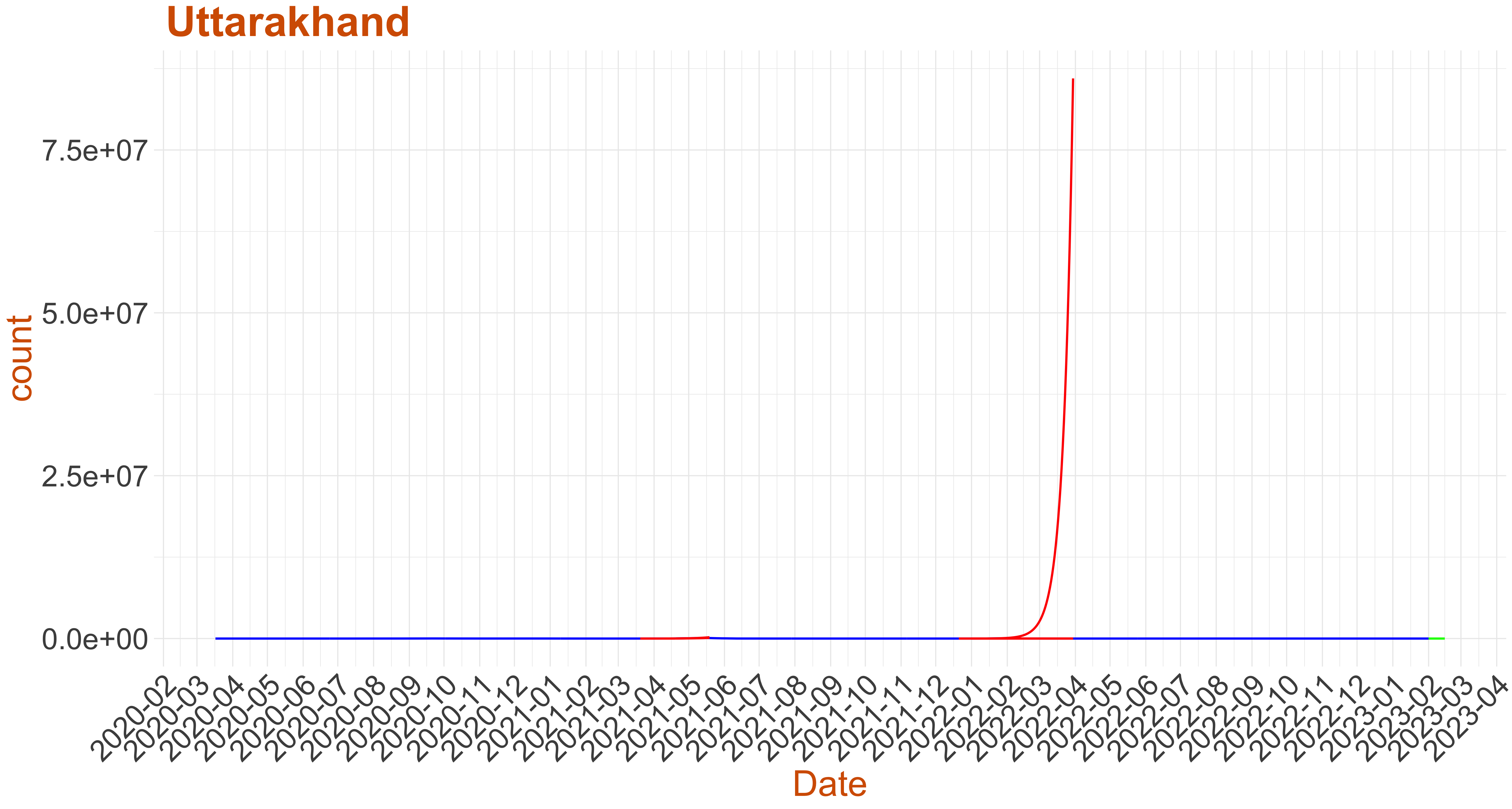
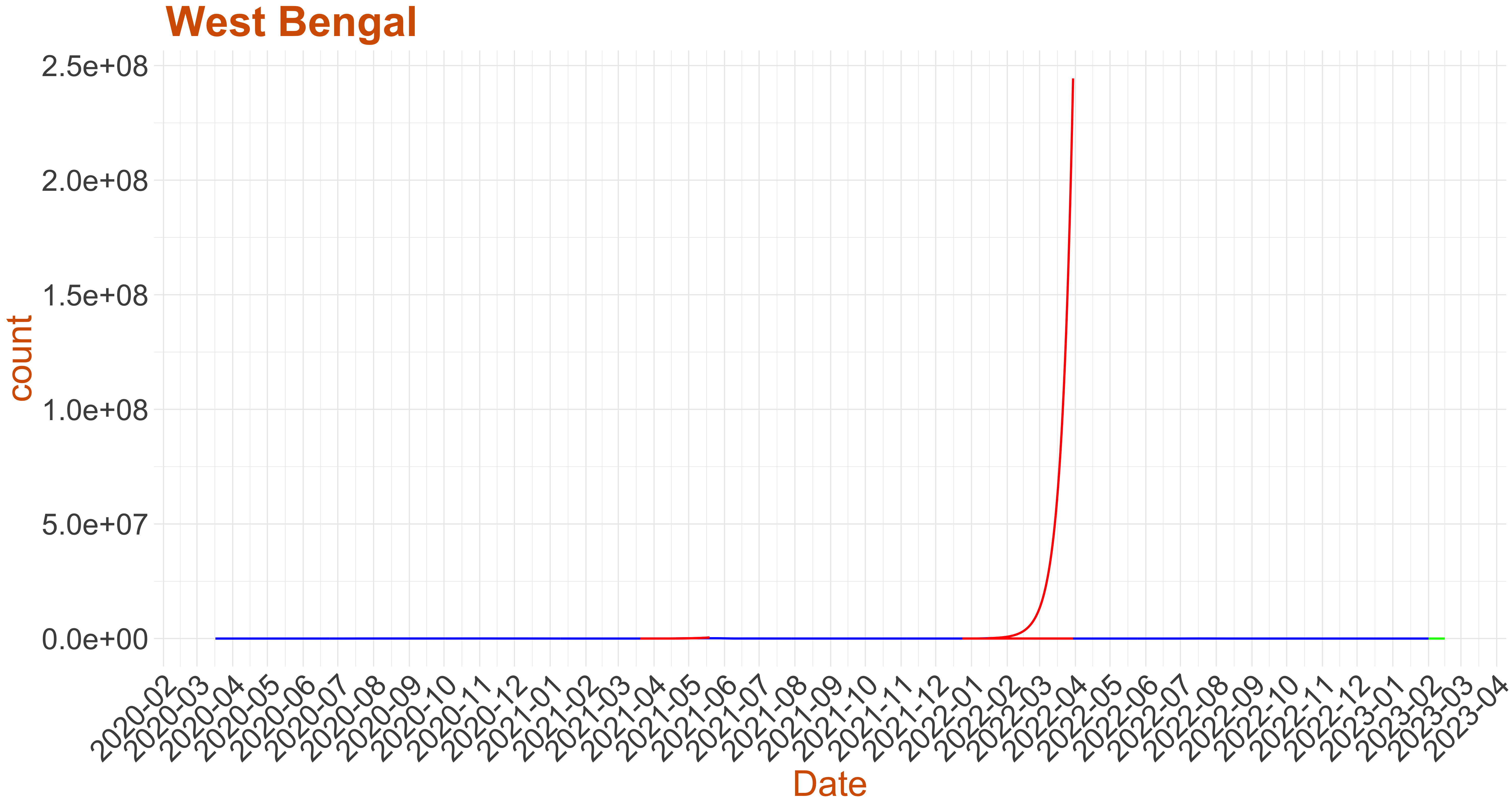
- Below we plot the active cases as reported in blue.
- For the past data we have picked a few critical instances where Growth rate:= the number of new infections per active infection per unit time at time $t$ exceeds recovery rate plot in red the surge in active cases predicted by the warning system (Note: false alarms do happen).
- Finally at the current date we use the model to predict the active cases for the next 14 days. If the green curve is shooting upward then this is an early warning to the respective district.
Caution: The number of Active cases in each state should be taken into account while considering the alert.
We have divided the states into three categories- Category 1: Predicted Days to 1500 cases per million population is less than 100 days and number of active cases is more than 100.
- Category 2: Growing and Daily Cases more than 50 Cases per million Population and number of active cases is more than 100.
- Category 3: Stable but Daily cases above 50 Cases per million Population and number of active cases is more than 100.
- Category 4: Stable or Number of active cases is below 100.
- Data in CSV
For all the graphs on this page, if you click on the image then it will display an interactive graph, where as you hover your mouse pointer over the graph annotations with details will be displayed. 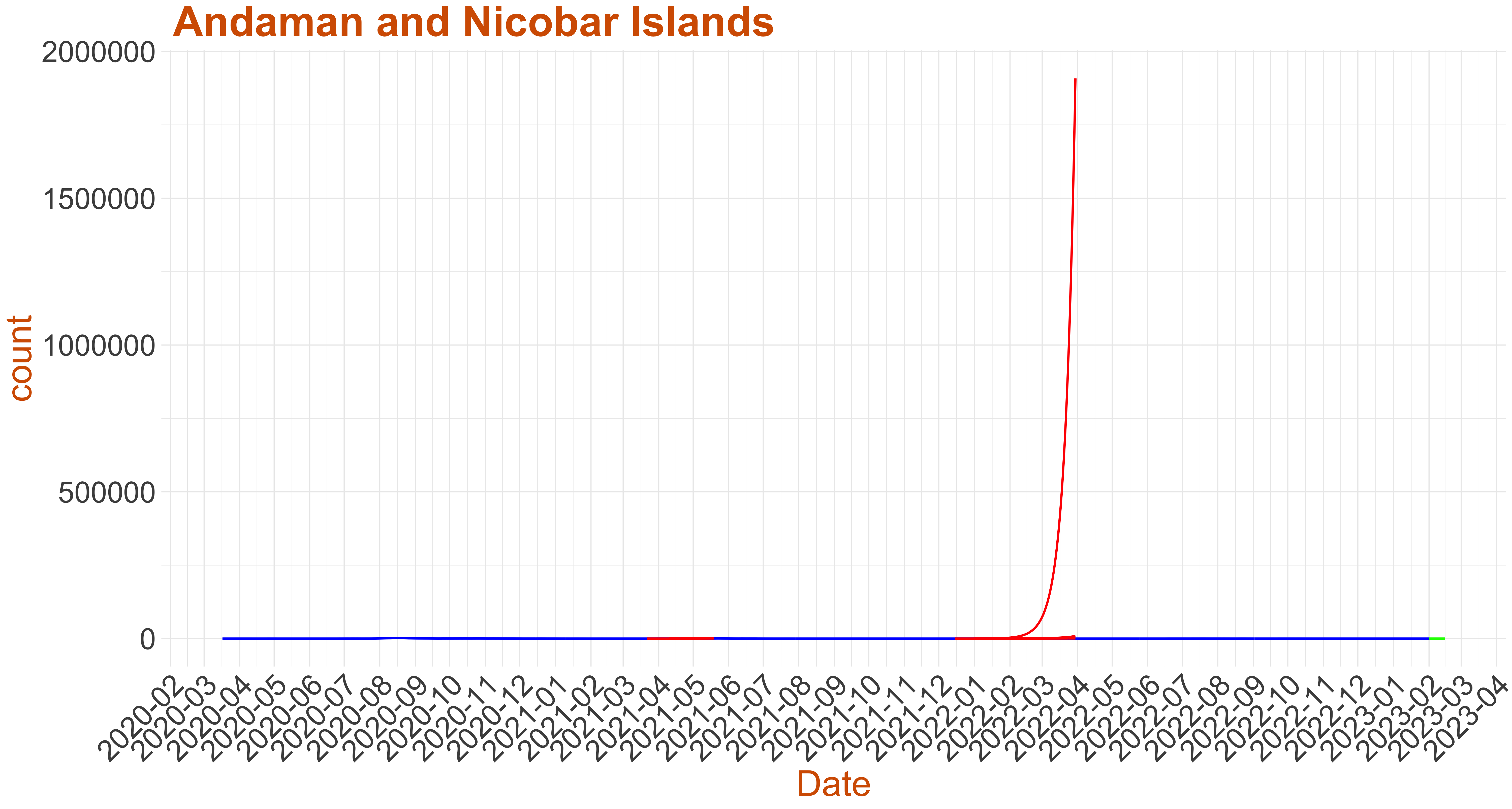 Active Cases: "Current Active Cases", Growth Rate: 0
 Active Cases: 0, Growth Rate: 0.001
 Active Cases: 3, Growth Rate: 0.1107
 Active Cases: 0, Growth Rate: 0.001
 Active Cases: 0, Growth Rate: 0.001
 Active Cases: 3, Growth Rate: 0.158
 Active Cases: 0, Growth Rate: 0.001
 Active Cases: 2, Growth Rate: -0.0173
 Active Cases: 0, Growth Rate: 0.001
 Active Cases: 10, Growth Rate: 0.0565
 Active Cases: 6, Growth Rate: 0.0121
 Active Cases: 8, Growth Rate: -0.0269
 Active Cases: 33, Growth Rate: 0.0625
 Active Cases: 0, Growth Rate: -0.3
 Active Cases: 13, Growth Rate: 0.0718
 Active Cases: 0, Growth Rate: 0.001
 Active Cases: 146, Growth Rate: 0.0974
 Active Cases: 1199, Growth Rate: 0.0703
 Active Cases: 0, Growth Rate: 0.001
 Active Cases: 0, Growth Rate: 0.0607
 Active Cases: 0, Growth Rate: 0.001
 Active Cases: 67, Growth Rate: 0.0226
 Active Cases: 0, Growth Rate: 0.001
 Active Cases: 0, Growth Rate: 0.001
 Active Cases: 0, Growth Rate: 0.001
 Active Cases: 0, Growth Rate: 0.001
 Active Cases: 84, Growth Rate: 0.0845
 Active Cases: 34, Growth Rate: -0.0227
 Active Cases: 18, Growth Rate: 0.0797
 Active Cases: 16, Growth Rate: 0.1067
 Active Cases: 1, Growth Rate: 0.2429
 Active Cases: 40, Growth Rate: 0.0932
 Active Cases: 25, Growth Rate: 0.0732
 Active Cases: 0, Growth Rate: 0.001
 Active Cases: 12, Growth Rate: 0.05
 Active Cases: 13, Growth Rate: 0.0947
 Active Cases: 50, Growth Rate: 0.0729