COVID-19 India-Timeline an understanding across States and Union Territories
Karnataka Testing Data

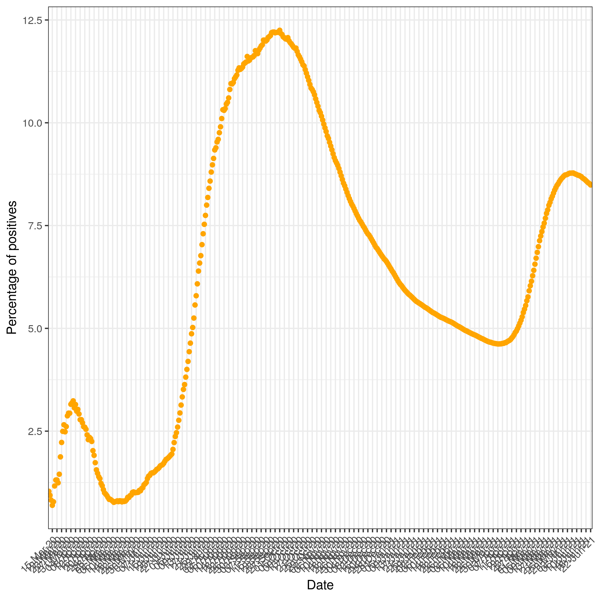
In the above graph the orange line is the number of total tests done daily and the red line is the number of tests found positive daily. The percentage of positive tests is an indication of the prevalence of the infection in the population. Below we have plotted, the total number of positives tests upto that day over the culumative tests done upto that day.


