COVID-19 India-Timeline an understanding across States and Union Territories
Early Warning System for Districts
- Goals
- prediction of number of active cases in the next two weeks;
- days to critical (i.e. the number of days in which active cases will test health care infrastructure at current rate of growth); and
- early warning before the active cases increase substantially.
- Summary of Method
From the daily reported cases, create a stable early warning system based on each district's health care infrastructure capacity that provides:
For details and limitations of the method we refer to Early Prediction of COVID Surge-Slides.
Summary:
Suppose $\active{t}$ is the total number of active cases at time $t$ and the relative growth rate $\ractive{t}$ is the number of new infections per active infection per unit time at time $t$. Assuming constant recovery : $\rinactive{t} \equiv 1/10$ we can estimate $$ \ractivehat{t} = 0.1 + \frac{ \active{t + 7} - \active{t} }{ 7 \cdot \active{t} } $$ Note that at time $t$, $\ractivehat{t} > 0.1$ implies active cases will increase over time and $\ractivehat{t} < 0.1$ implies active cases will decrease over time. To predict active cases at any given time, we average the last 4 calculated values of $\ractivehat{t}$ on that date and then use this average as the growth rate for the prediction.
Days: For the plots below, we have assumed that health infrastructure capacity in a district is proportional to its population. Hence we have used Days to 50 active cases per million Population and Days to 1500 active cases per million Population as markers for health care infrastructure capacity.
Days to Critical to previous peak: In the slides at: Estimated Growth Rate of Active Infections for districts in Karnataka are plotted along with days to critical, we assume the health-care infrastructure capacity to have been exceeded when it reaches the previously attained peak. For predicting the days to previous peak we do a smoothening of the data and use $1$ day lag instead of the $7$ day lag used otherwise.
- Category 1: Predicted Days to 1500 Active cases per million population is less than 100 days
- Category 2: Growing and Alert Raised
- Category 3: Stable but Need to be watched
- Category 4: Stable
- Data in CSV
- Data in HTML
| Days to | Days to | |||
|---|---|---|---|---|
| State | Active Cases | GrowthRate | 50 Active Cases | 1500 Active Cases |
| p.m.p | p.m.p | |||
| Dharwad | 1 | 0.243 | 35 | 61 |
| Tumakuru | 8 | 0.191 | 33 | 72 |
| Days to | Days to | |||
|---|---|---|---|---|
| State | Active Cases | GrowthRate | 50 Active Cases | 1500 Active Cases |
| p.m.p | p.m.p | |||
| Bengaluru Rural | 2 | 0.1 | ||
| Bidar | 110 | 0.107 | 0 | |
| Chamarajanagar | 4 | 0.11 | ||
| Chitradurga | 0 | 0.121 | ||
| Gadag | 8 | 0.1 | ||
| Koppal | 3 | 0.111 | ||
| Udupi | 1 | 0.136 | 120 | |
| Uttara Kannada | 0 | 0.121 | ||
| Yadgir | 0 | 0.121 | ||
| State | Active Cases | GrowthRate | ||
|---|---|---|---|---|
| Chikkaballapur | 11 | 0.087 | ||
| Davanagere | 10 | 0.099 | ||
| | ||||
|---|---|---|---|---|
| State | Active Cases | GrowthRate | ||
| Bagalkot | 0 | -0.007 | ||
| Ballari | 0 | 0.001 | ||
| Belgaum | 2 | 0.029 | ||
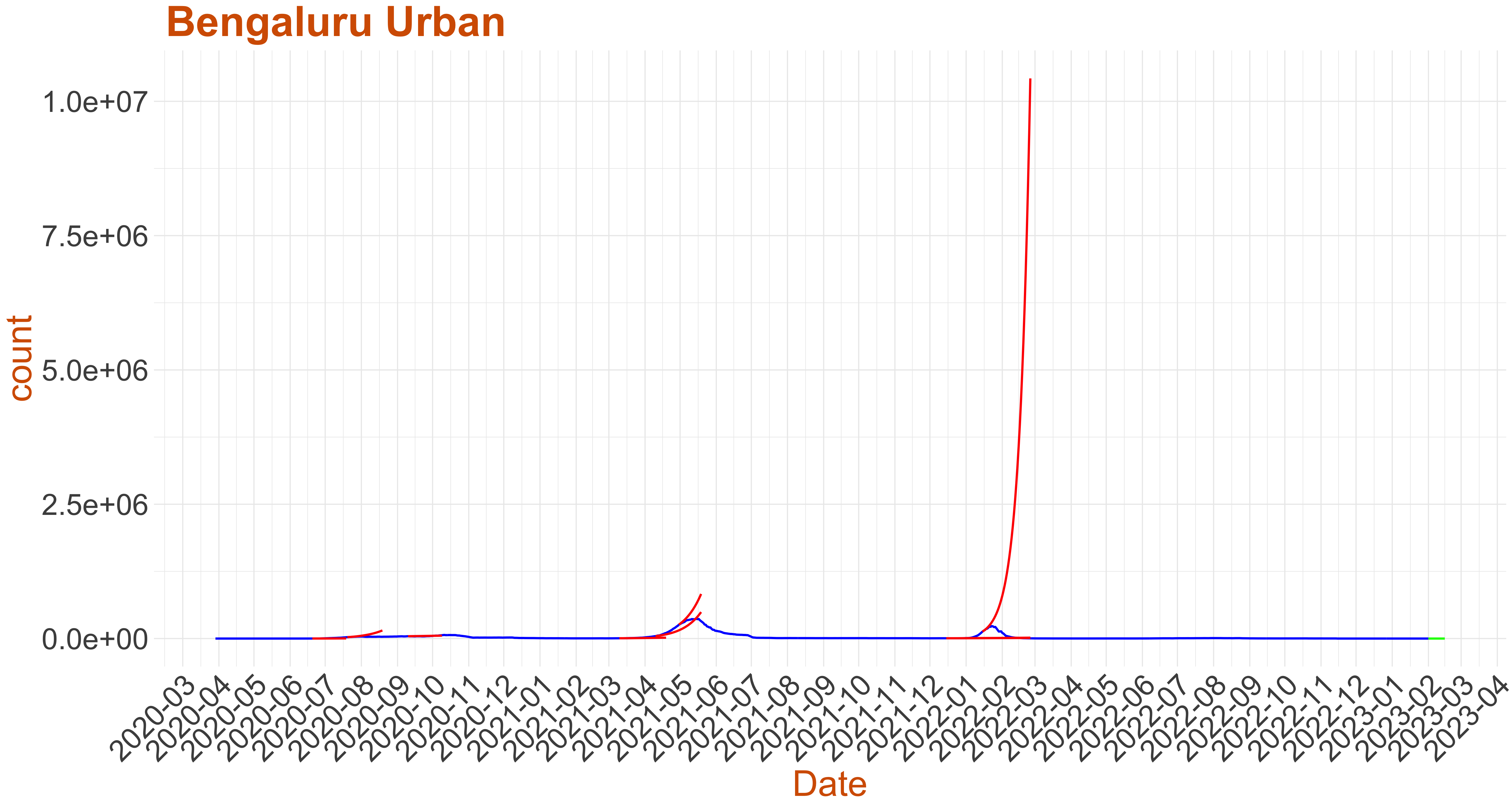
| Bengaluru Urban | 2 | -0.186 | ||
| Chikmagalur | 1 | -0.186 | ||
| Dakshina Kannada | 0 | 0.001 | ||
| Hassan | 0 | 0.001 | ||
| Haveri | 4 | -0.067 | ||
| Kalaburagi | 0 | 0.001 | ||
| Kodagu | 0 | 0.001 | ||
| Kolar | 4 | -0.043 | ||
| Mandya | 0 | 0.05 | ||
| Mysuru | 1 | 0.075 | ||
| Raichur | 2 | 0.076 | ||
| Ramanagar | 1 | 0.05 | ||
| Shivamogga | 0 | 0.043 | ||
| Vijayapura | 0 | 0.001 | ||
Predicted Days to 1500 Active cases per million population is less than 100 days
- Below we plot the active cases as reported in blue.
- For the past data we have picked a few critical instances where Growth rate:= the number of new infections per active infection per unit time at time $ exceeds recovery rate plot in red the surge in active cases predicted by the warning system (Note: false alarms do happen).
- Finally at the current date we use the model to predict the active cases for the next 14 days. If the green curve is shooting upward then this is an early warning to the respective district.
- For predicting the days to previous peak we do a smoothening of the data and use $1$ day lag instead of the $7$ day lag used otherwise.
- For the plots below, we have assumed that health infrastructure capacity in a district is proportional to its population. Hence we have used Days to 50 Active cases per million Population and Days to 1500 Active cases per million Population as markers for health care infrastructure capacity. Based on these we have divided the districts into four categories
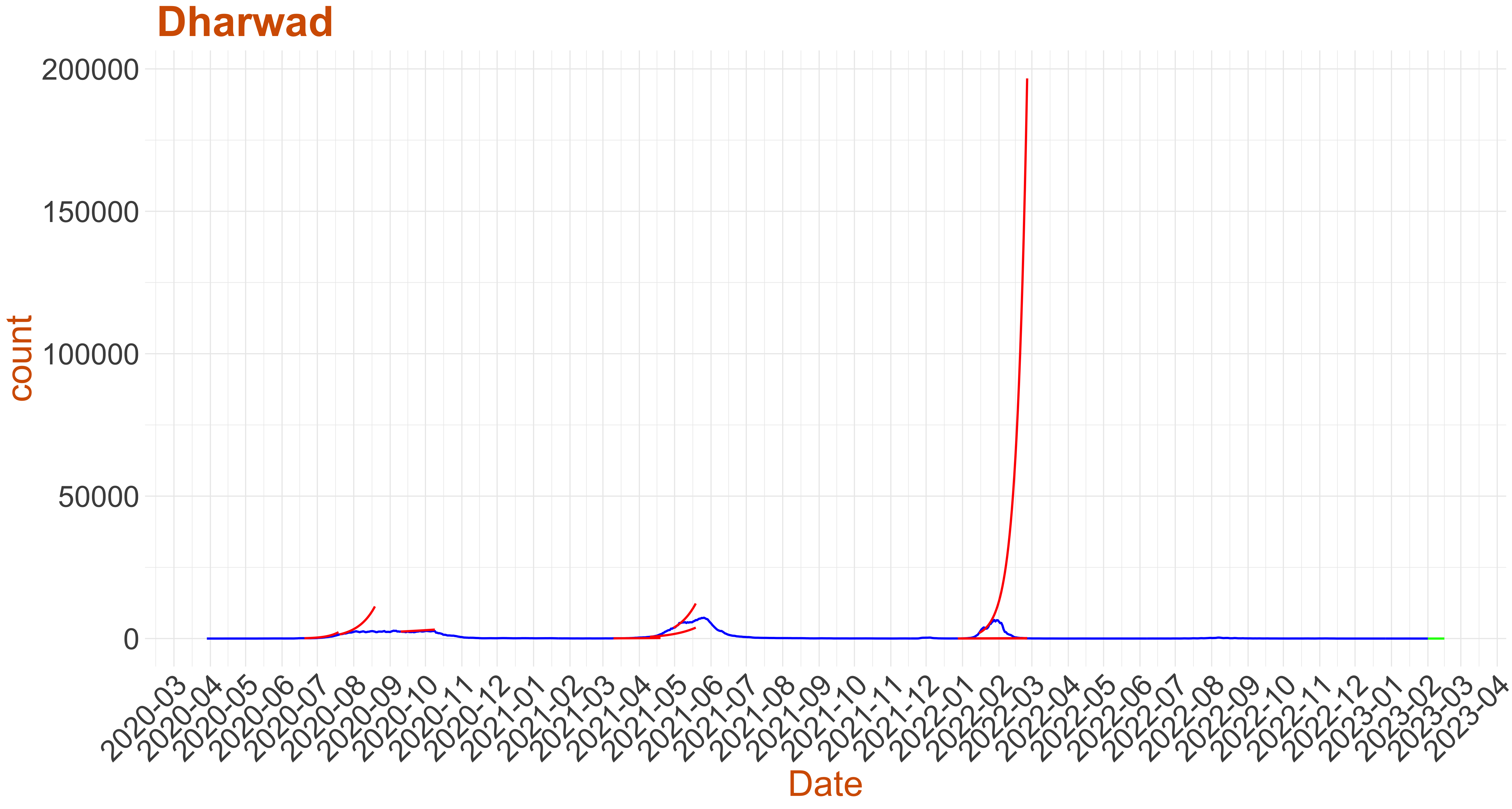 Active Active cases: 1, Growth Rate: 0.243
Days to 50 Active cases per million population: 35
Days to 1500 Active cases per million population is 61
Days to Critical to previous peak
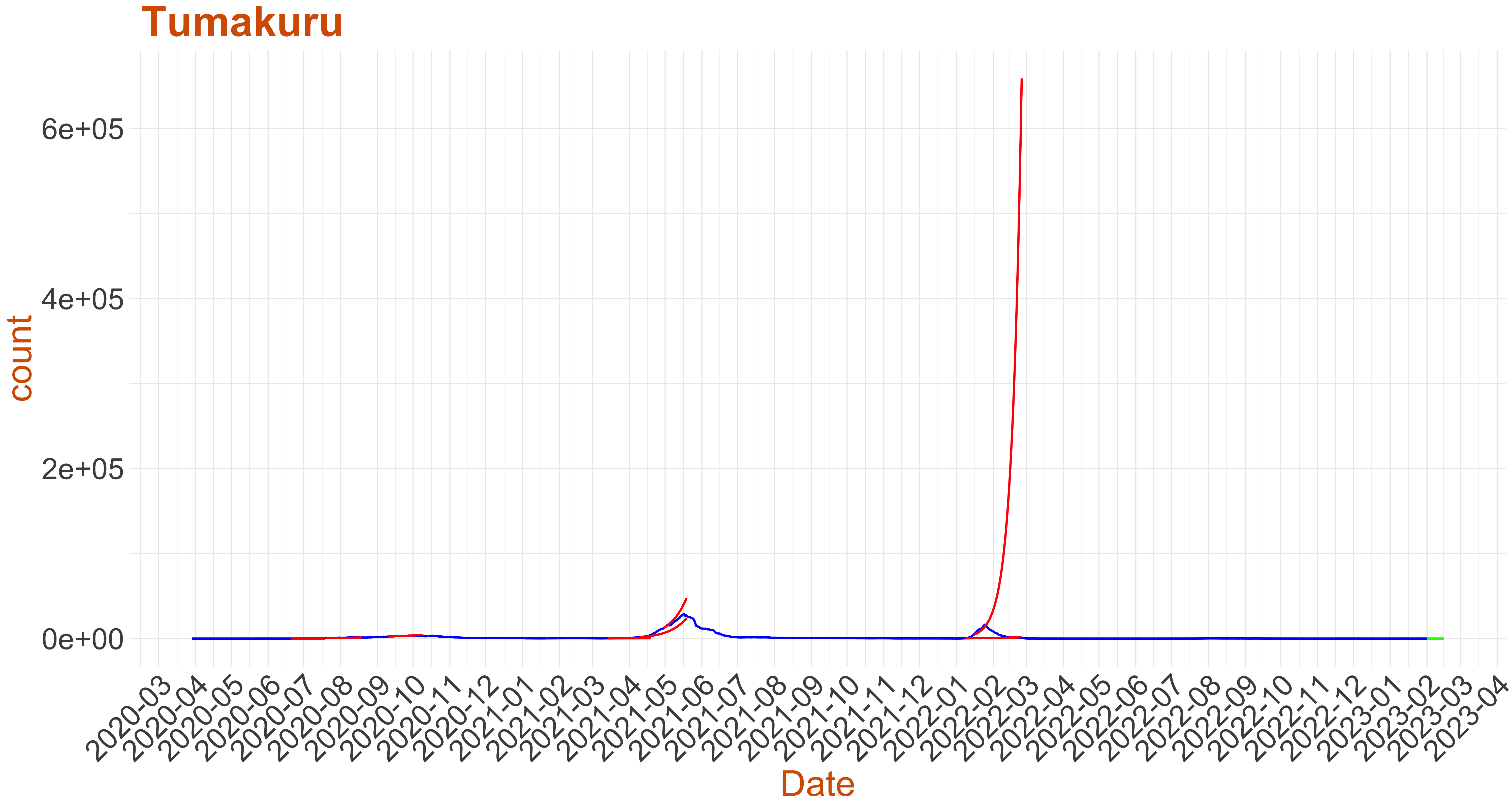 Active Active cases: 8, Growth Rate: 0.191
Days to 50 Active cases per million population: 33
Days to 1500 Active cases per million population is 72
Days to Critical to previous peak
Growing and Alert Raised
- Below we plot the active cases as reported in blue.
- For the past data we have picked a few critical instances where Growth rate:= the number of new infections per active infection per unit time at time $ exceeds recovery rate plot in red the surge in active cases predicted by the warning system (Note: false alarms do happen).
- Finally at the current date we use the model to predict the active cases for the next 14 days. If the green curve is shooting upward then this is an early warning to the respective district.
- For predicting the days to previous peak we do a smoothening of the data and use $1$ day lag instead of the $7$ day lag used otherwise.
- For the plots below, we have assumed that health infrastructure capacity in a district is proportional to its population. Hence we have used Days to 50 Active cases per million Population and Days to 1500 Active cases per million Population as markers for health care infrastructure capacity. Based on these we have divided the districts into four categories
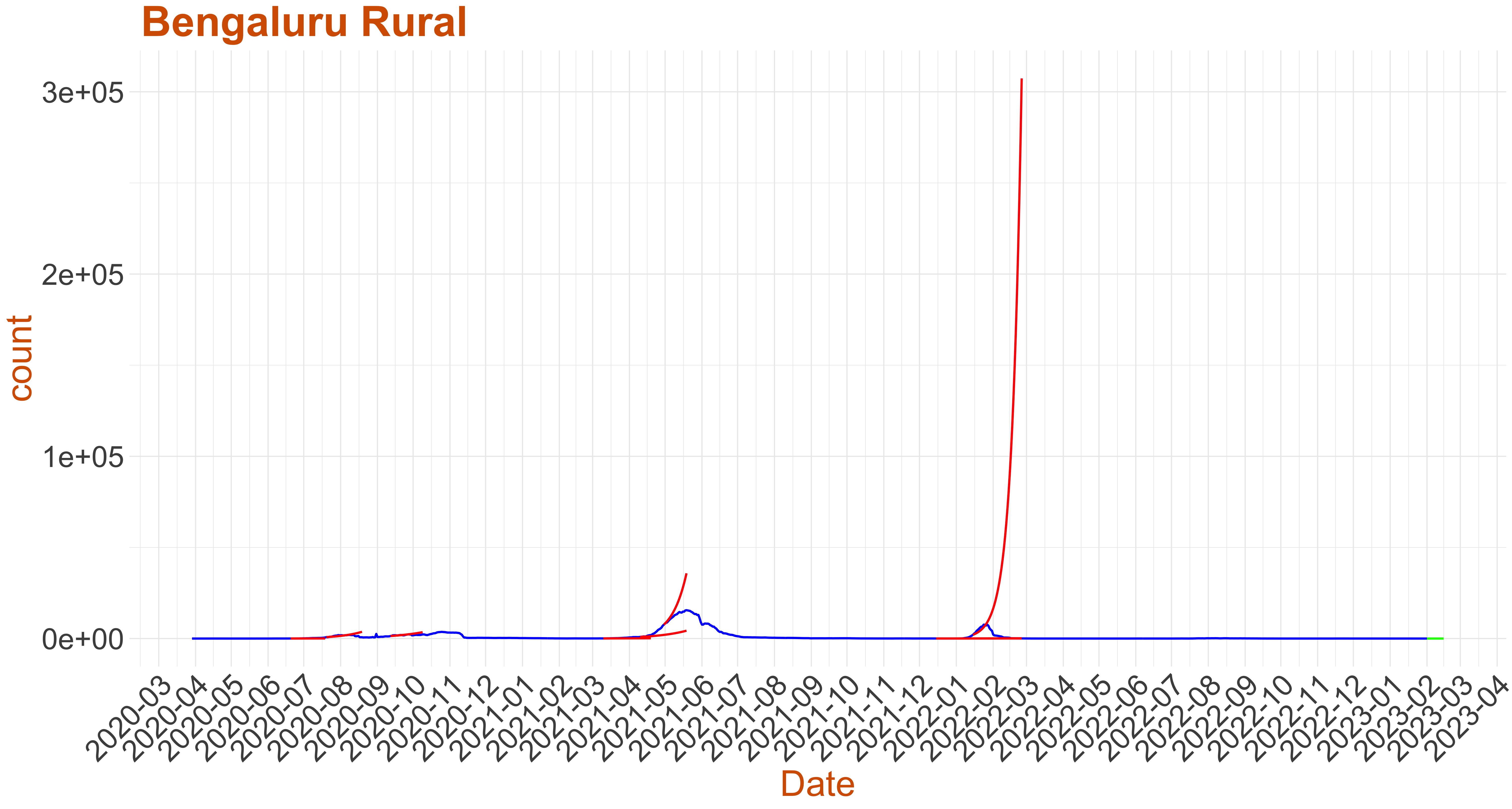 Active Cases: 2, Growth Rate: 0.1
Days to 50 Active Cases per million population:
Days to Critical to previous peak
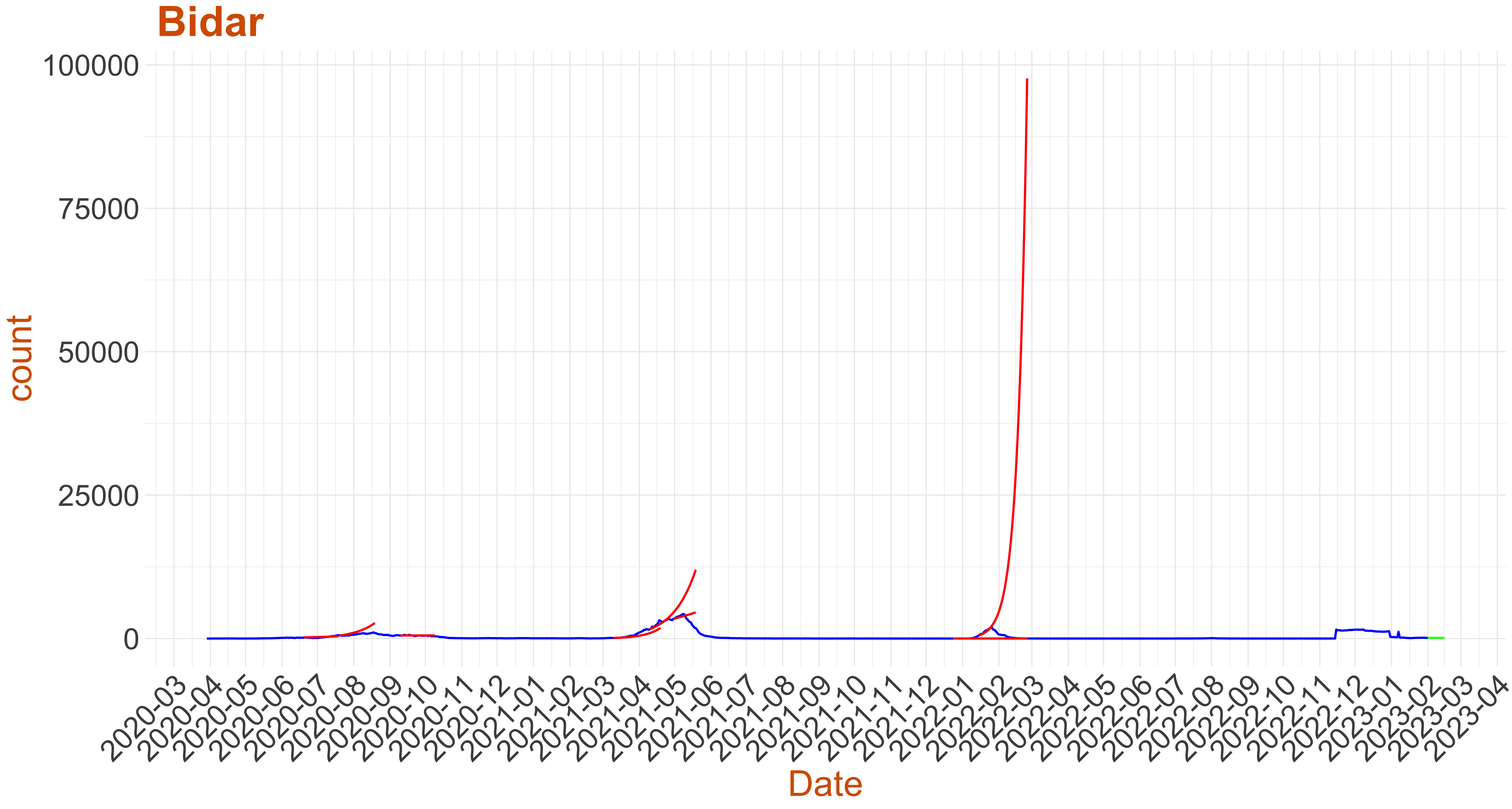 Active Cases: 110, Growth Rate: 0.107
Days to 50 Active Cases per million population: 0
Days to Critical to previous peak
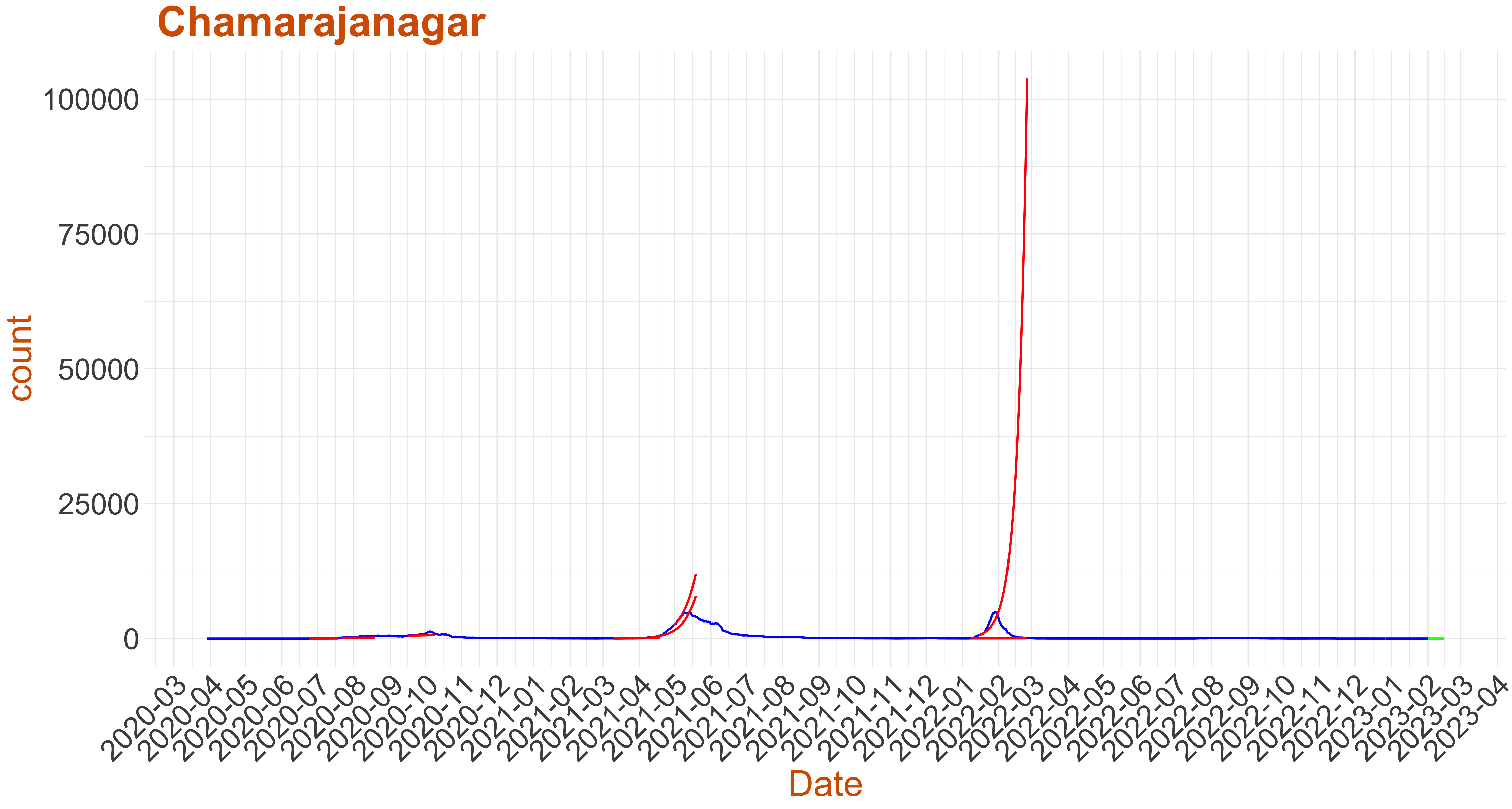 Active Cases: 4, Growth Rate: 0.11
Days to 50 Active Cases per million population:
Days to Critical to previous peak
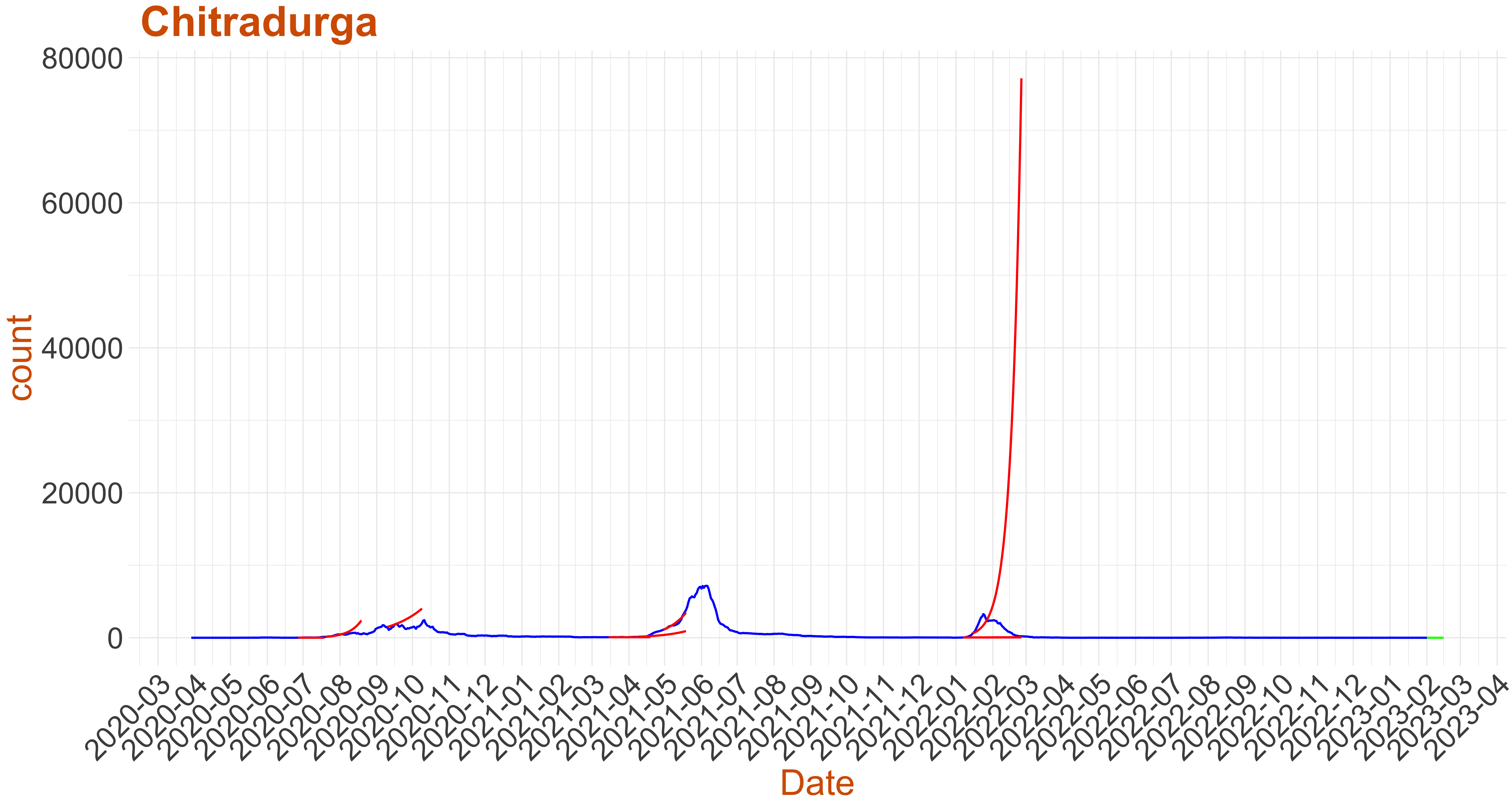 Active Cases: 0, Growth Rate: 0.121
Days to 50 Active Cases per million population:
Days to Critical to previous peak
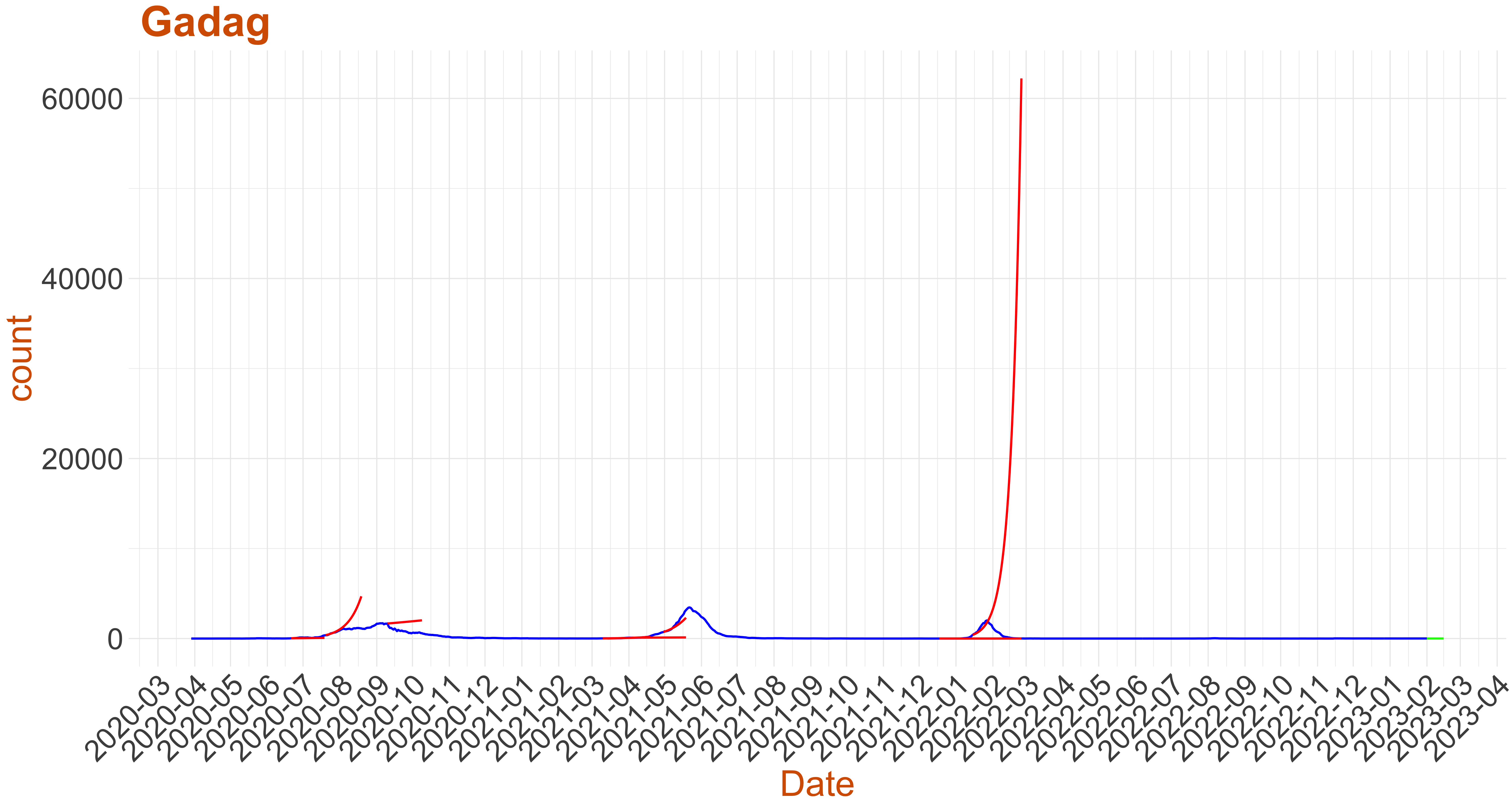 Active Cases: 8, Growth Rate: 0.1
Days to 50 Active Cases per million population:
Days to Critical to previous peak
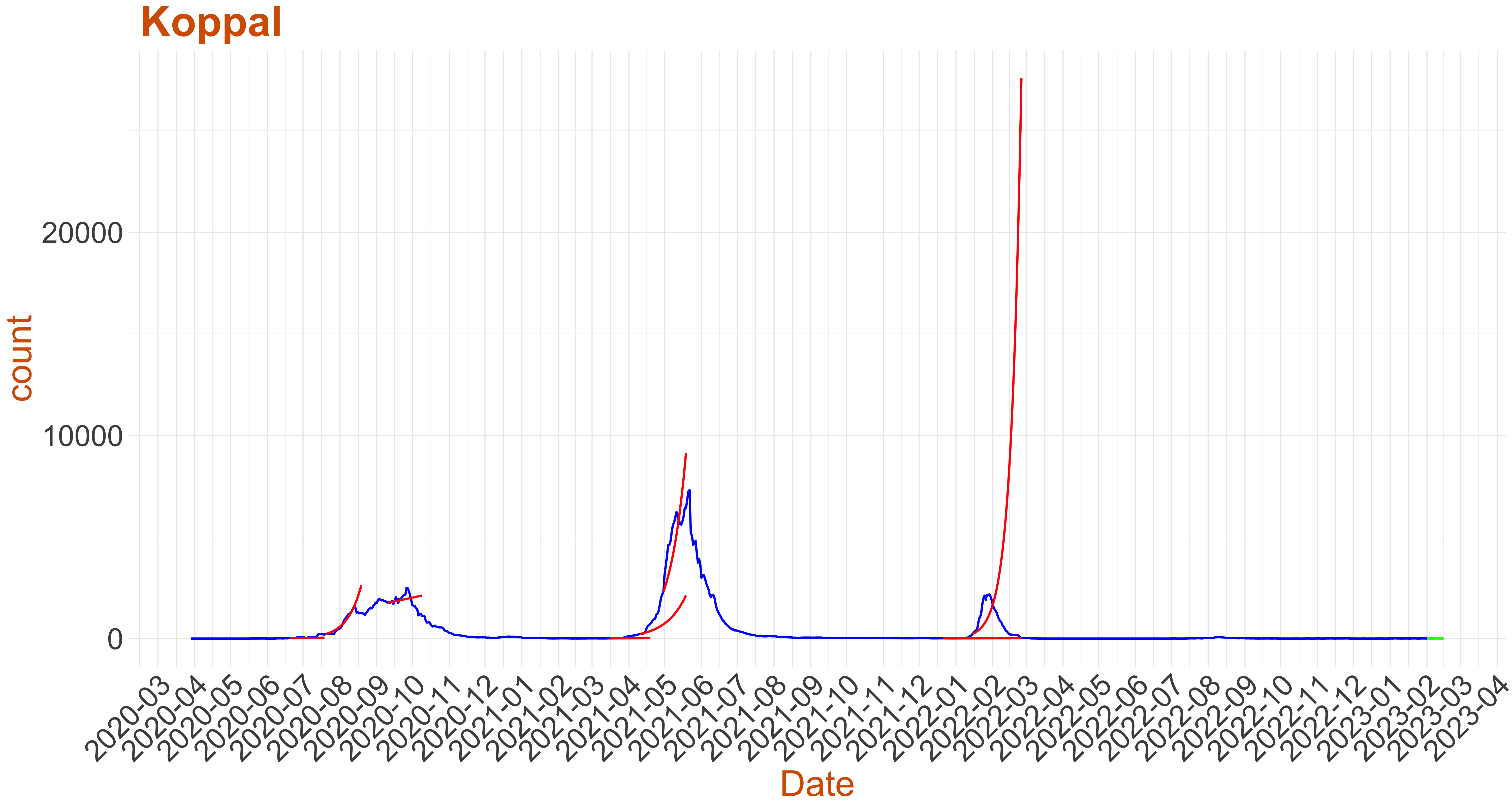 Active Cases: 3, Growth Rate: 0.111
Days to 50 Active Cases per million population:
Days to Critical to previous peak
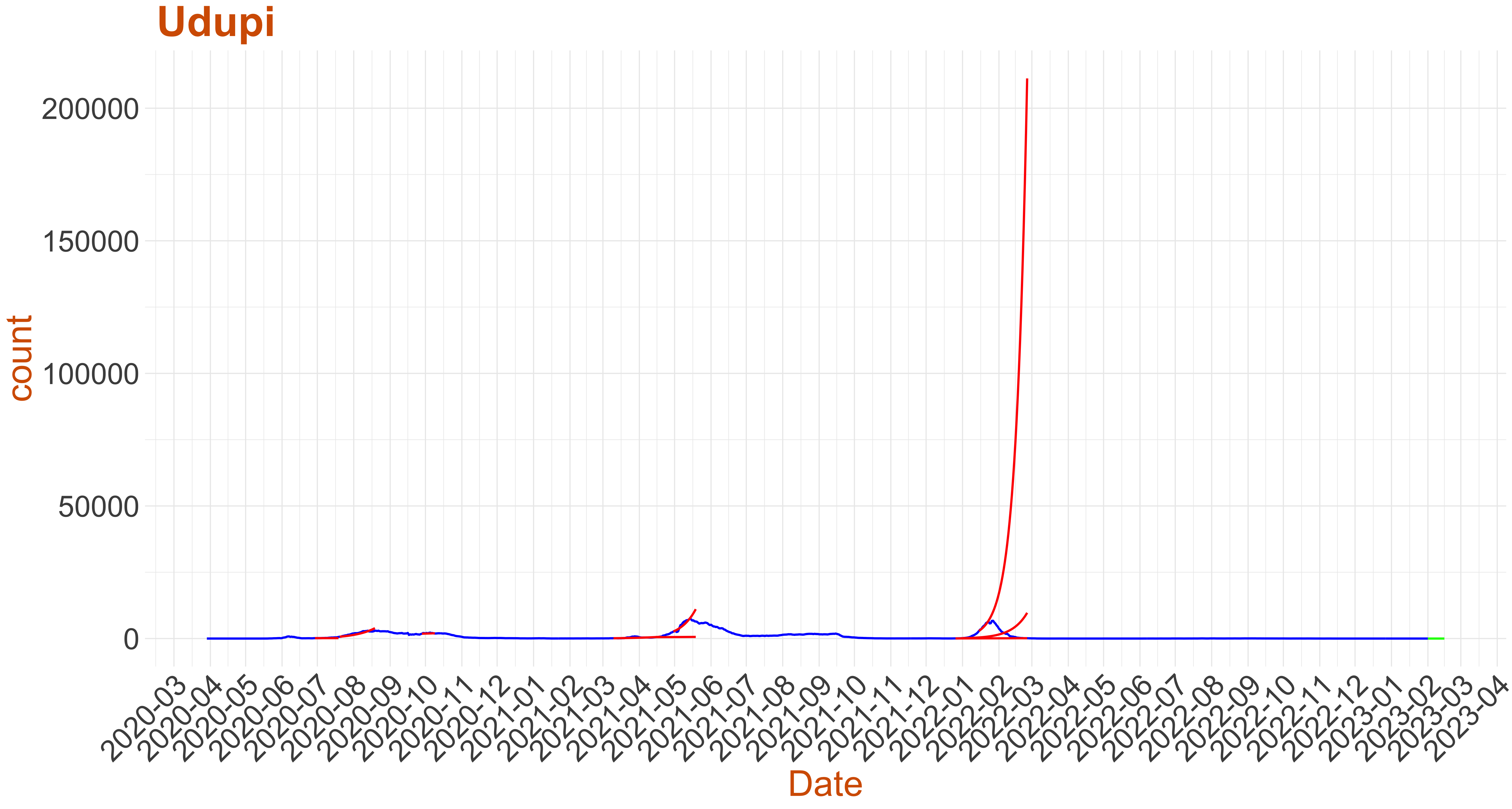 Active Cases: 1, Growth Rate: 0.136
Days to 50 Active Cases per million population: 120
Days to Critical to previous peak
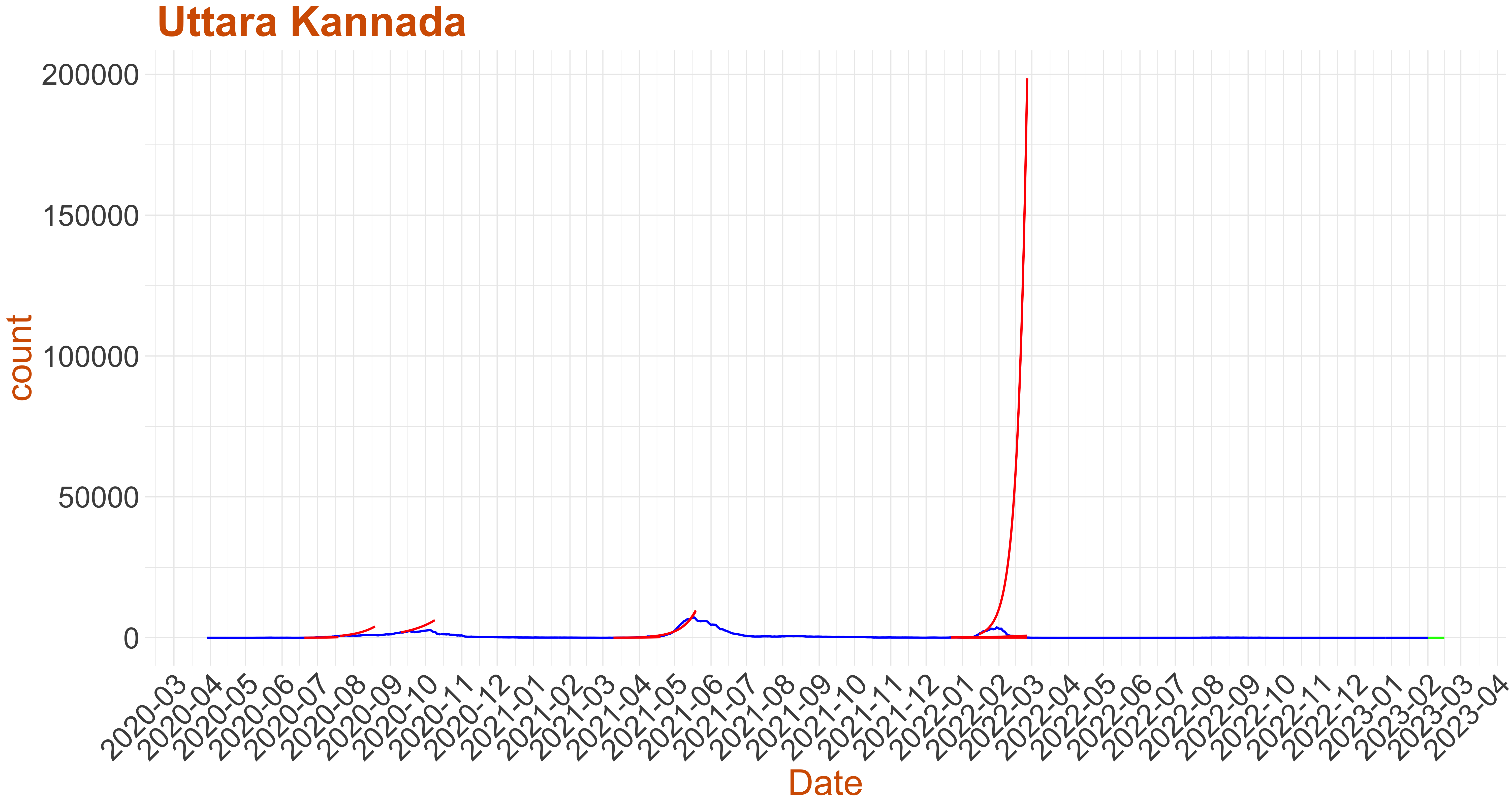 Active Cases: 0, Growth Rate: 0.121
Days to 50 Active Cases per million population:
Days to Critical to previous peak
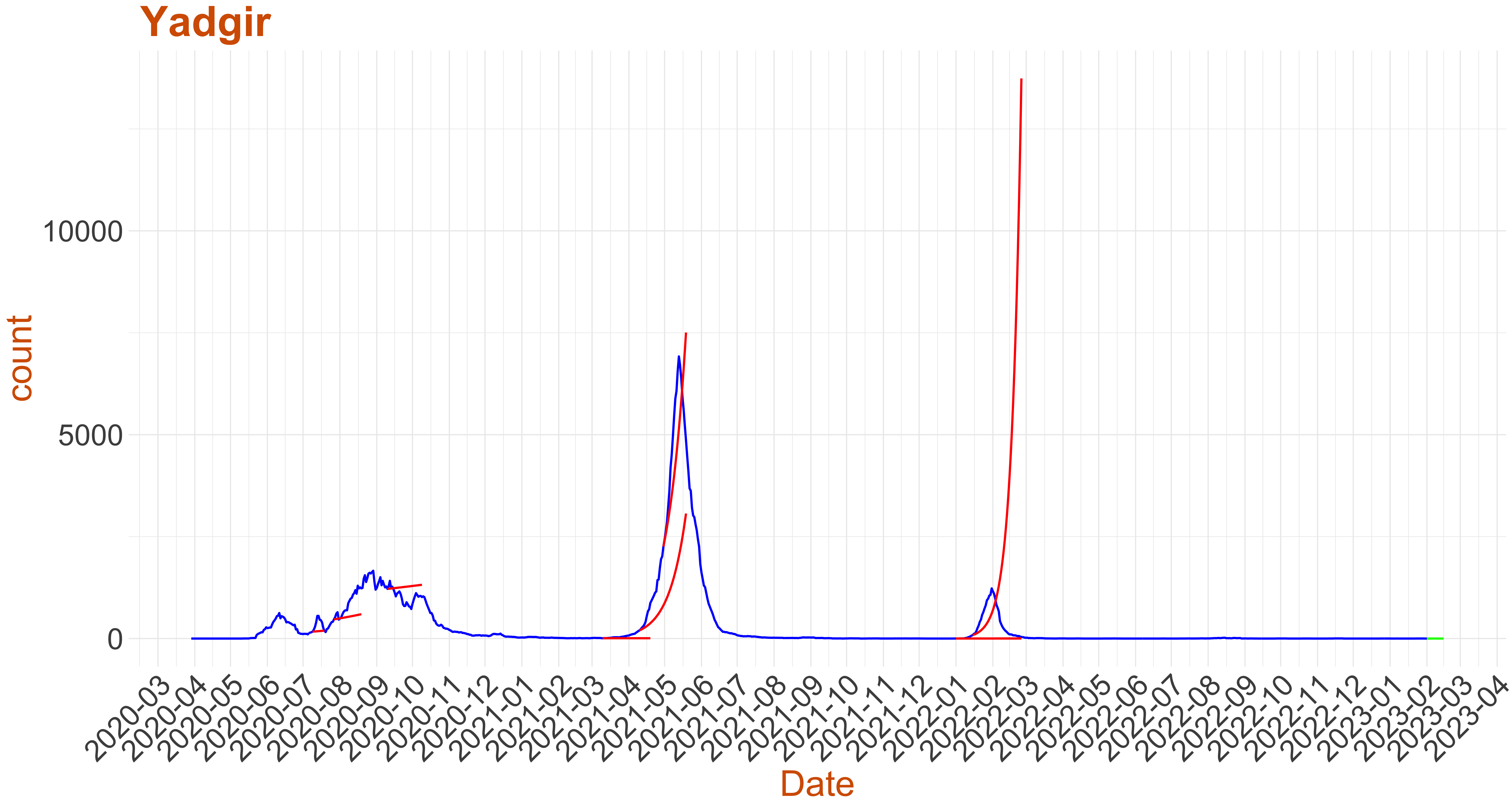 Active Cases: 0, Growth Rate: 0.121
Days to 50 Active Cases per million population:
Days to Critical to previous peak
Stable but Need to be watched
- Below we plot the active cases as reported in blue.
- For the past data we have picked a few critical instances where Growth rate:= the number of new infections per active infection per unit time at time $ exceeds recovery rate plot in red the surge in active cases predicted by the warning system (Note: false alarms do happen).
- Finally at the current date we use the model to predict the active cases for the next 14 days. If the green curve is shooting upward then this is an early warning to the respective district.
- For predicting the days to previous peak we do a smoothening of the data and use $1$ day lag instead of the $7$ day lag used otherwise.
- For the plots below, we have assumed that health infrastructure capacity in a district is proportional to its population. Hence we have used Days to 50 Active cases per million Population and Days to 1500 Active cases per million Population as markers for health care infrastructure capacity. Based on these we have divided the districts into four categories
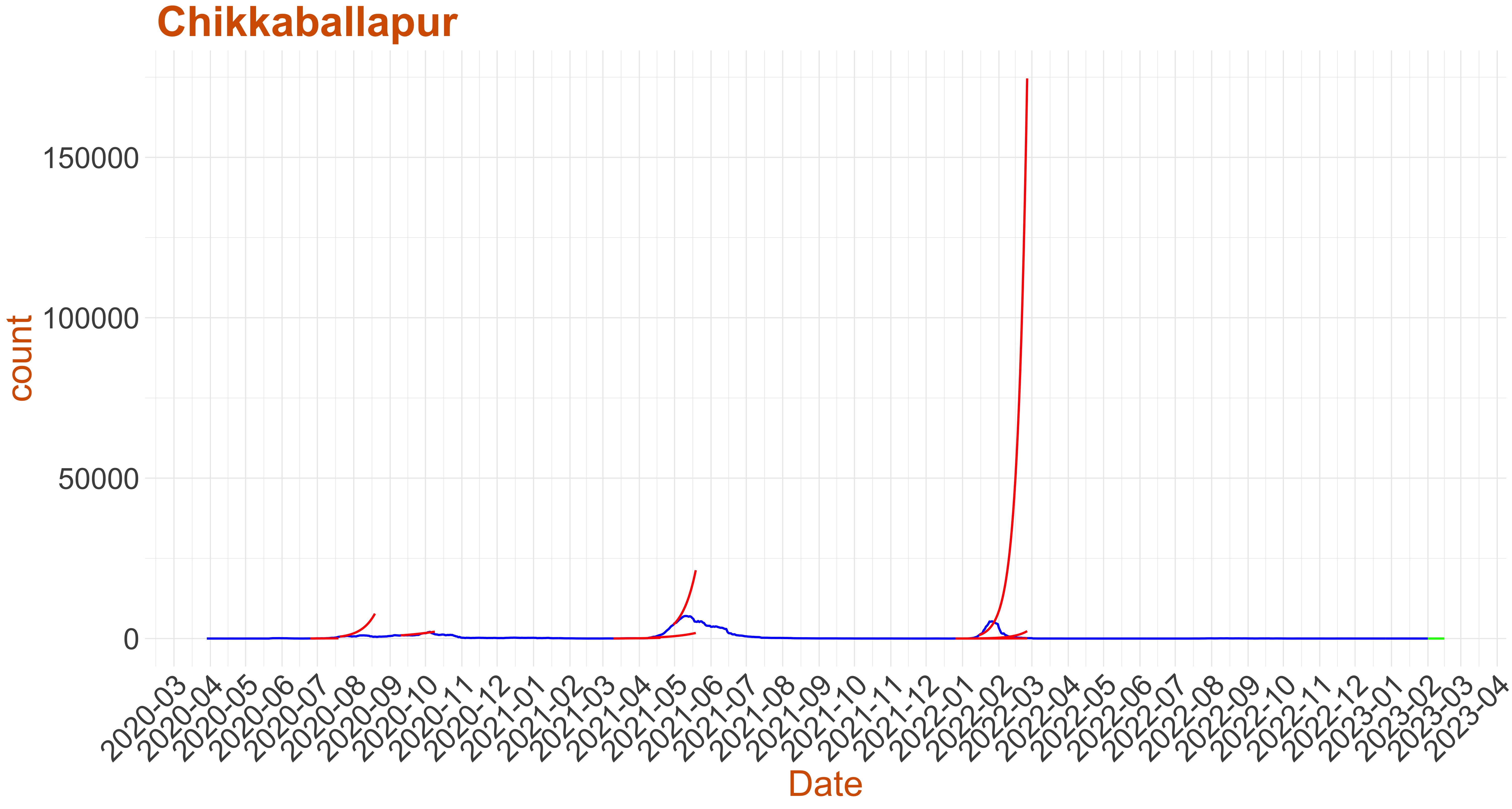 Active Cases: 11, Growth Rate: 0.087
Days to 50 Active Cases per million population:
Days to Critical to previous peak
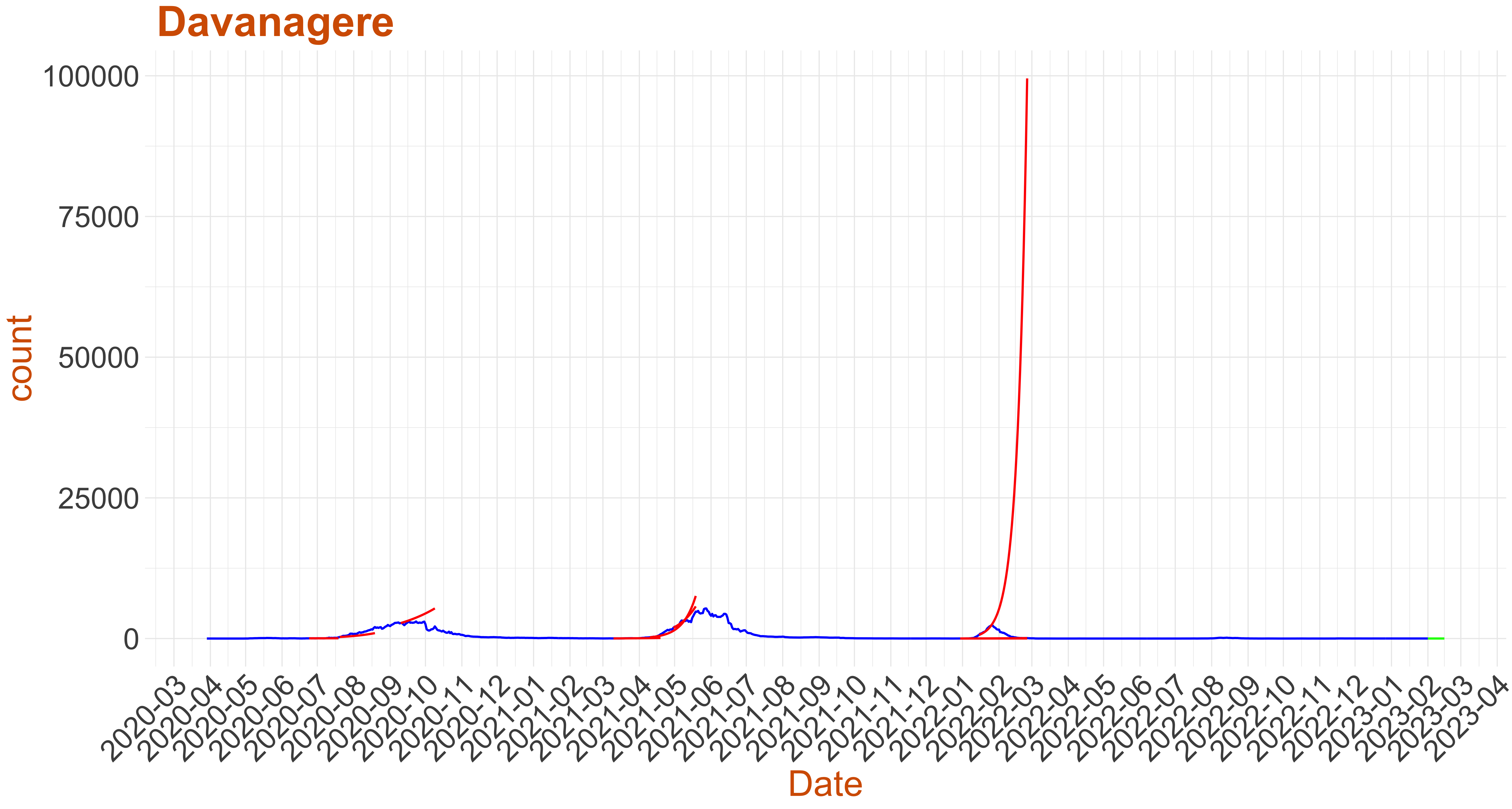 Active Cases: 10, Growth Rate: 0.099
Days to 50 Active Cases per million population:
Days to Critical to previous peak
Stable
About the plots
- Below we plot the active cases as reported in blue.
- For the past data we have picked a few critical instances where Growth rate:= the number of new infections per active infection per unit time at time $ exceeds recovery rate plot in red the surge in active cases predicted by the warning system (Note: false alarms do happen).
- Finally at the current date we use the model to predict the active cases for the next 14 days. If the green curve is shooting upward then this is an early warning to the respective district.
- For predicting the days to previous peak we do a smoothening of the data and use $1$ day lag instead of the $7$ day lag used otherwise.
- For the plots below, we have assumed that health infrastructure capacity in a district is proportional to its population. Hence we have used Days to 50 Active cases per million Population and Days to 1500 Active cases per million Population as markers for health care infrastructure capacity. Based on these we have divided the districts into four categories
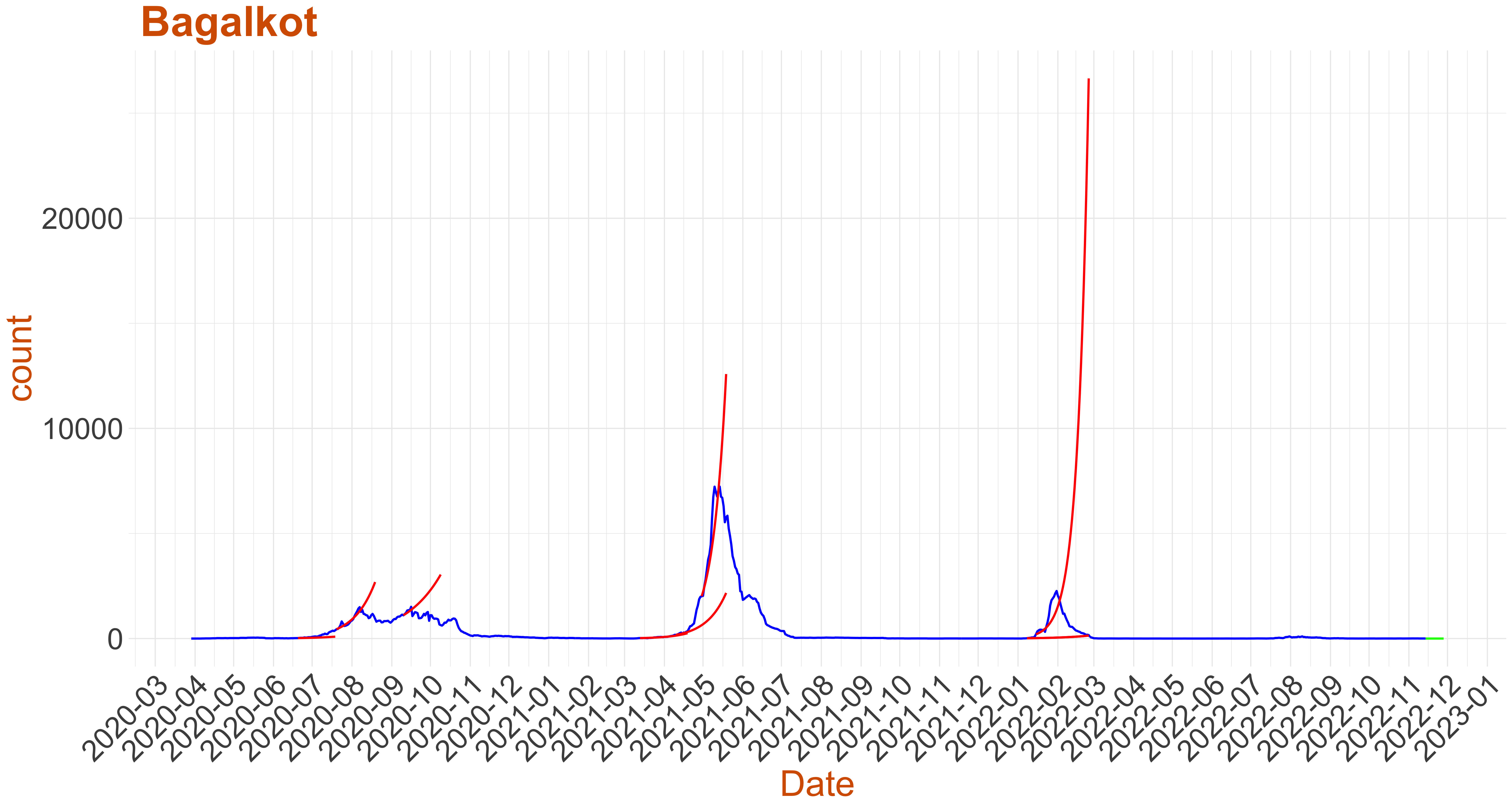 Active Cases: 0, Growth Rate: -0.007
Days to 50 Active Cases per million population:
Days to Critical to previous peak
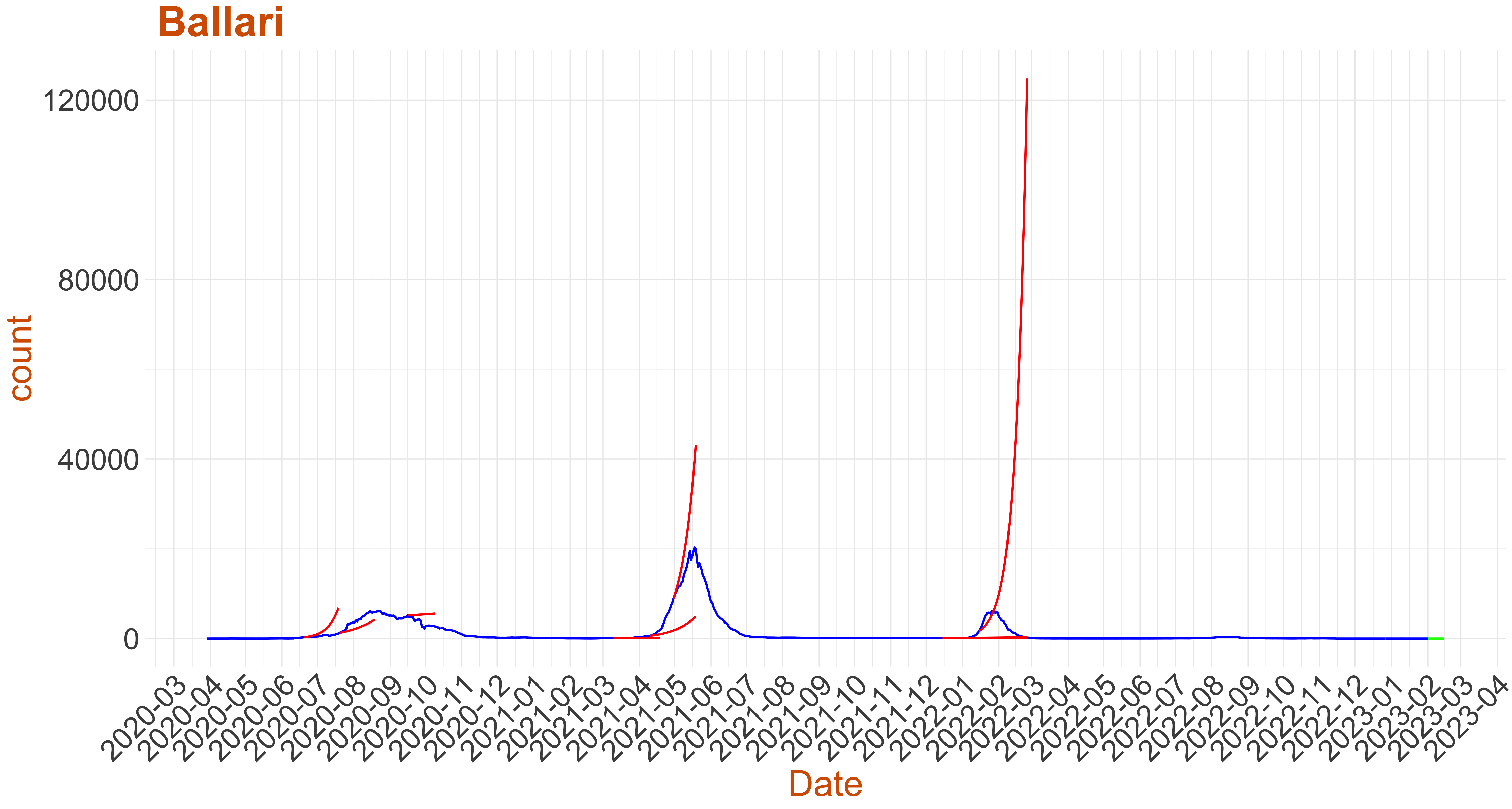 Active Cases: 0, Growth Rate: 0.001
Days to 50 Active Cases per million population:
Days to Critical to previous peak
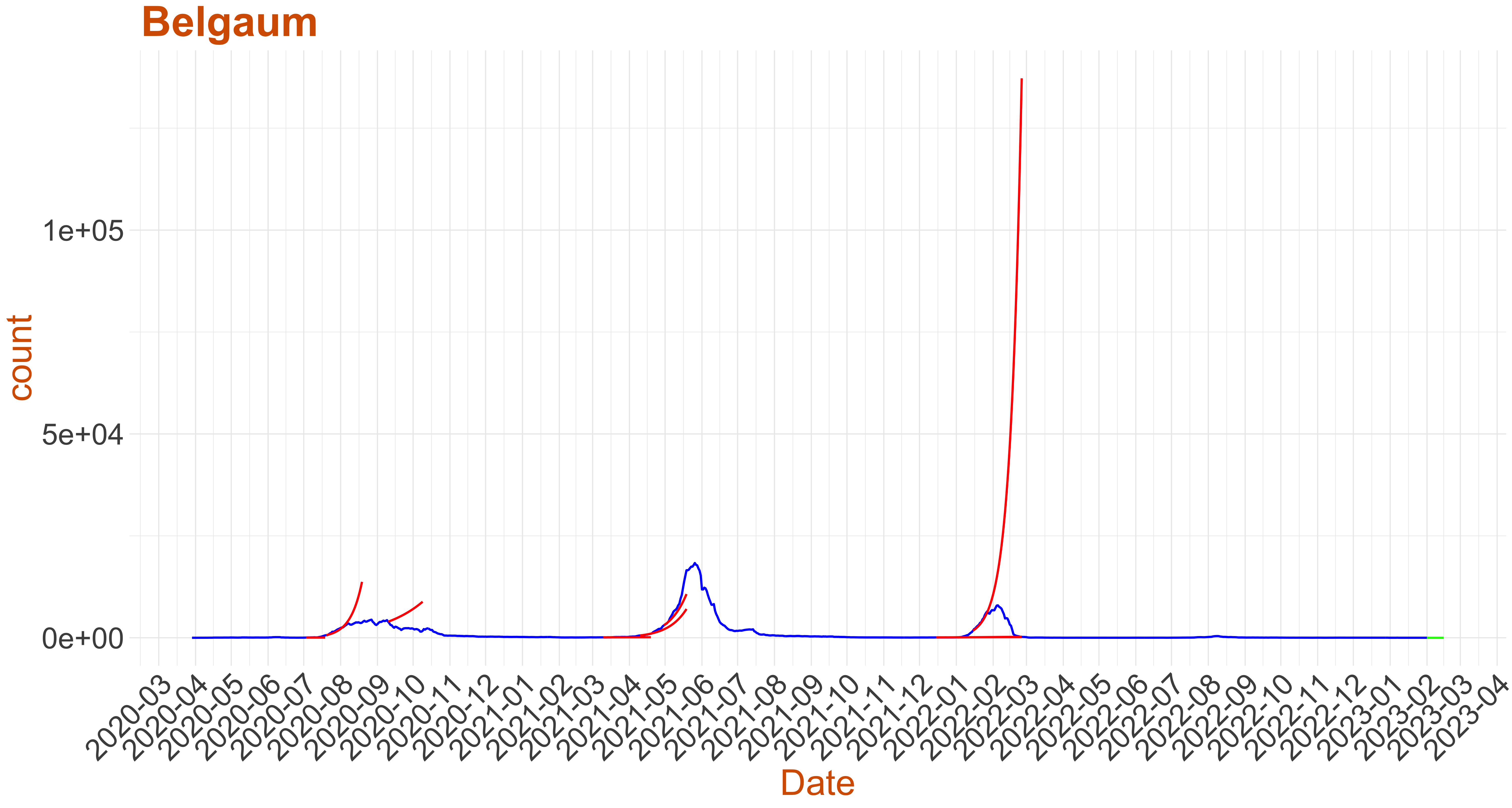 Active Cases: 2, Growth Rate: 0.029
Days to 50 Active Cases per million population:
Days to Critical to previous peak
 Active Cases: 2, Growth Rate: -0.186
Days to 50 Active Cases per million population:
Days to Critical to previous peak
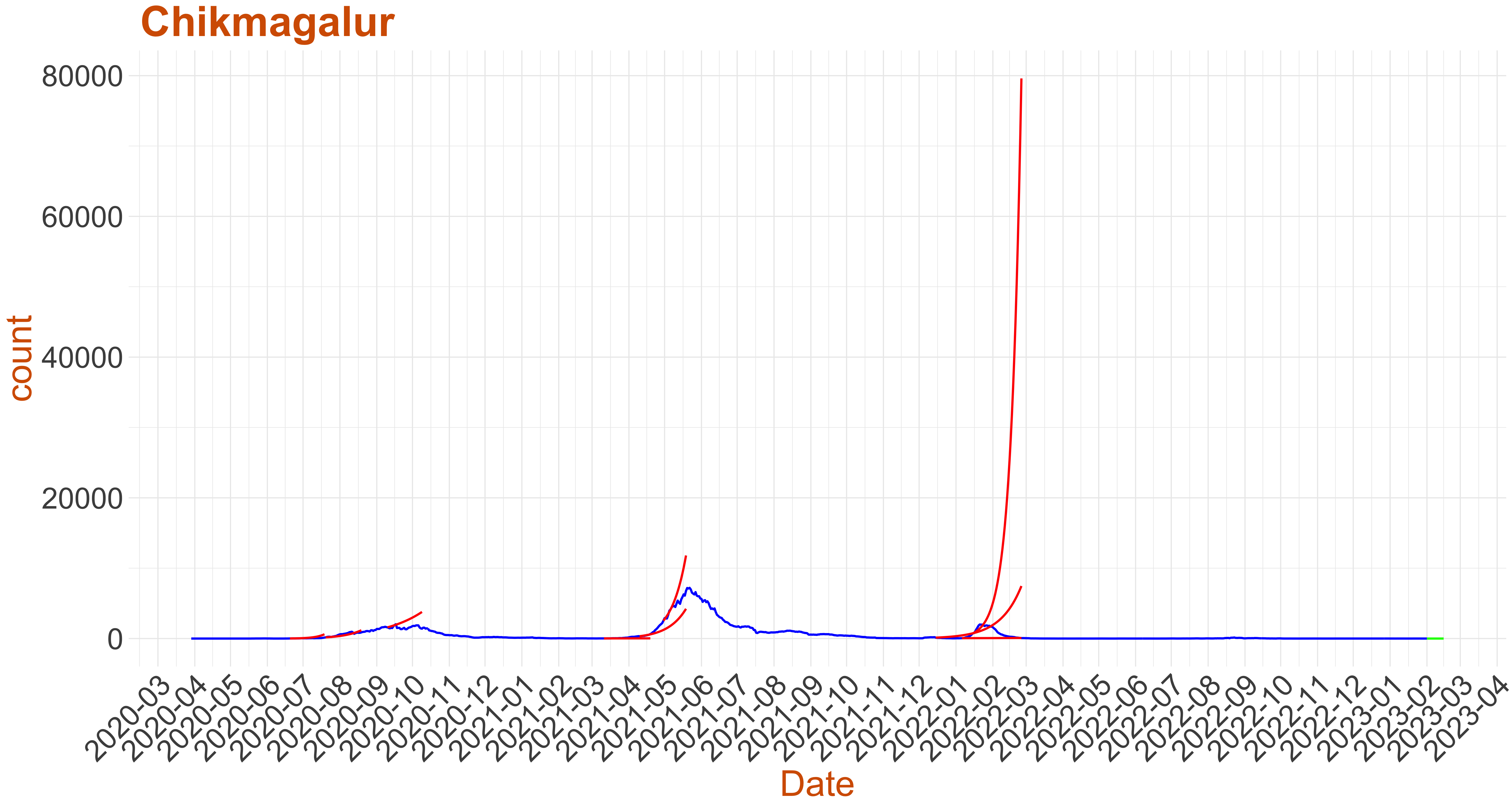 Active Cases: 1, Growth Rate: -0.186
Days to 50 Active Cases per million population:
Days to Critical to previous peak
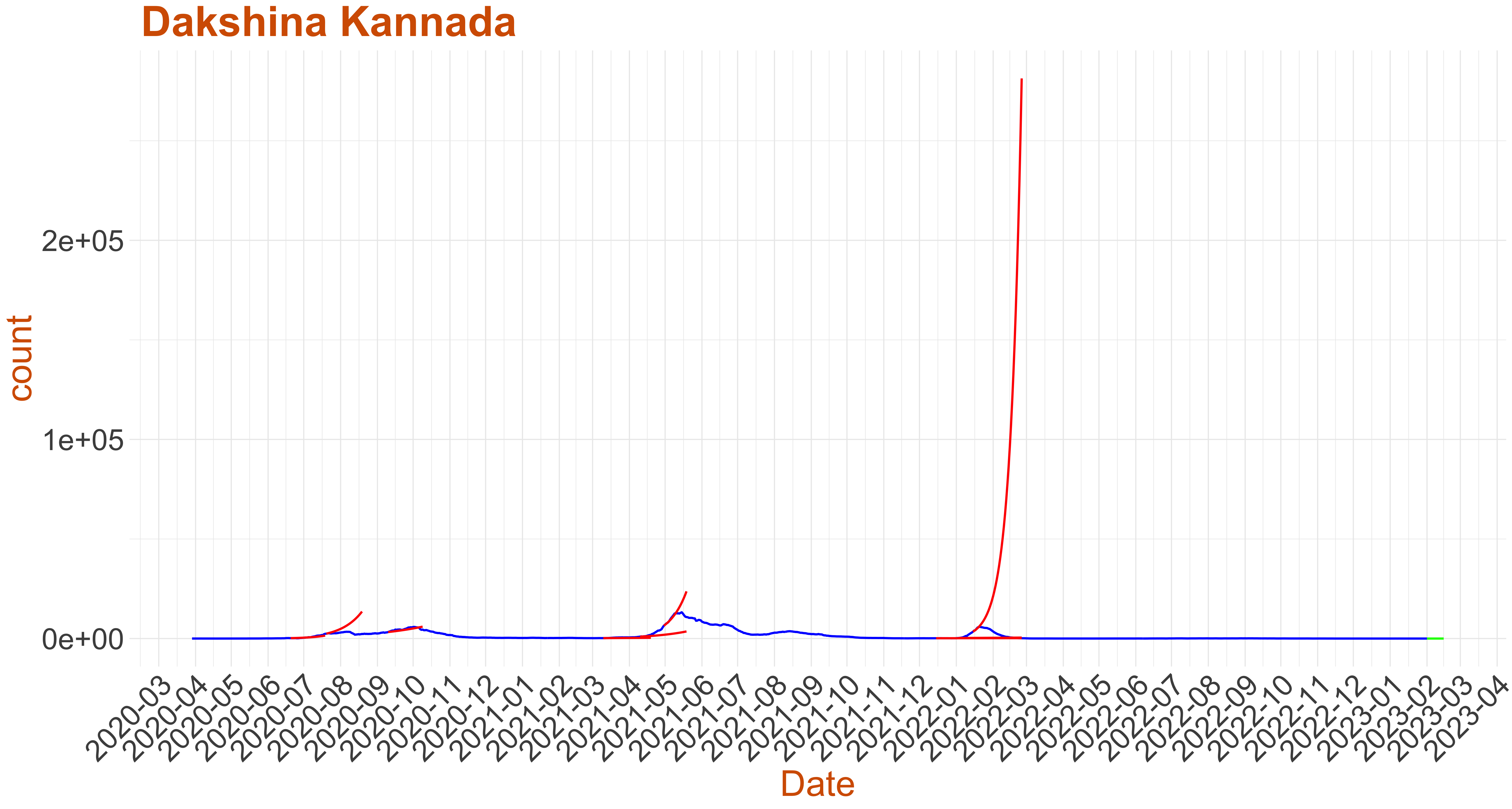 Active Cases: 0, Growth Rate: 0.001
Days to 50 Active Cases per million population:
Days to Critical to previous peak
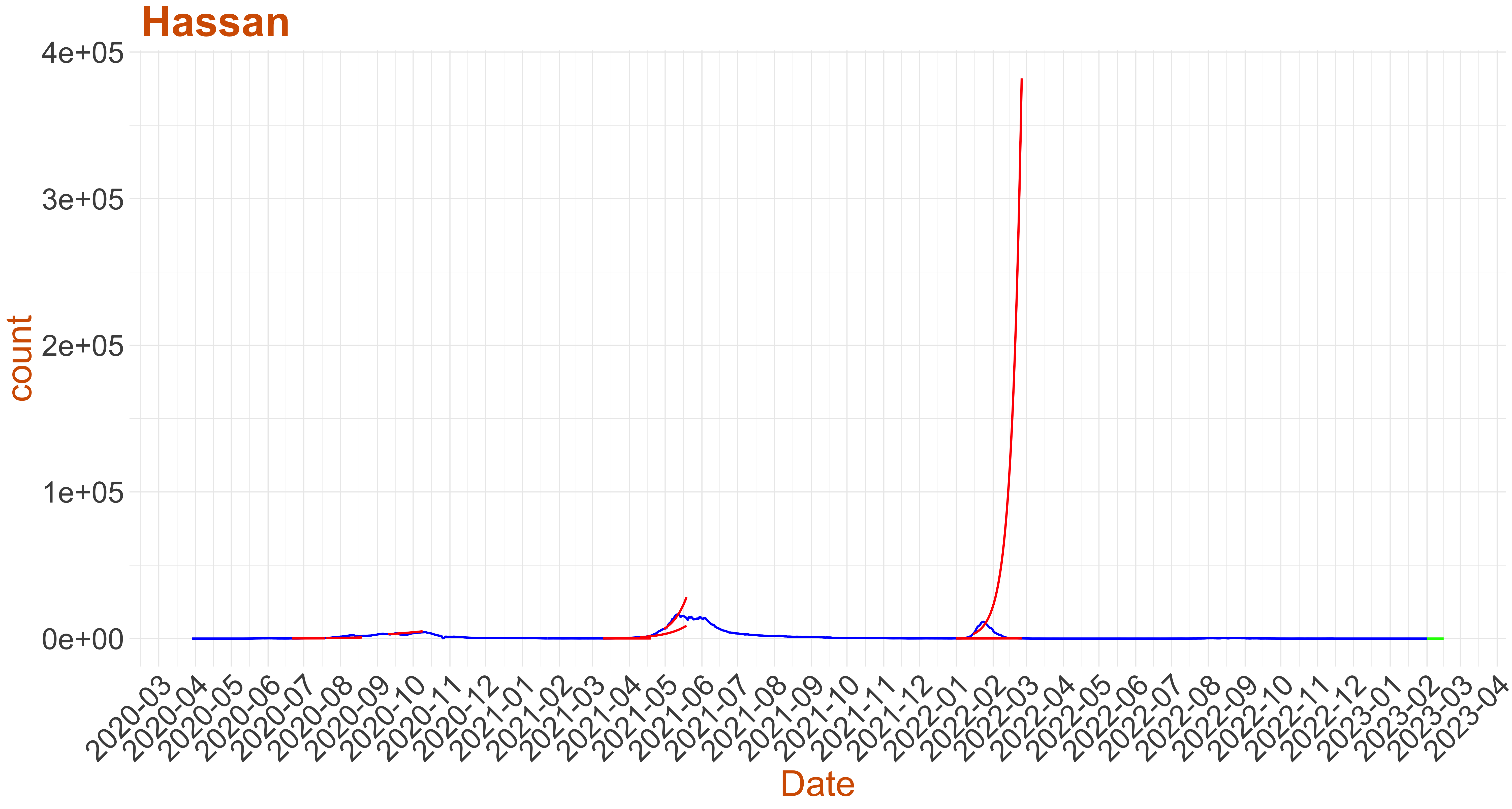 Active Cases: 0, Growth Rate: 0.001
Days to 50 Active Cases per million population:
Days to Critical to previous peak
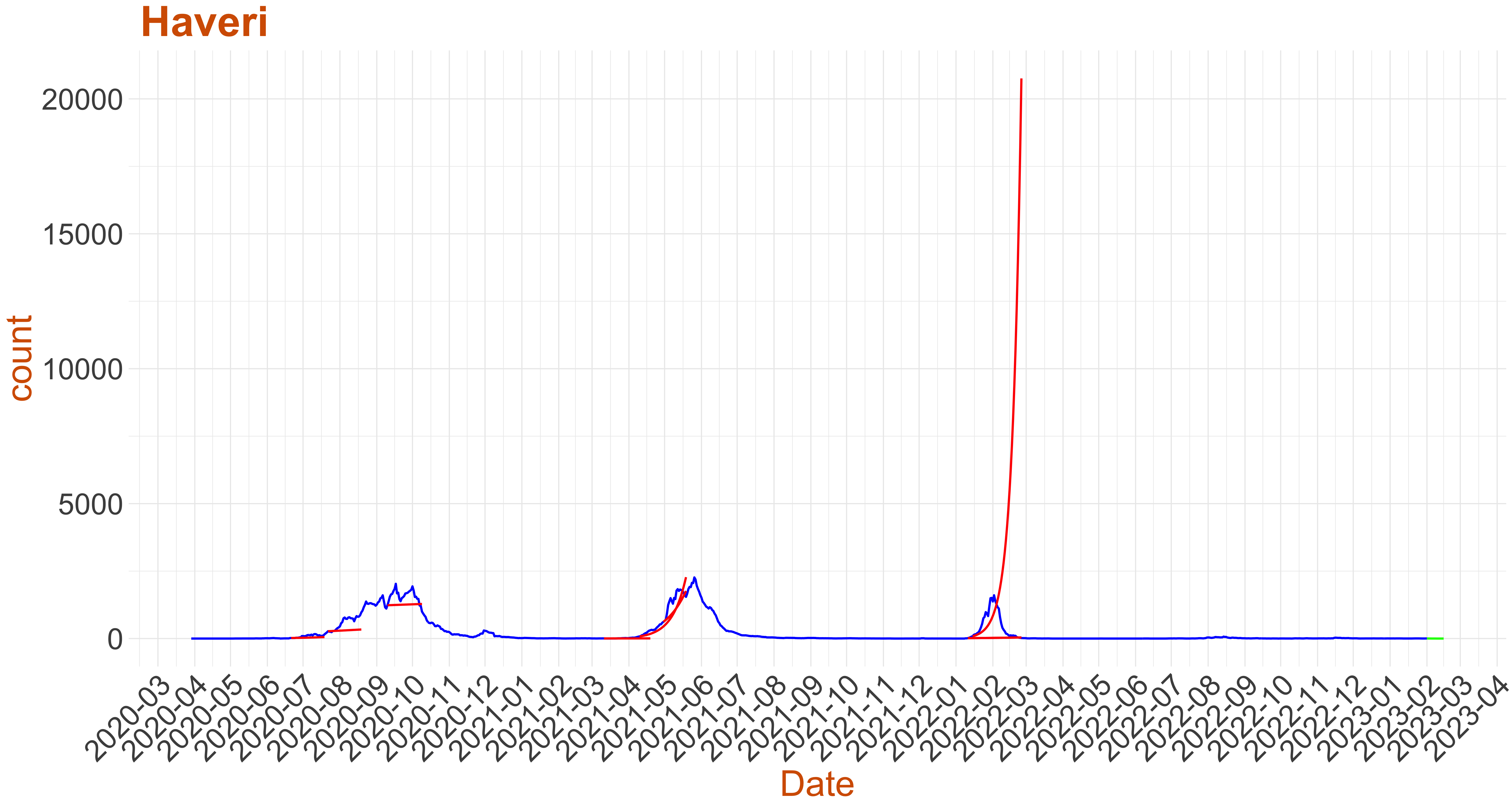 Active Cases: 4, Growth Rate: -0.067
Days to 50 Active Cases per million population:
Days to Critical to previous peak
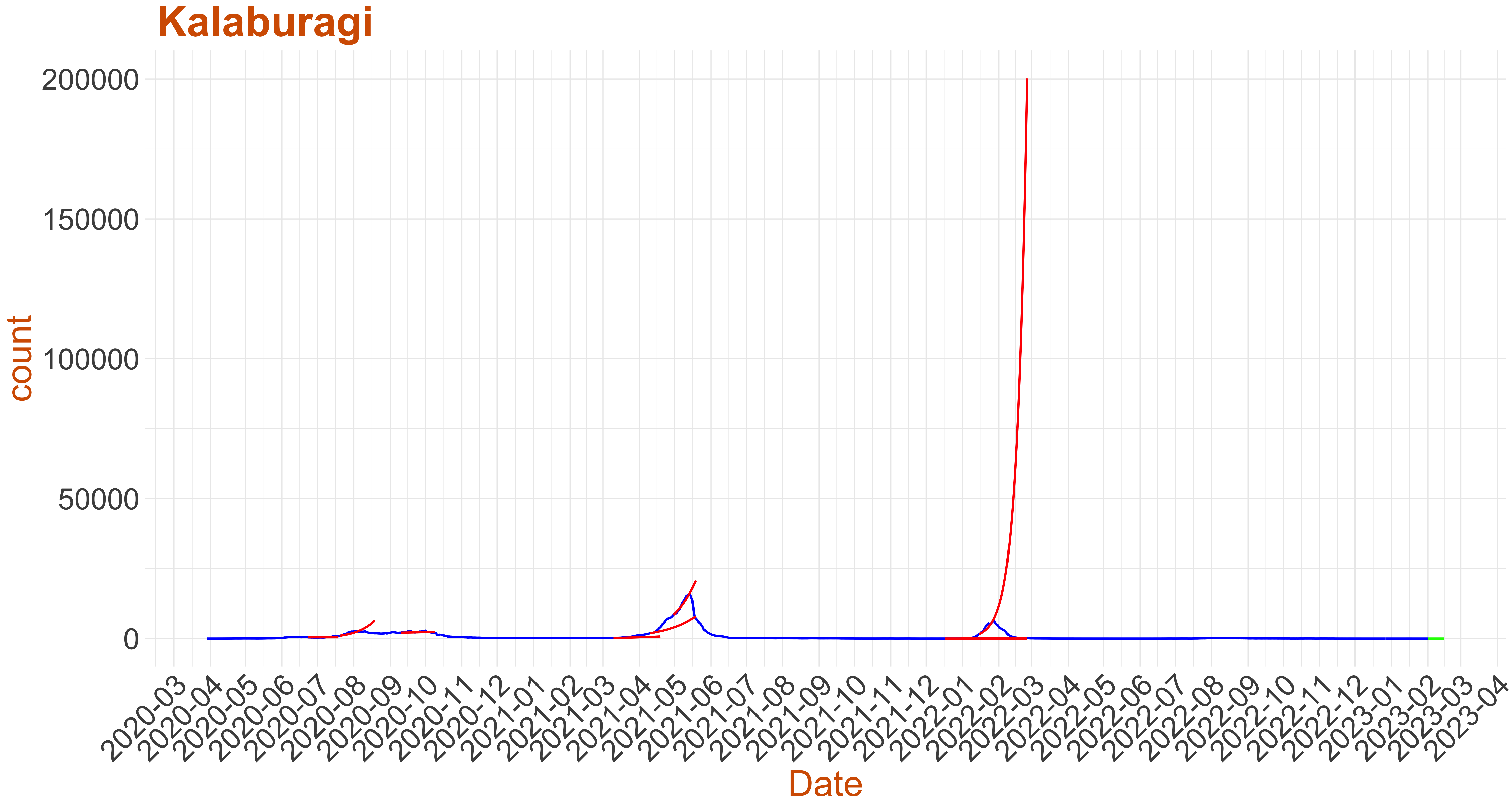 Active Cases: 0, Growth Rate: 0.001
Days to 50 Active Cases per million population:
Days to Critical to previous peak
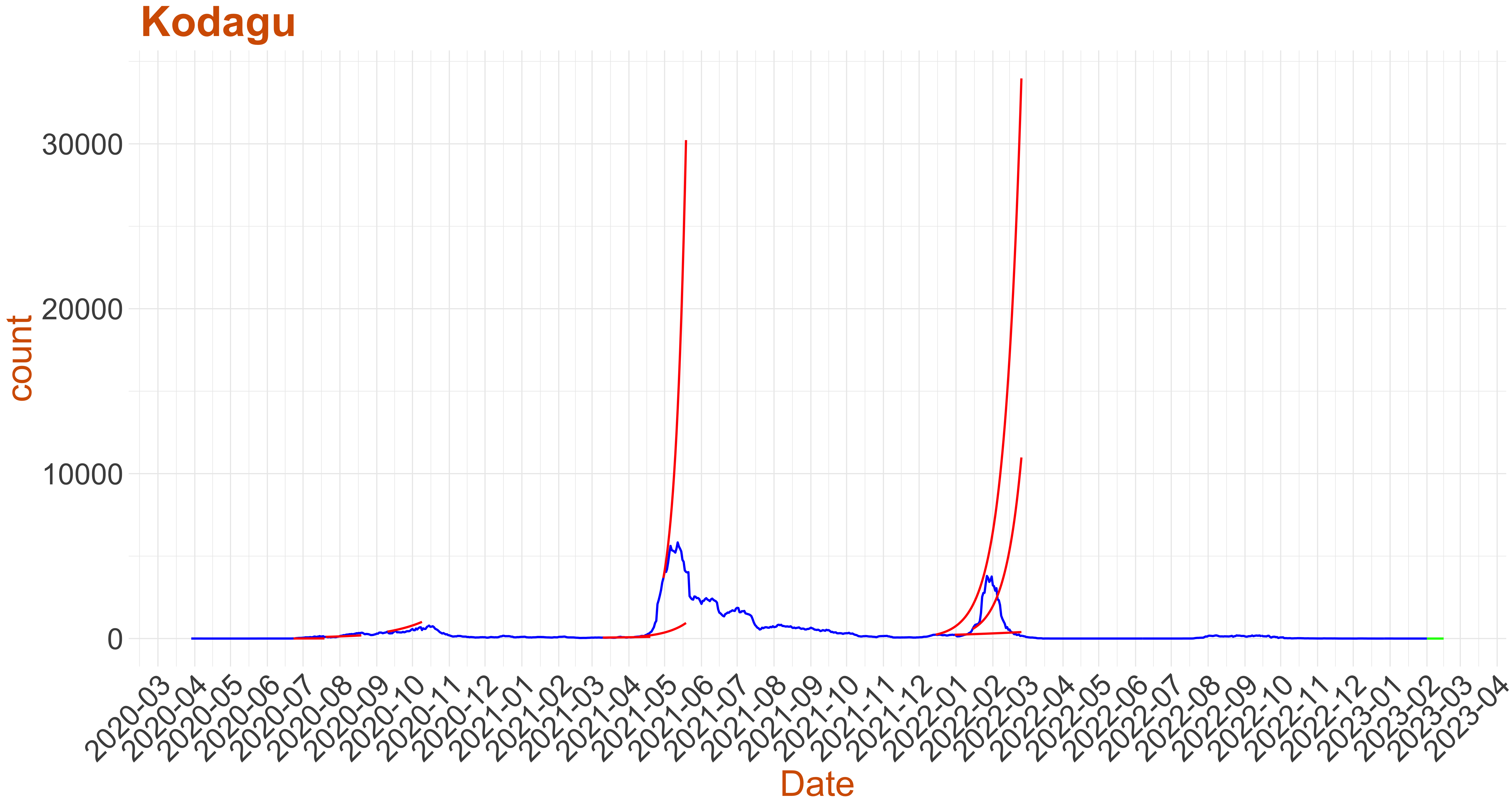 Active Cases: 0, Growth Rate: 0.001
Days to 50 Active Cases per million population:
Days to Critical to previous peak
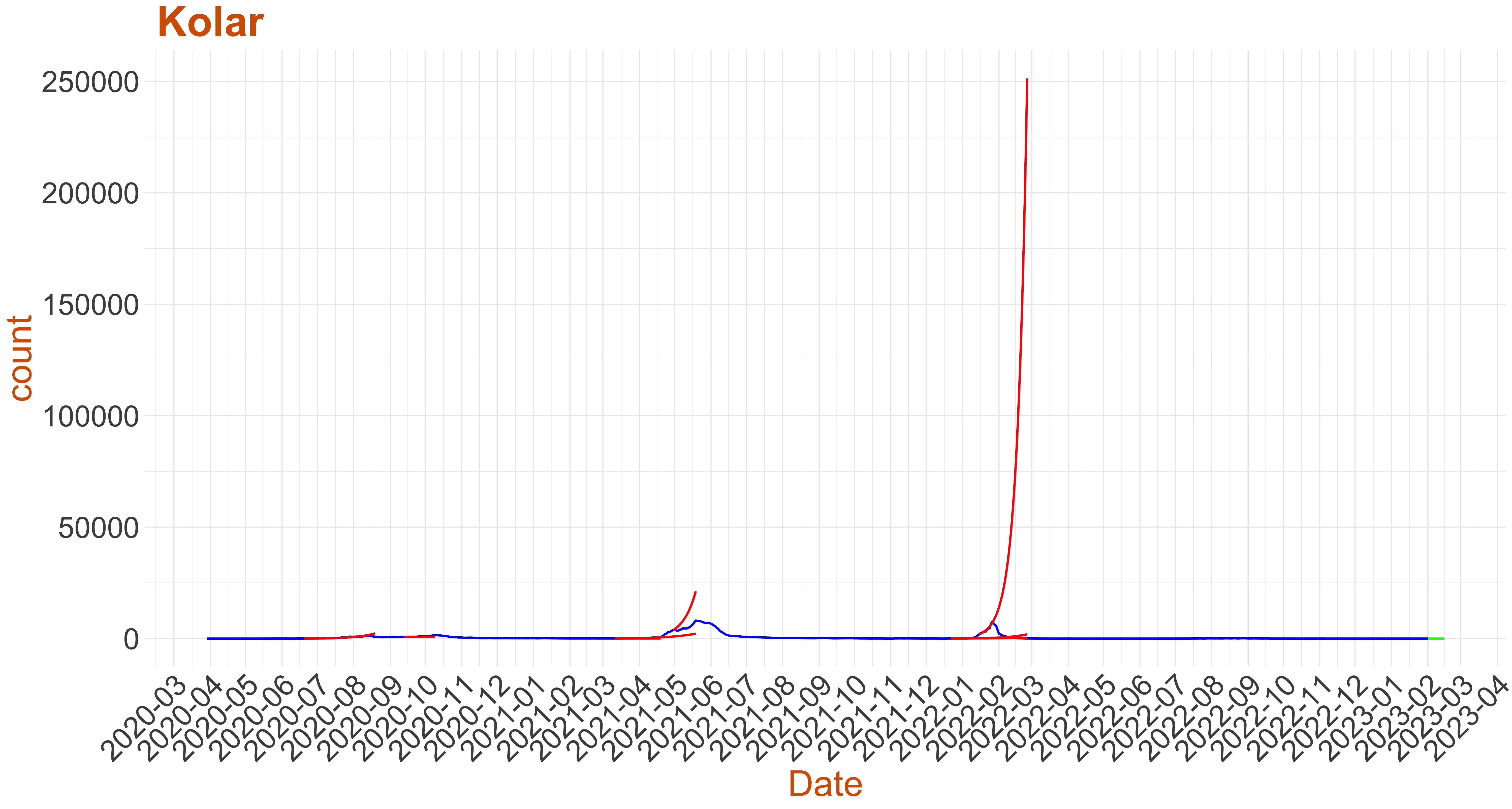 Active Cases: 4, Growth Rate: -0.043
Days to 50 Active Cases per million population:
Days to Critical to previous peak
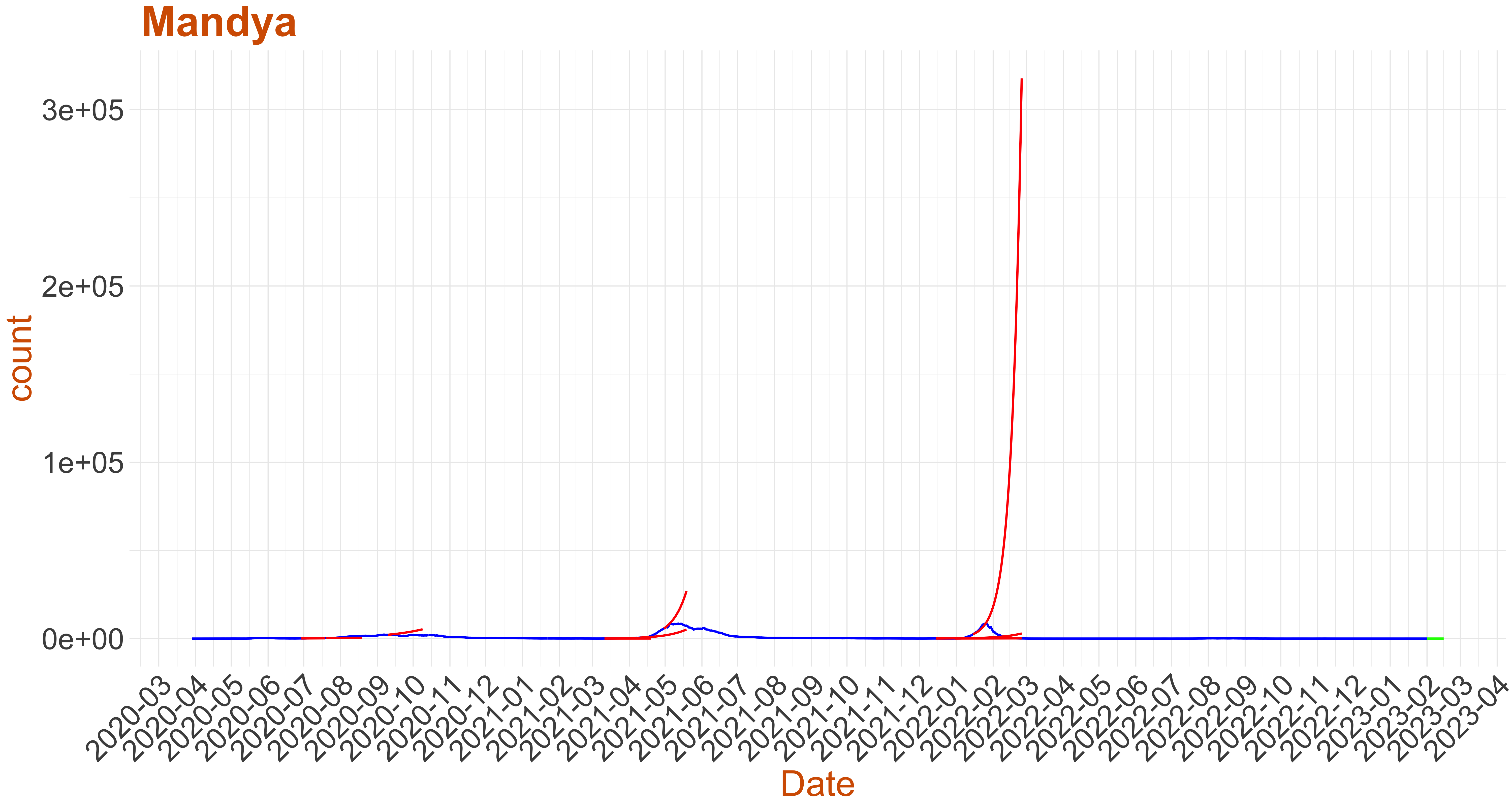 Active Cases: 0, Growth Rate: 0.05
Days to 50 Active Cases per million population:
Days to Critical to previous peak
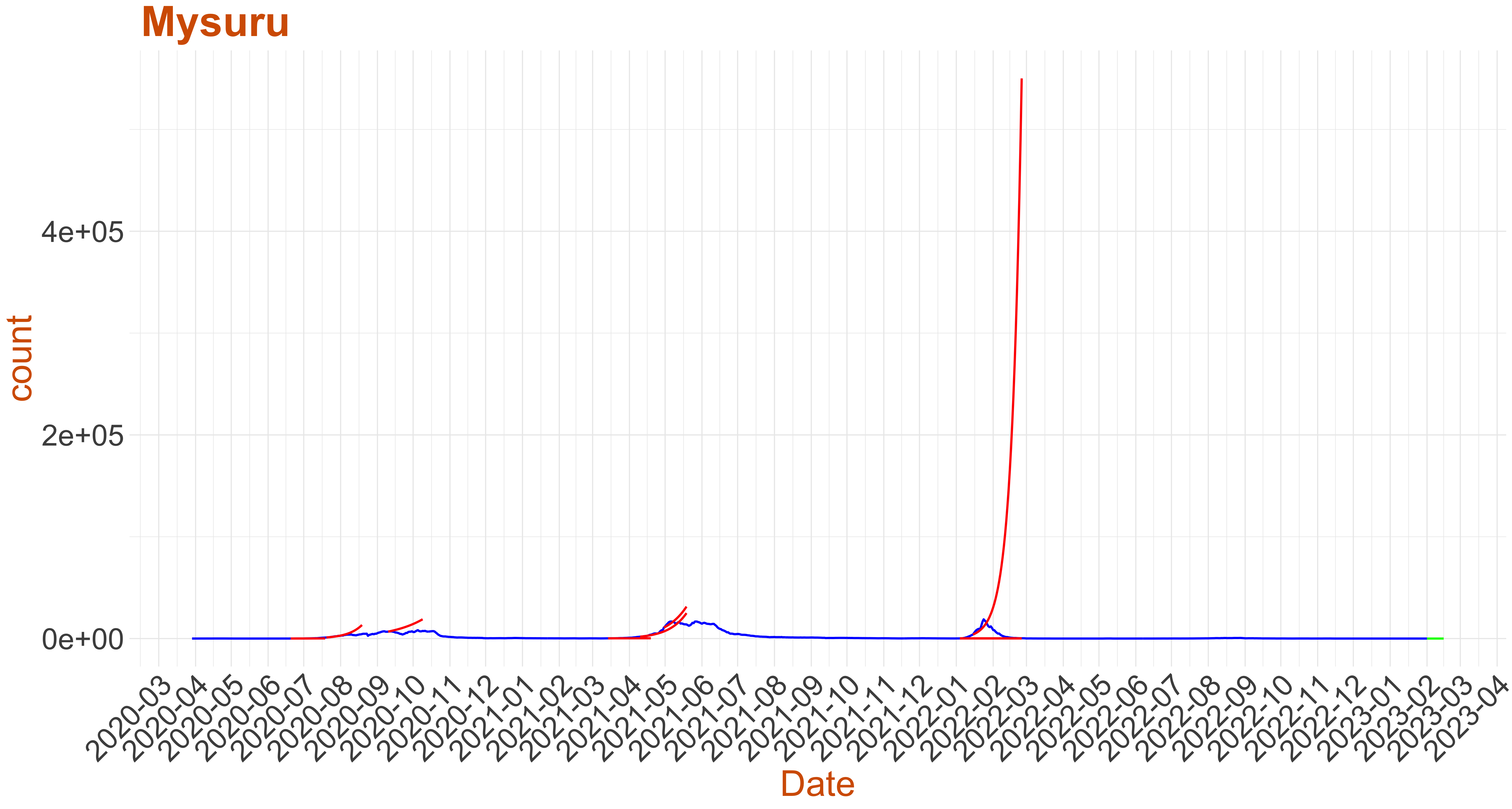 Active Cases: 1, Growth Rate: 0.075
Days to 50 Active Cases per million population:
Days to Critical to previous peak
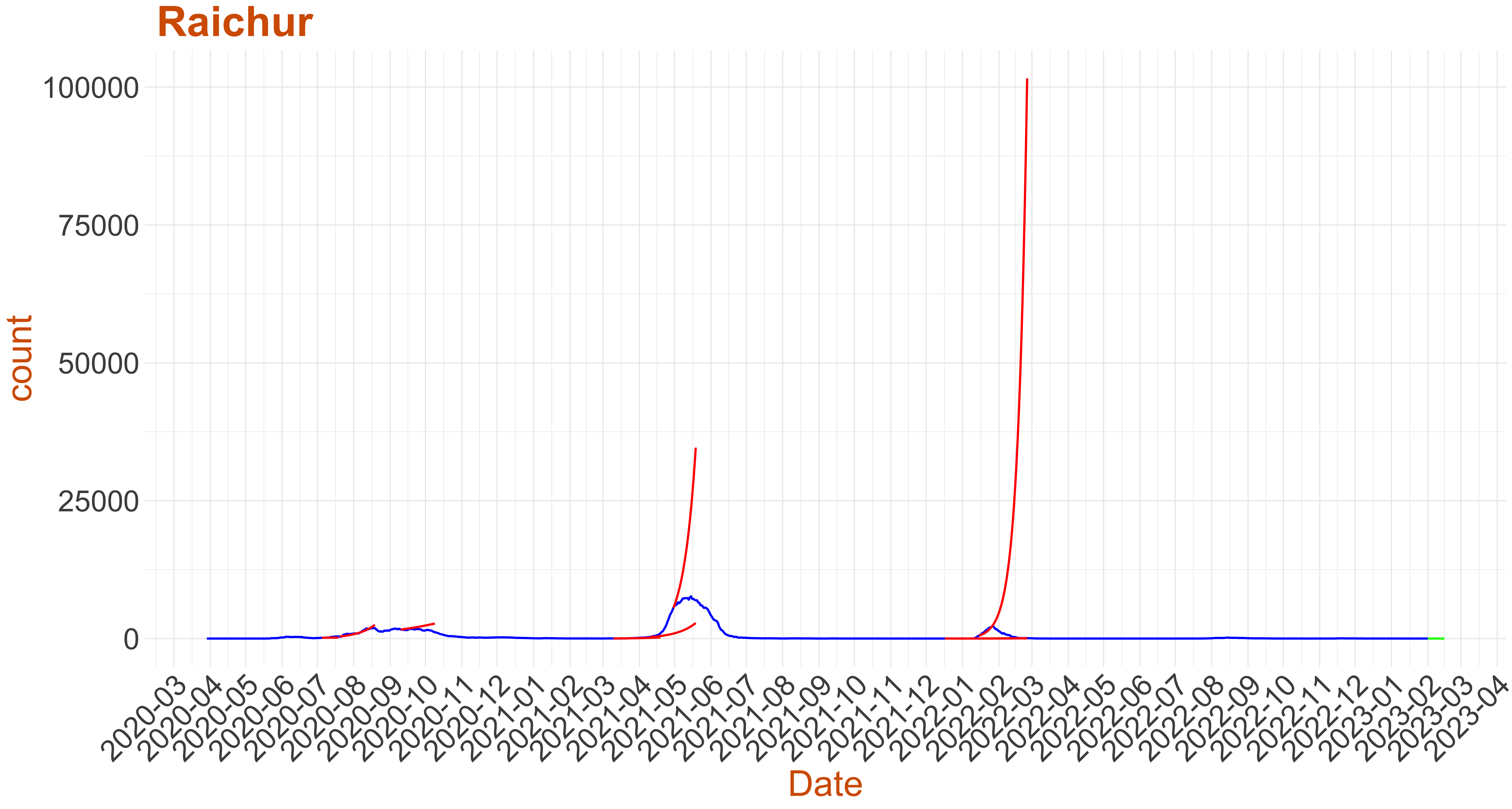 Active Cases: 2, Growth Rate: 0.076
Days to 50 Active Cases per million population:
Days to Critical to previous peak
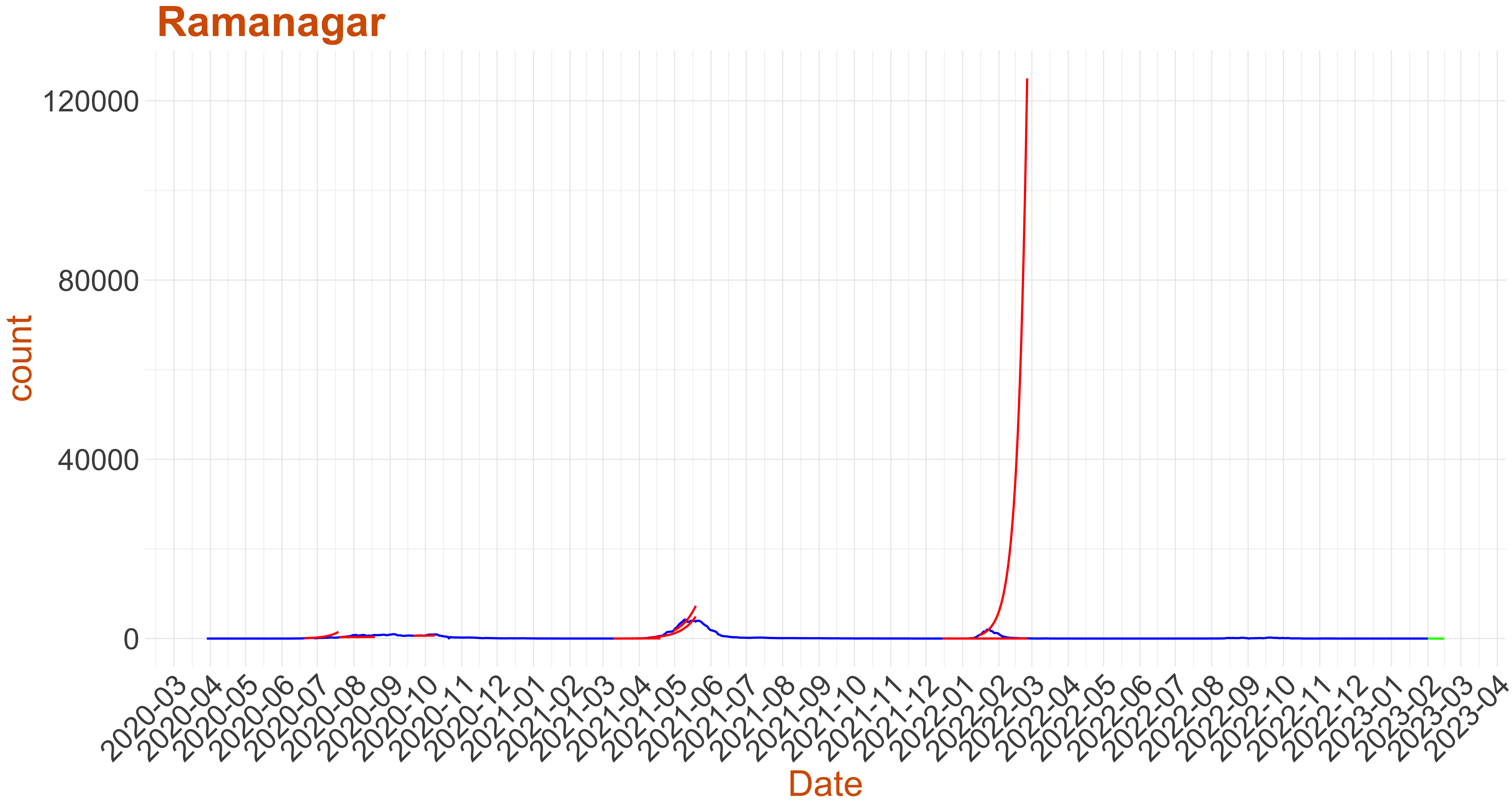 Active Cases: 1, Growth Rate: 0.05
Days to 50 Active Cases per million population:
Days to Critical to previous peak
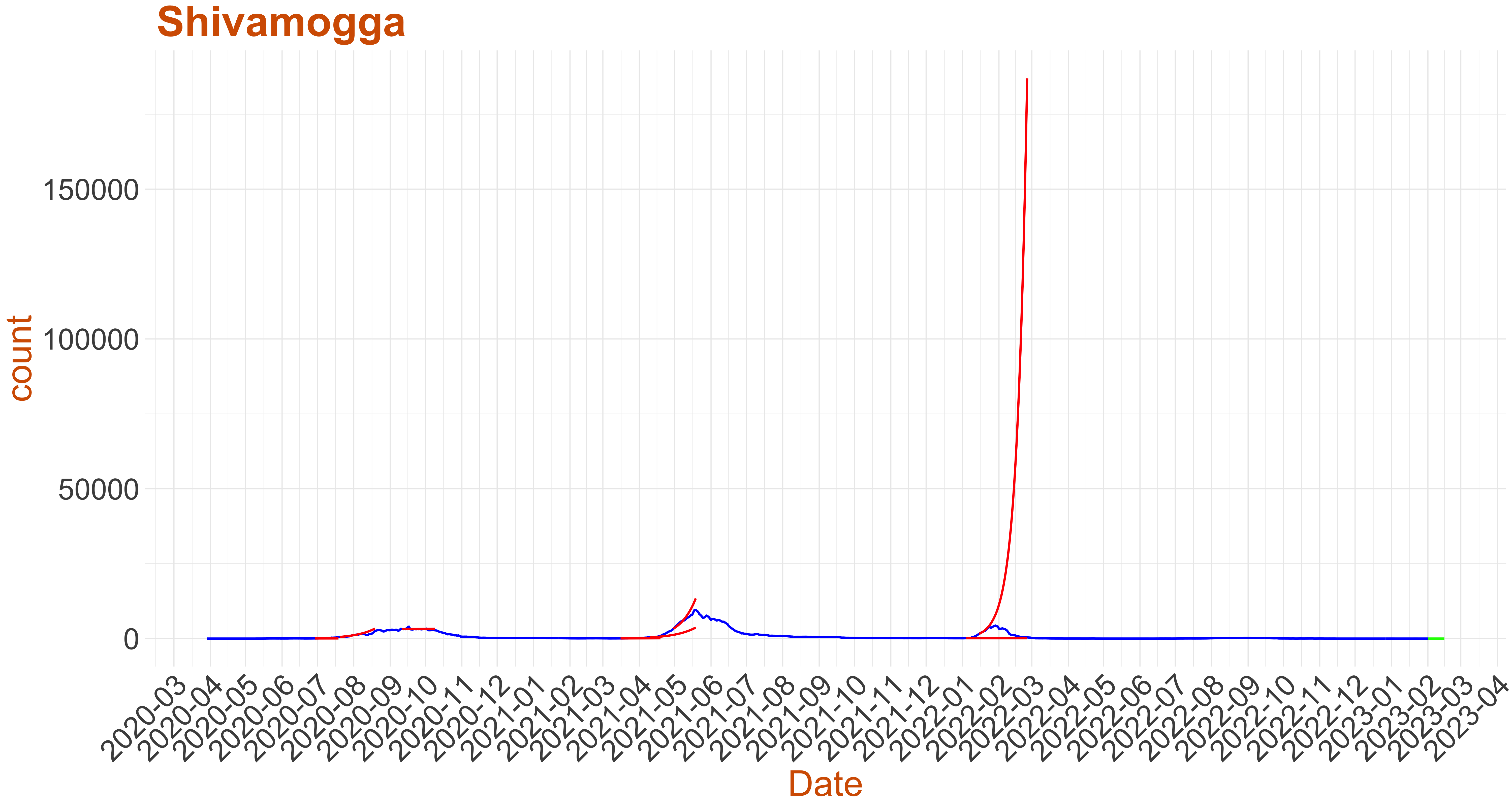 Active Cases: 0, Growth Rate: 0.043
Days to 50 Active Cases per million population:
Days to Critical to previous peak
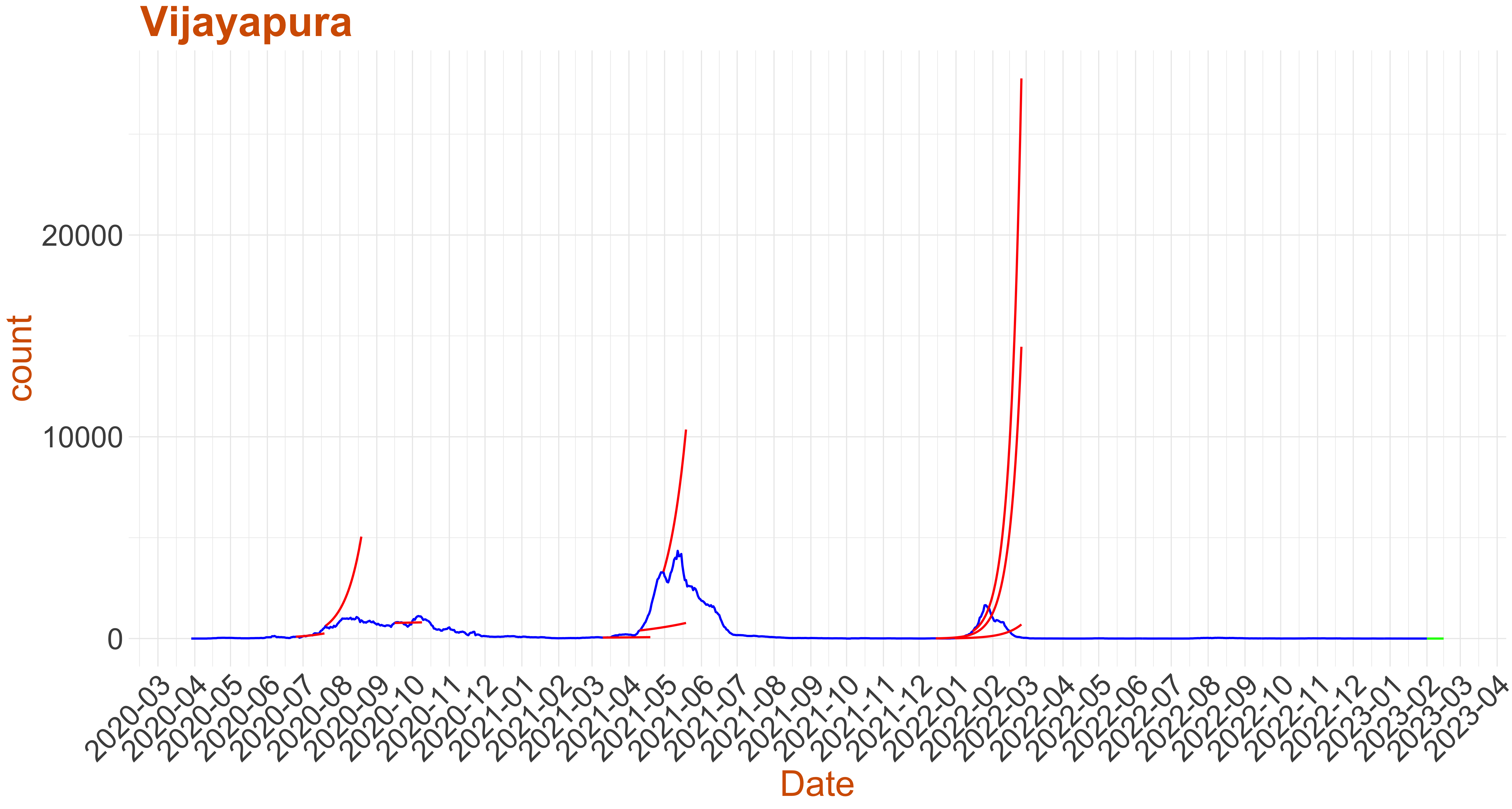 Active Cases: 0, Growth Rate: 0.001
Days to 50 Active Cases per million population:
Days to Critical to previous peak